Web Design Best Practices

You've built a website, but something feels off. Visitors arrive and leave within seconds. Your bounce rate makes you want to hide under your desk. Sound familiar? We get it, and you're definitely not alone in this struggle. Creating a website that actually works for your business isn't just about making it look pretty (though that helps too!).
Here's the thing: web design isn't rocket science, but there are proven strategies that separate websites that convert from those that collect digital dust. Research shows that a website has mere seconds to make a good impression before a visitor decides to leave (Source: Elementor). That's not much time to make your case!
This guide covers the essential practices that actually move the needle for your business. We'll walk through typography secrets, mobile optimization that works, user experience fixes that boost engagement, and performance tweaks that keep visitors happy. Ready to transform your site from "meh" to "wow"? Let's get started!
Typography and Readability: Making Your Content Shine
Typography might seem like a small detail, but it's the foundation of user experience. Think about it: if people can't easily read your content, they won't stick around long enough to become customers. Use clear, legible fonts and maintain sufficient contrast between text and background to ensure readability (Source: Elementor). Your visitors' eyes will thank you!
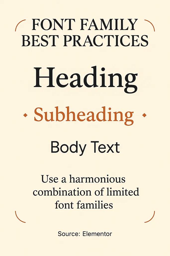
Here's a pro tip that makes a huge difference: limit the number of font families you use. Typically, two or three font families work best to maintain visual consistency and avoid clutter (Source: Elementor). Too many fonts create visual chaos, and nobody wants that on their website.
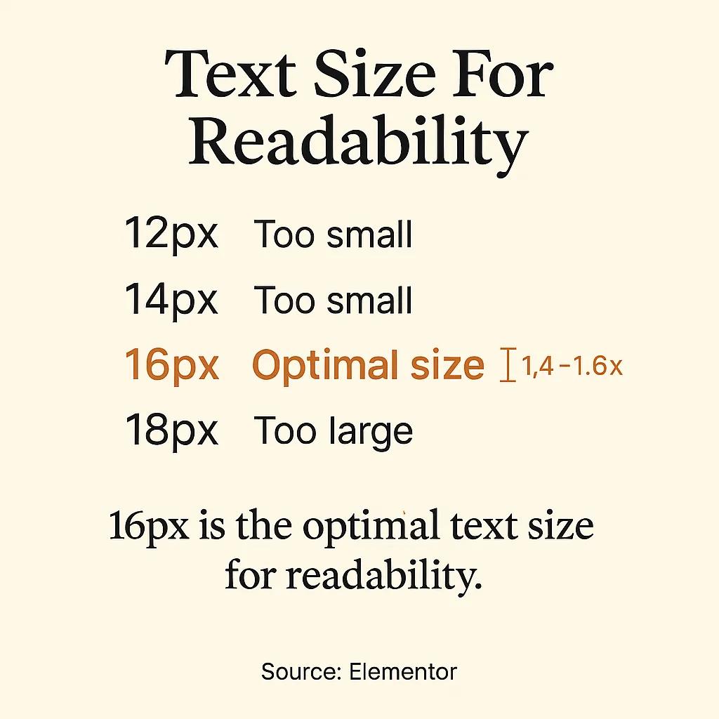
Font size and line spacing deserve special attention. Prioritize font size and line spacing for body text, with 16px or larger now standard for optimal reading comfort (Source: Elementor). Small text might look sophisticated, but it's not doing you any favors when it comes to user experience.
Content Structure That Works
Nobody wants to read a wall of text. Break up content with headings, subheadings, and bullet points to improve scannability (Source: Elementor). This approach helps visitors quickly find the information they need, which keeps them engaged longer.
Body Text Size
- Best Practice: 16px or larger
- Why It Matters: Ensures comfortable reading across devices
Font Families
- Best Practice: 2-3 maximum
- Why It Matters: Maintains visual consistency and reduces clutter
Line Spacing
- Best Practice: 1.4-1.6x font size
- Why It Matters: Improves readability and reduces eye strain
Contrast Ratio
- Best Practice: 4.5:1 minimum
- Why It Matters: Meets accessibility standards and improves legibility
Mobile-First Design: Where Most of Your Traffic Lives
Here's a statistic that might surprise you: as of July 2025, mobile devices generated 64.35% of all web traffic (Source: WP Beginner). That means the majority of your visitors are viewing your site on their phones. If your website doesn't work well on mobile, you're essentially turning away most of your potential customers.
Mobile-first design isn't just about making things smaller. It's about rethinking how users interact with your content on touch screens. Navigation needs to be thumb-friendly, buttons need adequate spacing, and content needs to flow naturally on smaller screens. When you implement proper website best practices, mobile optimization becomes much more manageable.
Responsive Layout Essentials
Responsive layouts should adapt seamlessly to different screen sizes, ensuring navigation, images, and content remain accessible on all devices (Source: Elementor). This isn't optional anymore; it's table stakes for modern web design.
The good news? Modern platforms make responsive design much easier than it used to be. To easily design a mobile-friendly website, use a responsive framework or content management system (Source: WP Beginner). This approach saves time and ensures consistency across devices.
- Test your site on actual mobile devices, not just browser tools
- Ensure touch targets are at least 44px for easy tapping
- Optimize images for faster loading on mobile networks
- Use readable font sizes without requiring zoom
- Simplify navigation for thumbs instead of mouse clicks
User Experience Optimization: The Psychology of Web Design
User experience is where psychology meets design. Users decide whether to stay or leave a website within mere seconds, making first impressions absolutely critical (Source: Elementor). That's pressure, but it's also an opportunity to get things right from the start.
The key is prioritizing clarity and simplicity in your layout and navigation. The website's purpose and navigation should be immediately obvious (Source: Elementor). Visitors shouldn't have to play detective to figure out what you do or where to find information.
Effective website navigation design reduces friction so users find what they need quickly. Think of your navigation as a helpful guide, not a maze. Every element should have a clear purpose and lead visitors closer to their goals.
Creating Intuitive User Pathways
Your website should tell a story that guides visitors naturally from introduction to action. This means organizing content logically, using clear calls-to-action, and eliminating unnecessary steps in important processes. When users can accomplish their goals easily, they're more likely to become customers and recommend you to others.
Navigation
- User Expectation: Find information in 3 clicks or less
- Implementation Tip: Use descriptive menu labels and logical hierarchy
Forms
- User Expectation: Quick completion with minimal fields
- Implementation Tip: Only ask for essential information
Search Function
- User Expectation: Relevant results displayed quickly
- Implementation Tip: Include filters and auto-suggestions
Loading Time
- User Expectation: Page loads in under 3 seconds
- Implementation Tip: Optimize images and minimize plugins
Visual Design and Color Psychology
Color isn't just decoration; it's communication. Choose a cohesive color palette that aligns with your brand while providing sufficient contrast for accessibility (Source: Online Thinkers). The right colors can evoke emotions, guide attention, and reinforce your brand message without saying a word.
Minimalist design approaches are particularly effective because they use ample whitespace and simple color palettes (Source: Online Thinkers). This doesn't mean boring; it means intentional. Every color choice should serve a purpose, whether that's highlighting important information or creating visual harmony.
When planning your visual hierarchy, use colors that complement each other (Source: Online Thinkers). This creates a professional appearance that builds trust with visitors. Consider how improving your website through strategic color choices can significantly impact user engagement.
Building Visual Hierarchy
Visual hierarchy guides users through your content in order of importance. Use size, color, and spacing to create clear pathways that lead visitors toward your most important messages and calls-to-action. This approach helps users process information more efficiently and increases the likelihood they'll take desired actions.
- Establish primary colors for your brand identity
- Choose secondary colors that support your primary palette
- Select neutral colors for backgrounds and supporting text
- Test color combinations for accessibility compliance
- Document your color system for consistent application
Performance and Loading Speed: The Need for Speed
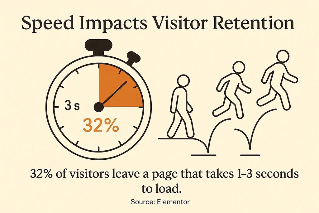
Speed kills, especially when it comes to websites. Here's a sobering fact: the probability of a visitor bouncing increases by 32% as page load time goes from one to three seconds (Source: Elementor). That's a significant chunk of potential customers walking away simply because your site takes too long to load.
Performance optimization isn't just about keeping visitors happy; it affects your search engine rankings too. Google considers page speed as a ranking factor, so faster sites tend to appear higher in search results. It's a win-win situation: better user experience and better visibility.
The good news is that many performance issues have straightforward solutions. Image optimization, efficient coding practices, and choosing the right hosting platform can dramatically improve loading times. When you're ready to tackle performance improvements, having a solid website launch checklist ensures you don't miss critical optimization steps.
Speed Optimization Strategies
Focus on the elements that have the biggest impact on loading times. Large images are often the biggest culprits, followed by unnecessary plugins and inefficient code. Tackle these areas first for maximum improvement with minimal effort.
Image Size
- Impact Level: High
- Quick Fix: Compress and resize images before uploading
Plugins
- Impact Level: Medium
- Quick Fix: Remove unused plugins and keep active ones updated
Hosting Quality
- Impact Level: High
- Quick Fix: Choose hosting optimized for your platform
Code Efficiency
- Impact Level: Medium
- Quick Fix: Minimize CSS and JavaScript files
Caching
- Impact Level: High
- Quick Fix: Implement browser and server-side caching
Content Strategy and Call-to-Action Optimization
Great design means nothing without great content. Your website copy needs to speak directly to your audience's needs and guide them toward taking action. This is where knowing how to write effective website copy that converts becomes crucial for business success.
Content organization plays a huge role in user experience. Information should flow logically, with the most important details prominently displayed. Use headings, subheadings, and bullet points to make content scannable. Most visitors won't read every word, so make it easy for them to find what they need quickly.
Call-to-action buttons deserve special attention because they're where conversions happen. Make them stand out visually, use action-oriented language, and place them strategically throughout your site. The best calls-to-action feel natural and helpful rather than pushy or salesy.
Strategic Content Placement
Position your most important content where visitors naturally look first. This typically includes the top of your homepage, above the fold sections, and prominent sidebar areas. Use analytics to understand how visitors move through your site, then optimize content placement based on actual user behavior.
- Place primary value propositions above the fold
- Use compelling headlines that communicate benefits clearly
- Include testimonials and social proof near conversion points
- Create logical content flow that builds trust and interest
Accessibility and Inclusive Design
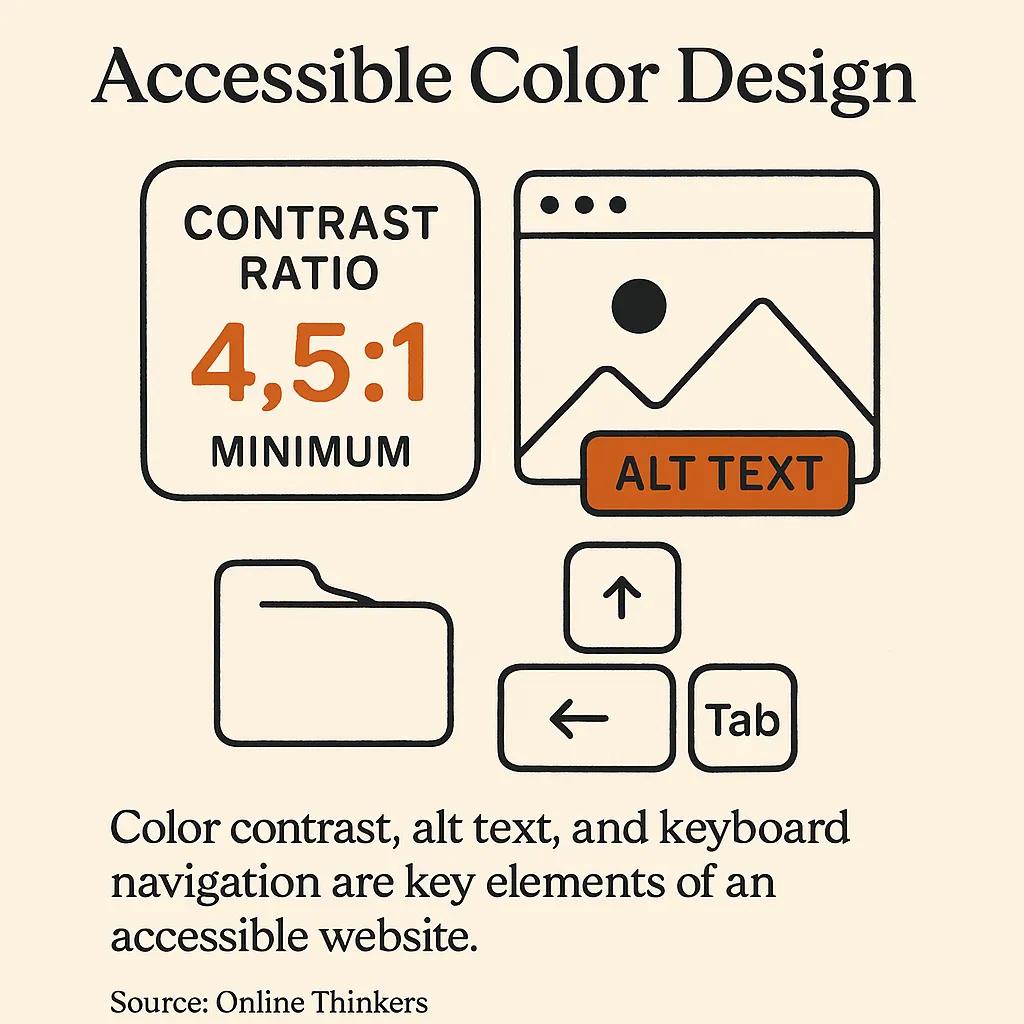
Accessible design isn't just the right thing to do; it's good business. When you design for accessibility, you're expanding your potential audience and improving usability for everyone. Design for WCAG compliance by ensuring sufficient color contrast, providing alt text for images, and enabling keyboard navigation (Source: Online Thinkers).
Many accessibility features actually improve the user experience for everyone. Captions on videos help people in noisy environments. Clear navigation benefits users who are distracted or multitasking. Alt text for images improves SEO while helping screen readers describe visual content.
Implementing accessibility features is easier when you plan for them from the start. If you're considering a website refresh, understanding the benefits of a website redesign can help you build accessibility into your planning process rather than trying to retrofit it later.
Practical Accessibility Steps
Start with the basics and build from there. Focus on high-impact changes that benefit the most users. Many accessibility improvements require minimal effort but provide significant value for users with disabilities and other limitations.
- Add descriptive alt text to all images and graphics
- Use sufficient color contrast (4.5:1 ratio minimum)
- Ensure all functionality works with keyboard navigation
- Include proper heading structure for screen readers
- Provide captions or transcripts for audio and video content

Putting It All Together: Your Next Steps
Web design best practices aren't just theoretical concepts; they're practical tools that directly impact your business success. Every element we've covered works together to create websites that attract visitors, keep them engaged, and convert them into customers. The key is implementing these practices systematically rather than trying to do everything at once.
Start with the areas that will have the biggest impact on your specific audience. If most of your traffic comes from mobile devices, prioritize mobile optimization. If visitors leave quickly, focus on loading speed and first-impression elements. Use your analytics data to guide your priorities and measure your improvements.
When you're ready to implement these practices but need expert guidance, that's where professional help makes sense. Knowing how to choose a web design agency can save you time and ensure these best practices are implemented correctly. Sometimes the best investment is working with people who live and breathe this stuff every day.
The web design world keeps evolving, but these fundamental practices remain constant because they're based on how people actually use websites. Focus on creating genuine value for your visitors, and the technical details will support that goal. Your website should work as hard as you do to grow your business.
Ready to Transform Your Website?
Web design doesn't have to be overwhelming when you focus on what actually matters. These practices form the foundation of websites that perform well and serve their users effectively. Whether you're building from scratch or improving an existing site, having a solid website redesign checklist helps ensure you don't miss any important elements.
Your website is often the first impression potential customers have of your business. Make it count by implementing these proven practices that actually work. Small improvements compound over time, creating websites that truly support your business goals and provide genuine value to your visitors.