Real Estate Website Redesign: When It's Actually Worth It

Most real estate website redesign articles open with the same pitch: your site looks dated, so you need a new one. I want to start with something more honest. Out of every property developer, agency, and architect studio site I have rebuilt or audited in the last few years, the ones that were genuinely worth redesigning had almost nothing to do with how they looked. They were losing inquiries in places the owners did not realise were leaking, and a visual refresh alone would not have fixed any of it.
I am Dimitri. I run DignuzDesign, a solo studio that builds custom websites for real estate developers, architects, and property companies, usually on Astro, Webflow, Svelte, and Cloudflare. I also run Faraday3D for architectural visualisation, and together those two produce AmplyViewer, our interactive property viewer. That combination matters for this article because a real estate website is not a generic small-business website. It is a product that has to convert a high-consideration purchase, using media that is heavier than most sites ever have to handle, for an audience that increasingly arrives on a phone. A redesign that ignores any one of those three facts is the redesign that fails.
The real reason most property sites need rebuilding
When a developer or agency approaches me about a redesign, the brief is usually framed aesthetically. "It looks old." "The homepage feels flat." "The photography does not do the properties justice." Those are real complaints, and sometimes they are enough to justify a rebuild on their own. But when I pull up the analytics, the same pattern turns up again and again. The homepage is not the problem. The listing pages are the problem. The mobile experience is the problem. The forms are the problem. And the page weight, which nobody on the marketing team has ever looked at, is quietly costing the site a third of its traffic before anyone sees a headline.
The useful way to think about a real estate website is as a single-purpose conversion product: it exists to move a property-interested visitor into a direct inquiry, a saved listing, a booked viewing, or a development registration. Every section of a redesign brief should be scored against that. If a decision helps conversion, it earns its budget. If it only helps internal stakeholders feel better about how the brand looks, be honest about what you are paying for.
The first five seconds decide the outcome
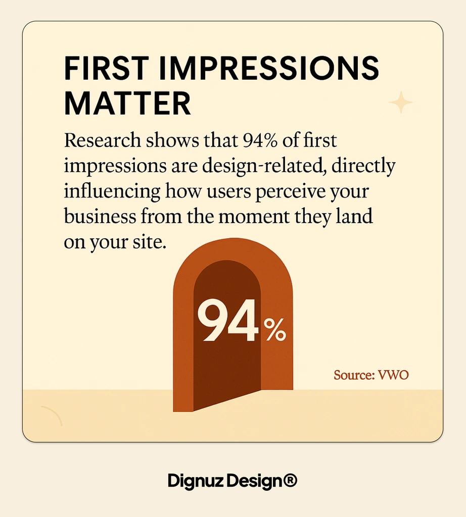
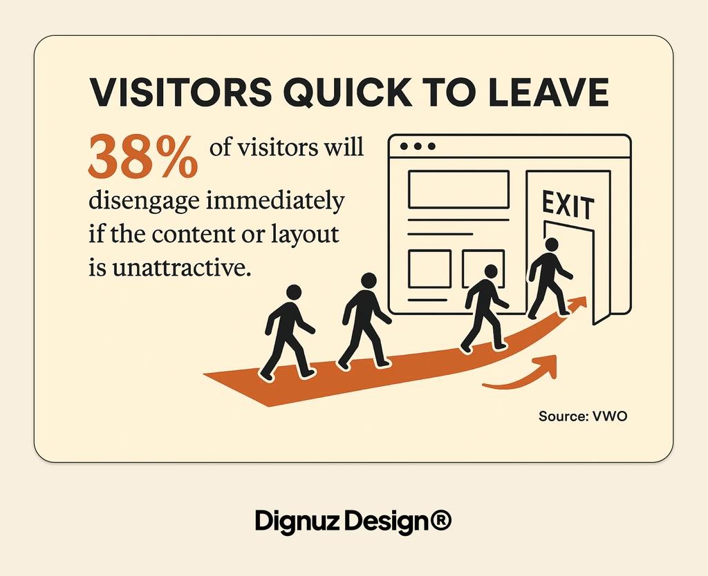
By the time most property seekers land on a developer or agency site, they have already compared half a dozen others. According to the NAR 2025 Profile of Home Buyers and Sellers, between 43 and 47 percent of buyers begin their home search online, and the website is the first impression that determines whether the buyer ever reaches a human on your team. The first five seconds are not about liking your brand. They are about answering three specific questions the visitor carries in from their last tab: is this the right kind of property, is this a serious operator, and can I see what I need to see without hunting.
That is a design brief, not a mood board. It means the hero has to establish the product category within one glance, the proposition needs to be readable without scrolling, and the path to browsing stock or registering interest has to be visible without hunting. Redesigns that I see fail at this point almost always do so because someone fought for a full-bleed video or an animated loading sequence. Both look impressive in the agency pitch and both cost you conversions on a 4G phone.
Speed is not a technical concern, it is the top of your funnel
If I had to pick one thing to argue for in every real estate redesign I touch, it would not be the look. It would be the speed budget. Property websites are image-heavy by necessity: renderings, photography, floorplans, drone stills, sometimes video. Without a deliberate performance strategy, the site loads slowly, the hero image arrives late, the fold sits empty while a carousel initialises, and you lose the visitor before they have read a word.
The data on this is not ambiguous. Google's mobile page speed benchmarks, built from a neural-network analysis of 900,000 mobile landing pages, show that as mobile load time moves from one second to three seconds, bounce probability rises by 32 percent. At five seconds, bounce probability is 90 percent higher than at one second. Property listing pages, which are usually the heaviest pages on a real estate site, are exactly where this curve bites hardest.
The counter-evidence that speed is a sales lever, not a vanity metric, is stronger still. In a controlled test published in the web.dev Vodafone case study, reducing Largest Contentful Paint by 31 percent produced an 8 percent increase in sales. That is an A/B test with revenue attached, not a blog-post correlation. When I rebuild a real estate site, the first real commitment I extract from the client is a Core Web Vitals target, and the stack follows from that. For heavy-image developer sites, this is usually why I default to a Jamstack approach, and it is the subject of a longer argument in a Jamstack stack piece. A deeper walk through the specific levers on real estate sites sits in speed optimisation on real estate sites.
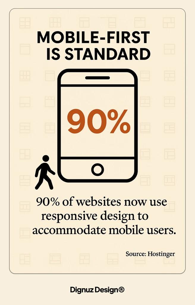
Mobile responsive was the 2015 standard, not the 2026 one
Every redesign deck I have read in the last ten years has "mobile responsive" as a bullet. That box was ticked a decade ago. The real question in 2026 is whether the site is genuinely mobile-native, which is a different bar. Property seekers do not browse listings on a phone in the way they browse an article. They swipe through photos, pan a floorplan, zoom into details, double-check a price, bookmark, and come back to the same property two days later on a laptop. The handover across devices is the test most property sites still fail.
Concretely, a mobile-native listing page keeps the hero photo and the price within the first viewport, makes the gallery swipeable rather than tap-forward, keeps the inquiry action in thumb range without covering content, and ensures that saved listings survive across sessions without forcing a login. Most generic CMS templates do none of this well, which is one of the main reasons why custom real estate websites outperform templates over any meaningful time horizon.
The listing page is the page that actually converts
Redesign budgets are usually allocated to the homepage, because the homepage is what the board sees in the pitch. But the page that converts is almost never the homepage. It is the individual listing, or the individual development page, or the unit-level page inside a multi-phase scheme. That is where a visitor makes the decision to call, email, register, or move on. If you are redesigning and the listing template gets 10 percent of the attention the homepage gets, the redesign is going to underperform.
The listing page is also where unglamorous decisions make or break conversion: how the price is displayed when it is on application, how floor plans load and zoom on mobile, how gallery navigation works when a user is halfway through scrolling and changes their mind, whether the inquiry form is two fields or seven. I have watched six-figure redesigns fail because the new listing page moved the inquiry button below a long description and lost half the inquiries. A good property listing design is a product specification, not a styling exercise. The page-level principles that apply across a property site are covered in a conversion guide for real estate pages.
Where 3D and interactive content actually earns its place
I will not pretend I am neutral on interactive property content, because I build it. But the industry data is independent. Zillow's 3D Home tour data found that listings with a 3D tour received 68 percent more views and were saved 36 percent more often than equivalent listings without. That is on a generic consumer portal. On a developer's own site, where the visitor is already self-selected as a serious prospect, the lift on engagement and time-on-page is larger still.
The rule I apply in redesigns is that interactive content has to earn its weight. A 360 spin of an empty plot helps no one. A master-plan viewer that lets a buyer click a specific unit in a new development, see its orientation, floorplate, price, and availability, then convert that into an inquiry, is the single most effective change I have made to conversion on developer sites. The longer argument for when this is worth building is in immersive 3D experiences in property sales, and the product we ship for it is AmplyViewer.
The redesign mistake to avoid here is bolting interactive content on as a widget. If the 3D experience lives in an iframe that floats over the page, loads its own stack, and breaks the site's speed budget, it will cost you more inquiries than it produces. The integration question belongs in the redesign brief, not in a post-launch phase two.
Where redesigns typically go wrong
After enough rebuilds, the failure patterns become predictable. I catalogue them because almost every brief contains at least one of them.
- Designing around the team's favourite properties rather than around the average search. The hero carousel full of trophy developments often has nothing to do with what buyers are actually searching for, and the rest of the stock feels secondary.
- Spending the performance budget on a homepage video. A 10MB video loop on the hero is the single most common reason a property site fails its Core Web Vitals after a redesign.
- Letting the filter sidebar grow to twelve fields because "buyers want to filter by everything". In practice, buyers filter by location, price, and bedrooms. The extra eight fields add cognitive load and rarely get used.
- Moving to a fashionable headless stack without the team to maintain it. If nobody on the client side can update a listing, the site becomes a ticket queue within a month.
- Treating SEO as a post-launch patch. If URL structure, meta templating, and schema are not wired in during the build, the redesign will quietly lose ranked pages, and the team will spend six months rebuilding authority.

When a real estate website redesign is genuinely worth it
A redesign is worth funding when at least two of the following are true, and usually more. The current site is not mobile-native and does not meet Core Web Vitals on key templates. Listing or development pages are structurally limited and cannot show the content that sells the property. The CMS is slow enough or rigid enough that new stock takes longer to list than it should. The brand has moved on and the site no longer represents the quality of the actual properties. The site is built on a platform that is about to be abandoned by its vendor or by the team that knows it. If none of those apply and the only issue is that the site feels dated, a content and photography refresh plus a targeted listing-template rebuild will usually deliver more inquiries per pound than a full redesign.
The decision framework I use with clients is simple. First, audit the current site against conversion-critical templates, not the homepage. Second, measure Core Web Vitals on mobile on a real 4G throttle. Third, run a content audit of the top 20 trafficked pages. If two of those three come back red, a redesign is justified. If only one is red, a surgical rebuild of that layer is usually the better investment, and I lay out the scope-setting approach in a redesign checklist.
What the brief should actually say
If I could rewrite the typical real estate redesign brief, it would look nothing like the usual document of moodboards and sitemaps. It would start with the inquiry: what is the specific action we are optimising for, on which template, for which buyer segment. It would commit to Core Web Vitals targets on mobile and a page-weight ceiling for listing pages. It would describe the content workflow the in-house team will use weekly, because that is what determines whether the site stays alive after launch. It would have a non-negotiable position on mobile-first listing layout. And it would explicitly answer the interactive content question up front, not treat it as a phase-two widget.
Redesigns that start from that brief tend to survive contact with reality. Redesigns that start from visuals tend to look great at launch, then drift into the same problems that made the previous site feel tired.
Frequently asked questions
How long does a real estate website redesign take?
For a developer or agency site of moderate scale, I plan for 10 to 14 weeks end to end: two to three weeks of discovery and audit, three to four weeks of design and template prototyping, four to six weeks of build including content migration, and one to two weeks of staging and QA. Sites with live MLS or API-driven listings take longer because the integration and data mapping become the critical path. The single biggest cause of overrun is content: photography, copy, and new imagery almost always slip, and the build cannot ship without them.
What is a realistic budget for a real estate website redesign?
It depends heavily on scope, but a credible range for a custom developer or agency site built by a small team or solo practitioner sits between 8,000 and 40,000 GBP. Template-based Webflow or WordPress rebuilds can come in lower, around 4,000 to 10,000 GBP, but usually at the cost of the listing and filter logic that matters most. Interactive features, 3D viewers, and live listing integrations add meaningful scope on top and should be budgeted separately rather than folded in as "nice to haves".
Will a redesign hurt my SEO rankings?
Only if redirects and URL structure are handled badly. The scenarios I see cause ranking drops are: URLs silently changing without 301 redirects, meta tags and structured data not migrated from the old templates, pagination or filter URLs becoming un-crawlable after the rebuild, and canonical tags pointing at staging domains post-launch. A proper redesign plan treats SEO as a first-class build concern, not a launch-week checklist, and the site usually recovers or improves within six to eight weeks.
Should I add a 3D property viewer before or after the redesign?
During, not after. Bolting an interactive viewer onto an already-launched site almost always breaks the speed budget and the mobile layout, because the viewer is heavy and the site was not built around it. If interactive content is part of the plan, the performance strategy, the listing template, and the asset pipeline need to be designed together. Adding it later is possible but usually costs more than building for it once.
Is WordPress still a sensible choice for a property website in 2026?
It can be, for agencies with a content team that lives in WordPress daily. For most developer sites I work on, a Jamstack approach using Astro plus a headless CMS, or a well-architected Webflow build, produces a faster site with fewer maintenance costs over three years. The right question is not which platform is trendy but which one your team can actually maintain without a retainer.
How do I know if my site needs a redesign or just targeted fixes?
Run three tests. Measure Core Web Vitals on mobile on your listing template, not your homepage. Time how long it takes your team to list a new property end to end. Look at the mobile versus desktop conversion gap in your analytics. If listing pages fail Core Web Vitals, or listing takes more than a couple of hours of work, or mobile converts at less than half the desktop rate, you have a structural problem that a full redesign is likely to fix. If all three are healthy, a surgical content and photography refresh will deliver more per pound than a rebuild.


