Property Listing Design Best Practices That Sell

I have been designing real estate websites and 3D property experiences for the better part of a decade through DignuzDesign and Faraday3D. What I see most often is the same pattern: a developer or agent invests in staging, shoots the photos, writes the copy, pushes the listing live, and then the listing page itself quietly undoes most of that work. A thumbnail cropped on the wrong axis. A hero image that loads half a second after the thumb starts moving. A floor plan buried under nine sections of boilerplate. None of these are the kind of mistakes that show up in a post-mortem. They just lower the ceiling on everything else.
Listing design is product design. The product is the property, the listing page is the shelf, and every decision from aspect ratio to form field compounds. Below is what I have learned matters, and what does not, despite what most "best practices" posts claim.
The buyer is on a phone, in a hurry, and scanning
The most recent NAR Profile of Home Buyers and Sellers reports that 70% of buyers used a mobile or tablet during their home search, and 52% found the home they eventually bought online. Read that again. Most of your listing's audience will never see the desktop version you are designing in the CMS preview. They will see it one-handed, on a phone, in the five minutes between a meeting and a school pickup.
That changes everything about how the page should be built. Hero images composed horizontally that read beautifully at 1400px wide often get their subject cropped out when the browser renders them at 390px. Long-form descriptions that flow as prose on desktop become wall-of-text blockers on mobile and are skipped entirely. The price, the specs, and the primary call-to-action need to be the first three things a thumb encounters, not buried under agent branding.
When I design listing templates for property developer clients, the first exercise is always the same: look at the page on an iPhone SE viewport, scroll twice, and ask whether the buyer now knows the price, the number of bedrooms, and how to request a viewing. If the answer is no, nothing else in the design matters. More on this problem in the broader real estate website user experience breakdown.
Photography has an honest ceiling, and most listings sit well below it
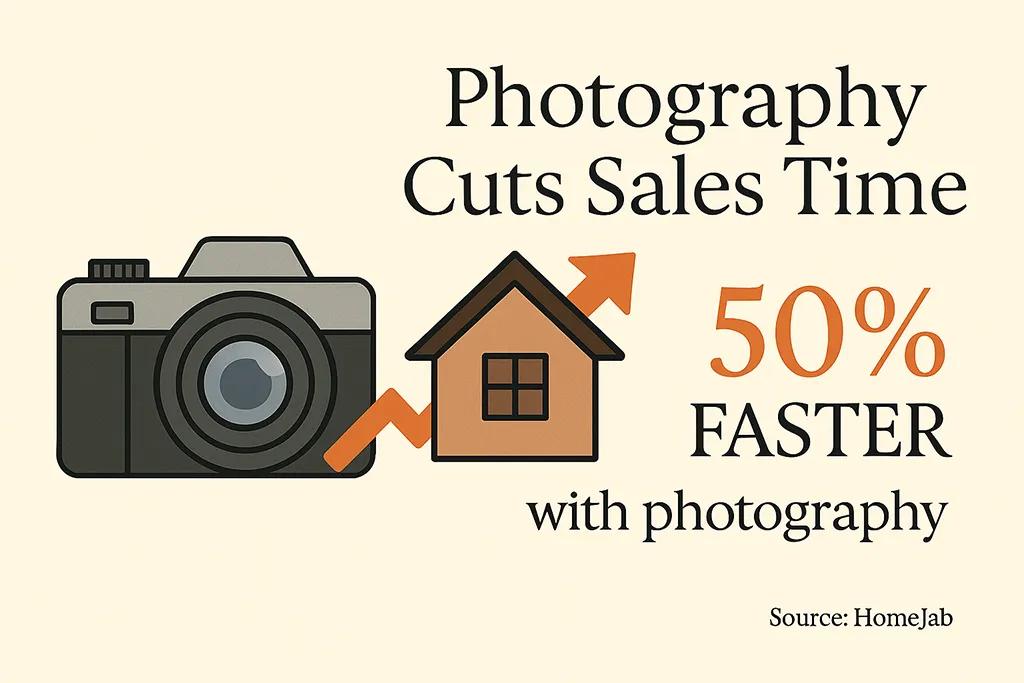
Zillow Research has consistently shown that listings with roughly 22 to 27 photos are far more likely to sell within two months than listings with fewer than nine, a 20% gap in sale probability. The tempting read is "post more photos." The useful read is "agents who take the time to post 25 photos are the same agents who think about the buyer's experience generally." Photo count is a proxy for care.
The actual lesson is harder: you need photos that survive the thumbnail grid. Most portal interfaces render property photos as tiny squares in a gallery or carousel. A beautifully composed wide-angle living room that worked on the photographer's monitor often reads as a grey-brown blob at 120px. Having shot and retouched hundreds of rooms for AmplyViewer integrations, the consistent fix is composing for two scales at once: the full-bleed hero and the square thumbnail. If a photo does not hold up as both, it does not belong in the first six slots.
Three specific issues I see on almost every site I audit:
- Over-bracketed HDR. Interiors shot with aggressive exposure merging look processed. Buyers instinctively distrust listings where every window glows and every shadow has been lifted. Underexposing the windows slightly and letting a corner remain dark reads as honest and the click-through rate reflects that.
- Wrong lens choice on small rooms. Ultra-wide lenses (anything below 16mm full-frame equivalent) distort space in ways buyers recognize. The bathroom looks enormous in the photo and tiny in person, which is a refund conversation waiting to happen at the viewing stage.
- No lifestyle frame. A kitchen without anything on the counter reads as empty, not clean. A single fruit bowl, a folded tea towel, a coffee machine turned on, small props anchor the room without drifting into staging for its own sake.
For a deeper treatment of this, see my notes on real estate photography tips and why consistent photography branding matters once you are shooting more than a handful of listings a month.

Virtual tours: where the research gets uncomfortable
This is the section most property marketing blogs get wrong, because they quote vendor-supplied statistics ("87% more views!") without ever reading the actual academic literature.
Here is what the literature says. A Harvard Business School study on 75,000 Los Angeles home sales found that once you control for listing quality (better photos, better copy), virtual tours had an "insignificant" effect on final sale price. Research from the University of Texas at Dallas, published in Information Systems Research, found that VR tours shortened days on market from 34 to 19 on average but did not affect sale price.
Put these two findings together and the honest picture emerges. Virtual tours and 3D walkthroughs are a filtering and timing tool, not a price-lift tool. They shorten the path from "interested" to "committed" by letting buyers self-select out before they ever request a viewing. That is valuable, but it is valuable for a specific reason, reducing wasted viewings and shortening time on market, and it needs to be priced against that, not against fantasy price premiums.
I run Faraday3D alongside DignuzDesign specifically because this space is interesting, and I have watched enough client projects to have a clear rule of thumb. A 3D tour pays for itself on properties above roughly £400,000 where one extra qualified viewing is worth the production cost; on off-plan or under-construction stock, where the 3D model is the only way to see the property at all; and on any property with spatial complexity, such as split levels, unusual layouts, or converted buildings where photos genuinely fail to convey flow. Below those thresholds, the math often does not work. A standard three-bedroom terrace with clear rooms and good photos probably does not need a Matterport scan.
This is where tools like AmplyViewer come in for off-plan and development projects. The property does not physically exist yet, and an interactive 3D model embedded into the listing is the honest way to let buyers explore it before they commit. For built properties, a well-shot photo gallery almost always wins on ROI. There is more on this trade-off in my piece on immersive 3D real estate experiences.
Copy that does the work the photos cannot
The article this rewrite replaces told you to "sell lifestyle, not just space" with the example "spacious kitchen perfect for hosting Sunday brunches with friends." That is the kind of advice that sounds reasonable and then produces the cloying, interchangeable copy you see on every second listing: "imagine yourself entertaining in this breathtaking entertainer's delight." Buyers have been trained to tune this out. Good listing copy does the opposite.
Replace adjectives with measurements or details only someone who has been in the room would know. Not "spacious living room" but "6m wide living space with a 3.2m ceiling and a south-facing bay window." Not "character property" but "original 1890s cornices, reclaimed pine floors, east-facing kitchen that gets morning light until about 10am." The second version survives comparison to the next ten listings the buyer will scroll through. The first does not.
Structure the description around the decision the buyer is making, not the features of the house. Most buyers at the listing stage are trying to answer three questions: does this fit my life, can I afford it, what is wrong with it. Good listing copy addresses all three. The third is the interesting one, because most agents will not touch it, so the ones who do ("previous owner converted the garage into a utility room, easy to restore if you want two off-street parking spaces") build instant trust. My notes on how to write effective website copy that converts go into this in more depth.
Performance is a listing quality signal
A listing page that takes four seconds to load loses somewhere between a third and half its traffic before the first photo renders. This is well-documented. What is less well-documented is that performance also affects how the listing ranks inside the portal's own algorithm. Major portals factor engagement signals (time on page, photo gallery completion rate) into visibility, and both those metrics collapse when the page is slow.
When I build property developer sites on Astro or Webflow, the non-negotiable checklist for the listing page runs as follows. Largest Contentful Paint must come in under 2.0 seconds on a mid-range Android device on a throttled 4G connection. The hero image is served as WebP or AVIF with a low-quality image placeholder while the full image loads. The photo gallery is lazy-loaded, with only the first three images preloaded. No render-blocking third-party scripts are allowed above the fold, so map widgets, chat widgets, and analytics all belong below. And the floor plan and key specs are rendered as HTML, not embedded inside an image asset that cannot be scaled or searched.
For a more complete treatment of the technical side, see real estate website speed optimization. The short version: every 500ms of load time below the 3-second threshold is worth more than almost any visual polish you can add above it.
The trust layer most designers forget
Floor plans deserve their own moment. Rightmove has reported internally that listings with a floor plan receive significantly more enquiries than those without, and in my experience the floor plan is the single highest-ROI element you can add to a page that does not have one. It answers the "how does this flow" question that no amount of photography can answer, and it does it instantly.
Beyond the floor plan, the trust elements that actually move the needle are fewer than most agencies think. The agent's face and a named, writeable mobile number on the page, not behind a "show contact" button. The energy performance rating (or the local equivalent) displayed as a graphic, not a PDF link. A neighborhood block with honest information: commute times from this specific property, nearest shops, the school catchment with a real opinion on it. A last-updated timestamp, because listings that say "just listed" while clearly being three months old destroy credibility faster than any design mistake.
What does not move the needle, despite every agency's instinct: logos of awards, unrelated testimonial sliders, and social media icons stacked in the hero. These are noise. The trust a buyer needs is specific to this property, not to your brand generally. For the broader conversion picture, I have written a separate real estate web page design conversion guide that sits alongside this one.

What to measure, and what to stop measuring
Most listing analytics dashboards measure the wrong things. Page views do not matter. Time on page is noisy and easily gamed by autoplay video. The two numbers that actually predict whether a listing is going to sell, in my experience building dashboards for property developer clients, are gallery completion rate and viewing-request conversion from gallery completers.
Gallery completion rate is the percentage of visitors who opened the listing and scrolled through to the last photo. If it is below 40%, something in the first six photos is telling people to leave. If it is above 70%, the listing is doing its visual job and any conversion problem you have is further down the funnel. Viewing-request conversion from gallery completers is the fraction of those people who then requested a viewing. This is where listing design actually gets measured. If gallery completion is strong but viewing requests are weak, the problem is the CTA, the form, or the price, not the photos.
Running an A/B test on the hero image, or on the order of the first six photos, usually pays off more than any other experiment you can run on a listing page. Change one variable, wait for a reasonable sample, measure gallery completion. The rest of it, heat maps, scroll depth, session recordings, is mostly comfort viewing.
Frequently Asked Questions
What size should property listing photos be for the web?
Deliver photos at 2000px on the long edge, compressed to WebP format at quality 80. That resolution holds up on retina displays, renders sharply as a thumbnail, and keeps file size under roughly 300KB per image. Anything larger is wasted bandwidth; anything smaller looks soft on high-density screens. A full-bleed hero image can be slightly larger, around 2400px, but never uncompressed.
Do I need a virtual tour for every listing?
No, and you probably should not have one for most. Virtual tours earn their cost on higher-value properties, off-plan developments, and properties with unusual layouts where photos cannot convey flow. Below around £400,000 for built stock, the money is usually better spent on a stronger photography package and a properly rendered floor plan. For off-plan or development projects where the building does not physically exist yet, interactive 3D is effectively the only honest option.
How many photos should a property listing have?
The Zillow research points to a sweet spot of 22 to 27 photos. Fewer than nine measurably hurts sale probability. More than 30 starts to suggest the listing is padding out a weak property and engagement drops. Order matters more than count: your best three photos should be the first three, and your hero image should be the single strongest shot you have, not a polite compromise.
What makes a property listing page load fast enough?
Largest Contentful Paint under 2.0 seconds on a mid-range Android on 4G. To hit that, the hero image needs to be WebP or AVIF, everything below the fold lazy-loads, and third-party widgets (maps, chat, analytics) defer until after the user interacts. Real Core Web Vitals field data in Search Console matters more than synthetic lab scores from PageSpeed Insights, because the lab is not standing in a kitchen with patchy signal.
Where should the price appear on a listing page?
Above the fold, in the same visual block as the headline, at a size larger than body text. Burying the price below the photo gallery, or requiring a click to reveal it, measurably reduces viewing requests. Buyers want to disqualify themselves quickly, and making that easy is an act of respect, not a lost sale.
What is the single highest-ROI fix for an existing listing page?
Add a floor plan as an HTML-rendered element on the page, not as a PDF download. If you already have one, swap your hero image for whichever photo earns the highest save rate in your analytics. If you have neither, fix the hero first. The floor plan fix comes second but is rarely far behind in impact.

Pulling it together
The listings that outperform are not the ones with the biggest budgets. They are the ones where someone has sat with a cold cup of coffee and a small laptop screen and asked, honestly, what a buyer scrolling on a phone at 10pm will see, tap, and skip. Most of the gains available in property listing design are already on the table. They just require refusing to accept the templated, checkbox version of what "good" looks like.
If you build this way, the compounding effect is visible within a cycle or two. Faster pages rank better inside portals. Better hero photos lift gallery completion, which lifts viewing requests, which lifts the only metric that matters. 3D tours, where they fit, cut wasted viewings and shorten time on market. None of this is magic. It is the product-design discipline applied to a property page instead of a SaaS landing page.


