Real Estate Website User Experience That Wins Buyers
Every other article on real estate website user experience reads as though it has been written by someone who has never watched a buyer use one. The advice is recycled from generic e-commerce playbooks, dressed in property language, and stitched together with surveys whose underlying questions nobody bothers to interrogate. The result is a stack of identical posts that talk about mobile responsiveness, page speed, virtual tours, and lead forms in exactly the order a content brief would dictate, with none of the texture that comes from having actually shipped a property website and watched the analytics come in.
I am Dimitri. I run DignuzDesign, a small studio building custom websites for real estate developers, agents, and architects, and Faraday3D, the visualization studio that produces the renders and walkthroughs those websites depend on. The combination is unusual and it shapes how I think about UX on a property site. I see what buyers do with the site, and I see what they do with the visuals the site is built around. The two are inseparable. This article is the version of the user-experience conversation I wish more agencies were having with their developers and designers, written from inside the work rather than from a content calendar.
The Buyer Journey That Real Estate UX Has To Serve
The starting point for any honest conversation about real estate website user experience is the actual behaviour of property buyers, not the imagined behaviour assumed by most templates. The National Association of Realtors profile of home buyers and sellers consistently finds that every home buyer in the survey used the internet during their search, that roughly seven in ten use mobile or tablet devices during that search, and that the content buyers value most on a property website is, in order, photos, detailed property information, and floor plans. None of that is the hero animation. None of it is the chatbot. None of it is the newsletter modal.
Buyers also spend months in the market. They visit the same listing page three, four, five times. They send the link to a partner, to a parent, to a friend who knows the area. Each return visit is a different micro-task. The first visit is a yes/no triage. The second is a "tell me about this room" zoom-in. The third is a floor plan check. The fourth is a "let me show this to my dad" walkthrough. A real estate website that designs only for the first session is designing for a fraction of the actual traffic, and missing the sessions where decisions are quietly being made.
UX, then, is not about converting a single visit. It is about being the asset that a buyer can return to, share, and trust over a months-long decision. Almost every recommendation that follows in this article ultimately serves that one principle.
Speed Is The Foundation, Not A Technical Add-On
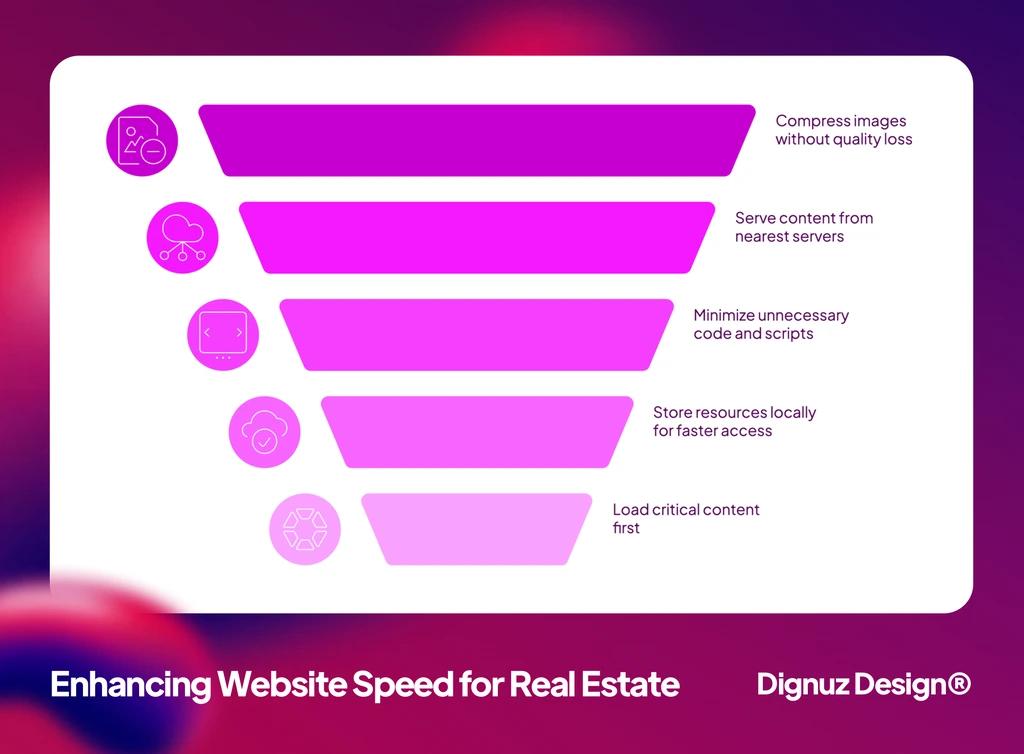
If I had to choose the single biggest UX lever on a real estate website, it would be page speed, and almost no agency I meet treats it as a UX decision. They treat it as something to be tested at the end of a build, hoped for, and patched if a Lighthouse score comes in low. That sequence is backwards. Speed is a UX outcome that gets locked in by the wireframes, by the image strategy, by the choice of platform, and by whether the third-party widgets are negotiated down before the build begins.
The business case for treating speed as a design decision is settled. Google's "Milliseconds Make Millions" study with Deloitte measured the effect of pulling mobile load times down by tenths of a second across thirty million sessions on luxury, retail, and lead generation sites. A 0.1-second improvement produced a 20.6% increase in progression rates to the contact page on luxury sites and a 21.6% improvement in form-submission progression on lead generation sites. Real estate sits in both of those categories. The math is not subtle.
What this means in practice is that you cannot afford a slow listing page. The listing page is the hardest-working URL on the site, and it is also the heaviest, because it holds a twenty-image gallery, a floor plan, a map, often a video, and increasingly an embedded 3D tour. Loaded naively, that page takes six or seven seconds to become usable on a mid-range Android phone on a city Wi-Fi connection. That is exactly the device most buyers use to triage shortlists between appointments. The buyer does not file a complaint. They simply close the tab and one of your competitors gets the enquiry.
The mechanics of fixing this overlap with general performance engineering, but a few specifics are worth naming. Hero images on listings need to be served as modern formats and sized for the device. Video and 3D embeds should defer their work until the user scrolls or taps. Third-party widgets, especially mortgage calculators and chat agents, should be loaded lazily or moved off the listing page entirely. A more comprehensive treatment lives in our guide to real estate website speed optimization, but the rule of thumb stays the same. Build for speed at the wireframe stage. Retrofitting it costs three times as much and rarely lands the same result.
Listing Pages Are Where Most Of The UX Decisions Happen
Real estate website UX is overwhelmingly about the listing page. The homepage matters for branded search and direct traffic, but most qualified visitors arrive on a listing page from a portal, a search engine, or a social referral. By the time they land, they have already passed a thumbnail, a price, and a location filter. The listing page's job is not to grab attention. It is to confirm that the reality matches the thumbnail.
That puts unusual weight on the first viewport. A buyer needs three things, in the same order, every time: a clean hero photo without aggressive overlays, the asking price and headline data in text large enough to read on a phone in bright light, and a single call to action that matches their actual intent, which is almost always "see more photos" or "request a viewing". Newsletter signups, contact forms, and download gates do not belong in the first viewport. They belong further down the page, after the buyer has had a chance to want something.
The sequencing of photos is its own UX problem and it is consistently underestimated. Twenty photos shot in consistent light, ordered as a walk-through of the property, outperform fifty photos dumped in capture order. The first photo is the one that best communicates what is distinctive about the property, not the one the agent personally likes. Floor plans, which buyers return to repeatedly, deserve a full-resolution view with a simple zoom control. Hiding the floor plan behind an email gate trades a low-quality lead for the loss of every serious buyer who needed it to confirm the layout. Our notes on property listing design best practices walk through these decisions at the layout level, and essential property marketing visuals covers the production side.
Search And Filters In Proportion To Inventory
Almost every generic UX article tells real estate sites to build out advanced filters, faceted search, and saved-search functionality as a matter of course. That advice is true for portals with hundreds of thousands of listings. It is mostly false for an individual agency or developer site with twenty or two hundred active listings, and the cost of getting that wrong is significant.
The reason is a basic principle from Nielsen Norman Group's research on faceted search. Filters succeed when they help users move from an overwhelming set to a manageable one. They fail when they fragment an already small set into empty filter combinations. On an agency site with thirty listings, an aggressive filter UI creates dozens of dead-end views where the buyer is told "no results match your search" and concludes the agency has nothing to offer. The cleaner experience is a simple, well-organised list of every active property, browsable in under a minute, supported by neighbourhood and price-range entry points rather than a wall of filter checkboxes.
Where filters and search do earn their keep, they need to map to how property buyers actually shortlist. That is almost always a combination of budget, neighbourhood, and bedroom count. Anything beyond those three is a nice-to-have and should not crowd the primary search interface. The filter UI also needs to make the active selection legible at a glance, because buyers refine their criteria in dozens of small steps over months of returning visits. The principles behind these layout choices live in our broader piece on website navigation design.
Maps Without The Gimmick
Map-based search is one of those features that every property website promises and most implement badly. The mistake is treating the map as a hero feature in its own right, taking up the full viewport with markers but offering little real navigational help. A useful map shows the property in context, with named neighbourhood boundaries, walkable distance to landmarks the buyer cares about, and an honest scale. A useless map shows a pin on a tile, with no context, behind a lazy-loaded iframe that delays the rest of the page.
The practical rule is to treat the map as a service to the buyer's mental model of the area. Most buyers know roughly where they want to live. They want the map to confirm that this property fits that mental map, not to teach them the city from scratch. That means showing the property pin alongside two or three named anchor points the buyer will recognise: the nearest station, the school catchment, the city centre. Anything more becomes noise.
3D Tours And Walkthroughs Where They Earn Their Keep
Virtual tours and 3D walkthroughs are the most over-promised and under-delivered feature in real estate UX. The promise is that adding a tour automatically increases engagement. The reality is more conditional. A poor-quality tour, slow to load and awkward to navigate, actively damages perceived listing quality. A well-produced tour, embedded sensibly into the page, materially changes the buyer's relationship with the property.
The data supports the upside when the production is right. Zillow reports that listings with their 3D Home tours are saved by buyers around 55% more often than listings without, and Matterport reports a similar pattern across the listings carrying their tours. Those numbers track with what I see in the projects we run through Faraday3D and embed through AmplyViewer. For an off-plan development, where the buyer is asked to commit to a property that does not yet physically exist, an honest 3D walkthrough is no longer a luxury. It is the difference between a sceptical enquiry and a confident reservation. Our longer write-up of immersive 3D real estate experiences and their sales impact walks through where the lift actually comes from.
The UX caveats matter. The tour needs to load on demand, not block the rest of the page. It needs a clear escape hatch back to photos and floor plan for buyers who prefer those formats. And it needs to be navigable on a phone without forcing the user into a fullscreen mode that breaks the back button. A tour that gets these details right is a conversion asset. A tour that does not is a polite distraction. The general principles behind these choices live in our piece on interactive ways to showcase properties.
Trust Signals Buyers Actually Read
The trust section of generic real estate UX advice is almost always a list of badges: SSL certificates, privacy policies, security icons, association logos. Those things are not unimportant, but they are not what serious buyers actually look for. A property purchase is the largest financial decision most people make, and the trust signals they weigh are correspondingly heavier than a green padlock.
The signals that actually carry weight are specific and verifiable. A real agent profile with a real photograph, a phone number that connects to that agent, recent listings with sold prices, and named projects with named locations. Generic "team" pages, stock-photography agents, and vague "we have over a decade of experience" copy do the opposite of what they intend. They tell the buyer that the agency is hiding behind language because there is nothing concrete to point at. Reviews are useful when they name properties and neighbourhoods the buyer recognises, and almost worthless when they are anonymous five-star blurbs.
The same principle applies to the website copy itself. The single biggest credibility lift you can give a real estate website is to write the listings in language that sounds like the agent actually spoke it. Templated descriptions that recycle the same five adjectives for every property are read as a signal that nobody is paying attention. A short, direct paragraph that says what is unusual about the home and what is not perfect about it converts more buyers than a polished but generic write-up. Our guide on real estate web page design for conversion covers how that copy interacts with the rest of the page.

💻 Let us help you create a stunning online showcase for your projects that works seamlessly across all devices. Ready to amplify your real estate business? 👉 Explore AmplyViewer now
Mobile UX Is Not The Same As Responsive Design
"Mobile friendly" has become so abused as a phrase that it now means almost nothing. Every modern website is technically mobile friendly in the sense that it does not break on a phone. That does not mean it is usable on a phone, and on a real estate site the difference is brutal.
The buyer on a phone is in motion. They are between appointments, on a train, in a queue, sitting in the back of a friend's car. They have one thumb available. The screen is small, the light is variable, and the network is intermittent. A site designed primarily for a designer's twenty-seven inch monitor and then "made responsive" almost always fails this user. Buttons end up an inch from the edge of the viewport. Image galleries hijack the scroll. Filter modals trap the user inside an interface they cannot back out of. Lead forms demand a postcode in a field the keyboard covers.
The fix is to design the listing page mobile-first and to test it on a real device, in real light, with real network conditions. That sounds obvious and it is obvious, and it is also extremely rare. Most agency websites are signed off on a desktop and never seriously stress-tested on the device that handles seventy percent of the traffic. The single most useful UX exercise an agency can do is to spend twenty minutes browsing its own site on a five-year-old Android phone, in cellular conditions, while standing up. Almost everything that needs to be fixed becomes obvious within ten minutes.
Lead Capture Without The Friction Tax
Form design is where the largest gap between generic UX advice and actual property practice opens up. The conventional advice says to collect as much information as possible at the point of contact: name, email, phone, budget, timeline, financing status, preferred neighbourhoods. The actual best practice is the opposite. A property purchase is not an impulse transaction. The form's job is to start a conversation, not to qualify a stranger.
The pattern that works on the sites I build is a graduated capture model that respects where the buyer is in their journey:
- On neighbourhood guides and market reports: offer a quiet quarterly newsletter sign-up with no urgency language and no popup. The buyer is at the research stage and what they value most is being treated as a thinking adult.
- On individual listings: use an inline three-field viewing request directly on the page. Name, phone, preferred viewing window. Everything else gets surfaced on the call back, which is where it always belonged.
- On the contact page: separate the enquiry types clearly. A seller asking for a valuation, a buyer asking about a specific property, and a developer asking about a marketing partnership all need different follow-up paths and should not be funneled through one generic form.
One discipline that pays off across all of these patterns is keeping the form physically near the content that prompted the enquiry. A buyer who has just looked at a floor plan should see the viewing request form within a scroll of that floor plan. Sending them to a separate contact page introduces a step where almost half the intent evaporates. The deeper structural reasons for this sit alongside our guidance on writing website copy that converts.
What To Measure Once The Site Is Live
The standard analytics dashboard for a real estate site reports bounce rate, average session duration, and pages per visit, and most agencies look at those numbers, find them roughly average, and conclude the site is doing fine. Those metrics are nearly useless on a property website. Bounce rate is inflated by mobile triage sessions where the buyer found exactly what they wanted in fifteen seconds. Session duration is inflated by tabs left open in the background. Pages per visit is gameable by anyone who adds a few CTA chains.
The numbers that matter for a property site are property-specific. How many listing pages are viewed per session. How many viewing requests come per hundred listing-page views. What percentage of mobile visits result in an enquiry compared to desktop. Which listings produce a disproportionate number of enquiries and what their photos, floor plans, and copy have in common. Which neighbourhoods receive the most repeat traffic but produce few enquiries, indicating an inventory gap to fill. None of these come out of the default Google Analytics report. They have to be configured deliberately, which is exactly the discipline most agencies skip.
For my own incoming reading on marketing, design, and industry trends I rely on AmplyDigest to summarise the newsletters and longer-form sources I follow into one morning email. The relevance to real estate UX is real. The faster you can keep up with what other industries are learning about web performance, search interfaces, and form design, the sooner those patterns make it into the property site you are running.
Frequently Asked Questions
How important is page speed for a real estate website?
It is the foundation, not a finishing touch. Google's mobile-speed research with Deloitte found that pulling load times down by tenths of a second produced double-digit improvements in progression to enquiry on luxury and lead generation sites, both of which describe real estate. On listing pages, which are heavy with photos, floor plans, maps, and tours, speed is also the difference between a buyer who triages a shortlist on their phone and one who closes the tab. Treat it as a wireframe decision, not a post-launch fix.
Do small agencies actually need an IDX search?
For most boutique agencies and developers selling their own inventory, a full IDX search is an expensive distraction. Buyers searching the complete MLS are already on the portal that owns the MLS, and a smaller site rarely matches the freshness or speed of that portal. A clean, browsable list of the listings you actually represent, presented well, converts better than a slower IDX widget pulling in everyone else's properties. Save the IDX investment for the moment the agency's traffic genuinely justifies it.
Are virtual tours and 3D walkthroughs worth the investment?
They are worth it when production quality is high and integration is sensible, and they are damaging when those conditions are not met. For off-plan developments and properties that are difficult to photograph well, a high-quality 3D walkthrough often becomes the most honest way to present the property. Public data from Zillow and Matterport shows substantial lifts in saves and inquiries for listings with strong 3D tours, and our own project data supports the same pattern. The caveat is that the tour must load on demand, work cleanly on a phone, and never block the photos and floor plan for the buyers who prefer those formats.
What is the right amount of information to ask for in a viewing request form?
Three fields is the rule that holds up. Name, phone number, and preferred viewing window cover everything the agent needs to begin a useful conversation. Everything else, including budget, timeline, and financing position, should be collected on the call back. Form research consistently shows that the number of fields is one of the strongest predictors of abandonment, and viewing requests are not the right place to qualify a buyer in writing.
How often should a real estate website be redesigned?
Less often than most agencies are told. A well-built property website should be evolving continuously through small improvements rather than periodically gutted in a full redesign. The signals that genuinely call for a redesign are structural: the site cannot be made fast on its current platform, the CMS no longer supports the content patterns the agency needs, or mobile behaviour cannot be properly served without a rebuild. Cosmetic dissatisfaction with the homepage is almost never a sufficient reason to start over.
Should I publish full pricing on every listing?
Yes, except in the few markets where local custom genuinely demands "price on application". Hiding the price increases the friction of the buyer's first decision without producing better leads. Buyers who cannot see the price either move on or send an under-qualified enquiry that wastes the agent's time. A clearly displayed price, with any conditions stated alongside it, performs better than a "contact for price" gate in almost every market I work in.
Pulling It Together
The closing thought I want to leave on real estate website user experience is the one that is easiest to lose in a long list of recommendations. Every piece of UX advice in this article ultimately serves a single goal, which is to be a website a buyer can return to for months without resentment. The buyer who returns is the buyer who eventually picks up the phone. The buyer who is forced to fight the interface, or wait for it to load, or hand over an email to see a floor plan, does not return.
Generic UX checklists rarely produce that quality, because they treat property websites as if they were e-commerce stores selling sneakers. They are not. A property purchase is slow, considered, emotional, and high-stakes, and the website's job is to be a calm, fast, honest collaborator across that entire journey. Get that right and the rest of the metrics take care of themselves.