Property Marketing Visuals That Actually Sell Listings

Almost every guide on property marketing visuals treats the question the same way: a checklist of asset types you should have. Exterior photos, interior photos, drone, video, virtual tour, floor plan, neighbourhood shots. Tick them off, publish, hope the leads come.
That framing skips the actual job. The job is not to produce a checklist of assets. The job is to give a specific buyer enough visual information to picture themselves living in a specific home, so the next thing they do is book a viewing instead of scrolling past. The visuals that achieve that for a one-bed flat in a city centre are not the same visuals that close a buyer on a six-bedroom new-build with land.
I run DignuzDesign, a studio that builds property and architect websites, and Faraday3D, an architectural visualisation studio producing renders and virtual tours for developers. I see both ends of the same pipeline - the visual content going in and the buyer behaviour coming out the other side on live listing pages. This piece is what I would tell a developer, agency principal, or solo agent who asked me what to actually commission, in what order, and why.
What buyers are really trying to do when they look at your photos
Before you decide what to shoot, it helps to be honest about what is happening on the other side of the screen. A buyer scrolling a listing portal is not assessing your photography. They are doing a fast, mostly unconscious risk check: is this property worth the hour out of my Saturday to drive across town and view?
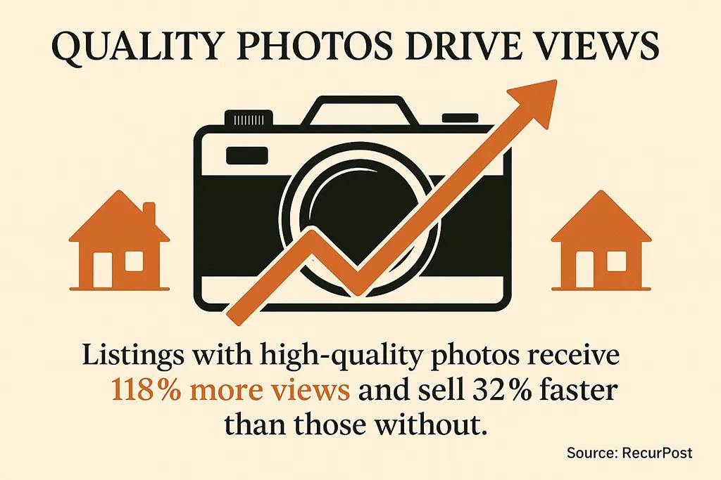
The National Association of Realtors' annual Profile of Home Buyers and Sellers consistently finds that photos are the single most valuable feature buyers want from an online listing, ranking above written property descriptions and floor plans. That is not a vote in favour of pretty pictures. It is a vote in favour of information density. Every image is a chance to answer a question the buyer would otherwise have to discover at viewing - or, more often, decide to skip the viewing over.
The decisive questions buyers ask themselves on a listing are concrete: How does the light fall in the living room? Is the kitchen as small as the floor plan suggests? Is the garden private or overlooked? Does the building look maintained? Strong visuals answer those before the buyer has to ask. Weak visuals raise more questions than they settle, and the brain's default move when a question is unresolved is to scroll past.
The shot sequence that mimics a real walk-through
The single highest-leverage change most agents and developers can make is not buying a better camera. It is ordering the shots so they tell a coherent story. A listing should not feel like a photo dump. It should feel like a walk-through written in images.
A sequence I keep coming back to, for residential listings of any value bracket:
One strong exterior - usually the front elevation, taken at a height that does not distort the building, ideally with one corner showing so the building reads as three-dimensional rather than as a flat facade.
The entrance approach - the path or door as a buyer would actually see it walking up. This is where lifestyle starts.
The most spacious living area, shot from the corner with the longest sight line, so the room reads as generously as it actually is.
Kitchen, from the angle that shows both work surfaces and the relationship between cooking, dining, and where the family ends up.
The principal bedroom and one supporting bedroom - never every bedroom, because identical bedroom shots train the eye to scroll faster.
The bathroom that is in best condition - just one, unless others are exceptional.
Outside space - garden, balcony, terrace - in the season it photographs best.
A neighbourhood or context shot that places the home in its setting.
That is eight to twelve frames, in order. Zillow's research on time-on-market found that homes with fewer than nine photos were measurably less likely to sell within sixty days than those with twenty-two to twenty-seven photos, but the curve flattens fast after that. Their analysis is worth reading - what it actually shows is that the floor matters more than the ceiling. Twenty-six photos of identical bedrooms do not outperform twelve photos that tell a story. The reason most listings benefit from more images is that most listings start under-shot, not because adding endless frames helps.
Photography decisions that move the needle
Below that sequencing decision, the actual craft questions are narrower than the standard checklist makes them sound. There are three that I find make almost all of the difference: time of day, lens choice, and processing.
Time of day. For exteriors, shoot when the sun is on the front of the building, not behind it. For interiors, shoot when the rooms get the most natural light - which in many homes is mid-morning for east-facing rooms and mid-afternoon for west-facing. Twilight shots for the hero exterior on higher-value listings are worth the extra trip back, because they read as cinematic and almost always become the lead image. For more on these technical fundamentals, the camera settings guide goes deeper into apertures, ISO and exposure bracketing.
Lens choice. The shoulder-to-shoulder argument in property photography is about how wide to go. Going too wide stretches a room and signals "estate agent photography" to anyone who has seen a bad listing - which is everyone. A 16-24mm range on a full-frame camera, or roughly 10-16mm on a crop sensor, covers almost any residential interior without making the geometry look like a fish-eye toy. The exception is genuinely tight spaces - galley kitchens, small bathrooms - where a wider lens is the only way to convey scale honestly.
Processing. Exposure-blended images, where multiple exposures are combined to keep both the room and the view through the windows visible, are now the default for any property over a certain price bracket. HDR done badly looks worse than a plain single exposure. HDR done well, with restraint, looks like the room your eye saw rather than what the camera captured. The visible giveaway is the window - if the view through the glass is blown out white, the image was not blended. For aerial work, the same logic applies: well-shot drone photography placed correctly in the sequence sells the plot and the context, badly shot drone footage advertises that you own a drone.

Where video earns its place
Video is the part of the checklist most often produced without thinking through what it is for. A vertical phone walkthrough on Instagram and a five-minute cinematic film on a developer's website are not the same medium, and neither is "real estate video" in any useful sense.
Three formats actually pull weight in my experience:
- The short vertical walkthrough, thirty to sixty seconds. Filmed on a phone with a gimbal, no narration, a soundtrack at low volume, fast cuts through the property in the same sequence as the still photos. Lives on Reels, TikTok, and Stories. Its job is reach - getting the listing in front of buyers who were not actively searching. It does not need to be polished. It needs to be in the right order and to move.
- The horizontal property film, one and a half to three minutes. Used on the listing page and in email. Usually justified for properties over a certain value where a buyer is making a long-haul travel decision before a viewing. Quality matters here because the people watching are warm leads, not cold scrollers.
- The neighbourhood or context piece. Often the most underrated format, because it sells what the property cannot show - the school, the high street, the commute, the noise level. For new-builds and relocations, this is frequently the video that closes a long-distance buyer.
The 3D animated tour, which many "essential visuals" guides put in a category of its own, sits awkwardly between video and interactive content. It is a recorded fly-through of a 3D model. It looks impressive on a sales suite screen. On a website, my honest view is that it usually underperforms either a real video or a real interactive viewer, because it is non-interactive but also clearly not real - which is the worst of both worlds.
3D visualisation and the difference between immersive and decorative
I have spent the last several years building 3D content for property developers, and the lesson I have learned the hard way is that there are two completely different reasons to use 3D, and conflating them produces expensive content that does not sell.
The first reason is to show what does not yet exist. Off-plan developments, refurbishments, plots being sold for development - none of these have photographable interiors. Rendered computer-generated images and walkthroughs are the only honest way to present them. The quality bar here matters because the renders are the product. If the kitchen looks rendered, the kitchen the buyer is imagining looks rendered.
The second reason is to give a buyer agency over how they explore a property that already exists. This is where interactive 3D viewers earn their place. Matterport's own commissioned academic study across four US markets found properties listed with a 3D digital twin sold meaningfully faster than matched properties without one, and a useful counter-reading of that data is that the lift comes not from the 3D itself but from the kind of buyer who self-selects into spending three minutes inside a virtual home before they ever call. Those buyers convert better because they have already qualified themselves.
The technology has moved past Matterport-only options in the last few years. We built AmplyViewer partly out of frustration that most third-party 3D tour platforms force you to embed someone else's branded iframe, hand off the visitor to a different URL, and add several megabytes of payload to your listing page. The viewer we ship is a 3D explorer that lives inside the developer's own site, runs on mobile without an app, and inherits the site's design language. Whatever vendor you choose, those three questions - does it live on your domain, does it work on a five-year-old Android, does it load in under three seconds - matter more than the feature list.
For higher-value listings specifically, the broader question of luxury visual marketing strategy changes again, because the buyer pool is smaller, the average value is higher, and the cost calculus for premium content tilts decisively toward investing more per asset.

Assembling visuals into something coherent
One pattern I see constantly: developers and agencies commission strong individual assets - a great photo shoot, a decent video, a competent 3D model - and then publish them in isolation. Photos go to the portal. Video goes to YouTube. The 3D tour gets its own button labelled "Virtual Tour". The visitor experiences three disconnected things instead of one property.
A coherent visual portfolio is not a quantity problem. It is a sequencing and consistency problem. The same property, photographed by two photographers on two different days, will look like two different properties on a feed if the colour grading drifts. The same room shown in a still photo and a 3D walkthrough should not have different curtains because the model was built three months earlier. Consistent photography branding across an estate agency's whole inventory - same processing style, same crop ratios, same exposure approach - is a quiet trust signal that buyers respond to without being able to name what they are responding to.
For developments specifically, the brutal test is to scroll the website on a phone, in landscape and portrait, and ask whether someone who has never heard of the project understands within fifteen seconds what is for sale, where it is, what it costs, and what it feels like inside. If the answer is no, the issue is rarely the individual visuals. The issue is the order they are arranged in and the speed at which they load.
The technical layer almost nobody talks about
Visual quality is wasted if the visuals are slow. A 6MB hero image that takes four seconds to render on a 4G connection is, for half the buyers on the page, a blank box for those four seconds - and a meaningful proportion of them are gone before it appears.
The technical decisions that make property visuals work in the wild are unglamorous: serving WebP or AVIF instead of JPEG for the same visual quality at a third of the file size, generating responsive image variants so a phone never downloads the desktop-sized hero, lazy-loading images below the fold, putting the 3D viewer behind a poster frame so it does not block the rest of the page. These are the kind of things a thoughtful property listing design sweats over, and they are the difference between a listing page that loads in two seconds and one that loads in eight.
One reason I push developers toward modern build tools - Astro for static-first listing sites, careful use of Svelte islands for the interactive bits - is that the default behaviour of older WordPress-style stacks ships far more JavaScript than a property page actually needs. The visual content is the product. Everything else on the page is overhead.

Measuring what is worth measuring
Most of the metrics commonly cited in marketing dashboards are weakly correlated with what actually matters, which is qualified viewings booked. Instagram engagement on a property reel is interesting but rarely diagnostic - a reel can perform well in metrics and generate no enquiries, because the audience for casual property-content consumption is much wider than the audience of active buyers.
The numbers I would actually watch on a property marketing programme are narrower than most analytics suggest. Time spent on a specific listing page tells you whether the buyer engaged with the visuals or bounced. Scroll depth tells you whether the visual sequence held interest past the third image. The ratio of listing-page visits to enquiry-form submissions tells you whether the visuals are doing their job at the bottom of the funnel. Email open rates on a "new listing" newsletter, segmented by whether the email contained a video thumbnail, will tell you within two campaigns whether video belongs in your email at all.
Everything else is either upstream of those numbers or a vanity proxy for them.
The honest hierarchy if you have a fixed budget
If a developer or agent asked me to rank where to spend the next thousand euros of marketing budget, my answer would not be "balanced across photography, video, and 3D". It would be a sequence.
Get the still photography to a professional standard first, because it is the asset that goes everywhere and the floor below which nothing else compensates. Add a short vertical walkthrough next, because it is cheap relative to its reach. Add 3D or interactive content third, but only if your typical listing is either off-plan or significant enough that long-distance buyers are part of the pipeline. Add a polished horizontal property film last, and only for the assets where the price bracket justifies it.
That order assumes a generalist agent or smaller developer. Architecture practices and prime developers usually have the opposite problem - over-investment in renders and films, under-investment in fast websites that deliver them. The fix is rarely more content. The fix is making the content you already paid for actually arrive in the buyer's browser before they look away.

Frequently asked questions
How many photos should I have for a property listing?
Twenty to thirty well-sequenced images is the practical sweet spot for most residential listings. Below about ten, you are below the threshold where buyers feel they have enough information; above about thirty, you are mostly duplicating angles and training the buyer to scroll faster. The Zillow research mentioned earlier found that the strongest gains come from moving listings out of the under-photographed range, not from adding endless extras.
Are professional photos worth it compared to smartphone photography?
For any listing where the value justifies an hour of professional photography, yes - largely because of three things a phone cannot do as well: a wide-angle lens that captures rooms honestly, exposure blending so window views remain visible, and a tripod-stabilised setup that lets you shoot at low ISO for clean detail. Smartphone photography is a reasonable fallback for very low-value listings or supplementary social content, but it is rarely the right choice for the primary listing imagery.
When does a 3D virtual tour actually pay for itself?
Three scenarios reliably justify the cost: off-plan or pre-construction sales where there is no real property to photograph, listings that attract long-distance buyers who cannot easily visit in person, and higher-value properties where the cost of a tour is a small fraction of the commission at stake. For everyday mid-market listings being sold to local buyers who will visit anyway, a strong still gallery and short walkthrough video usually outperforms a 3D tour at lower cost.
What is the difference between a 3D rendering and a 3D virtual tour?
A rendering is a fixed image or animation created from a 3D model - the camera path is set, the viewer watches passively. A virtual tour is interactive: the viewer chooses where to look and where to move. Renderings are the right tool for properties that do not yet exist. Tours are the right tool for properties that exist but are far from the buyer.
How can I tell if my listing visuals are actually working?
Look at time on page and enquiry rate per listing-page visit, not at social media likes. If buyers are spending more than a minute on a listing page and scrolling to the bottom, the visuals are working. If average time on page is under thirty seconds and the bounce rate is high, the issue is almost always either the visuals themselves or the speed at which they load - in roughly equal measure.
Should every property have the same visual content treatment?
No. A one-bedroom city flat does not justify the same investment as a six-bedroom country house, and trying to apply identical visual treatments across an entire portfolio either over-invests in low-value listings or under-invests in high-value ones. Tier your visual production: a baseline standard everything must meet, and incremental investment - video, 3D, drone, twilight exteriors - applied only where the value warrants it.
Closing thought
The reason most property marketing visual guides feel interchangeable is that they treat visuals as a checklist of deliverables rather than a sequence of decisions about a specific buyer looking at a specific property. The asset list is the easy part. The harder, more valuable work is matching the asset to the moment in the funnel, the moment in the buyer's research, and the price bracket of what is actually being sold. Get that right and the rest of the technical questions - which lens, which video length, which 3D platform - become much smaller decisions than the industry usually makes them out to be.


