Real Estate Photography Settings That Sell Properties
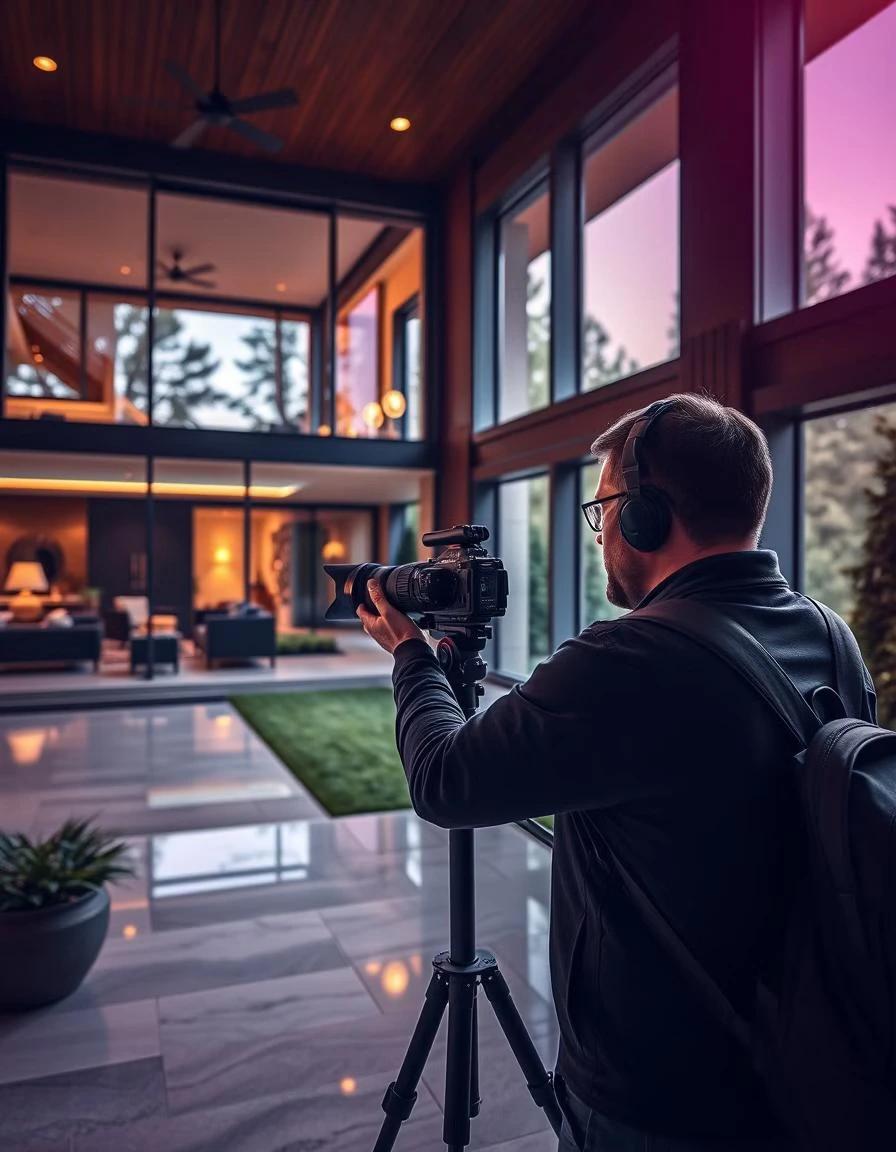
Most articles about real estate photography settings are written from inside the viewfinder. This one is written from the other end of the pipeline, where the photo ends up: the property listing page, the search-results grid, the hero image on a developer's website, the thumbnail that pulls a buyer into a portal listing on their phone at 11 pm. I run DignuzDesign, a web studio building custom property websites, alongside Faraday3D for the 3D side of the work. Photos cross my desk every week from agents, developers, and sometimes the listing photographer directly. I see what survives the trip from sensor to screen and what falls apart. That is a useful angle for thinking about settings, because a camera setting is not really a creative choice. It is a decision about how the image will perform once it is no longer in the camera.
Settings exist to serve the place the photo will live
Before any specific number, the most useful frame is this: pick settings that produce a clean, recoverable file that survives compression, retina displays, mobile viewports, and a website's image pipeline. A real estate photo lives in a brutal environment. It gets resized aggressively, served through a CDN, displayed on screens that range from a 27-inch 5K monitor to a 6-inch OLED phone, and looked at for an average of two to four seconds before a buyer moves on. The 2024 NAR Profile of Home Buyers and Sellers reports that the overwhelming majority of buyers start their search online, and that photos remain the single most cited useful feature of a real estate listing. The photo is doing more work than any other element on the page, including the copy.
Once you accept that, the settings stop being a creative meditation and become a checklist for predictability. You want the same exposure characteristics from room to room, the same color temperature across the listing, the same depth of field, and enough latitude in the file that you can tame a hot window or a dim corner without the image breaking up.
Aperture is the setting that matters most for interiors
For interior real estate photography, set the aperture to f/8 and leave it there unless you have a specific reason. Not f/4 because the light is low. Not f/11 because someone on YouTube said it. F/8 because it gives you front-to-back sharpness in a bedroom, a kitchen, or a living room without driving you into diffraction softness at the corners, and it keeps you in the resolution sweet spot of most modern lenses.
The mistake I see most often is photographers using a wide aperture, like f/4 or f/5.6, to compensate for indoor light. The result is a bedroom with a sharp pillow and a soft headboard, which looks careless on a property listing where the buyer is trying to read the entire room. Stop down, raise the ISO if you must, or put the camera on a tripod and slow the shutter. Sharpness across the frame is non-negotiable for property work. If you are shooting a courtyard or a long living-dining room and you want even more depth, f/9 to f/11 is fine. Past f/11, diffraction starts to chew into perceived sharpness, especially on cameras with smaller pixels. You will see this most when the image is downsampled aggressively on a listing page.
ISO is the setting that lies to you
The cheapest piece of advice in real estate photography is "keep your ISO low." It is also the most often broken. The correct version is: keep ISO low when you can, and accept ISO 400 or 800 indoors when you cannot put the camera on a tripod. A modern full-frame body at ISO 800 produces a file that cleans up easily in post and downsamples beautifully for the web. A noisy file at ISO 1600 is still better than a motion-blurred one at ISO 200.
What you must avoid is auto-ISO indoors. Auto-ISO meters scene by scene, which means the kitchen at ISO 320 and the bathroom three meters away at ISO 1600. When the photos hit the listing, the buyer scrolls and the color, brightness, and noise floor shifts every time, and the listing reads as visually unsettled even though the buyer cannot name why. Lock the ISO. The same goes for the whole sequence: shoot the entire property with a fixed ISO, fixed aperture, fixed white balance, and variable shutter speed only. The image consistency that produces is the difference between an amateur set and a professional one.
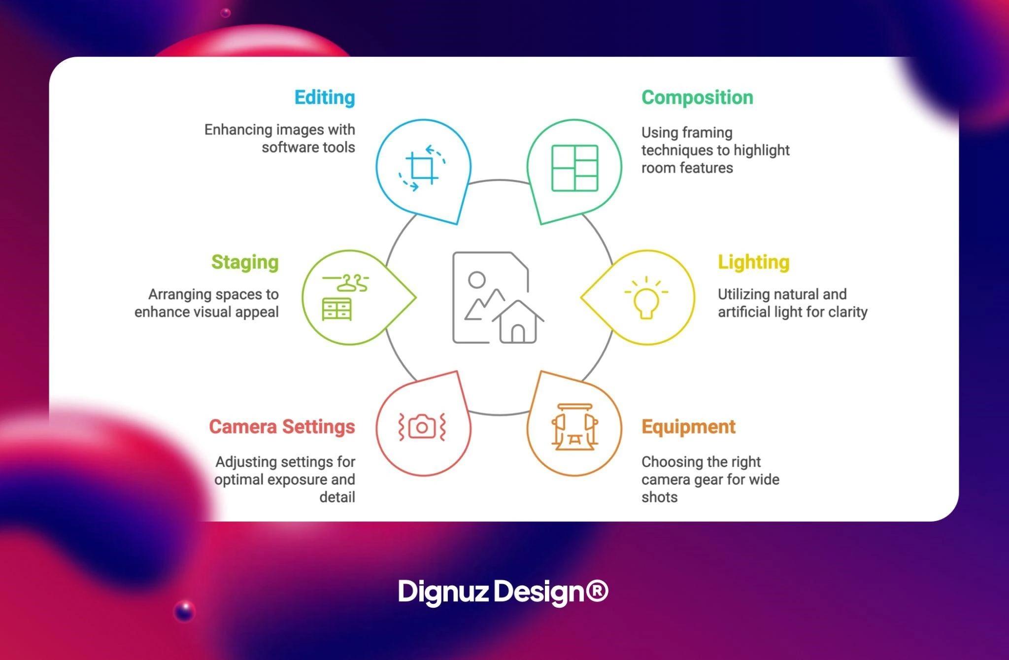
White balance is where listings quietly fall apart
Auto white balance is fine for vacation photos. It is not fine for property listings. Inside a single house, AWB will read a living-room window scene as one color, a kitchen with under-cabinet LEDs as another, and a bathroom with a single overhead fixture as a third. Now you have a listing where the floors are warm in three photos and cool in two, and the wood looks like two different woods. Buyers do not say "your white balance is inconsistent." They feel that something is off and they move on.
Set a custom Kelvin value (5000K to 5500K is a good starting point for most mixed indoor light, 5500K to 6000K for window-dominant rooms), or shoot a gray card in one frame and synchronize the white balance across the set in post. The consistency matters more than the exact value. This is the same principle that runs underneath everything I write about brand consistency on property listing pages: predictability is what a buyer reads as professionalism. The point I made in the piece on consistent real estate photography branding is that color temperature is part of the brand even when the agent has never thought of it that way.
Shutter speed and bracketing solve the window problem
The single hardest thing in interior real estate photography is the window. The interior wants two to four seconds of exposure on a tripod. The window wants one one-hundredth of a second. The dynamic range between the two is roughly 12 to 14 stops, which is well past what a single exposure can hold without clipping the sky or crushing the shadows.
The professional answer is exposure bracketing. Mount the camera on a tripod, set f/8 and ISO 100, and shoot a five-frame bracket at minus two, minus one, zero, plus one, plus two stops. Blend the frames in Lightroom or with the manual approach in Photoshop. The result is a room where the floor is bright, the ceiling is not blown out, and the window shows the garden instead of a flat white rectangle. Listings that hold the window view consistently outperform listings that do not. The 2014 industry analysis from VHT Studios, which has been widely cited since, found professionally photographed homes selling roughly a third faster on average than amateur-photographed comparables, and the window-handling discipline is one of the visible markers buyers respond to even unconsciously.
If you cannot bracket, expose for the interior and recover the window in post by selectively masking and reducing highlights. This works on most modern raw files for one or two stops of recovery. Beyond that you are inventing pixels. Buyers can tell, particularly on a large screen.
Exterior settings change with the time of day
Daylight exteriors are the easiest situation in the property workflow. Set the aperture to f/8 or f/9, ISO 100, and let the shutter speed float. Aim for a moment when the sun is on the front facade, not behind it. A back-lit front elevation produces an image with a black front door and a hot sky, and the recovery work in post is more than you want to do for a routine listing.
Twilight and golden-hour exteriors are different and worth the effort for properties priced above the local median. You want f/8, ISO 100 to 200, and exposures running from a half-second to four seconds depending on ambient light. You need a tripod. You need a remote release or a two-second timer. And you need the interior lights on, every fixture, including the bathroom, because the warm interior glow against the cool blue twilight sky is the visual cue buyers associate with luxury. The piece on luxury real estate visual marketing strategies covers why this matters more in the high-end segment than it does at the entry level.
For aerial work, the principles are the same, but the platform changes. The NAR commentary on digital photography practices notes that a majority of buyers now expect aerial frames on most residential listings, and the gap between drone footage and ground-level photography is one of the most visible differences between a polished listing and a mediocre one. I have written about this in more depth in the post on real estate drone photography.
Composition is a setting in everything but name
Camera height for interiors should be roughly chest height, or about 1.4 meters, not eye level and not waist level. Eye level makes a room feel smaller because the camera is looking down on the floor. Waist level makes the ceiling look heavy. Chest height is the standard. Shoot with the camera level. Use a hot-shoe bubble or the in-camera virtual horizon. Crooked vertical lines on a kitchen cabinet read as amateur work faster than any other single signal in a property photo.
Frame the room from a corner whenever the geometry allows. This shows two walls, gives the buyer a sense of scale, and produces an image with a foreground anchor (a piece of furniture) and a background view (the next room or a window). Single-wall compositions are flat. Five-point-perspective compositions where you can see four walls and the ceiling are gimmicky and dated.
The equipment minimum that genuinely changes the output is shorter than most gear lists suggest, because each item solves a specific failure mode I see in real listings:
- A tripod is the single piece of equipment that produces the biggest jump in image quality. It enables bracketing, makes ISO 100 viable indoors, and keeps the sequence across a property consistent. Anything that does not move while the shutter is open is doing work.
- A wide-angle lens between 16mm and 24mm on full frame, or 10mm to 18mm on crop sensor, is the working range. Anything wider produces distortion that flattens rooms. Anything narrower forces you to back into walls in apartments and small bedrooms.
- A remote release or in-camera intervalometer is non-negotiable for bracketing. Touching the shutter button on a tripod-mounted camera at slow shutter speeds introduces vibration that is invisible at small preview size and obvious at full resolution.
- A flash that can be bounced off a ceiling matters more for evening interiors than any other lighting accessory. Off-camera flash, even a single unit, produces interior shadows that read as natural, which is the look buyers respond to.
Post-processing is where amateurs cross the line
The line in post-processing is straightforward: the photo should represent the room. The same room, in the same light, on the same day. Adjustments should pull the file closer to what the eye saw, not push it past that into a marketing fantasy.
In practice that means lifting shadows two to three stops, pulling highlights down by one to two stops, correcting white balance to neutral, straightening verticals, removing dust or sensor specks, and applying a modest contrast and clarity adjustment. It does not mean replacing skies, painting in lawn grass, removing structural features the buyer will see in person, or saturating colors past the point where the wood floor looks orange.
Listings get pulled from portals for misrepresentation. More commonly, listings simply lose buyers at the showing, where the buyer realizes the bathroom is smaller and dimmer than the wide-angle, brightened photo suggested. The cost of an over-edited photo is not a complaint email. It is the buyer who walked away before making an offer.
What the photo has to survive on the actual listing page
This is the angle I have that most photographers do not. After the photo leaves the editing suite, it gets uploaded to a portal or a custom property website. It is resized, compressed, possibly converted to AVIF or WebP, and served at multiple breakpoints. The original 24-megapixel file is rendered at 480 pixels wide on a phone, 1200 pixels in a search result, and maybe 2400 pixels on a hero. Each of those sizes punishes different choices.
Heavy contrast crushes in compression. Oversaturated reds posterize. Tight detail in window curtains becomes a noise pattern after AVIF encoding. Photographers who shoot for the print magazine of a decade ago produce files that look great on their calibrated 4K monitor and disintegrate in a portal's image pipeline. Photographers who shoot for the web produce files that look almost flat at full size but render cleanly at every breakpoint.
The implication for settings is that "expose to the right" is right twice over: it gives you cleaner shadows and it gives the image pipeline more latitude. Save the final web export at 80 to 85 percent JPEG quality, sized to the largest viewport you actually serve, and let the website handle the rest. On my own product, AmplyViewer, the interactive 3D property viewer we embed into developer and agent websites, the photos that perform best alongside the 3D model are the ones edited with restraint. Loud edits and a clean 3D render side by side look unbalanced, and buyers register the dissonance before they consciously notice the cause. The article on essential property marketing visuals has more on how photos, renders, and listing copy work together as one visual system rather than as separate assets.

Visit our solution: AmplyViewer
Mistakes I see weekly from photographers who should know better
The interior with the ceiling fan in motion. Use a tripod and a long exposure and the blades streak across the photo like a smear. Turn the fan off.
The bedroom shot from the foot of the bed with the camera level. The bed becomes the entire frame. Step into the corner.
The kitchen shot with mixed daylight from a window and tungsten from a pendant, white-balanced for daylight. The pendant area turns orange. Either turn the pendant off or correct selectively in post.
The listing where the hero is the best room and rooms three, four, and five are progressively worse. Order matters because the buyer's attention is highest in the first five images. Spend the most editing time on the first five. The order of photos on a listing page is part of the photography brief, not an afterthought.
The unedited HDR look where shadows are lifted to gray, highlights are pulled to gray, and the entire image has a flat, halo-ridged feel. Pull back the local contrast. A good HDR blend does not announce itself.
Frequently asked questions
What is the best aperture for interior real estate photography?
F/8 is the working default for interior real estate work. It gives you the front-to-back sharpness a property listing requires and keeps the lens in its optical sweet spot. Move to f/9 or f/10 when the room is unusually deep, and stay below f/11 to avoid diffraction softness once the image is downsampled for web display.
Should I use auto-ISO or manual ISO for property photography?
Use manual ISO and keep it locked across the entire property. Auto-ISO produces inconsistent exposure and noise levels from room to room, which makes a listing read as visually unsettled. Set ISO based on the darkest room you expect to shoot, lock it there, and adjust shutter speed instead.
Do I need to shoot bracketed exposures for real estate photos?
You should bracket whenever a room has a window with a bright view, which is most rooms in most properties. A five-frame bracket at minus two to plus two stops, blended in post, gives you a balanced exposure that holds detail in the interior and the window simultaneously. Without bracketing, you choose between a blown-out window or a dark interior, and neither converts well on a listing page.
What white balance should I use for real estate photography?
Set a custom Kelvin value between 5000 and 5500 for mixed indoor light, or shoot a gray card in one frame and synchronize the white balance across the whole set in post. Auto white balance is the single most common cause of inconsistent color across a property listing, and the inconsistency is what buyers register even when they cannot name the problem.
How do I shoot twilight exterior photos for a property listing?
Use a tripod, set f/8 and ISO 100 to 200, and shoot exposures between half a second and four seconds during the fifteen-minute window after sunset when the sky has color and the interior lights are visible. Turn on every interior light in the house, including bathrooms and closets. The contrast between warm interior glow and cool twilight sky is the visual cue buyers associate with high-end property work.
Does professional photography actually affect sale price?
The published research is consistent. Industry data analyzed across tens of thousands of listings shows professionally photographed homes spending roughly 30 percent less time on market and closing at higher prices than amateur-photographed comparables. The effect is largest at and above the local median price point, where buyers expect production value as table stakes.
The bottom line
Settings are not a creative decision. They are a discipline that produces files that work everywhere a property listing has to live: a phone-sized search grid, a developer's website hero, a portal listing on a 27-inch monitor, an emailed brochure, a presentation deck. Pick a working aperture, lock ISO, set a custom white balance, bracket the windows, shoot on a tripod, and edit with restraint. The photographs that sell properties are not the ones with the most striking edit. They are the ones that look like the house, hold up at every size, and let the buyer believe what the photo is showing.
For agents and developers thinking about how the photography integrates with the listing page itself, the conversation has to extend past the camera. The post on property listing design best practices covers the layout side of that question, and the piece on interactive ways to showcase properties gets into where photography ends and 3D begins. If you are running AmplyDigest or any other content workflow that aggregates property data daily, the visual consistency point applies there too: the photos have to behave the same way every morning, in every email, on every screen.


