Consistent Real Estate Photography Branding Guide
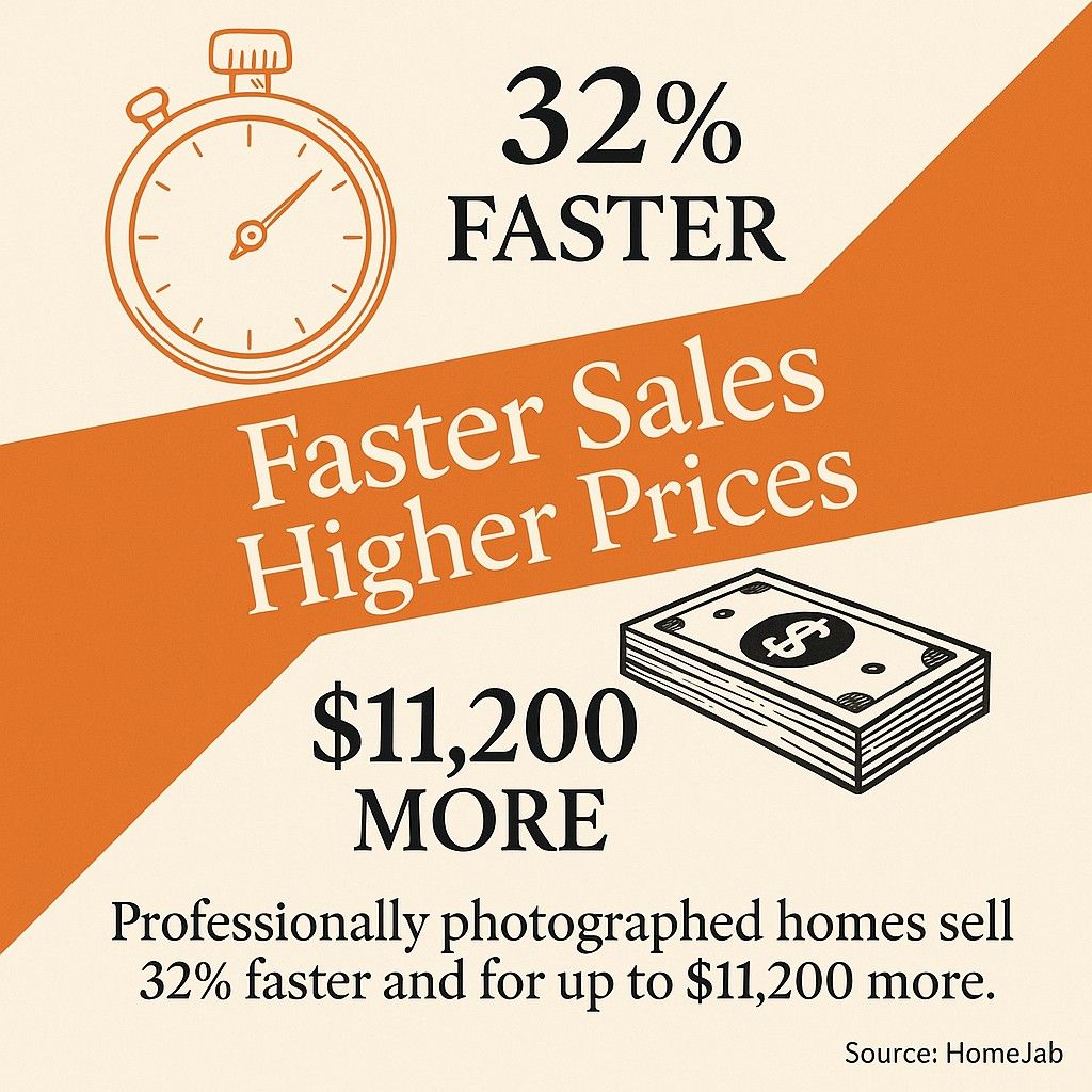
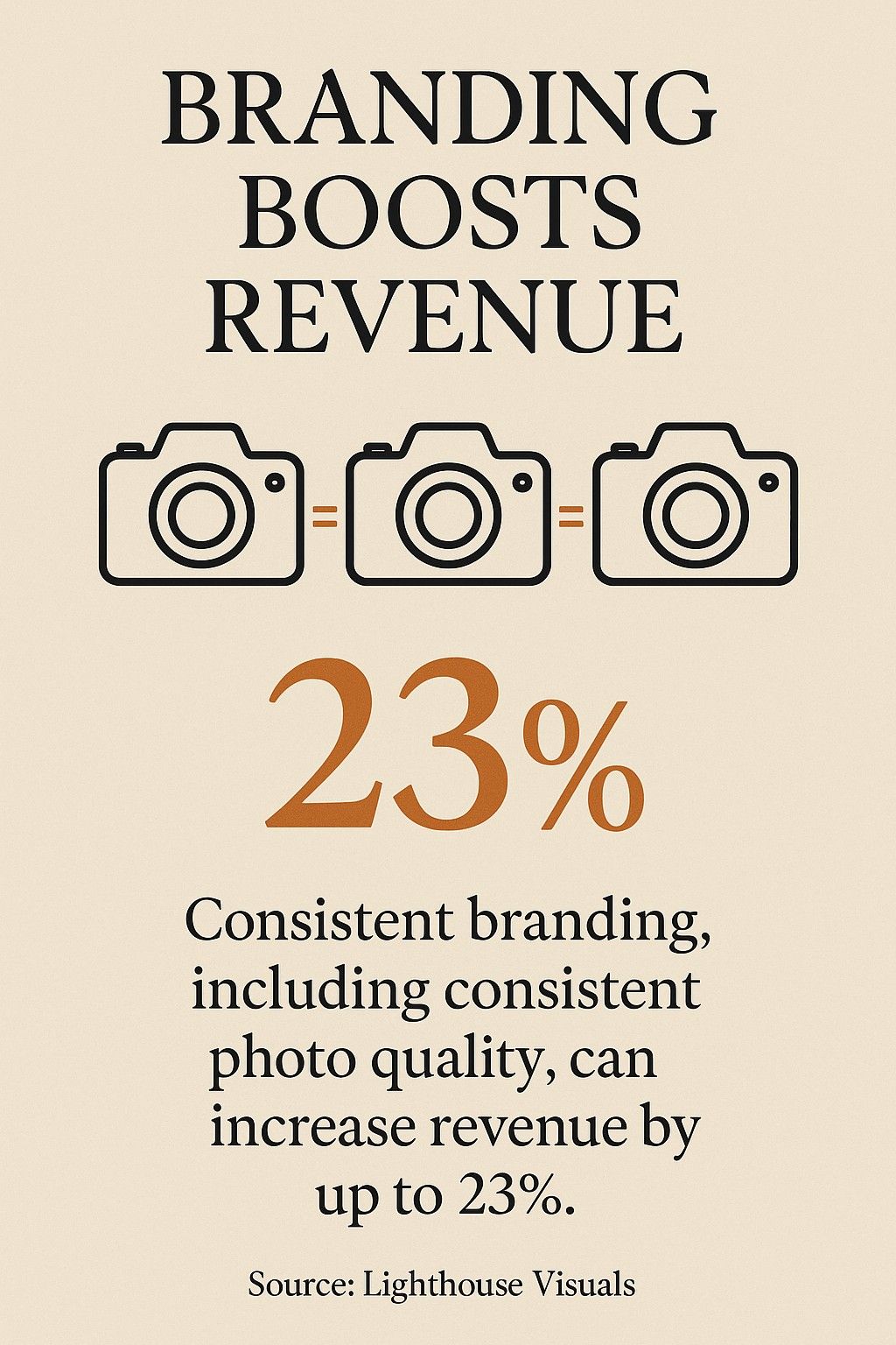
Most guides on this topic open with the same set of numbers. Professional photos sell homes 32% faster. Listings with DSLR shots pull 118% more views. Consistent branding lifts revenue by 23%. The numbers are real enough, but they tell you nothing about why consistency actually matters or where it tends to fall apart in practice.
I work with real estate developers, agencies, and individual agents every week. I build their websites through DignuzDesign, produce 3D visualisation for their projects through Faraday3D, and embed interactive property viewers into their listings through AmplyViewer. That position shows me something most photography guides miss: photography branding does not live in the photograph. It lives in the presentation surface where the buyer finally sees it. A perfectly consistent shoot can still look inconsistent the moment a bad gallery template crops it, a social feed compresses it, or a portal re-encodes it next to three competitor listings. This article is about how to keep your photography branding intact from the shutter to the buyer's screen.
What Consistency Is Actually Doing in the Buyer's Head
Buyers do not sit down to admire a photographer's signature. They scroll. The buying journey in 2026 starts in a listing feed or a portal search result, where ten or twenty properties flash past in a few seconds. What consistency gives you in that environment is not prestige, it is recognition. A buyer who has already seen three of your listings skims the fourth differently. They know what your opening shot looks like. They know how you treat late-afternoon light. They know your rooms feel a specific way before they read the caption.
This is why the Redfin study of more than 22 million listings matters more than it is usually cited. Redfin's analysts found that homes photographed with a professional DSLR sold for between $3,400 and $11,200 more relative to their list price and pulled 61% more page views across every price tier they measured. Most guides quote that figure and stop. What matters is why a buyer clicks a DSLR-shot listing 61% more often. It is not the optical sharpness. It is that in a grid of thumbnails, the professional shot reads as confident before the buyer can articulate a reason. Consistency compounds the same effect: the fourth confident shot from a name they recognise gets clicked harder than a random confident shot from a stranger.
The National Association of Realtors has tracked buyer-side behaviour for more than four decades. The NAR 2025 Profile of Home Buyers and Sellers continues to show that the vast majority of buyers begin their search online, long before the first agent conversation. Photography branding is the part of your brand that runs that pre-conversation silently.

Three Places Consistency Breaks
In my experience rebuilding real estate marketing systems, photography branding fails in one of three places. It fails at the camera, where agencies use different shooters with different instincts and no documented style. It fails at the edit, where even a single photographer drifts from job to job if the preset is not locked. And it fails at the presentation layer, where a website or portal imposes its own crop, its own sizing, its own colour behaviour on top of images that were perfect when they left the photographer.
The first two failures are well covered by the rest of the industry. The third one is what makes agency after agency look inconsistent even when their photographer is flawless, and it is the part I deal with almost every day.
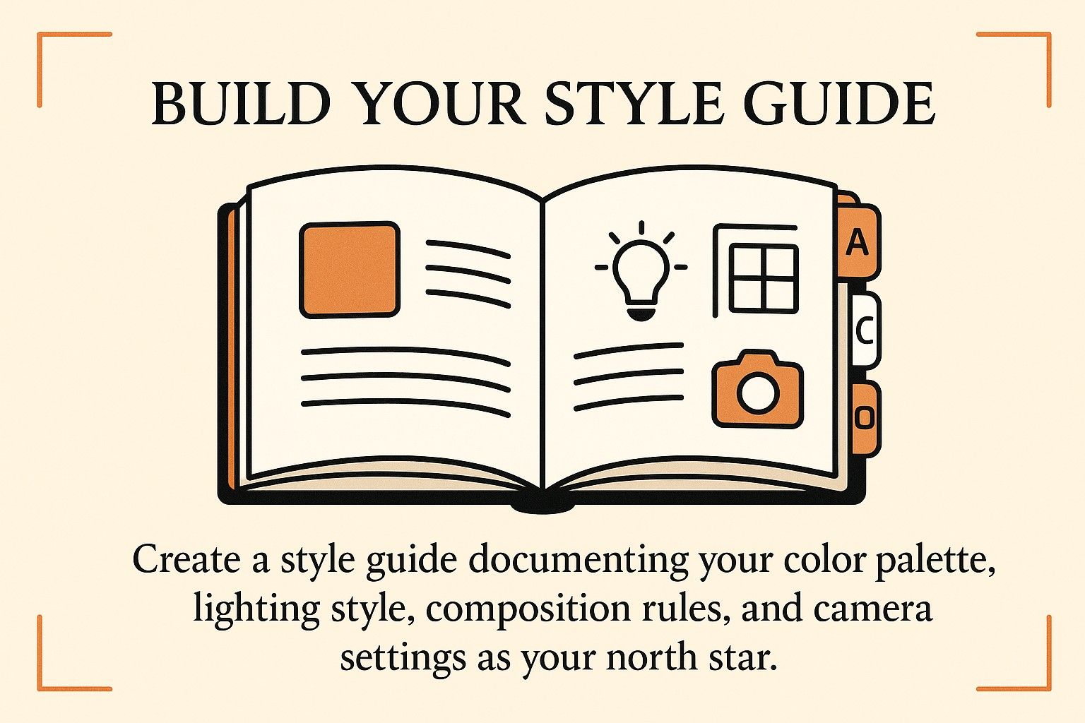
Step One: Define the Photo Language Before You Write a Style Guide
Style guides that list focal lengths, ISO ranges, and editing presets are not worth much until you have decided what the photos are trying to say. I have watched agencies spend months documenting technical settings and then look at their own portfolio and realise every listing still looks generic. The technical settings are downstream. The upstream decision is about language.
Pick three questions and answer them honestly. Is your brand quiet and editorial, or saturated and high-energy? Do your properties read as homes that are lived in, or as stages a buyer projects themselves onto? Do your photographs feel like still lifes, or like moments someone walked into? The answer dictates every choice that follows. A quiet, editorial approach leans into negative space, muted grades, and off-axis framing. A saturated, high-energy approach leans on rich contrast, active wide shots, and occupancy cues like set tables and made beds. There is no right answer. There is only the answer that matches the properties you sell and the buyers you serve.
For developers in particular, the photo language has to agree with the brand identity already in place on the website and in the sales gallery. I wrote about that coordination in more detail in the property developer brand identity piece, but the short version is this: if your building's identity is warm and handcrafted, a clinical real estate shoot breaks the whole experience.

What Actually Belongs in the Style Guide
Once the language is clear, the documentation gets short. I find the following set holds up across most projects without becoming bureaucratic: a colour grade reference with two or three LUTs or presets, a small pack of exemplar frames for hero, living space, kitchen, bedroom, and exterior, a horizon rule for verticals, a time-of-day window for exterior captures, and a lens range. That is usually enough. A well-written four-page guide can replace a thirty-page one, because photographers do not read long documents before a shoot. They glance at reference frames.
A style guide that tries to be a training manual fails. A style guide that fits on a tablet during setup is used.
On-Shoot Realities That Ruin Most Templates
The shoots I sit in on almost never run according to the plan. Developers release access windows of two hours because the units are still being staged. HOA rules ban drones for two weeks because of a neighbour complaint. Three different rooms get three different mixed-lighting situations because the building orientation fights the planned shoot time. The photographers who deliver consistent branding in those conditions are not the ones with the longest checklists. They are the ones who know which variables to sacrifice.
A practical example. On a recent townhouse development with identical floor plans across units, the brief called for a specific late-afternoon grade. The client kept rescheduling. We ended up shooting three units at morning light and three at afternoon light, which by default would have broken the gallery's visual continuity. We agreed in advance that the post-processing grade would anchor to the afternoon look, with the morning units brought back to match in colour correction rather than trying to light-balance on location. When the agency dropped those photos into their website gallery, no buyer could tell the units had been shot at different times. The consistency came from the editorial decision, not from the impossible logistical one.
That is what a working style guide does. It tells the team which constraint to keep when the others break.
Post-Processing Is Where the Brand Actually Speaks
The photograph you deliver is not the photograph the camera captured. In real estate photography, the edit is the brand's main voice. Most agencies never think about this clearly, which is why a shoot that looked consistent on the photographer's monitor goes out inconsistent to buyers.
I keep a simple rule with every team I work with. The editing preset is the style guide. If a new photographer joins the roster, they inherit the preset before they inherit the brief. The preset handles white balance target, shadow lift, sky treatment, and interior-versus-exterior bias in a way that removes most of the subjective drift between operators. What the preset does not do is substitute for judgement. A preset will happily clip the highlights on a window view of the ocean if nobody is watching, and it will happily crush the shadows in a dark wood-panelled library. Presets enforce consistency. Human review enforces correctness.
One warning about HDR. HDR photography is often sold as the answer to real estate interiors because it solves the window-exposure problem cleanly. It does, but it also has a visual fingerprint that not every brand should carry. The over-blended HDR look reads as a 2016 real estate listing to an experienced buyer, and in a luxury context it can actively hurt the positioning. If you are working the luxury segment, my write-up on luxury real estate marketing goes into why polish-without-tells tends to outperform polish-with-obvious-technique at that price point.
The Presentation Layer Where Most Agencies Lose the Plot
This is the part I care about most, because it is the part I see destroyed every week, and it is the part almost nobody writes about. Your photography is consumed through a website, a portal, and a social feed. Each of those surfaces has its own crop rules, its own compression, its own ordering, its own background colour, and its own behaviour around aspect ratios. If you do not design your photography to survive those surfaces, the consistency you paid for at the shoot evaporates the moment it ships.
A few specific examples from projects I have worked on. A developer's hero shot was composed at 3:2 for print and then cropped to 16:9 by a portal, which sliced the foreground element the whole composition relied on. An agent's editorial grade was flattened by a social platform's compression pipeline, which pushed the skin-tone and wood-tone balance toward a warmer register than the brand allowed. A luxury listing page built on a generic template dropped photos into a grid of 4:3 thumbnails, disrupting the horizontal-first composition the photographer had shot for.
Every one of those failures was invisible to the photography team because they looked at the delivered files, not at the live listing. The fix starts by understanding that the presentation surface is part of the photography brief.
For developers and agents I work with, I write presentation rules alongside the shooting brief. That includes the aspect ratios the photographer must cover (16:9, 4:5 for social, 1:1 for thumbnails), the crop-safe zones inside each frame, and the compression targets for web delivery. On websites I build with Astro or Webflow, I control the image pipeline directly, which means the photographer's grade survives to the buyer's screen. On portals we cannot control, I insist on pre-cropping to the portal's ratio rather than trusting its automatic crop. The property listing design best practices article covers the ratio and crop logic in more detail for teams that want to audit their own listing pages.
Where 3D and Video Fit the Same Brand
Photography does not live alone on a modern listing. It shares the space with 3D renders, floor plans, virtual tours, drone stills, and increasingly with interactive viewers like the one my team and I built at AmplyViewer. If those assets are branded separately from the photography, the gallery starts to feel like a collage. The eye catches the break even when the buyer cannot name it.
This is where operating at the intersection of photography, 3D, and web matters. When my Faraday3D team produces real estate 3D renders for a development, I feed them the photography grade as a reference. The renders are graded to match. When AmplyViewer embeds a property tour, the tour's material palette is calibrated to the shoot. The result is a listing page where photography, renders, and immersive 3D experiences all feel like one authored piece of work. It is the single most consistent change I have seen move high-end listings, and almost no agency does it, because the disciplines normally sit with different vendors who never talk.
If you are coordinating drones into the same pipeline, the drone photography tips guide covers the aerial-to-ground grade matching that is the most common failure point for aerial sequences.
Measuring What Matters, Ignoring What Does Not
Most real estate photography guides recommend measuring click-through on individual listings and counting social media impressions. Both are noisy. A listing's click-through depends far more on price positioning, location, and headline than on photography consistency. What actually tells you if your branding is working is harder to quantify but easier to observe in practice.
I look at two signals. The first is repeat engagement across listings within the same buyer session. When someone lands on one of your listings and then visits a second listing on the same site within the session, that is a branding signal. The photography just earned that second click by feeling familiar. The second signal is inbound qualification quality. Agents who run consistent photography brands almost always report that inbound leads arrive already having skimmed three or four properties, rather than calling about one listing they saw on a portal. That is recognition doing its work.
Academic research supports the broader point. Peer-reviewed work on hedonic pricing models for real estate listings has increasingly incorporated listing imagery as a measurable price factor, showing that the visual characteristics of a listing influence buyer willingness-to-pay independently of the property's physical attributes. In plain terms, what the listing looks like contributes to what it sells for, not just what the property actually is.
Frequently Asked Questions
How many photos do I actually need per listing to maintain brand consistency?
For most residential listings, the working number is 25 to 35 hero-quality images, with the first six composed to carry the brand on their own. Buyers skim the first six in a thumbnail grid and the rest in detail view. Shooting hundreds of images does not strengthen the brand, it dilutes it, because weaker frames drag the average perception of your quality down.
Should I use the same photographer for every listing?
Not necessarily, and this is where most agencies overreach. What matters is that every photographer delivers to the same style guide and the same editing preset. I have worked with agencies running a roster of four photographers that produce more consistent galleries than many single-photographer outfits, because the brand is enforced at the edit and the presentation layer rather than relying on one shooter's habits.
How does photography branding interact with virtual tours and 3D renders?
They need to share a colour grade, a material palette, and a visual register. When the photography is warm and editorial but the 3D renders arrive cool and clinical, the listing page splits into two visual worlds and the buyer feels the break even if they do not articulate it. Brief your 3D team and your photography team from the same reference board.
Do these rules change for luxury listings?
The underlying logic does not change, but the tolerance for obvious technique drops. Luxury buyers read polish-with-tells as trying too hard. The grade should be quieter, the HDR less aggressive, the composition more editorial. Consistency matters more, not less, at the top of the market.
What is the cheapest way to start a photography brand from scratch?
Pick one photographer whose native style is closest to where you want the brand to go, lock their preset as your starting editing profile, and shoot six listings against it before documenting anything. The style guide writes itself out of the evidence. Most agencies try to write the guide first and end up describing a brand that does not match what their photographer actually produces.
How often should I audit the consistency of my existing listings?
Quarterly is usually enough, and the audit should look at live listing pages on your website and on the portals you syndicate to, not the delivered image files. Most of the consistency failures I find happen at the presentation layer, which is invisible unless you open the public-facing listing with fresh eyes.

Closing
The industry's usual advice about consistent photography branding treats photography like a standalone discipline. In real work it is not standalone. It is the opening move of a presentation system that includes the edit, the website, the portal feed, the 3D renders, and the interactive viewer, and it only looks consistent to buyers if every one of those layers carries the same grade, the same register, and the same visual intent. Get the shoot right by all means. Then spend equal attention on the stack that carries the shoot to the buyer's screen, because that is where most agencies lose the branding they paid for.


