Luxury Real Estate Web Design: What Actually Works

I have spent years building websites for developers selling eight-figure listings, architects showcasing award-winning projects, and agents whose average commission is higher than a mid-sized studio apartment. Over time, a clear pattern emerges: the websites that close business at the top end of the market rarely look like the Pinterest boards their competitors copy. They look restrained, fast, and deeply informed about the properties they sell. Almost everything else is surface polish.
The generic advice about luxury real estate web design treats the problem as an aesthetic one: use big imagery, pick a serif font, add a black-and-gold palette, then call it sophisticated. That is not how this market works. Affluent buyers have seen a thousand versions of that template already, and they read it the same way a sommelier reads a wine list with too many exclamation marks on the specials. They are not looking for a logo in gold foil. They are looking for signal that you understand the asset you are selling.
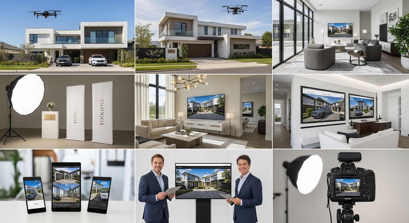
At DignuzDesign I build custom websites for this exact audience, and through Faraday3D I produce the renders, walkthroughs, and virtual tours that fill those sites. That dual seat - site builder and visualization producer - gives me a perspective that most web design studios never develop. You start to notice which design choices actually move a qualified buyer toward a viewing request, and which are invisible to everyone but the designer who made them.

What High-Net-Worth Buyers Actually Evaluate on Your Site
The cliche about a three-second first impression is mostly nonsense. Serious buyers do not bounce in three seconds because your homepage lacked a motion banner. They stay long enough to form a real judgment, and what they are judging is your competence, not your taste.
When I review analytics from real estate client sites, the pattern of high-intent sessions looks nothing like the pattern of casual browsing. A serious prospect will open a listing, scroll through every photo, zoom into a floor plan, open the neighborhood guide, then go back to the listing, then check the agent page. That behavior happens over several minutes, sometimes across multiple sessions and devices. The design questions that matter are about what they find when they dig in, not what greets them at the top of the homepage.
This matters because most of the common "first impression" advice is optimized for bounce-rate metrics that barely correlate with revenue in luxury property sales. The National Association of Realtors research on home buyer behavior has consistently shown that serious buyers treat the internet as a research environment, not a browsing environment. They are not deciding whether to like you in three seconds. They are deciding whether to trust you over the next twenty minutes.
The Three Signals That Actually Separate Serious Sites
Stripped down, what wealthy buyers look for when they evaluate a luxury real estate website falls into three categories. The first is proof that you know the specific property and the specific neighborhood at a level of detail they could not get from Zillow. The second is proof that the experience of buying from you will be competent and unfussy, which the site demonstrates through the quality of everything they touch. The third is proof that the imagery is real, current, and unretouched in any misleading way. Any one of these missing is fatal. All three present is rare.
Every design decision in a luxury site either supports these signals or distracts from them. A hero video of a butler pouring champagne signals nothing except that your designer watched too many hotel commercials. A quiet, precisely typeset headline next to a sharp photo of the actual entryway signals confidence.
The Performance Floor Most Luxury Sites Fail to Clear
Here is a recurring finding from audits I do on existing luxury real estate websites. The visual design is usually fine, sometimes beautiful. The performance is almost always terrible. Hero videos weigh thirty megabytes, galleries block the main thread, third-party widgets load synchronously, and mobile Largest Contentful Paint lands north of six seconds.
This matters more than most agents realize. Google's published guidance on Core Web Vitals treats LCP under 2.5 seconds as the target, and research across commerce sites has shown that pushing LCP from two to four seconds roughly halves conversion on product pages. Property listings behave exactly like product pages for this purpose. The buyer who opens your listing on an iPad in a café during lunch is making a second-by-second decision about whether to keep scrolling or close the tab. You do not feel that friction in your own browser because you have a fast laptop and a hot cache. Your buyers do not.
I have largely moved client work onto Jamstack architectures for this reason. Astro for the site shell, Cloudflare at the edge, Svelte islands for interactive components that actually need JavaScript, and a headless CMS for the listings. A site built that way loads the homepage in under a second on a mid-range phone on 4G. That is the floor, not the ceiling. Anything slower is competing with its own design.
If your current site is on WordPress with a heavy real estate theme, the honest assessment is usually that performance cannot be rescued by plugin tuning. It can be worked around, but the underlying architecture keeps fighting you. Rebuilding with a modern stack is often the shortest path to something that actually loads fast on a listing page heavy with imagery.
Imagery Decisions That Matter More Than Your Budget
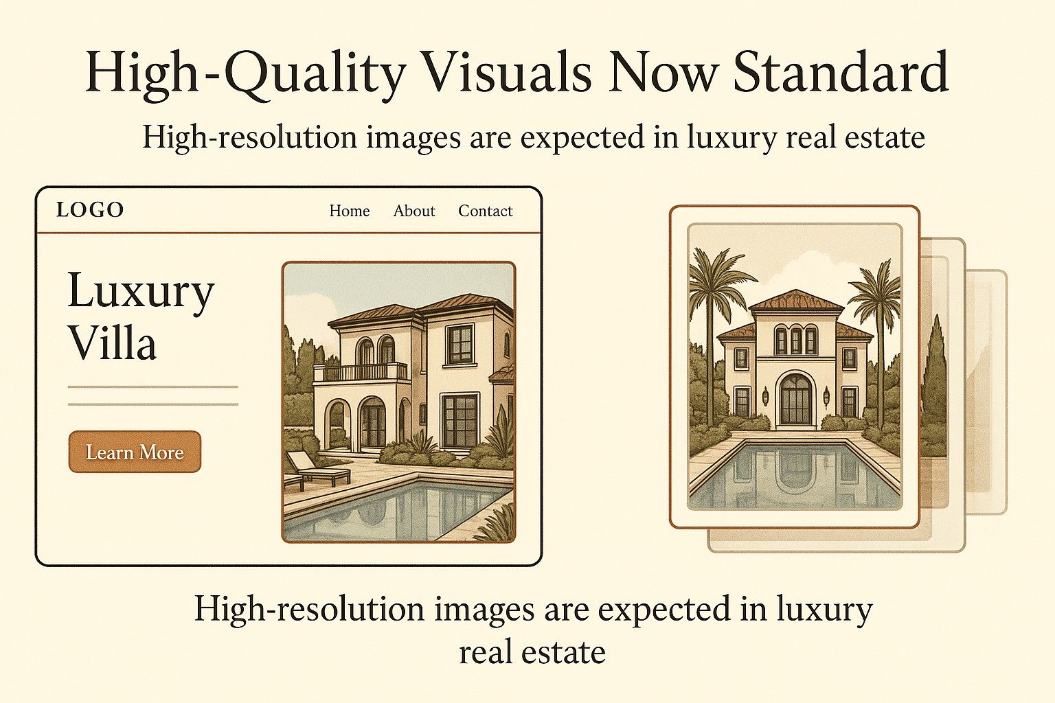
A common misconception is that luxury imagery requires a bigger photography budget. In practice, the biggest quality gap is not the camera or the lens. It is the editorial discipline behind which images get chosen, cropped, and published.
Most luxury listings are shot with the same handful of wide-angle interior photographers. The raw material is similar across the market. What sets a good site apart is the sequence and the restraint. Fourteen well-chosen photos in a deliberate order outperform sixty photos dumped in capture sequence. The first image on the gallery should be the one that best captures what is unique about this specific property, not the one the agent happens to like most. The last image should be the one that leaves the strongest emotional impression. Everything in between should build an argument about how the house lives.
Where photography hits a real ceiling is when the property does not yet exist, or when renovations are ongoing, or when you want to show a buyer how an empty loft could feel furnished. That is where 3D visualization stops being a luxury and starts being the most honest way to present the asset. Through Faraday3D I produce photoreal renders and interactive walkthroughs for off-plan developments, and through AmplyViewer we embed those walkthroughs directly into the listing page so a buyer in Singapore can explore a property in Lisbon at two in the morning without booking a Zoom call.
Interactive Property Exploration That Sells, Not Just Decorates
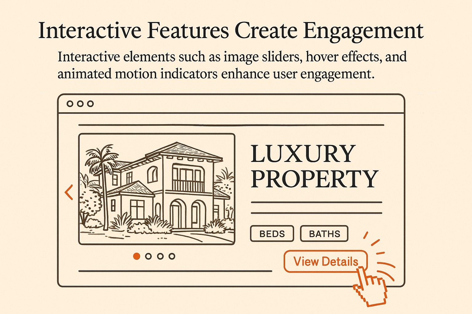
Interactive tours are one of the most abused features in luxury real estate web design. Most implementations are a Matterport embed shoved into an iframe, running slowly, with ugly controls, producing the uncanny-valley effect of a property photographed with a robot vacuum. It is usually worse than good still photography.
Done well, interactive exploration belongs in the main flow of the listing page, not hidden behind a small "take a tour" button in the corner. It should feel like picking up the floor plan and rotating it in your hands. For immersive 3D experiences on current projects, we typically combine three layers. A lightweight orbit view of the building exterior and site, a walk-through of key interior spaces with day and night lighting, and a configurable layer that lets the buyer see alternative finishes or furniture packs without reloading.
Every one of these layers has to load on demand. The single biggest mistake in interactive property design is making the visitor pay the performance cost upfront for a feature they may never use. Only load the 3D engine when the visitor actually asks to enter the tour. Everything else should stay static HTML and responsive images.
How Lead Capture Actually Works With High-Net-Worth Prospects
The standard playbook of pop-up newsletter boxes, exit-intent offers, and aggressive chat widgets does not work on affluent buyers. It does more than fail. It actively repels them. An exit-intent offer for "your free luxury buyer's guide" says you consider the visitor a lead to be harvested, not a client whose time is worth protecting.
The lead capture strategies that actually convert at this price point share three properties. They are contextual, meaning they appear where the buyer has a natural reason to want to continue. They are quiet, meaning they do not demand attention with animation or sound. And they offer an obvious next step, not an exchange of email for a PDF.
In practice this looks like a clean "Request private viewing" action on each listing, reachable without scrolling past a carousel of unrelated CTAs. A neighborhood page that ends with "Talk to Dimitri about listings in this area" rather than a generic contact form. An off-plan development page that offers a downloadable floor plan in exchange for an email, because the floor plan is genuinely useful and the email is genuinely justified.
The Lead Capture Hierarchy I Use on Client Sites
The distinction between different lead moments matters, because each calls for a different intensity of ask. Mapped out, the hierarchy I use on client sites looks like this:
- Browsing neighborhood content: offer a soft subscription to a quarterly market letter. There is no pressure, and it positions you as a genuine local expert rather than a salesperson chasing the visitor.
- Reading a specific listing: show a request-viewing form inline on the page, not inside a modal. This matches the buyer's actual next step at that moment, and it converts far better than any pop-up variant.
- Downloading a floor plan or spec sheet: ask for name and email, single field each. This is a genuine value exchange rather than a trick, and sophisticated visitors read the difference immediately.
- Exiting the site from a listing: ask for nothing at all. Exit-intent pop-ups read as desperate at this price point, and the cost to your brand perception outweighs any marginal capture they produce.
One last note on forms: ask for as little as possible. On every site I have built, shortening the viewing request form from seven fields to three roughly doubles completion. The agent then phones the lead and collects the rest of the information in a real conversation, which is what the lead expected anyway.
Hyperlocal Content That Signals Genuine Expertise
The single most undervalued asset on a luxury real estate website is the neighborhood content. Most agents treat neighborhood pages as SEO filler, a template with population statistics and a couple of restaurant recommendations scraped from Tripadvisor. The result is an obvious tell that the agent does not actually live in or understand the area, which is exactly the impression you cannot afford to give a buyer about to spend several million on a property there.
A good neighborhood page reads like it was written by someone with strong opinions. It names specific streets as quieter than others, specific restaurants as worth the trip versus tourist traps, specific school catchments as currently strong versus currently in flux. It links to council planning documents when there is a major development on the horizon. It is not longer than it needs to be, but the density of real information per paragraph is visibly different from a generic local guide.
This is also where the unique angle of combining web design with visualization pays off. A neighborhood guide can include a custom interactive map with annotated points of interest, not a generic Google Maps embed. For a waterfront development we recently worked on, the neighborhood page included a short aerial walkthrough I rendered in Faraday3D showing the property in context of the surrounding marina, with labels for the yacht club, the nearest fine-dining restaurant, and the driving route into the city. A buyer comparing our client against two other developments in the area had this kind of context on only our page. Guess which one they shortlisted.
Custom Versus Template, Reframed
The standard custom-versus-template argument gets framed as a question of budget. It is really a question of competitive differentiation. If you are a solo agent with a small territory and no luxury specialism, a good template-based site is genuinely fine. Your competition is also on templates, and your clients are not comparing your web presence against the best in the world.
If you work at the top of the market, the calculus is different. Your listings are being compared against sites built by people who do nothing but luxury development websites, and the shortcut patterns in template themes become obvious very quickly. There is a specific class of WordPress theme used by a large chunk of the luxury real estate market, and once you have seen its navigation pattern a few times, you notice it immediately on every site using it. That is bad branding regardless of how expensive the header image is.
The longer-term issue is flexibility. Custom real estate websites are not only about aesthetic differentiation. They are about being able to add a configurable 3D viewer, or a bespoke neighborhood map, or a complex filter that matches how buyers actually search at the high end. Template themes start fighting you the moment you need to add anything genuinely unique. Custom real estate websites outperform template solutions for exactly this reason, and the ROI case gets stronger the higher your price point goes.

SEO That Serves High-End Buyer Searches
Luxury real estate SEO has one structural difference from general real estate SEO. The query volume on specific luxury terms is tiny compared to generic local terms. There are far fewer people searching "modernist architect Lisbon waterfront" each month than "homes for sale in Lisbon." The upside is that the visitors who do search luxury-specific queries are extraordinarily qualified, because nobody with a budget below a certain threshold types those phrases.
This changes how you approach content. Thin listicles aimed at broad keywords rank nowhere useful and attract the wrong audience even when they do. What works instead is deep, narrow content aimed at the exact search intent a qualified buyer would use. A page titled "Off-plan penthouses in Cascais with sea view" targets a real query from a real buyer. A page titled "Top 10 tips for luxury home buyers" targets nobody who will ever buy a luxury home.
The Knight Frank Wealth Report tracks buyer behavior at the top end of the residential market and consistently shows that ultra-high-net-worth buyers are mobile across borders and highly specific in what they want. Your content needs to reflect that specificity. Listing pages with genuine information about views, light, materials, and ownership costs outperform listing pages padded with generic luxury adjectives. Property descriptions written like an actual broker would describe the place to a friend, not like a copywriter trying to inflate word count, convert far better in my experience.
The Tech Stack Choice Behind All of This
Because I build these sites personally, the stack is not abstract to me. For the typical luxury real estate project I default to Astro for the site, because its islands architecture keeps shipping small JavaScript payloads even when the site has rich interactive pieces. For clients who need ongoing editorial control without developer involvement, Webflow can be a defensible middle ground, although its performance ceiling is lower than a custom Astro build. For the interactive 3D layers I use a mix of Three.js for bespoke viewers and our own pipeline through AmplyViewer where a standardized embed works.
On top of whatever stack you pick, the hosting layer matters. I run client sites on Cloudflare because the edge network handles global traffic well, which matters in luxury real estate where buyers are often in a different continent from the property. A Singapore buyer opening a Miami listing should see the same sub-second load time as a Miami buyer. That is genuinely hard to achieve with single-region hosting.
Frequently Asked Questions About Luxury Real Estate Web Design
How much should a luxury real estate website cost to build?
For a genuinely custom build with real performance, interactive 3D elements, and a considered content architecture, plan for a range that sits well above standard template-based real estate sites. The exact number depends on how many listings need structured content, whether interactive tours are in scope, and whether you need multilingual support. The honest answer is that under a certain threshold you are buying a lightly customized template, which for most working luxury agents is not enough differentiation to be worth doing.
Is Webflow good enough for a luxury real estate website?
For agents with a small number of listings and a need for editorial independence, Webflow is workable and I build in it regularly. For large developer portfolios with hundreds of off-plan units, a filterable inventory, and heavy interactive content, Webflow starts hitting structural limits and a custom Astro or headless build becomes the better choice. The right answer depends on volume and how much interactive complexity you need.
How important is a virtual tour or 3D walkthrough on a luxury listing?
Essential for off-plan developments and large-format properties where a buyer cannot easily visit in person before deciding to engage. For already-built homes in a local market the picture is more nuanced: excellent stills plus a short video walkthrough often outperform a clunky 3D tour. The decision should come down to what genuinely helps a serious buyer make up their mind, not what looks impressive on the pitch deck.
What is the most common mistake on luxury real estate websites?
Overstuffing the homepage. A crowded homepage is the single most reliable signal that a brand is anxious rather than confident. The strongest luxury sites I have seen, and the ones I try to build, feel generous with whitespace, quiet in their typography, and genuinely restrained about what they show above the fold. That restraint is what communicates confidence to a sophisticated buyer.
Do luxury buyers actually browse properties on their phones?
Yes, often more than on desktop. A significant portion of buyer sessions on sites I have analytics access to happen on iPads and premium Android phones, frequently during travel. Mobile is not a secondary concern to be addressed after the desktop design is locked. It is where the first real evaluation of a listing often happens, which is why mobile performance and mobile gallery design deserve more thought than they usually get.
Should a luxury real estate website include a blog?
A blog only earns its place if the content is genuinely informed. Generic luxury lifestyle posts are noise. What works is hyperlocal content about the specific neighborhoods you operate in, market letters with your own interpretation of current data, and case studies of properties you have sold or helped develop. If you cannot commit to real substance, it is better to have no blog than a thin one, because a thin blog broadcasts exactly the wrong signal.
Where to Start If Your Site Needs Rethinking
Most luxury real estate websites do not need a total rebuild on day one. They need a clear diagnosis of where the biggest gaps are between the brand's positioning and the experience the site actually delivers. In roughly that order of payoff, the usual fixes are: improve mobile performance to get LCP under 2.5 seconds, rework the listing page to foreground proof of property knowledge, rebuild neighborhood content from a position of genuine local expertise, and only then consider a larger visual redesign. Done in that sequence, each step produces measurable improvement and de-risks the later work.
If you are an agent, developer, or architect serving the top of the market and your site is not doing the job, the brief I usually work from is short. What do your best listings deserve to look like on the web, and what is standing between the current site and that? The answer to the second question is almost always more technical and more editorial than it is visual. The visual work is the easy part. The hard part is the judgment behind it, and that is where a practitioner's perspective matters more than a template's aesthetics.