Real Estate Web Design That Converts Visitors to Buyers

I have spent the last several years building websites for real estate developers, agents, and architects, and producing the 3D visualizations that fill those websites. Over and over the same pattern appears. The sites that generate real enquiries rarely look like the "high-converting real estate template" trend on design showcases. They look unremarkable on a screenshot and exceptional on a phone in a café at lunchtime. The difference is almost never decorative. It is structural.
The generic advice about real estate website conversion is written for a buyer journey that does not exist anymore. It assumes a cold visitor arriving from nowhere, making a split-second decision about whether to stay. That fantasy flatters the designer, because it makes every visual flourish feel decisive. The truth is less glamorous. By the time someone reaches a property agent or developer site, they have almost always been pre-filtered through a portal, a search engine, a social post, or a referral. They are not deciding whether to care about property. They are deciding whether to trust you with it.
This article is about what that reality actually demands from a real estate website. It is not a list of tips. It is an argument about where the conversion leverage actually sits, based on daily work at DignuzDesign building custom property websites, and at Faraday3D producing renders and virtual tours for developers selling off-plan units across Europe.

Why Buyers Actually Land on a Real Estate Website
Before talking about design, it pays to understand the trip a visitor has already taken. The National Association of Realtors profile of home buyers and sellers found that every home buyer in the survey used the internet to search for a home, that the first step for almost half of buyers was to look at properties online, and that the three most valuable pieces of content on property websites were photos, detailed property information, and floor plans. None of those items are the hero banner. None are the logo. None are the contact form.
That reframes the brief. Your homepage is not the first impression for most qualified traffic. The listing page is. The neighbourhood page is. The agent profile is. The homepage matters for branded search and direct referrals, but a serious buyer arriving from Rightmove, Idealista, Zillow, or a Google result rarely sees the homepage at all. Every hour spent perfecting a hero animation is an hour not spent on the pages that actually carry the conversation.
Once you accept that the listing page is the real front door, the question changes from "how do we grab attention" to "how do we prove we are worth a viewing request". That is a different design problem, and it has different answers.
The First Five Seconds on a Listing Page
A common claim is that visitors decide whether to stay within a handful of seconds. On a listing page that claim is mostly true, but it is true for a specific reason. The buyer has just arrived from a search result where they saw a thumbnail, a price, and a location. The first job of the listing page is to prove that the reality matches the thumbnail. If it does not, the visitor leaves and no amount of further design cleverness retrieves them.
This is why the opening section of a listing page has more conversion weight than the entire rest of the site combined, and why most templates get it wrong. A buyer arriving on the page needs the same three things in the same order every time. A clean hero photo that matches the thumbnail they clicked, without aggressive overlays that obscure the interior. The asking price and the headline data, set in text large enough to read without zooming. A single clear call to action that matches buyer intent at this stage, which is almost always "see more photos" or "request a viewing", and almost never "sign up for our newsletter".
The temptation among designers is to start decorating this area. A parallax effect on the hero, a diagonal cut through the price block, an animated reveal on the CTA. Each of these adds friction for zero conversion benefit. I audit enough property sites to say with confidence that the best-performing listing pages I have seen are aesthetically close to boring. They lose nothing to decoration and gain everything to clarity. For a deeper look at structural choices on these pages, our notes on property listing design best practices walk through the layout decisions that compound over a full gallery and floor plan scroll.

Speed Is a Design Decision, Not a Technical Afterthought
If I had to name the single most undervalued conversion lever in real estate web design, it would not be visual hierarchy or copywriting. It would be page speed. Property pages are heavy. A listing gallery easily runs twenty images plus a floor plan, a map, and often a video or 3D tour. Loaded naively, that page takes six or seven seconds to become usable on a mid-range phone on mobile data, which is exactly the device most buyers use to triage listings between appointments.
The business impact of this is not theoretical. Google's own case study work on the business impact of Core Web Vitals documents measurable improvements in engagement and conversion when Largest Contentful Paint is pulled under 2.5 seconds. On property listing pages, which behave almost exactly like e-commerce product pages for this metric, the drop-off between a two-second LCP and a four-second LCP is steep enough to be the difference between a healthy enquiry pipeline and a quiet one.
The depressing truth about most real estate websites is that they fail this test badly and their owners have no idea. The agent tests the site on a fast laptop with a warm cache and concludes it is fine. The buyer tests it on a three-year-old Android on hotel Wi-Fi and concludes the agency is unserious. Nobody meets in the middle.
Fixing this is a design problem as much as an engineering one. It starts with decisions about image strategy, video loading, third-party widgets, and script blocking that a designer makes in the first wireframe. I now build most client sites on Astro at the edge with Cloudflare, defer anything interactive until the visitor actually needs it, and treat the thirty largest images on the site as individually worth optimizing. A more detailed walk through the tactics we use for real estate website speed optimization covers the mechanics, but the headline is this. Speed is cheap to buy on a new build and expensive to retrofit. Build for it or pay later.
Visual Substance Is What Turns a Maybe Into a Shortlist
When a buyer flags a property for a second look, what they are really doing is building an internal case for why this one is worth a Saturday viewing slot. The website's job is to give them enough material to build that case. Generic advice talks about "high quality photos" as if that were a meaningful instruction. The meaningful instruction is about editorial discipline.
Twenty carefully sequenced photos, shot in consistent light, showing the rooms in the order a visitor would actually walk through the house, outperform fifty photos dumped in capture order every single time. The first photo should be the one that best communicates what is distinctive about the property, not the one the agent personally likes. The last photo should leave an emotional impression. Everything between should tell a coherent visual story about how the house lives. For agencies shooting their own photography, our guide to essential property marketing visuals covers the common pitfalls in sequencing and editing.
Floor plans matter more than most agents realize. Buyers returning for a second look almost always want to verify the layout, and a high-resolution floor plan is one of the few assets that reliably holds their attention for more than a minute. Present it at full resolution with a simple zoom control. Do not hide it behind a download gate. The lead captured by hiding the floor plan is worth less than the buyer lost by asking for an email before they can confirm the layout.
Where still photography hits its ceiling is with off-plan developments, ongoing renovations, or properties where the empty shell does not convey how the finished space will feel. This is where 3D visualization stops being a marketing luxury and becomes the most honest way to present the asset. Through Faraday3D we produce renders and interactive walkthroughs for developers selling units that do not yet physically exist, and through AmplyViewer we embed those walkthroughs directly into the listing page so a buyer can explore a property at two in the morning from a different country. The sales impact of a serious interactive 3D layer on off-plan listings is measurable and repeatable in our own project data, and the public data tracks with what we see. Zillow reports that listings with their 3D Home tours receive roughly 68% more views and 36% more saves than equivalent listings without them, which is a reasonable proxy for what integrated 3D does on an individual agency site.

The IDX Question Most Agents Get Backwards
Advice about IDX integration almost always frames it as a must-have feature that justifies a meaningful chunk of the website budget. For most solo agents and boutique agencies, that framing has it backwards. The buyer who is searching the full MLS is already using the portal that owns the MLS. They are on Zillow, Realtor.com, Rightmove, or the local equivalent, because that is where inventory is actually complete and fresh. Your IDX feed on a smaller site is almost always slower, less filtered, and presented on a page that loads worse than the portal.
What that means in practice is that a comprehensive IDX search is rarely the thing that wins you business. It is table stakes for larger brokerages with established traffic, and it is an expensive distraction for smaller agencies who would be better served focusing on the handful of listings they represent directly. A page built around your own listings, shot properly, with a coherent neighbourhood narrative and a fast floor plan, converts better than an IDX search that pulls in every property in the region.
When IDX is worth the investment, the details matter. Listings must update frequently enough that status changes are accurate. Search filters must map to how buyers actually shortlist, which is usually a combination of budget, neighbourhood, and bedroom count, not a fifteen-field advanced search that nobody completes. Lead capture inside the IDX flow must be restrained. The moment you block a search result behind a registration wall, you have told the buyer you are more interested in their email than their questions.
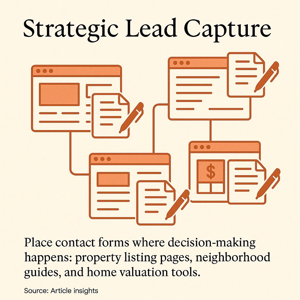
Lead Capture Where Less Genuinely Means More
Form design is the area where bad advice has done the most damage to real estate websites. Every template ships with four or five different lead capture patterns, each more aggressive than the last, and none of them informed by how a property decision actually unfolds. A property purchase is not an impulse buy. Collecting a phone number, email, budget, timeline, preferred neighbourhoods, and financing status in a single form is not qualification. It is friction.
Baymard Institute's form usability research has found repeatedly that the number of fields is one of the strongest predictors of abandonment, and that many sites use roughly three more fields than they actually need. Their finding tracks with what I see on real estate sites. Every time I shorten a viewing request form from seven fields to three, completion roughly doubles. The agent picks up the missing detail on the phone call, which is where the qualifying conversation was always going to happen anyway.
The lead capture hierarchy that consistently works on the sites I build breaks down as follows:
- Browsing a neighbourhood guide: offer a quiet subscription to a quarterly market update. There is no urgency, no pop-up, no discount language. The visitor is early in their research and what they value is being treated as a thinking adult rather than a lead to be harvested.
- Reading an individual listing: place an inline request-a-viewing form within the page, not inside a modal. Three fields only. Name, phone, preferred viewing window. Everything else belongs in the callback conversation.
- Downloading a floor plan or spec sheet: ask for name and email as a fair exchange for a genuinely useful document. This works because the value is real on both sides and the visitor reads the trade honestly.
- Exiting a listing page: ask for nothing. Exit-intent pop-ups read as desperate and poison the brand perception far more than the marginal leads justify.
One pattern worth singling out because it does work is the saved-search alert. A buyer who creates an account to get notified about new listings matching their criteria is telling you, in the clearest possible way, that they are serious and still looking. That account is worth twenty cold lead magnets. The design challenge is making account creation take seconds rather than minutes, and making the alert emails feel like genuine market intelligence rather than automated spam.
Neighbourhood Content Is Where Trust Actually Compounds
Nothing on a real estate website builds long-term equity like genuinely useful neighbourhood content. Every agent claims local expertise. Very few websites demonstrate it. A neighbourhood page with three paragraphs of generic text about "vibrant community" and "excellent schools" does nothing except confirm that your agency sounds exactly like every other agency.
What a serious neighbourhood page looks like is a short, honest piece of writing about what it is actually like to live in that area, written by someone who has sold property there for real money. It mentions the streets that are quieter than they look on the map, the developments that are coming in the next two years, the schools that are oversubscribed versus the ones that are improving. It includes sold-price history, not just current asking prices. It links out to the local planning authority and to the transport board. It earns trust because it treats the reader as someone making a meaningful life decision, which is what property buying actually is.
This is where agencies with real local knowledge have an enormous advantage over national portals, and almost none of them use it. The investment required is a few days of honest writing per neighbourhood, plus photos shot by someone who understands the area. The return is a stream of organic traffic that arrives with genuine intent and reads everything you have written before ever filling in a form. For the conversion copy itself, our notes on writing website copy that converts cover the voice and structure that tend to hold up on property pages.
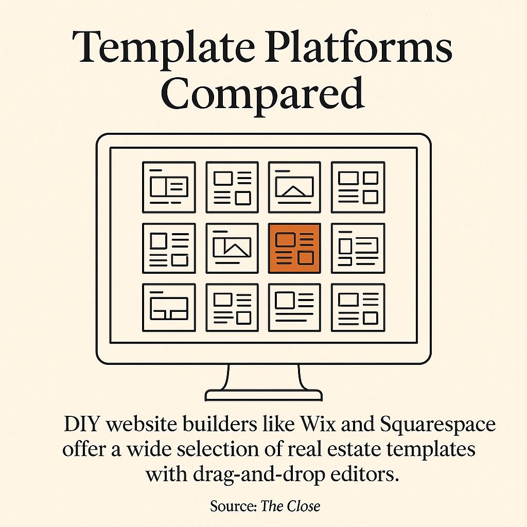
Template Versus Custom: A Practical Framing
The template-versus-custom question gets debated endlessly and usually answered badly. The honest answer depends on what problem you are actually trying to solve. A new agent with three listings and no established brand should not be spending five figures on a custom site. A template on a decent platform will carry them through their first years, and the money saved is better spent on photography, signage, and direct marketing.
The calculus changes at the point where the site starts to limit the business rather than serve it. That point usually arrives when the agency has enough unique inventory to justify editorial presentation, when brand positioning requires something the template can no longer fake, or when performance and integrations start falling behind what the competitive set is doing. At that point, a custom build stops being a vanity project and starts being a competitive necessity. Our longer piece on why custom real estate websites outperform template solutions walks through the break-even calculation in detail.
The mistake to avoid in both directions is confusing the platform with the outcome. A Webflow template built with discipline will outperform a custom Astro site built carelessly. A slow WordPress theme with brilliant photography will convert better than a perfectly engineered site with mediocre imagery. The platform is a tool. The decisions inside it are what produce the result.
What This Looks Like When It All Works
A real estate website that actually converts is quieter than the advice suggests. It loads fast enough that nobody notices it loading. The hero image is high resolution and accurate to the property it represents. The listing page gives the buyer everything they need to build their internal case without making them work for it. The forms ask for what matters and nothing more. The neighbourhood pages read like they were written by a human with skin in the game, because they were. The 3D tour, if there is one, loads on demand and behaves like a serious tool rather than a gimmick.
None of this is visible in a before-and-after screenshot. All of it is visible in the enquiry log six months later. The agencies that win at digital in this industry do not look flashier than their competitors. They look calmer, because everything on the site is pulling in the same direction. That alignment, more than any single tactic, is what turns a property website into an actual lead generation engine.

Frequently Asked Questions
How long should a real estate website take to load on mobile?
The practical target is a Largest Contentful Paint of 2.5 seconds or less on a mid-range phone on 4G, which is Google's published threshold for a good Core Web Vitals score. Anything over four seconds and you are measurably losing enquiries, particularly on listing pages where visitors have just arrived from a portal result. Testing on a fast laptop with a cached browser is misleading. The honest test is an incognito window on a phone over mobile data.
Do I need IDX integration for a small agency website?
For most solo agents and boutique agencies, a comprehensive IDX search is a lower-priority investment than editorial presentation of your own listings. Buyers searching the full MLS are already using the dominant portal, and competing with that experience on a smaller site is usually a losing proposition. Your own properties, shot and presented with genuine care, will out-convert a generic IDX grid most of the time. IDX makes more sense once you are a larger brokerage with inventory that justifies the infrastructure.
Is a 3D virtual tour worth the investment for standard residential listings?
For properties that already exist and photograph well, a strong still-photography gallery with a clear floor plan is often enough, and a 3D tour is incremental rather than transformative. For off-plan developments, staged renovations, or high-value properties where the buyer is remote, a real 3D walkthrough is closer to essential. The buyer saving a listing at midnight from another country cannot book a physical viewing on the spot, but they can spend twenty minutes exploring the space if you give them the tool.
How many fields should a property enquiry form have?
Three is usually the right answer for an initial viewing request. Name, phone number, and preferred viewing window. Every additional field measurably reduces completion, and every qualifying detail you would have collected in the form can be gathered more naturally during the callback. Longer forms belong later in the relationship, not at the first point of contact.
What is more important for conversion, design or content?
This is a false choice in practice, because a great website needs both. If forced to rank them, content wins. A plain page with honest photos, accurate information, and useful neighbourhood context will convert better than a beautifully designed page with stock imagery and recycled description. Design decides how the content is received. Content decides whether there is anything worth receiving.
How often should a real estate website be redesigned?
A full redesign every three to five years is a reasonable cadence for brand-led work, but the listing pages and performance should be under continuous review rather than waiting for a full rebuild. If the site no longer meets Core Web Vitals, if the visual language looks dated compared to the competitive set, or if the CMS has started to fight the team on a daily basis, those are signals that a refresh is overdue regardless of the calendar.