Website Navigation Design for Real Estate That Converts

Most articles about website navigation design treat the menu as a wayfinding tool, a polite signpost at the top of the page. That framing is wrong, and on a real estate website it is expensive. Navigation on a property site is not a signpost. It is a filtering machine. Its job is to take a visitor who knows almost nothing about your inventory and, within a handful of clicks, hand them a shortlist that matches what they actually want.
I build websites for property developers, estate agents, and architects. I also run a 3D architectural visualisation studio called Faraday3D and an interactive property viewer called AmplyViewer that embeds inside those websites. That combination gives me a strange dual view of navigation. I see the front-end menu, but I also see what visitors do once they get into a property, how long they stay, and where they bail. From that angle, the patterns that win are not the ones that look prettiest in a portfolio. They are the ones that respect how a property buyer's brain actually works.
This piece is about that pattern. It is not a generic checklist. It is the navigation logic I keep returning to on real estate projects, the mistakes I see almost every property website making, and what the available research actually supports.
Why generic navigation advice fails for property websites
Almost every article about navigation design borrows its framework from e-commerce or SaaS. That framework assumes a visitor with a known product in mind, browsing a structured catalogue. Property buyers are not that user. According to the National Association of Realtors, recent buyers spend an average of around ten weeks searching and view roughly nine homes in person, but the online discovery phase before they ever pick up a phone is much longer and much messier. The buyer arrives at your site with a vague feeling - a neighbourhood, a price ceiling, a school catchment, a sense of how many bedrooms they need - and the site has to translate that fog into a shortlist.
You can read the Highlights From the Profile of Home Buyers and Sellers from NAR for the underlying data, but the operational takeaway is simple. The user is not looking for a product. They are negotiating with themselves about what they can afford, what they will compromise on, and what they refuse to give up. Navigation on a property site has to support that internal negotiation.
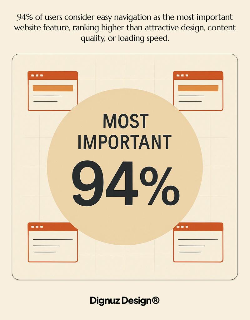
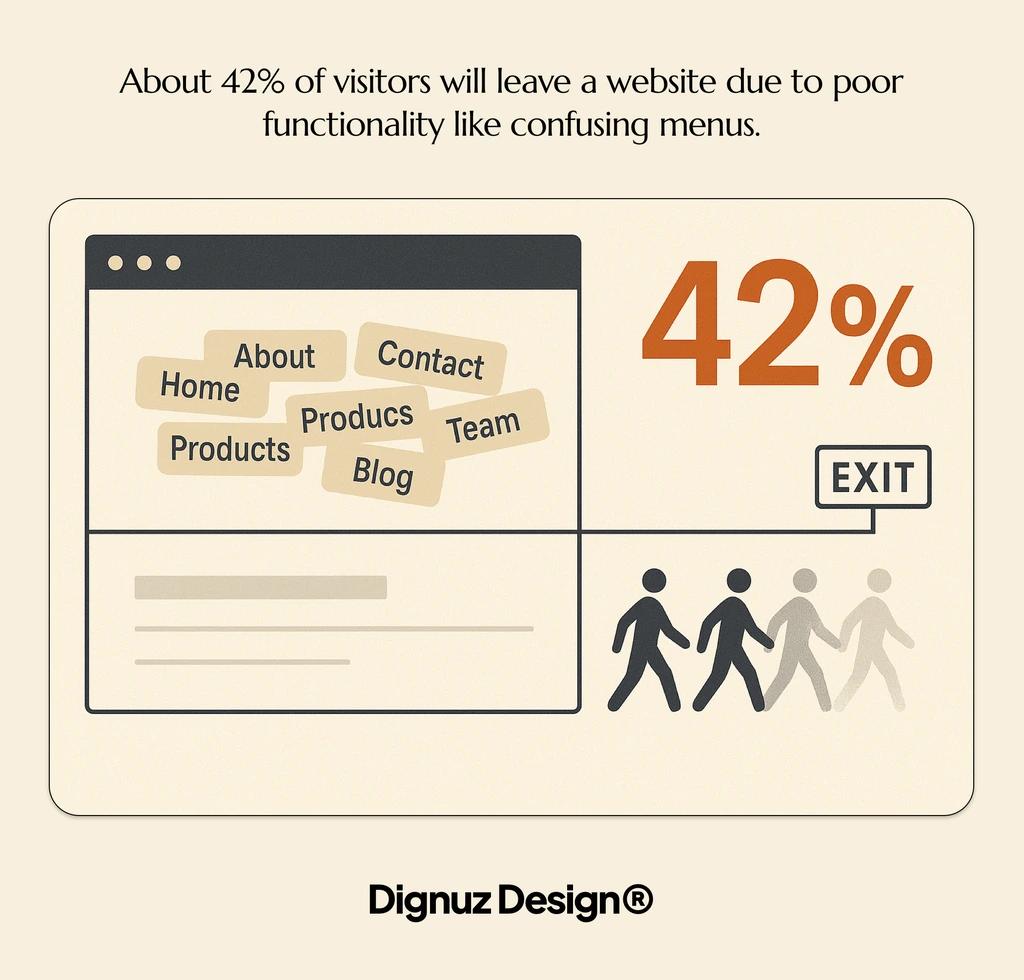
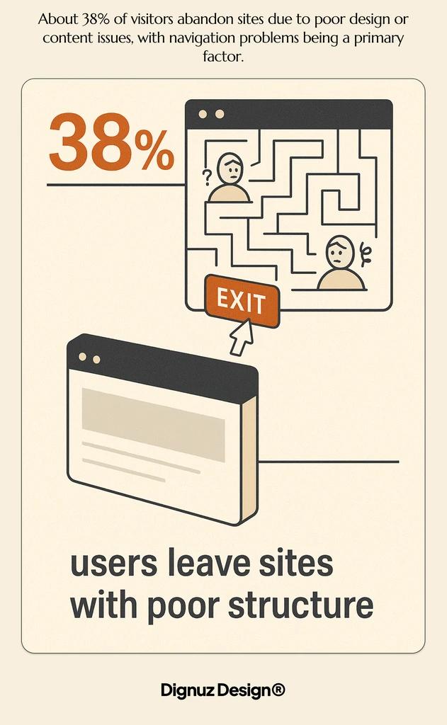
This is why the standard advice ("limit your menu to 5-7 items", "use a hamburger on mobile", "add breadcrumbs") is technically correct and practically useless. It optimises a button. It does not optimise the journey.
The two visitors your navigation has to serve at once
On every property site I have built, traffic splits into two distinct modes, and they want opposite things from your navigation. The browsers want to wander - they will scroll the homepage, click a featured listing, read the area guide, look at the about page, and then come back another day. The hunters want to filter - they already know the postcode, the price, and the number of bedrooms, and they want your search to behave like a database, not a brochure.
A navigation system that only serves one of these visitors leaks the other. Most property websites I audit are heavily optimised for the hunter, with a giant search widget on the homepage and a thin top menu that gestures vaguely at the rest of the site. That works fine until you remember that the hunter often already has a saved search on Rightmove or Zillow and is on your site to evaluate you, not the inventory. They want to know who built the development, who the agent is, what the firm has done before. The browser, meanwhile, wants the inventory. Both of them ignore the navigation you designed because it was built for the wrong half of the audience.
The fix is not adding more menu items. It is acknowledging that the top navigation and the property search are two parallel systems serving two different intents, and they should be designed as such. I cover the related conversion mechanics in more depth in this guide to real estate web page design for conversion, but the navigation principle stands on its own.
The architecture that actually works
After a decade of building these sites, I have settled on a structure that, with small variations, fits almost every property business. It has four layers, not five categories laid out across a horizontal bar.
The first layer is the persistent header. This is where the brand, the primary phone or contact action, and the menu live. Keep it short. Five items is plenty, and one of them should be your contact or enquiry call to action styled as a button rather than a link. The other four are typically Properties, Services or Developments, About, and Insights or Journal. Resist the temptation to add Locations or Property Types as top-level items. Those belong inside the search system, not in the global menu.
The second layer is the property search itself, and on most sites it should live not in the menu but in the page. On the homepage it sits prominently above the fold. On the properties index it becomes the page. On every property detail page it sits as a persistent secondary band, so a visitor who decides this property is not for them can pivot in one click instead of clicking back. This is where most of the navigation work happens, and it is also where mobile design lives or dies.
The third layer is the in-property navigation: photos, floorplans, 3D viewer, area, video, schedule a viewing. This is technically still navigation, even though designers tend to treat it as content. It is the part that decides whether a property page converts, because a buyer who cannot find the floorplan or the location map in two seconds will not request a viewing.
The fourth layer is the footer. Treat it as the safety net, not the dumping ground. It carries privacy, terms, sitemap, social, and a final call to action, but it should not be where you hide the locations menu because you ran out of header space.
Mobile is where most property sites lose buyers
NAR's digital reports have shown for years that the majority of property searches now start on a phone. My own site analytics, across about fifteen active property clients, sit between 65 and 78 percent mobile depending on the audience. So when I say mobile navigation is the project, I am not being dramatic.
The mistake I see most often is treating mobile navigation as the desktop menu collapsed behind a hamburger icon. That pattern is fine for a brochure site with eight pages. On a property site it hides exactly the thing the visitor came for, which is the search. Nielsen Norman Group's research on menu visibility is unambiguous on this point: hiding the main navigation roughly halves discoverability and increases the time it takes users to complete tasks. You can read their menu-design checklist for the underlying guidelines. The implication for property sites is that the property search needs to be reachable in zero clicks from the mobile homepage, not buried behind a hamburger.
What works in practice is a layered approach. The hamburger holds the global menu (About, Services, Insights, Contact). The search lives as a persistent element either pinned to the homepage hero or to a slim bottom bar. On property detail pages, the floating call to action should not be "Open Menu" - it should be "Request Viewing" or "Enquire", because by that point the visitor's intent is no longer navigation but action.
Touch targets matter more than people think. The 44 by 44 pixel minimum from the platform guidelines is a floor, not a ceiling. On a property card grid, the entire card should be a tap target, not just the headline. On the search filters, the price slider needs to be reachable with a thumb on a phone held in one hand. These are not aesthetic decisions. They are conversion decisions, and they connect directly to the broader question of real estate website user experience.
Search versus menus: where to put the work
Real estate is one of the few industries where search is more important than the menu, and most teams under-invest in it. Baymard Institute's e-commerce research, although focused on retail, found that the vast majority of usability failures on product-finding tasks came from search and category navigation, not from the global menu. Their homepage and category usability research is the closest parallel to a property catalogue, and the lessons translate cleanly.
For real estate, the search interface needs to do a few specific things that generic site builders rarely handle well. It needs to allow location search by name, by postcode, and by drawing on a map. It needs to handle price as a range, not a dropdown of fixed bands. It needs to recognise that bedroom counts are a soft preference and surface near-matches rather than zero results. And it needs to remember the user's last search when they come back, because the average buyer visits the same site multiple times before converting.
I have written separately about the broader question of property listing design best practices, but the search-level point is this: the filters are your navigation. Treat the filter UI with the same care you treat the top menu. If the price slider feels cheap and the location autocomplete is sluggish, your visitor will conclude the listings are also second-rate, even if your inventory is excellent. Perception transfers.
Visual navigation: where property sites have a real opportunity
Most navigation advice talks about text labels. Property sites have a genuine reason to break that mold. A buyer scanning eight similar two-bedroom flats in the same area is not reading the headlines. They are reading the photos. A grid of listings is itself a navigation system, and the design of that grid affects which properties get clicked.
The standard mistake is treating photos as decoration and putting too many of them per card. A property card needs one strong photo, the address, the price, the bedroom and bathroom count, and a price-per-square-metre figure if your market uses it. That is enough. Carousels inside the card sound clever and almost always hurt scan rate, because the visitor stops scanning and starts interacting, which costs them more attention than they intended to spend.
Map navigation is the other big lever, and the one that benefits most from competent implementation. Clustering matters. Performance matters. A map that loads in three seconds is fine; one that loads in eight is dead. For developments with multiple units, an interactive site plan or a 3D viewer becomes a navigation layer in its own right. This is the gap that AmplyViewer was built to fill - it lets a visitor on a development page select a building, a floor, and a unit visually, and land on the right listing without ever touching a menu. That kind of interactive way to showcase properties sits closer to navigation than to content, even though it rarely gets categorised that way.
Performance: the navigation that does not load does not exist
Every navigation system I have just described depends on one thing the design files cannot show, which is whether it loads quickly enough to be used. A perfectly architected menu that takes four seconds to become interactive on a 4G connection is, for the visitor on the train, the same as no navigation at all.
On the property sites I build, I work hard on this. The stack matters. Static-first frameworks like Astro produce HTML that is interactive almost immediately. Heavy JavaScript SPAs, by contrast, often delay the menu until the bundle has parsed, which on a mid-range Android device can be painfully slow. I have written about the wider performance picture in real estate website speed optimization and about the broader stack choice in jamstack property developer websites. The navigation is the canary - if it is fast, the rest of the site probably is too.
The same logic applies to maps and 3D viewers. A property page that lazy-loads its 3D viewer until the visitor scrolls to it, rather than blocking initial paint, will outperform a heavy upfront load every time. Treat performance as a navigation requirement, not a separate engineering concern.

What to measure, and what to ignore
Most teams measure the wrong things. Bounce rate on the homepage is almost useless on a property site - the visitor who lands, runs one search, finds nothing they like, and leaves is not a problem; that is the system working as intended. The metrics that actually matter are downstream:
- Search-to-listing rate. Of visitors who run a search, what percentage click through to at least one property detail page? If this is below half, your search results page is failing - the layout, the photos, or the relevance.
- Listing-to-enquiry rate. Of visitors who reach a property detail page, what percentage submit an enquiry, request a viewing, or save the property? This is the single most important number on the site.
- Repeat visit rate. Property buyers come back. If your repeat-visitor share is under 30 percent, either your inventory is being indexed badly elsewhere or your saved-search and return experience is broken.
- Time to first interaction on mobile. Not page load. The moment the visitor can actually tap the search field. This is what they feel, not what your Lighthouse score says.
None of these numbers come out of the box. They have to be set up, and they need to be reviewed monthly. The teams that do this well end up with navigation that improves over time, because they can see what is happening. The teams that do not end up making opinion-led changes that often regress.
How navigation thinking changes for luxury and developer sites
The advice above is the general case. Two specific verticals push it in different directions. Luxury real estate website design usually has fewer listings and more story. The navigation can be quieter, more editorial, with the search demoted in favour of curated routes through the inventory. The risk in luxury is the opposite of the risk on a mass-market portal - over-design hides the listings and gives the visitor nothing to do.
Developer sites, particularly for new-build projects with a defined set of units, benefit from navigation built around the development rather than around generic search. A floor-by-floor selector, a phase or building toggle, an interactive masterplan, and a release calendar are all more relevant than a price slider. The site is selling one product with variations, not a marketplace. Get this distinction right early and the navigation almost designs itself.

FAQ
How many items should a real estate website's main menu have?
Four to six top-level items is the working range. Five is the sweet spot in my experience. The items should be Properties, the service or development category, About, Insights or Journal, and Contact, with Contact styled as a button rather than a link. Adding Locations or Property Types as top-level items is almost always a mistake because it duplicates work the search should be doing.
Should a real estate website use a hamburger menu on desktop?
No. On a property site, the desktop main menu should be visible at all times. Nielsen Norman Group's research consistently shows that hidden navigation reduces discoverability and increases task time, and the trade-off only makes sense when screen space is genuinely scarce. On a desktop screen it is not.
What is the best way to handle property filters in mobile navigation?
Filters belong in a dedicated, full-screen sheet that the visitor opens from a persistent button. Cramming filters into a dropdown or a small modal forces them to scroll inside a tiny area, which is exactly the friction that makes them give up. Apply filters with a single explicit action ("Show 24 results") rather than refreshing the result count on every tap, because the latter feels laggy on slower connections.
How do I know if my real estate website's navigation is hurting conversions?
Look at the search-to-listing rate and the listing-to-enquiry rate. If visitors land on the site, run a search, and almost none of them click through to a property detail page, the problem is either the results layout or the relevance of what comes back. If they reach detail pages and almost none of them enquire, the problem is downstream of navigation. Heatmaps and session replays from tools like Hotjar will tell you which one you are looking at within a week of running them.
Are mega menus a good idea on real estate sites?
Rarely. Nielsen Norman Group's research on mega menus shows they work well when the site has a large, structured taxonomy with clear top-level groupings. Most real estate sites do not. The taxonomy is location-by-price-by-property-type, and that is what the search is for. Mega menus tend to surface as a way of paving over a navigation strategy that was never designed properly. If you genuinely have ten developments across five regions and twenty service lines, a mega menu can earn its place; if you have eight listings and a contact form, it cannot.
Does the navigation matter for SEO?
Yes, but not for the reasons most articles claim. Google does not weight your menu items as ranking signals in any meaningful way. What it does care about is internal linking, and your navigation is the densest internal link surface on your site. A clean structure with descriptive anchor text on your category and location pages helps crawlers understand the shape of your inventory. Confusing or duplicate menu items dilute that signal.
The point
Navigation on a property website is not a decoration on top of the design. It is the design's load-bearing wall. The visitor's entire impression of your firm - whether you look organised, current, and worth contacting - is formed inside the first thirty seconds of moving around the site, and almost all of that movement passes through the navigation. Build it for the way property buyers actually search, not the way an e-commerce template says they should, and the rest of the site has a chance to do its job.


