Luxury Real Estate Website Design: What Buyers Want

The thing nobody tells you about luxury real estate websites is that the people they are built for almost never behave the way the design briefs assume. The brief, in the version I see most often, asks for something elegant, restrained, generous with whitespace, with a slow hero video and serif typography. The implied user is a discerning aesthete who lingers on every page. The actual user is a wealthy person who has been awake since five in the morning, is looking at the site on their phone between meetings, and will give the page about three seconds before forming an opinion that is very hard to reverse. The disconnect between the brief and the user is where most luxury property websites quietly fail.
I run DignuzDesign, a small studio that builds websites for real estate developers, property companies, and architects, and I also produce 3D visualizations and interactive property viewers through Faraday3D. Sitting between web build and 3D production means I see the same patterns from two angles. The agent or developer wants a website that signals their position in the market. The buyer wants to make a confident decision about a property and an agent without wasting a Saturday morning. Those two goals overlap less than people assume, and the websites that work for the buyer almost always end up serving the seller better too.
This article is what I would tell a luxury brokerage or developer if they sat down in my studio and asked me to be honest about what their website needs to do. It is not a feature list dressed up as advice. It is the practical view from inside the build.
The wealthy buyer is not who the brief thinks they are
Luxury Portfolio International, in partnership with YouGov, has been running affluent buyer research for years through their State of Luxury Real Estate reports. The consistent finding across editions is that high-net-worth property buyers do real homework on the agent and the brokerage before they engage. They check websites. They check social presence. They form an opinion about whether this is a serious operator before they pick up the phone. The website is therefore not a brochure to confirm what a referral has already told them. It is the second interview after the referral, conducted alone, on their device, on their time.
That changes the design problem. The website is not trying to impress a buyer who has just discovered the brand. It is trying to reassure a buyer who has already been told by someone they trust that this firm is worth a conversation. The visitor is warm but skeptical. They are looking for two things in parallel. Evidence that the firm handles properties like theirs at the level they expect. And evidence that the firm is technologically competent in a way that suggests the rest of the operation runs on the same standard.
That second point is the one most luxury sites neglect. A high-net-worth buyer who walks into a Maybach showroom and finds the iPad on the desk frozen will quietly write the brand off. The same buyer who lands on a luxury real estate website and watches a hero video stutter, or scrolls a listing page that loads images in clumsy stages, makes the same private judgment. The website is not separate from the brand. It is one of the first operational signals the buyer receives.
Why most luxury property sites look the same and convert badly
Walk through ten high-end real estate websites in a single sitting and a pattern becomes obvious. The same heavy sliders. The same slow fade-in animations. The same gallery layouts. The same listing pages with a stack of images, a paragraph of agent prose, and a contact form at the bottom. The visual vocabulary of luxury has become genuinely homogeneous, and that is a problem because the buyer cannot use the design to distinguish between firms.
The deeper issue is that this aesthetic has been imported wholesale from the fashion and hospitality web of about a decade ago, when slow-paced cinematic sites were a fresh signal of quality. They are not a fresh signal anymore. They are a default. When everyone in the category has the same hero treatment and the same image grid, none of them communicate anything specific about their practice. The buyer leaves having seen ten elegant sites and remembers none of them. I have written about why custom builds outperform this template-driven default in the case for custom real estate websites over templates, and the argument applies sharply at the luxury end.
The luxury sites that actually convert do something different. They use the aesthetic vocabulary, because the audience expects it, but they put real substance behind it. The listing pages explain the property the way an excellent agent would explain it standing in the kitchen. The neighborhood pages do not list amenities, they describe how a Saturday actually unfolds in that part of the city. The agent pages do not list awards, they describe specifically which kinds of properties this agent has handled and which they have not. That is the layer where firms separate themselves, and it is the layer most luxury sites skip.
Speed is a luxury signal, not a technical detail
Of all the things that have shifted in the last few years, the one most luxury brokerages still get wrong is page speed. The instinct on a luxury build is to load richer assets. Higher-resolution photography, more video, more interactive elements, more font weights. The result is a site that feels luxurious to the team who built it and feels broken to the buyer on a hotel Wi-Fi connection.
Google's Core Web Vitals are not a vanity metric. They correspond to how the buyer experiences the site. Largest Contentful Paint over four seconds means the buyer is staring at a half-loaded image. Cumulative Layout Shift above the threshold means the buyer tries to tap a listing and the page jumps. Interaction to Next Paint that exceeds the recommended limit means the gallery feels stuck. Each of these failures is read by a wealthy buyer as a quality signal about the brokerage, not as a technical limitation of the web. The wider topic of how I approach this in practice is covered in real estate website speed optimization, but the headline is straightforward. A luxury property site that loads slowly is not a luxury site. It is a luxury-looking site, which is not the same thing.
This is one of the reasons most of my luxury builds run on Astro deployed to Cloudflare rather than on WordPress with a heavy theme. The build target is not a developer preference, it is a buyer experience choice. A site that ships almost no JavaScript by default and serves images intelligently is the only kind of site where the visual vocabulary of luxury survives contact with real-world network conditions.
The listing page is the conversion unit
If the website is the showroom, the listing page is the car. Almost every meaningful conversion on a luxury real estate site happens on a property page, not on the homepage. The homepage is a brand surface. The listing page is where the buyer either books a viewing or quietly leaves. Most luxury sites invest most of their design energy on the homepage and treat listing pages as a templated afterthought. That is the wrong way around.
The luxury listing page does five things well or it does not do its job. The hero treatment communicates the property's specific character within the first scroll, without relying on a generic exterior shot. The image sequence is curated and ordered to walk a buyer through the property the way a senior agent would walk them through it in person. The written description does the work that an excellent listing brochure used to do, with specificity about materials, light, layout, and context that elevates the property out of the search-result grid. The interactive elements, where they are used, answer real buyer questions about scale, layout, and the relationship between rooms. And the contact path is built around the assumption that the buyer will inquire, not around hoping they might. The detailed treatment of this is in property listing design best practices, but it is worth saying that listing-page work is where most luxury site redesigns deliver their measurable return.
Where 3D and virtual tours actually earn their place
The case for 3D and virtual tours has been overstated by vendors and understated by skeptics. Both groups are wrong in opposite directions. Matterport's own analysis of more than 140,000 listings found that properties marketed with a 3D tour sold for several percentage points more on average and closed up to thirty-one percent faster, and Zillow's research has consistently shown that buyers prefer listings with interactive floor plans and immersive walkthroughs (Matterport's findings are summarized here). At the luxury end the effect is more pronounced for a specific reason. The buyer is often remote. They cannot pop down on a Wednesday lunch break to view a property in another country, and the cost of a wasted in-person viewing for a buyer at that level is real money in travel and time.
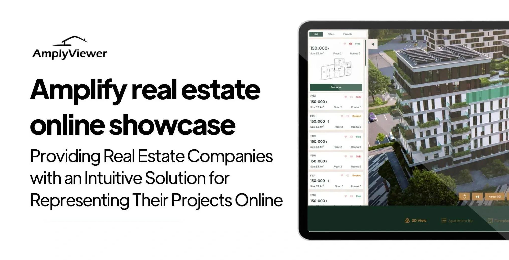
The mistake luxury sites make with 3D is treating it as a checkbox. A generic Matterport scan dropped into a listing page is better than nothing, but it does not earn its place on a property worth several million. The interactive viewer needs to feel as considered as the photography, because at this price point it is read as part of the brand. This is the gap that drove me to build AmplyViewer, which embeds a tuned interactive 3D experience directly into the listing page rather than redirecting the buyer into a third-party viewer that looks nothing like the rest of the site. The point is not the specific tool. It is that the 3D layer needs to be designed as part of the property page, not bolted on afterward, and the same logic applies whether the practice uses a custom build, a Matterport setup, or scrolling renderings produced through a partner. For the wider argument about how interactive content shifts buyer behavior, I have written about immersive 3D experiences and sales in more depth.
What the visitor needs the website to make easy
The wealthy buyer's website experience is governed by a small set of needs that the design has to make almost frictionless. These are not optional features, they are the cognitive load the page is asked to remove.
- Filter without thinking. The buyer who is shopping at the top of the market is filtering on a few specific dimensions, usually price band, neighborhood, square footage, bedroom count, and a small number of property-type distinctions. The search interface needs to land on those dimensions in the first interaction, not bury them under fashionable iconography. A search experience that requires more than two taps to express what the buyer wants is already losing the inquiry.
- Save and return. Luxury property purchases play out over weeks or months, not minutes. The site has to remember the buyer's shortlist gracefully, ideally without forcing account creation as a wall before any saved-property functionality works. The friction of forced sign-up sends a real share of warm prospects to competitor sites that let them save first and identify themselves later.
- Reach a human on the buyer's terms. The contact path needs to support the buyer who wants a quick written reply, the buyer who wants to schedule a call, and the buyer who wants to text the agent on WhatsApp or iMessage. Forcing every inquiry through the same form is a mistake at this price level, because the audience expects to be accommodated, not processed.
- Read the page on any device, in any lighting. The buyer is as often on the phone in a car park as on a desktop in a study. Type hierarchy, image sizing, and contrast all have to work on a phone in bright daylight, not only on the design team's calibrated monitors.
Branding through the site, not on top of it
One of the patterns I see most often when a luxury brokerage commissions a redesign is that the brand is treated as a layer applied to a generic information architecture. The logo goes on top, the typeface is exchanged for a more refined one, the color palette is muted, and the structure underneath stays the same as every other real estate site. The brand is then communicated through ornament rather than through behavior. That is a missed opportunity, and it is one of the reasons luxury sites blur together in the visitor's memory.
The branding that survives the visit is structural. It shows up in the way listings are sequenced, in the rhythm of the photography, in the editorial voice of the property descriptions, in the way the agent profiles are written, and in the choice of what the site explicitly does not do. A practice that markets only six properties at any time, presented with editorial depth, signals a position in the market that a thousand-listing site cannot. A practice that builds neighborhood guides that read like a Monocle travel piece signals an audience the practice expects. These signals are doing the brand work, not the logo at the top of the page. The deeper treatment of this layer is in mastering luxury property branding, and it is the part of the conversation I push hardest on with new clients.
How most luxury buyers actually start their search
It is worth grounding the design discussion in how the search actually begins. The National Association of Realtors' Profile of Home Buyers and Sellers consistently shows that around four in ten buyers begin their property search online, and that share is higher at the upper end of the market where remote and international buyers are common. The implication is that the website is the first surface, not a confirmation tool that follows offline introductions. At the luxury end this is even more true for international properties, second homes, and investment purchases, where the buyer may never visit the listing in person before serious negotiation begins.
The buyer behavior that follows is well-documented. The first session is short and exploratory, mostly on a phone. The second session is longer and usually on a laptop, with serious filtering and shortlisting. The third interaction, if the site has done its job, is an inquiry to the agent, often through a mix of email and a saved-listings link. The website that wins is the one that supports each of those three sessions on its own terms rather than designing for one and forcing the other two to adapt.
What a luxury website should not try to do
It is as useful to be clear about what a luxury real estate website should not do as it is to list features. It should not try to be a content platform with weekly blog posts written by ghostwriters. It should not chase volume on social proof through quantities of testimonials or logos. It should not load a heavy chatbot that interrupts the visit. It should not gate property details behind a contact form, which is a tactic from the volume end of the market that signals desperation at the luxury end. And it should not try to be an MLS clone with every active property in the city dumped into a search interface, because the brokerage's value is curation, and a thousand-listing grid actively undermines that positioning.
The luxury site that converts is small, fast, opinionated, and operationally serious. It looks expensive because it actually is well-built, not because it has a slow hero video stretched over a heavy hero image. It works on a phone in a car as well as on a desktop in a study. It tells the visitor exactly what kind of work the brokerage does, and what kind of work it does not. It treats every property like a campaign rather than a row in a database. And it makes the path from interest to inquiry feel like a relief, not an obstacle course.
Where to spend the budget, in order
If I had to put a luxury real estate website redesign budget in priority order for a brokerage that cannot afford to do everything at once, the order would be uncomfortable for some of the conventional vendors. Speed and structural performance come first, because every other investment is wasted if the page does not load. Photography and listing-page craft come second, because that is where conversion happens. Branding and voice come third, because that is where the practice separates itself from the category. Interactive 3D and tour content come fourth, because at this price point they are an expected layer once the foundation is right. And the homepage, which is what most clients want to talk about first, comes last, because the homepage's job is mostly to send the visitor into a listing page that will do the actual conversion work.
That order is rarely the order new clients propose when they brief a redesign. Most briefs start with the homepage hero and end with the technical details. Reversing that priority is one of the most useful things a brokerage can do with their next website project, and it is a free decision. It costs nothing to make in the brief and saves a great deal in the build.
💻 Let us help you create a stunning online showcase for your projects that works seamlessly across all devices. Ready to amplify your real estate business? 👉 Explore AmplyViewer now
Frequently asked questions
How much should a luxury real estate website actually cost to build?
A custom luxury real estate site built by a small studio sits in a range that depends almost entirely on how many listings are managed dynamically, whether the site needs MLS or IDX integration, and how custom the interactive content is. A serious brokerage build with custom listing templates, integrated 3D viewer, and proper performance work typically sits between fifteen and forty thousand euros for the initial build, with ongoing costs for hosting, updates, and content. Anything substantially below that range is almost always a template product with a cosmetic skin, and at the luxury end the buyer will notice.
Is WordPress acceptable for a luxury real estate website?
WordPress is acceptable but rarely optimal at this price tier. The plugins required for serious real estate functionality tend to drag performance, and the maintenance burden is real. Most of the luxury builds I work on now use Astro or Webflow on the front end with a headless content layer, which gives the editorial control of WordPress without the performance penalty. WordPress remains a defensible choice for brokerages with strong in-house content teams who already know the platform deeply.
Do 3D tours and virtual viewings actually shift inquiries on luxury listings?
Yes, but the effect depends on the buyer profile of the listing. For local primary residences where buyers can visit in person, a 3D tour is a useful but secondary asset. For international, second-home, and investment properties where the buyer is often remote, a good 3D tour shifts inquiry quality measurably. The visit becomes more committed because the buyer has already self-screened, which means the in-person viewings the agent does run are more likely to close.
How important is the homepage versus the listing pages?
The listing pages do most of the conversion work. The homepage's job is to direct the visitor into the right listing as quickly as possible and to communicate the brokerage's position in the market within the first scroll. A common mistake in luxury redesigns is to spend most of the budget on the homepage and most of the design energy on the hero, while the listing pages run on a generic template. Reverse that ratio if you have to choose.
Should a luxury real estate website include a blog?
Only if there is a genuine editorial point of view to publish, and someone in the practice who actually writes. A blog populated with ghostwritten SEO posts at the luxury end of the market does measurable harm, because the buyer can tell. A small number of long, considered pieces, written by the practice's principal or a credible voice, can do real work for the brand. Most luxury brokerages are better off with no blog than with a half-committed one.
How often should a luxury real estate website be redesigned?
Full redesigns every two to three years are a marketing-led habit that often destroys accumulated SEO equity and confuses returning clients. A better cadence is a rolling refresh, where the listing template, photography standards, and copy voice are updated every twelve to eighteen months while the core structure stays stable for four or five years. The biggest redesign wins almost always come from improving one section at a time rather than rebuilding from scratch.


