Luxury Property Branding That Cash Buyers Take Seriously

Most writing about luxury property branding reads like it was produced by someone who has never watched a high-net-worth buyer interact with a listing. It is a catalogue of words that sound expensive: storytelling, emotional connection, exclusivity, elevated experience. The actual behaviour of a cash buyer considering an eight-figure residence has nothing to do with any of that language. It is methodical, skeptical, and designed to disqualify candidates quickly. If your brand is trying to seduce that buyer, your brand is already losing.
I run DignuzDesign, a small studio building custom websites and digital experiences for property developers, architects, and luxury estate agents using Astro, Webflow, and Cloudflare. I also run Faraday3D, the architectural visualisation studio that produces the renders, virtual tours, and interactive previews those sites are built around. The combination of those two angles, plus the years of watching what shifts on a project between the brand pitch and the first serious buyer conversation, is the basis for what follows. This is an argument about what luxury property branding actually is once you stop performing luxury at people and start engineering trust for them.
Luxury Property Branding Is a Credibility Audit, Not a Creative Exercise
The buyer your brand exists to serve is running a silent audit from the first five seconds they land on your site. They are not asking "does this feel premium." They are asking "is this real, is the person behind it competent, and will I look foolish to my family office if I engage." Every design decision, every piece of copy, and every image is evaluated against those three questions. The audit is unforgiving. An aesthetically beautiful site with one overreaching claim, one stock photo, or one render that does not match the actual finished building will fail it.
This framing matters because most luxury branding advice treats the buyer as a consumer looking for emotional resonance. The market data suggests the opposite. According to Sotheby's International Realty's Luxury Outlook, cash remains the dominant transaction method in the luxury segment, and a large share of purchases are portfolio additions by buyers who already own multiple properties. These are not first-time buyers experiencing a lifestyle awakening. They are people for whom this is the fourth or tenth property purchase, and they are buying the credibility of the seller as much as they are buying the bricks.
Once you accept that framing, the job of the brand becomes specific. It is not to move the buyer emotionally. It is to remove every reason for them to move on. Luxury property branding is the disciplined construction of a reason not to click away.

Why Restraint Consistently Outperforms "Premium" Aesthetics
There is a visual idiom that the mid-market uses when it wants to signal luxury. Black backgrounds, gold accents, oversized hero videos of women in long dresses walking toward distant pools, serif typography set impossibly large, a voice-over promising an exceptional lifestyle. Nothing about that language is wrong in isolation, but deployed together it reads as a costume. Actual luxury brands, and actual luxury properties, almost never present themselves that way. They are quieter. The restraint is the point.
Part of the reason is structural. When a product is already aspirational, you do not need the design to perform aspiration on top of it. A heavily designed page telling you that a penthouse is exclusive reads as insecurity. A calm, plainly typeset page with accurate floorplans, honest photography, and unobtrusive language lets the property do its own work. This is why the most successful luxury real estate web design I see and build is often stripped of decoration: generous white space, restrained typography, slow and deliberate transitions, and a refusal to over-explain.
The visual identity that actually reads as premium to serious clients is the one that does not announce itself. Think of how a private banking statement looks compared to a retail bank flyer. The private banking document has less on it, smaller type, more margin, and fewer promises. That signature is a brand decision, not an accident, and luxury property branding borrows from exactly that tradition.
The Render Honesty Problem That Quietly Breaks Developer Brands
This is the part of luxury property branding that generic marketing blogs cannot see, because they do not sit on the production side of the image pipeline. Renders are the primary trust artifact in any off-plan luxury sale. They are also the place where brands most often destroy themselves without realising it. The developer commissions renders that oversell the site. The brand inherits those images. The completed building does not match. A handful of early buyers notice, mention it to their network, and the next launch in the same city struggles to find serious interest.
At Faraday3D I have had this conversation with developers more times than I can count: the renders you show buyers have to survive the comparison with the keys-in-hand reality. That means the terrace plant life has to be plausible for the climate. The light has to come from a direction the sun actually reaches at that latitude. The view from the balcony has to show what you will actually see, including any neighbouring building that the render conveniently omitted. This is not a creative constraint, it is a brand-preservation constraint. A render that is too generous is a lawsuit in slow motion, but it is also a brand liability that outlives any specific unit.
Sensible 3D rendering practice for property developers treats the visualisation as documentary, not aspirational. The point of the image is to transfer an accurate spatial understanding to a buyer who cannot walk the site. When the deliverables eventually match, the brand compounds. When they do not match, every future project inherits the memory of the one that did not.
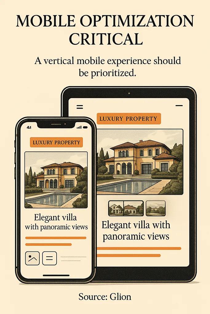
Microsites Are a Brand Asset Before They Are a Marketing Asset
A well-known pattern in luxury real estate is the single-property microsite: one URL, one property, one narrative. The default reading is that this is a marketing tactic for generating leads. That is the surface interpretation. The real function is brand-architectural. Giving a property its own site signals that it is worth the investment, and that the seller has the operational maturity to produce one. A grid listing buried on a portal signals the opposite, no matter how beautiful the individual photographs are.
The microsite is also where the credibility audit happens most intensely. The buyer will open the floorplan. The buyer will zoom in to inspect the finish schedule. The buyer will try to find out who the architect is, who the builder is, and whether the images they are looking at can be cross-referenced with anything verifiable. If the microsite does not let them do that, they leave. If the microsite lets them do that and the answers hold up, they engage. This is why I push clients to include honest floorplans, named professionals, and, where possible, a real immersive 3D walkthrough of the property embedded directly on the page.
That interactive layer is the work I do through AmplyViewer, an embedded 3D property viewer that lets a buyer explore the geometry of a residence before they fly in to see it. The brand effect of a working, smooth, embedded viewer is disproportionate to its technical cost. It removes the uncertainty that a remote buyer carries silently, and it tells them that the seller understands what it means to present a property to someone who will not be in the room.
What Consistently Kills Luxury Property Brand Credibility
Across the projects I audit, brand credibility collapses in the same small set of ways. Naming them is more useful than listing abstract principles.
- Stock-image portraits used in place of the actual team. The serious buyer reverse-image searches, finds the photo on three other websites, and writes the brand off inside a minute. It is almost never worth the shortcut.
- Auto-translated language versions where the English reads correctly and the Russian, Arabic, or Mandarin reads like a bot. High-net-worth buyers in those markets notice instantly, and it signals that the brand does not respect them enough to hire a native editor.
- Renders that show cherry blossoms on a Mediterranean terrace, palm trees in a northern-latitude courtyard, or light falling from an impossible angle. Any architect or designer looking at the images spots it within seconds, and your buyer will often have one on retainer.
- Marketing claims that are unverifiable but specific enough to feel legally exposed. "Most exclusive address in the city" invites a reaction. A neutral description of the building and its location does not.
- Contact forms that require the buyer to self-qualify with intrusive questions before they have decided whether to engage. A serious buyer will abandon the form. A less serious buyer will overshare, and neither outcome helps you.
Each of these is a brand failure expressed as an interface failure. They are not fixed with a rebrand. They are fixed by deciding that the brand will not do these things, and holding that line across every page, every email, and every asset the brand ever produces.

What the Wealth Reports Actually Tell Us About the Buyer
Reading the annual wealth research, rather than the marketing commentary written about it, changes the picture of who this buyer is. The Knight Frank Wealth Report tracks the global population of individuals with net assets above ten million dollars, and it continues to show that a meaningful share of family offices plan to increase their real estate allocation. These are institutional-grade buyers, not individuals responding to a hero video. They are represented by advisors, and the advisor is the person your brand has to pass muster with before the principal ever hears your name.
The Bain luxury sector research makes a related point that directly applies to property: the luxury buyer now expects meaningful connection that sits beyond the transaction itself, which translates in real estate to after-sale continuity. Most developers treat the hand-over as the end of the relationship. The brands that compound treat it as the beginning. A buyer who has a good experience at the fit-out, at the warranty issue two years later, and at the resale five years later is the source of the next three prospects. That continuity is a brand choice, not a marketing choice, and it is reflected in the way the brand talks about service on the public-facing site long before the sale closes.
Distribution Partnerships That Are Actually Worth the Effort
The advice that luxury property brands should "partner with lifestyle brands" is common and almost useless without specifics. The partnerships that tend to move the needle are not the ones marketing teams design. They are the ones that place the property in front of the advisors and institutions that the buyer already listens to. A presentation at a regional family office breakfast reaches more qualified attention than a six-figure digital campaign. A relationship with the concierge service a principal uses on a yacht charter puts the brand in the exact setting where discretionary decisions are being made.
This is where the intersection between web, 3D, and marketing matters. The visual and digital assets a developer builds for the public site are the same assets that need to travel well to those introducer conversations. A quiet, bank-grade microsite with an embedded viewer and a downloadable floorplan deck plays well in those rooms. A noisy marketing landing page does not. Coherent property developer brand identity work treats the distribution channels a project will actually use as inputs to the design, not afterthoughts.

Measuring What Actually Matters in Luxury Brand Performance
Traditional digital marketing metrics are unreliable in the luxury segment. Time on page is not trust. A bounce is not always a failure, because a serious buyer visiting for thirty seconds to verify a detail they were already told is a useful interaction, not a lost one. Conversion rate across a site selling residences priced above five million is not a meaningful number on any reasonable sample size. Measuring the brand means measuring signals, not volumes.
The signals that genuinely matter are direct-search growth for the brand name, the proportion of inbound enquiries that name a specific introducer or publication, the behaviour of returning visitors across long time windows, and the quality of the questions that come through the contact form. A brand that is working produces questions about specific finishes, specific floorplates, and specific timelines. A brand that is not working produces questions about whether the property is still available. The difference between those two inbox patterns is usually the difference between a disciplined brand and a decorative one.
I also track, for my own clients, how often their materials are forwarded. If a single microsite link is shared inside a family office, that is a signal of brand adequacy no vanity metric will ever produce. That requires building shareable artifacts, which circles back to the microsite as the primary brand unit. Useful property marketing visuals are the ones that travel without commentary and still make sense.
The Brand Guidelines That Hold All of This Together
A luxury property brand without explicit guidelines does not survive contact with multiple channels. The moment the Instagram account, the microsite, the brochure, and the broker pack drift apart visually or verbally, the credibility audit fails. The audit reads inconsistency as amateurism. Strong real estate brand guidelines in this segment are short, strict, and weighted toward restriction rather than permission: a single typeface, a tight colour range, one voice, one aspect ratio, one tone toward claims. The guidelines exist to stop well-meaning additions from eroding the signal.
This is also where the brand intersects with the operation behind it. If the brand promises discretion and the contact form sends an auto-reply at three in the morning, the guideline has not been translated into the system. I review the operational touch points as part of the brand work, because the brand that does not hold up in the reply to the enquiry never holds up anywhere else.

Frequently Asked Questions
How is luxury property branding different from mainstream real estate branding?
The buyer population is smaller, wealthier, and typically advised by intermediaries who do their own audit before the principal sees anything. Luxury property branding is optimised for that audit, which means accuracy, restraint, and long-term credibility matter more than reach or emotional pull. Mainstream real estate branding is usually trying to generate volume; luxury branding is trying to earn a single right meeting.
Should a luxury property have its own microsite or sit on a portfolio page?
For any residence above a meaningful price threshold for its market, a dedicated microsite is almost always the right answer. It signals investment, it lets the property set its own pace, and it gives the buyer the depth of information they expect without forcing them to navigate unrelated listings. A portfolio page is a fine supplement, but it should never be the primary presentation of a serious asset.
Do I still need 3D renders and virtual tours for finished luxury properties?
Yes, and arguably more than for off-plan. Even a completed luxury residence is often viewed for the first time by a buyer who is in another country and may never set foot in it before making an offer. Accurate 3D walkthroughs let them understand the geometry, the light, and the flow in a way that photography cannot. For off-plan, they are non-negotiable, but they have to be honest enough to survive the delivered building.
How much should a luxury property developer budget for brand work versus marketing?
The numbers vary by project, but the mental model I share with clients is that brand work is a fixed investment that compounds across projects, while marketing spend is a variable cost against a specific launch. Underfunding the brand side to spend more on paid campaigns for a single project is the most common mistake I see, and it tends to make every subsequent project more expensive to sell.
What is the most common mistake in luxury real estate logo and identity design?
Trying to look like every other luxury brand. The market is crowded with serif wordmarks in black and gold that would be indistinguishable without their surrounding context. A luxury property brand that commits to a clear position, a specific typographic voice, and a restrained palette that reflects the actual property will always outperform a generic luxury signature. The identity is a consequence of the position, never a substitute for one.
How long does it take for luxury property branding work to show results?
The brand effect shows up in the quality of inbound interest first, usually within the first few months of a disciplined launch, and in measurable transaction outcomes across the cycle of the specific development. More important than the speed of the first signal is the compounding effect across the second and third project, where a strong brand makes every subsequent launch cheaper, faster, and better qualified.


