Real Estate Brand Guidelines That Hold Up In Practice

Most real estate brand guidelines are written by someone who will never have to implement them. The document arrives as a beautiful PDF, the agency invoices, and the file is uploaded to a shared drive. Six months later the listing pages are using off-palette greens, the agent profile cards are using three different headshot styles, the social posts are mixing two logo variants depending on who is publishing them, and the new 3D viewer embed on the homepage looks like it belongs to a different company. The guidelines did not fail in any single place. They failed in every place at once, because nobody designed them to survive contact with the surfaces buyers actually look at.
I run DignuzDesign, the studio I built to make custom websites for real estate businesses, property developers, and architects, and I produce the visualization work for those projects through Faraday3D. That combination means I sit at the implementation end of every brand guideline I have ever received, which is the unusual angle this article is written from. I am not telling you how to write a brand guidelines document so it wins an award. I am telling you how to write one so the agents, marketers, photographers, third-party portals, and developers who have to apply it actually can.
This article is about the discipline that separates a working real estate brand system from a decorative one. It covers the foundation work that makes the rest of the document defensible, the visual decisions that hold up under real production conditions, what the guidelines document itself needs to contain, and how to keep the system honest as the business grows. None of this is theoretical. All of it has been forced into shape by the failure modes I see when I open a client's current website with their current guidelines document on a second monitor.
What Real Estate Brand Guidelines Actually Have To Survive
A guidelines document for a software company has a fairly contained job. There is a product, a website, a few marketing channels, maybe a conference booth. The number of surfaces where the brand has to render correctly is small and the people producing those surfaces are usually in-house. Real estate is the opposite. A single brokerage might be putting the brand onto MLS-syndicated listings, third-party portals like Zillow or Rightmove, printed property brochures produced by the photographer's lab, agent business cards ordered in batches of 250 by individual agents, Instagram posts produced by a junior marketing hire, signboards installed by a printer who has never seen the guidelines, agent profile pages rendered automatically from a CRM, and an interactive 3D viewer embedded on the development microsite. Most of these surfaces are produced by people the brand owner cannot control directly.
This is the test your guidelines document has to pass. If it cannot tell an external printer how to handle the logo on a yard sign at fifty meters, if it cannot tell the photographer what exposure values to standardize on so listing photos hang together across the portfolio, if it cannot tell a junior marketer which logo variant to use on a square Instagram post, the guidelines have not done their job. They have simply moved the decisions from one shared drive to another.
The NAR Profile of Home Buyers and Sellers consistently shows that agent reputation is the single most important factor sellers cite when choosing a listing agent, with trustworthiness and honesty close behind. Reputation is built in the small consistencies that buyers and sellers absorb without naming them: the same headshot style on every agent card, the same photographic register on every listing, the same logo treatment on every signboard. Inconsistency does not register as "their brand is broken." It registers as "something feels off about this firm," which is the more dangerous outcome because nobody can articulate it during the listing presentation.
Foundation: Define the Brand by Transaction, Not by Persona
Most brand guidelines begin with a section on the ideal client. In practice these sections are useless because they describe demographics rather than transactions. "Aspirational urban professionals aged 30 to 45" tells a designer nothing about how a listing page should feel. What actually shapes the rest of the document is the transaction the firm wins. A boutique brokerage that lists family homes between 600k and 1.2m in a defined catchment area is in a fundamentally different business from one that handles new-build apartment launches for a developer, and a fundamentally different business again from one that does off-market introductions on prime country estates. Each of those transactions implies a different photographic register, a different tone of copywriting, a different speed of response, and a different visual restraint.
The exercise I push clients through is to write the firm's transaction in one sentence specific enough that half of all prospects self-select out. "We sell two-to-four bedroom resale family homes in three named neighborhoods, with a typical price band between A and B" is workable. "We provide trusted real estate advice to discerning clients" is filler that will produce filler guidelines. A useful resource on getting this layer right is the work I have done on brand identity for property developers, which deals with the analogous problem on the developer side, where the transaction is unit absorption inside a defined release schedule rather than individual listings.
Once the transaction is named, the audience falls out of it almost automatically and you can describe that audience by the questions they ask when they first land on your site, not by the demographic bands they sit inside. That is the input the rest of the guidelines document actually needs.
Visual Identity Built for the Surfaces It Lives On
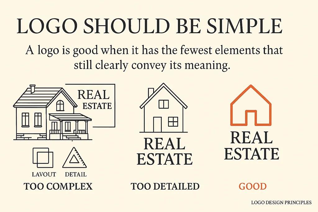
Most visual identity sections in real estate brand guidelines are organized around the elements: logo, color, typography, imagery. That is the convenient way to write the document. The more useful way is to organize the decisions around the surfaces the brand has to render onto, because every element has constraints those surfaces impose.
The logo decision is the obvious place this matters. A logo that works as a sharp wordmark on a website often disintegrates when reduced to fit a yard sign letter at twenty-five meters viewing distance, or when reversed out onto a dark agent profile card, or when embossed on a printed property brochure cover. A guidelines document that only specifies a single primary logo and a horizontal lockup will fail the moment somebody has to produce a square avatar for a portal, or a 16-pixel favicon, or a tall vertical banner for a development hoarding. The defensible approach is to design the system with at least four logo variants in mind from the start: the primary lockup for headers and printed collateral, a compact mark for square placements and avatars, a single-color version for monochrome printing and embossing, and a stripped wordmark or symbol for small-format use. Each variant has to be tested at its real production size, not just on a clean page.
Color decisions in real estate are unusually consequential because the brand color has to coexist with photography on almost every surface. A signature accent that looks elegant against white space can read as a clash when it sits next to the warm tones of dusk-shot exterior photography or the cool light of a contemporary interior. The Marq State of Brand Consistency report found that organizations that apply their brand consistently see meaningfully higher revenue, but consistency is not the same as rigidity. The discipline is to lock the primary and supporting colors in a way that survives the photography rather than fighting it, and to specify which colors are allowed to sit beside listing imagery versus which colors only appear in pure brand contexts. I cover the broader principles in more depth in the piece on color psychology in real estate, but the practical rule is straightforward: choose colors that frame photography, not colors that compete with it.
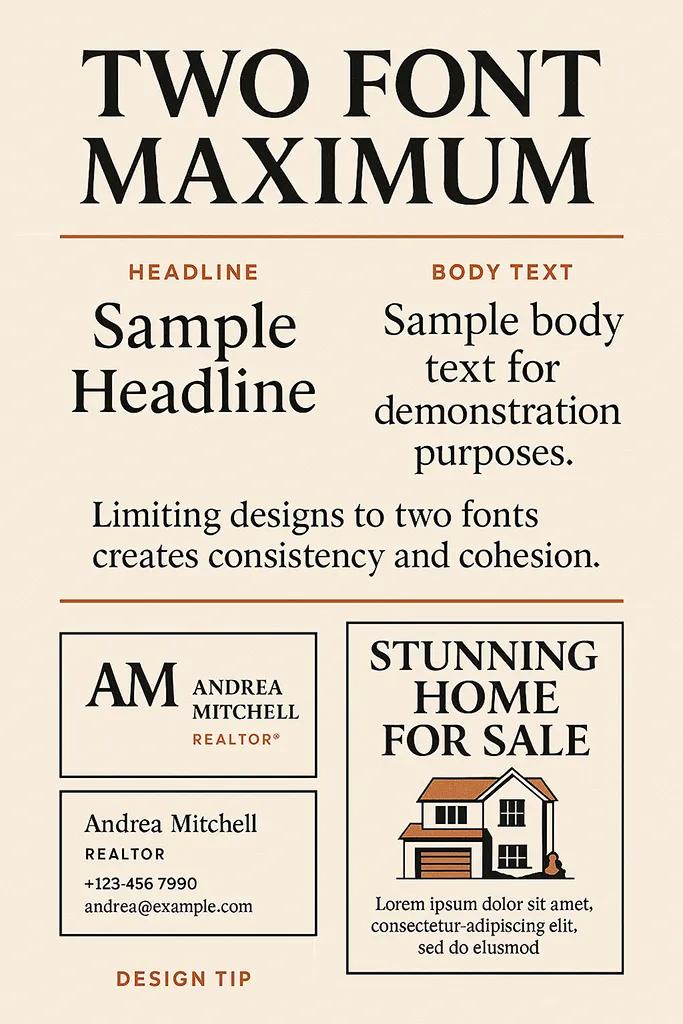
Typography in real estate is less complicated than the design press makes it out to be, and the trap most firms fall into is over-specifying. A working type system needs one serif or sans for headlines, one workhorse for body and UI, and clear rules about how each scales across web, print, and small mobile placements. Anything more than that produces a document the agents will never read and the production team will never apply correctly. The specification should also account for the constraint nobody mentions, which is that property portals strip out custom fonts. Your typography has to remain readable in a system font fallback because that is exactly how a third-party site will render your description after syndication.
Photography is the element most real estate guidelines under-specify and over-aestheticize. A line about "warm, inviting imagery" produces nothing usable. What the photographer needs is concrete: white balance values, exposure compensation rules, vertical line correction tolerance, treatment of natural light, whether twilight shots are permitted, whether HDR is used and at what intensity. There is more on this in my piece on building a consistent photography brand, but the principle is that if the spec is too abstract, two photographers will deliver two visibly different portfolios under the same brand and nobody will be able to explain why the listing pages look uneven.
The Guidelines Document as a Working Specification
Once the visual decisions are made, the document that captures them has to be usable by people who will not read it cover to cover. Treat it as a working specification rather than a brand book. A working specification has the following components, each of which earns its place by answering a question a real production scenario will raise:
- A one-page summary at the front that an agent or external printer can read in two minutes and walk away with the basics. This is the only section most users will ever read, so it has to carry the highest-leverage decisions: primary logo, primary color codes in all formats, type pairings, and the three rules that matter most.
- Logo usage examples that include the failure modes explicitly. Most guidelines show what the logo should look like. The more useful document shows what it should not look like, with annotated examples of the misuses that happen most often: wrong proportions, insufficient clear space, color tints applied to a fixed-color mark, drop shadows added by well-meaning Canva users.
- Color specifications in every format the production stack actually uses. CMYK and Pantone for print, hex and HSL for digital, and a documented rule for how the hex was converted to CMYK so reprints match.
- Photography direction with sample shots from the actual portfolio annotated against the rules, not stock examples from Unsplash. Photographers respond to references from real listings far better than to abstract prose.
- Voice and language guidance written as a list of words and phrases you do use, and a parallel list of words and phrases you do not. Banning specific clichés is more useful than describing a tone of voice in adjectives.
- Application examples that show the brand applied to the surfaces the firm actually produces: a listing page, an agent profile card, a brochure spread, a signboard, an Instagram post, a portal description. Each example annotated against the rules that produced it.
The last bullet is the one most guidelines documents skip, and it is the one that decides whether the document gets used. A guidelines document that only describes the system in the abstract leaves every production decision to interpretation. One that shows the system applied to ten real surfaces is essentially self-enforcing because anyone producing a new piece of work has an existing reference to match.
Implementation Across the Channels That Actually Matter
Most real estate firms produce work across at least six channels: their own website, third-party portals, social platforms, printed collateral, signage, and email. A useful brand system has to define how the identity expresses on each, not just specify the elements and trust that application will follow.
The website is the channel most under direct control and therefore the channel that should set the standard for everything else. This is where I do most of my client work and where the brand has the most range to express itself. A guidelines document that does not include component-level specifications for the website is leaving the highest-leverage surface to chance. Headings, body text, button states, listing card layouts, agent card layouts, form patterns, navigation behavior, image treatment: every one of these is a place the brand either expresses itself or contradicts itself. The same logic that I apply to visual identity for premium real estate clients applies here, which is that consistency at the component level is where buyers feel the brand without consciously naming it.
Third-party portals are where most brand systems get stripped to the studs. Zillow, Rightmove, Idealista, and their equivalents render listing content inside their own visual chrome, with their own fonts, their own colors, and their own card layouts. You cannot brand the portal. What you can brand is the photography, the description voice, the floor plan style, the agent headshot, and the watermark or signature image included in the listing's photo set. These are the levers your guidelines document has to specify because they are the only ones that survive syndication.
Printed collateral and signage are the surfaces most likely to be produced by people outside the firm. The printer in the industrial estate cutting your signboards has never seen your brand book. The agent ordering business cards through a self-service portal will not read your typography section. The defense against this is to produce locked templates that contain the rules rather than relying on third parties to apply them. A signboard template with the dimensions, the safe areas, the agent photo box, and the QR code already positioned correctly is enforceable. A document explaining how to lay one out is not.
Visualization is the channel I think the existing literature consistently under-treats. Renders, virtual tours, and interactive viewers are how a buyer encounters a development before completion, and they form a substantial part of the brand impression. A render that looks like it was produced by a different studio than the website it sits on is a brand fracture, even if every other piece is on-message. This is why I build AmplyViewer to take the host site's brand variables directly into the viewer chrome, so the embedded experience extends the brand rather than puncturing it. Any guidelines document for a developer or new-build brokerage needs a section on visualization standards: lighting register, material library, camera height conventions, and how the viewer chrome relates to the rest of the brand.

Maintaining the System Without Burning Out
A brand system that requires constant intervention to remain coherent is a broken system. The goal of the guidelines work is to push as many decisions as possible into the upstream specification so that downstream production becomes almost mechanical. When I review a client's brand application a year after rollout, the question I am asking is not "does this match the document" but "is anyone having to ask the document." If individual agents, photographers, and marketers are still calling someone to clarify how to handle a routine case, the system has not been specified deeply enough.
The maintenance work that actually matters is reviewing the surfaces themselves, not policing the team. Once a quarter, I open a sample of recent client listings, social posts, signboards, and portal entries side by side. The drift is always visible in twenty minutes. Agent headshots that have crept towards different framing conventions, listing descriptions that have started using a banned cliché, an Instagram template that has acquired a fourth color without anyone deciding it should. The fix is rarely to write more rules. The fix is usually to update the template the drift came from, because the template is what the team is actually using.
Documentation also has to live somewhere people will find it under pressure. A PDF on a shared drive does not count. Linking the live guidelines into the CMS used to publish listings, into the agent onboarding flow, into the template library used by the marketing team, and into the brief used to commission photographers means the document is encountered exactly when it is useful. The professional standards work published by bodies like the Royal Institution of Chartered Surveyors survives in property practice because it is woven into the workflows practitioners use every day, not because it sits on a website. The same principle applies to your brand system. Embedded standards get followed. Filed standards do not.
The last piece of maintenance discipline is to accept that the document will need to evolve. A brand system written for a five-agent boutique will not survive expansion into a thirty-agent multi-office firm without a deliberate revision, and a developer brand system written for a single launch will not survive a second project without being generalized. The work to make that revision deliberate, rather than letting the system fracture under load, is the actual ongoing brand work. Everything else is housekeeping. The deeper treatment of how positioning shapes brand decisions, which I cover in the piece on commercial real estate branding, applies here too: the brand system is downstream of the business decision, and when the business decision changes, the system has to be revisited honestly rather than patched.

The Practical Test Your Guidelines Document Has To Pass
If your current real estate brand guidelines document exists, the test is straightforward and harsh. Open three things side by side: a current listing page on your website, the same listing as it renders on the largest third-party portal in your market, and a signboard photographed at one of your active listings. If those three artifacts feel like they were produced by the same firm, your guidelines are working. If they feel like they were produced by adjacent firms that happen to share a logo, the document has failed its job. The work then is not to redesign the identity. It is to figure out where the implementation broke down and to update the specification so that surface cannot drift again.
That is the loop. The brand is not the logo, not the color, not the document. It is the cumulative impression a buyer or seller forms across every artifact your firm produces, and the guidelines exist only to make sure those artifacts agree with each other. Anything else in the document is decoration. The firms that win on brand in this industry are the ones whose work is recognizable across every surface a client encounters, and that recognizability is engineered, not stumbled into.
Frequently Asked Questions About Real Estate Brand Guidelines
How long should a real estate brand guidelines document be?
Long enough to specify every recurring production decision and not a page longer. In practice that lands between 40 and 80 pages for a working brokerage or developer brand, including application examples. Documents under 20 pages tend to be too abstract to enforce. Documents over 100 pages tend to be too long for anyone to read, which means the rules that actually matter get diluted by the rules that do not. Front-load the high-leverage decisions in a one-page summary and let the depth follow for the people who need it.
Do we need a different brand guidelines document for each property development?
For most property developers the answer is no, but you do need a parent brand system and project-level brand extensions that inherit from it. The parent brand carries the developer's identity, voice, and quality bar. Each individual project gets its own naming, color treatment, and visual register, but inherits the underlying typography, photography standards, and quality controls. The mistake is to let each project become its own free-standing brand, which fractures the developer's reputation across launches and forces every project team to rebuild the wheel.
What is the difference between brand identity and brand guidelines?
Brand identity is the actual decisions the firm has made about who it is, who it serves, and how it presents. Brand guidelines are the documentation that captures those decisions so other people can apply them consistently. You can have an identity without guidelines if the team is small enough that everyone holds the rules in their head, but the moment the firm grows beyond two or three people producing public-facing work, the absence of documentation starts producing visible drift. Guidelines are the operating manual for the identity, not the identity itself.
How often should real estate brand guidelines be updated?
The structural decisions should hold for several years at minimum, because the cost of changing them propagates through every printed artifact, every signboard, and every external partner. The application-level details should be reviewed quarterly to catch drift and to incorporate new surfaces as they appear. A guidelines document that has not been touched in two years is almost certainly out of date with the channels the firm is actually using, and one that is rewritten every six months is destabilizing its own consistency.
Who in a real estate firm should own the brand guidelines?
Ownership has to sit with someone who can refuse work that violates the system. In a small brokerage that is usually the founder or managing broker. In a larger firm it is a marketing lead who has the authority to send a piece of collateral back for revision. Without an owner with refusal authority, the document becomes advisory rather than binding, and the system erodes one well-intentioned exception at a time.
Can we use a brand guidelines template instead of producing one from scratch?
You can use a template as a structural starting point, but the content has to be specific to your firm or the document will be useless. Templates are useful for ensuring you do not forget a section. They are dangerous if they are filled in with generic placeholder content, because the resulting document will fail every implementation test the moment the production team tries to apply it. Treat the template as a checklist of what to specify, then specify it for your actual business.


