Real Estate Color Psychology: What Actually Sells Homes
Color in property doesn't start at a paint chip and end on a wall. It starts with a sample card, gets photographed under whatever light was available that morning, lands on a screen calibrated by someone in another city, and competes with eleven other thumbnails in a scroll. By the time a buyer has an opinion, the original color has been translated at least four times. Most articles about real estate color psychology ignore that chain. They treat paint as if it speaks directly to the brain. It doesn't. The chain speaks first.
I run two studios that sit on either side of that chain. DignuzDesign builds custom websites for real estate companies, architects, and developers using Astro, Webflow, Svelte, and Cloudflare, which means I deal with how color actually renders in the browser. Faraday3D produces architectural renders and virtual tours, which means I also deal with how color gets captured and re-captured in the hand-off from interior to camera to screen. That double vantage point is where this rewrite starts, because the advice that gets repeated in most color-psychology articles only holds true when the chain is intact. In real listings, the chain is almost never intact.
What color actually does in a property buying decision
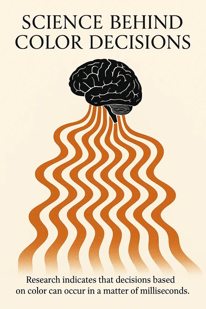
There is a small industry of blog posts claiming that buyers form an opinion in "seven seconds" or "thirty seconds" or "milliseconds," usually without a source and always with the implication that color is doing the heavy lifting. The cleaner claim, backed by published research, is more useful. The Pantone Color Institute, which advises consumer brands on how color carries meaning, puts between 62% and 90% of snap product judgments down to color alone. The number matters less than the mechanism: color arrives before structure. Before a buyer reads anything - the square footage, the school district, the agent's name - the eye has already decided what kind of property this is. That decision is pre-linguistic and mostly unconscious, which is why it is so hard to overwrite with a good description later.
In property specifically, the decision isn't "do I like this color." It is "does this place feel finished, cared for, and honest?" A color choice that signals any of those three wins the fight with the thumbnail. A color choice that signals cheap paint over damp drywall, or a recent staging that fights the architecture, loses. The research on color psychology in interiors is broad, but the specific research on real estate is narrow, and it has shifted recently in ways the older advice has not caught up with.

The Zillow data that killed the "always go light and bright" rule
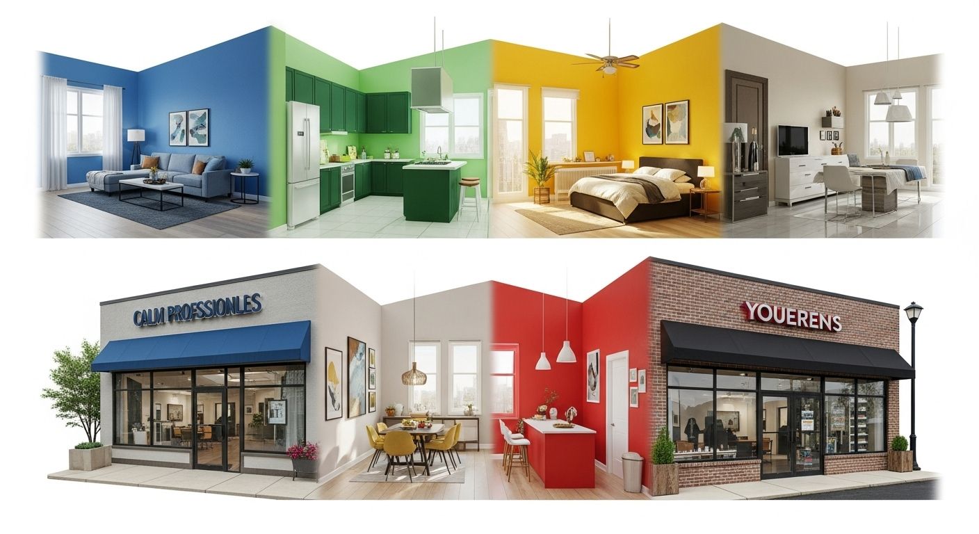
The most repeated staging advice is still "paint everything white, keep it bright, let the buyer project." It isn't wrong, but it is stale, and the data has moved. Zillow's behavioral-science team surveyed more than 4,200 recent and prospective buyers in 2025 and found that darker, more saturated colors beat pale ones in three of the most fought-over rooms. Zillow's 2025 paint color study reports that a navy-blue bedroom increased the average offer by $1,815, a charcoal-grey living room by $2,593, and a muted-green kitchen cabinet set by $1,597. Fire-hydrant red or daisy yellow in the same rooms knocked nearly $4,000 off the offer.
Taken as a recipe, those numbers are misleading. They only hold for the exact shades Zillow tested, under the exact lighting Zillow photographed, viewed on the device the buyer happened to be holding. Taken as a signal, they say something more important: buyers have stopped reading saturation as "bold" and started reading it as "intentional." A pale greige wall reads as a rental. A charcoal living room reads as someone made a choice. In a market where most listings look the same through the MLS pipeline, the intentional one wins the second click.
The second click is the one that pays. A listing photo gets a fraction of a second to stop the scroll; a floor plan never gets that far if the main shot doesn't halt the thumb. The color choice is what halts it, not the square footage.
Where color goes to die: the capture-to-screen chain
Here is the part most color-psychology articles miss, and it is the part I see break most often in client work. A color has to travel through at least four stages before a buyer has any feelings about it. The wall itself, the camera sensor, the photographer's edit, and the buyer's display. Every step warps the original. An honest color article has to talk about all four.
The most common failure is that the on-wall color was chosen in a showroom under 3000K lighting and the photographer shoots at midday through a north-facing window at 5600K. The navy bedroom the seller paid real money to paint shows up as a flat grey on the listing. The second most common failure is aggressive AI denoise on the edit, which lifts shadow tones and pulls greens toward yellow without anyone noticing. The third is that the buyer is on an unmanaged phone screen with a warm reading-mode tint on, because it's nine in the evening. Any one of those steps quietly destroys the color decision that the seller paid for.
3D renders have the same problem in a different form. A photo-real render of a kitchen with muted-green cabinets can pass brand approval, sit on the website at the correct hex value, and still arrive on an iPhone in a subtly wrong register because the website's image pipeline stripped the color profile. In my rendering work at Faraday3D, we decide the camera gamut before the color palette, not after. That's the opposite of how most interior designers think about color, and it is the main reason our renders survive compression. If you are using any form of CGI or virtual staging in your listings, the same discipline applies to whoever is producing it. I've written more on this in the piece on immersive 3D real estate experiences.
The practical consequence for a seller is simple. The choice of paint and the choice of photographer have to be made in the same conversation, not in sequence. Otherwise the seller is paying for color twice and getting it once.
Staging choices that survive the photograph and the scroll
The 2025 NAR Profile of Home Staging found that staging reduced time on market for 49% of sellers' agents, and 29% of agents reported a 1 to 10% lift in the dollar value offered. On a $400,000 home that's a real number. The report also ranked rooms by staging importance to buyers: living room first at 37%, primary bedroom next at 34%, kitchen third at 23%. A staging budget that doesn't match that ranking is a staging budget spent in the wrong order.
Color is the highest-leverage part of staging because it's the cheapest thing to change and the first thing to register. A pale sofa against a charcoal living-room wall does more psychological work than a new coffee table. An off-white bedding set in a navy bedroom reads as designed; the same bedding against a plain grey wall reads as unmade. Practitioners I respect tend to pick one saturated anchor per room and let everything else stay quiet. The recipe articles pick three or four accents and end up with a staged room that photographs like a furniture showroom, which is exactly the feeling most buyers read as "impersonal."
This is the point at which staging, photography, and post-production have to agree on a palette. There is a reason I've written at length about real estate photography: the color decision only becomes visible to a buyer after it has been captured. A seller who doesn't sign off on the photographer's edit is a seller who is trusting two different people with the same asset.
Exterior color and what curb appeal actually rewards
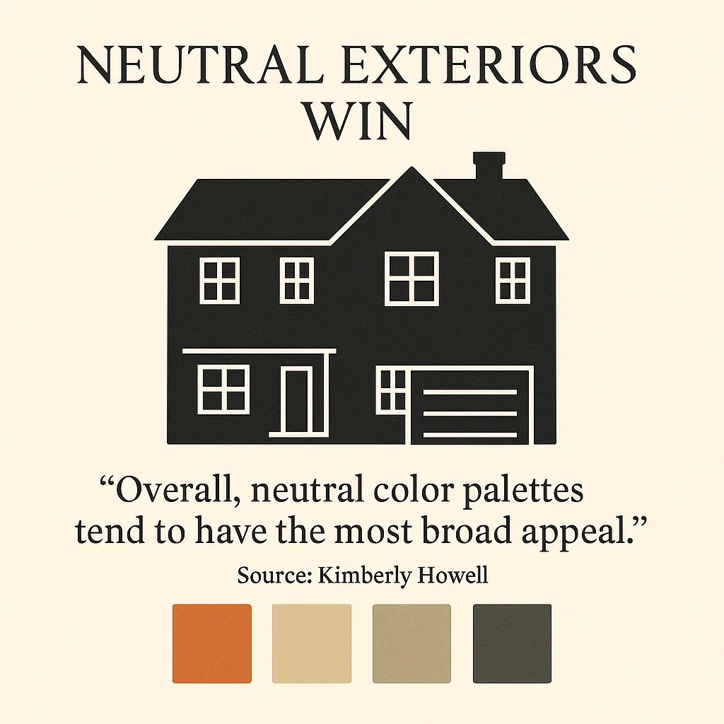
The exterior is where the "go neutral" rule does still mostly hold, but not for the reason the old articles say. The reason is statistical, not psychological. Zillow's broader analysis, which looked at more than 135,000 homes, found that white, beige, and greige exteriors tend to get the highest offers, with creamy yellows costing sellers around $3,400 on average. What buyers are actually rejecting isn't the color itself but the signal of "someone who will make the rest of my maintenance decisions this way."
The one worthwhile exception is the front door. A dark door - charcoal, navy, sometimes matte black - repeatedly outperforms a neutral door by a meaningful margin in the same research. A dark front door against a neutral facade is one of the very few places in residential real estate where a saturated color consistently increases offers rather than decreasing them, because it reads as considered rather than as a statement. Whenever a client asks where to spend a small exterior budget, I point at the door first.
There is also the problem of photography again. A neutral exterior shot at the wrong hour looks flat and institutional. A slightly saturated exterior shot at the right hour, with clean sky and warm low light, reads as aspirational. The same house. The same paint. Different photograph. Whoever is shooting the exterior needs to be at the property at sunrise or golden hour, not at the agent's preferred appointment time.
Color on the listing page itself
This is where my design studio sees most of the value leak out. A seller spends real money on paint, staging, photography, and retouching, and then the listing lives on a website that does one or more of the following. It strips the color profile during upload. It serves the image as aggressive WebP with a too-low quality setting. It renders the hero against a bright primary-color UI that fights the photograph. It wraps every image in a hard drop shadow that forces the eye away from the color decision.
A listing page should be the quietest surface on the internet. Neutral background. Generous white space. No competing brand color in the hero. The color of the property is the brand at that moment, not the agency's logo. I have built enough real estate sites to know that the single biggest lift from a rebuild is usually not speed or SEO; it is removing UI color that was competing with the listing imagery. If you work with me through DignuzDesign on a custom property site, this is usually the first thing I flag.
The same logic applies to interactive 3D. An interactive 3D viewer like AmplyViewer has to preserve color across every device it loads on, because the buyer is now actively walking through the space rather than glancing at a thumbnail. A color shift that a buyer forgives in a static image becomes obvious when they can move the camera. That's why AmplyViewer uses a calibrated render pipeline rather than a generic WebGL one. The product exists because too many property websites were killing the color work that the render studio and the photographer had already paid for.
Color in the wider marketing system
Color psychology in real estate does not end at the listing. The property's color world has to match the agency's color world, or both feel weaker. This is the part where most developer-led marketing breaks down. The brand system shows up in the logo, the signage, and the brochure, but not in the property photography, because those two pipelines are usually owned by different people. Buyers register the mismatch without being able to name it. They just feel that the agency and the listing don't belong to each other.
The fix isn't to force every listing into the brand's primary palette. It is to define a neutral base that agency materials and property photography can both live inside. A serious discussion of property developer brand identity starts here, not at the logo. The logo is the easy part. I've argued the same point in more detail in the guide on essential property marketing visuals and in the piece on luxury real estate visual marketing strategies, which cover how the same palette has to hold across printed collateral and screen.

Building a color system instead of following a recipe
Most color-psychology articles end with a room-by-room prescription. That is the part of the original I am happy to replace, because prescriptions rot. Shades that sold in 2019 don't sell now; shades that win in a Zillow survey don't necessarily win in a specific regional market. What holds up is the system. A short list of decisions, made in the right order, that produces the right color outcome regardless of which specific hex value is currently on trend.
- Decide the photographer and the paint palette in the same meeting, not in sequence, so the two halves of the color decision cannot drift apart.
- Pick one saturated anchor per priority room (living room, primary bedroom, kitchen) and keep the rest of the palette quiet, because buyers read a single considered choice as intentional and three as busy.
- Calibrate the listing site's hero and gallery background so the property imagery is the brightest, most saturated thing on the page, not the UI.
- Hold a neutral front-door contrast against the exterior facade, because it is the cheapest exterior color decision with the most consistent return.
- Define a single neutral base that both the agency's brand guidelines and the property photography have to live inside, so buyers feel the two belong to the same world.
- Audit every stage of the color chain - wall, camera, edit, website, 3D viewer - at least once per property, because the chain almost always breaks somewhere, and the break is usually invisible until a buyer has already scrolled past.
A seller or agency that runs through those six decisions will not need a separate color-psychology article next year. The specifics will shift; the system will not.
Frequently asked questions
Does paint color really change how much buyers offer on a home?
Yes, but less directly than most articles suggest. Zillow's behavioral-science work shows measurable differences of roughly $1,500 to $2,600 per room between well-chosen and poorly-chosen paint colors on identical homes. The effect is strongest when the color is consistent with the rest of the staging and the photography preserves it. A strong color choice captured badly performs worse than a neutral choice captured well.
What are the best interior colors to paint a house to sell?
Based on the 2025 Zillow survey, the current best performers are muted green for kitchen cabinetry, navy blue for primary bedrooms, and charcoal grey for living rooms. The caveat is that "best" means best-photographing and best-signalling-intention, not universally preferred. In some regional markets and for certain property types, a disciplined off-white still wins. The decision should be made with the photographer in the room, not from a paint chip alone.
Which exterior house colors sell best?
Neutral palettes - white, beige, greige, and light grey - consistently receive the highest offers in the large Zillow exterior analysis. The most reliable exception is the front door, where a darker charcoal, navy, or matte black door raises offers rather than lowers them. Creamy yellows and saturated reds on the main facade tend to cost sellers money on average.
Should I repaint before listing or use virtual staging?
Both can work; they solve different problems. Repainting works when the budget supports it and the timeline allows photography to catch the result under good light. Virtual staging and color-corrected 3D renders work when the property is occupied, the timeline is short, or the seller wants to present a design option rather than commit to it. The failure mode in both cases is the same: poor color fidelity between the intent and the final image a buyer sees. If you are using rendered or virtually staged content, the color pipeline matters more than the specific palette.
How does website design affect the color choices I made for the property?
More than most sellers expect. The listing site is where your paint, staging, and photography are finally shown to a buyer, and most real estate websites actively damage the color work. Compression that strips the color profile, UI colors that fight the hero image, and heavy drop shadows are the three most common offenders. A neutral, content-first layout with an uncompressed hero and a calibrated image pipeline preserves the color decisions you already paid for. The practical test is to open the listing on three devices and check whether the wall colors match.
Is it worth hiring a specialist for color consulting on a listing?
Usually only for the top end of the market, where a 1% lift on an €800,000 property comfortably covers the fee. For most sellers, the more valuable hire is a photographer and an editor who understand color management, because that is where the paint decision is most often lost. A good color consultant matters less than a good color chain.


