Real Estate Flyer Design: 15 Ideas That Generate Leads

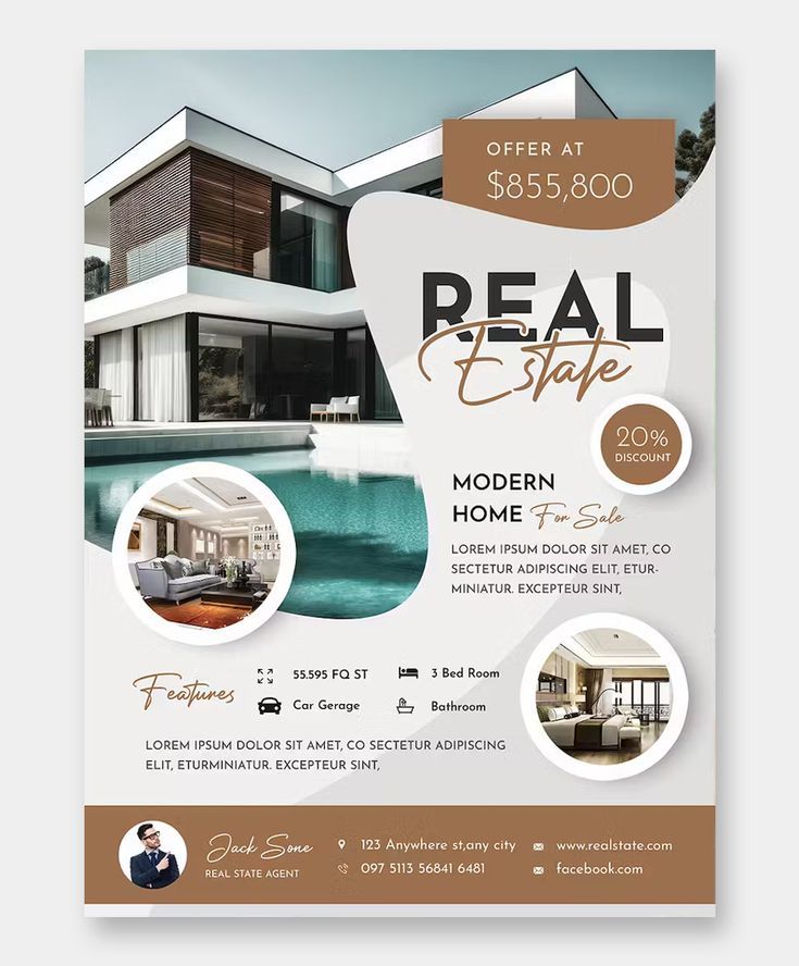
The best real estate flyer design idea starts with your strongest property photo taking up most of the page. That's it. Not fancy graphics, not clever wordplay, just one killer photo that makes someone stop scrolling or stop walking. Everything else supports that visual punch.
The best real estate flyer design idea starts with your strongest property photo taking up most of the page.
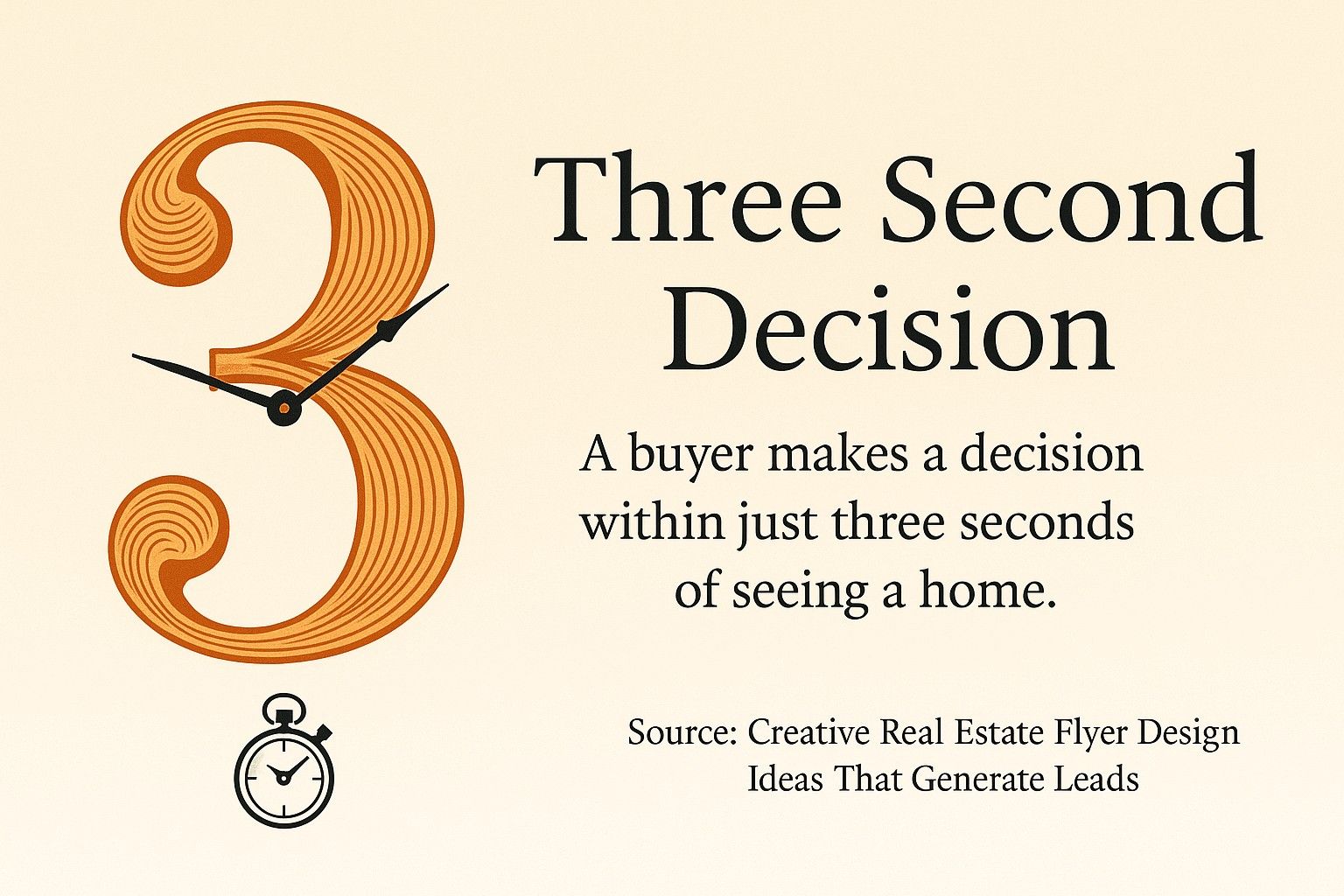
Real estate flyers work when they look good and communicate fast. Your potential buyers and sellers have three seconds to decide if your property is worth their time. A well-designed flyer bridges that gap between first glance and genuine interest.
Your potential buyers and sellers have three seconds to decide if your property is worth their time.
You'll learn how to create flyers that actually get results. We're covering design elements that matter, practical templates you can start using today, and mistakes that kill your response rates. Plus, we'll show you tools that make flyer creation simple, even if you've never designed anything before.
By the end, you'll know exactly how to structure your real estate marketing materials to stand out in mailboxes, on windshields, and in online listings. You'll have a clear action plan for creating professional flyers that generate calls and inquiries.
What Is a Real Estate Flyer and Why It Still Works
A real estate flyer is a single-page marketing document showcasing a property or promoting your services as an agent. It includes property photos, key details, and your contact information in a visually appealing layout.
Real estate flyers remain effective marketing tools when designed properly, combining visual appeal with strategic information presentation. They work because they're tangible, portable, and easy to share.
Flyers serve multiple purposes in your real estate marketing. They generate leads at open houses, provide takeaway materials for property tours, and create touchpoints with potential clients through direct mail campaigns.
The physical nature of flyers gives them staying power. Unlike digital ads that disappear with a scroll, a well-designed flyer sits on someone's counter or gets pinned to their bulletin board. It becomes a reference point they return to when they're ready to make a decision.
Digital distribution extends your reach even further. You can share PDF versions via email, post them on social media, or embed them in your website listings. The same design works across multiple channels, maximizing your investment.
Modern flyers integrate with your broader marketing strategy. Modern real estate marketing incorporates materials beyond traditional flyers, including graphics with striking images, charts, graphs, and maps that explain valuable information to target audiences.

Key Elements Every Effective Real Estate Flyer Design Needs
Great real estate flyer design starts with understanding what information buyers need most. Let's break down the essential components that make flyers convert browsers into qualified leads.
Professional Property Photography
Beautiful photography serves as the main feature of successful real estate flyers, with the best photo taking up the most space on the flyer. Your hero image should capture the property's most compelling feature.
Just like this template you could download and use yourself.
Choose exterior shots during golden hour for warm, inviting lighting. Interior photos should showcase spacious rooms with natural light streaming through windows. Avoid cluttered spaces or awkward angles that distort room dimensions.
Quality matters more than quantity on a single flyer. One stunning photo beats three mediocre ones every time. Your main image establishes the property's value proposition at first glance.
Multiple photos can be arranged on top of each other in a photo collage style to showcase several elements of the property in a single flyer. This approach works well for properties with multiple standout features.
When using photo collages, maintain visual hierarchy. Your primary photo should still dominate the layout, with supporting images providing context and additional selling points. Balance composition carefully to avoid overwhelming viewers.
Consider working with professional photographers who understand property marketing. The investment pays off in faster sales and higher perceived values.
Compelling Headlines and Property Information
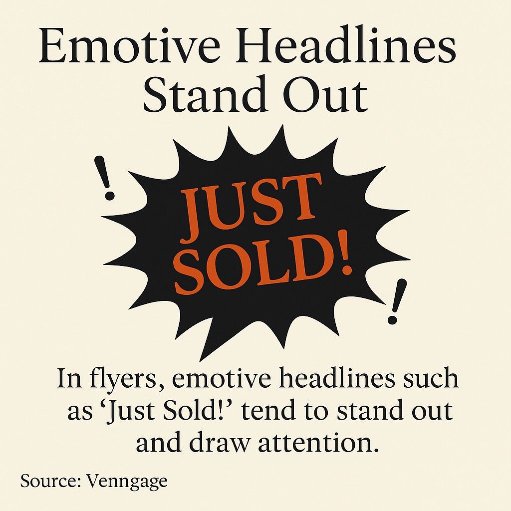
Your headline determines whether someone reads further or tosses your flyer. Emotive language in headlines grabs attention, with phrases like 'JUST SOLD!' accompanied by bold fonts, exclamation points, and colored background boxes helping headlines stand out against white backgrounds.
Emotive language in headlines grabs attention—think bold, punchy phrases like “JUST SOLD!”
Focus on the property's unique selling proposition. "Waterfront Luxury with Private Dock" works better than "Beautiful Home for Sale." Be specific and benefit-focused in your word choices.
Property details should be scannable and prioritized. Lead with information buyers care about most: bedrooms, bathrooms, square footage, and price. Secondary details like garage spaces and lot size come next.
Use bullet points or icon-based layouts for quick information processing. Buyers shouldn't have to hunt for basic facts. Group related information together logically.
Include a brief property description that highlights key amenities and recent upgrades. Keep it to 2-3 sentences maximum. Focus on differentiators rather than generic descriptions that could apply to any home.
Strategic Color Choices and Visual Hierarchy
Bold contrasting colors help make flyers pop and grab attention, with combinations like blue and yellow creating modern and stylish looks while maintaining professionalism. Your color palette communicates your brand personality instantly.
Check out this template as an example.
Stick to 2-3 main colors throughout your design. Too many colors create visual chaos and dilute your message. Choose one dominant color, one accent color, and use neutral tones for text and backgrounds.
Color psychology impacts buyer perception. Blue conveys trust and professionalism, green suggests growth and tranquility, while warm tones create feelings of comfort and energy. Understanding color psychology helps you connect emotionally with potential buyers.
Create visual hierarchy through size, color, and placement. Your most important information should be the largest and most prominently positioned. The eye naturally moves from top to bottom and left to right.
Use white space strategically to prevent cluttered designs. Empty space gives your content room to breathe and guides the viewer's attention to priority elements. Don't feel pressured to fill every inch of your flyer.
Clear Contact Information and Calls-to-Action
Your contact details need to be impossible to miss. Include your name, phone number, email, and website at minimum. Position this information where it's visible even if someone only glances at your flyer.
Create urgency with specific calls-to-action. "Call Today to Schedule Your Private Tour" outperforms generic "Contact Me" buttons. Tell potential clients exactly what step to take next.
QR codes bridge physical and digital marketing seamlessly. Link to virtual tours, property videos, or detailed listing pages. Test your QR codes before printing to ensure they work correctly.
Add your professional headshot and credentials to build trust. Highlighting realtor experience and credentials through visual elements helps differentiate agents in competitive markets.
Include your brokerage logo and licensing information where required. This builds credibility and ensures compliance with real estate advertising regulations in your area.
Icons and Graphic Elements
Icons serve as efficient tools to sum up large amounts of information in limited space, working as section headers or ways to group relevant information while making flyers more visual.
Icons efficiently summarize key property details in limited space, making flyers more visual.
Use icons to represent property features like number of bedrooms, bathrooms, garage spaces, and lot size. This creates an at-a-glance understanding of key details without reading dense text blocks.
Choose icon styles that match your overall design aesthetic. Modern properties pair well with minimalist line icons, while luxury listings might use more detailed, elegant icon designs.
Maintain consistency in icon sizing and styling throughout your flyer. Mixing different icon styles creates visual confusion and appears unprofessional. Stick to one icon family for cohesive design.
Types of Real Estate Flyers for Different Marketing Goals
Different flyer types serve distinct purposes in your marketing strategy. Choosing the right format for your goal increases your success rate significantly.
For Sale and Listing Flyers
For sale flyers focus entirely on a single property listing. They showcase the home's best features, provide comprehensive details, and create desire through compelling visual presentation.
These flyers work best for open houses, door-to-door distribution in the neighborhood, and as leave-behinds after property showings. They give potential buyers something tangible to reference later.
Include property address, listing price, key features, and multiple high-quality photos. Add neighborhood information and nearby amenities to provide context. Highlight recent renovations or unique selling points prominently.
Structure your layout to guide the eye from hero image to key details to contact information. Make the property address and price immediately visible. Use your brand colors consistently to build recognition.
Open House Announcement Flyers
Open house flyers prioritize event details over exhaustive property information. The goal is driving foot traffic to a specific date and time.
Feature the property's exterior prominently so people can identify it when they arrive. Include clear directions, parking information, and any special instructions for attendance.
Create urgency by emphasizing limited availability or unique showing opportunities. "Only Sunday Showing Before Offers Reviewed" generates better turnout than generic open house announcements.
Flyers can be delivered to doors, handed out at property fairs, open houses, or shopping malls where passers-by are most likely to engage. Target homes in the immediate neighborhood first.
Just Sold and Market Update Flyers
Just sold flyers establish you as the neighborhood expert. They demonstrate your ability to close deals and generate listing inquiries from neighbors considering selling.
Highlight the final sale price, days on market, and any notable achievements like selling over asking price. Keep specific property details minimal since the focus is your success as an agent.
Market update flyers position you as a trusted resource for real estate information. Include recent neighborhood sales data, average prices, and market trends affecting property values.
These educational flyers build long-term relationships with potential clients. They keep you top-of-mind when someone decides to buy or sell. Distribute them quarterly to maintain consistent visibility.
Agent Branding and Bio Flyers
Personal branding flyers introduce you to potential clients before they have a specific property need. They focus on your experience, specializations, and unique value proposition.
Include your professional photo, credentials, years of experience, and areas of expertise. Share your approach to client service and what makes working with you different from other agents.
Add testimonials from satisfied clients to build social proof. Recent sales achievements and market knowledge demonstrate your competence. Keep the tone professional yet approachable.
These flyers work well for farming specific neighborhoods, networking events, and community sponsorships. They create name recognition that pays off when someone needs real estate services.
15 Real Estate Flyer Design Ideas You Can Start Using Today
Let's look at specific design approaches that work across different property types and marketing situations. These ideas combine proven principles with creative execution.
Bold Typography with Minimal Design
Large, bold typography creates immediate impact. Use oversized text for the property address or key selling point, then keep everything else clean and minimal.
This approach works particularly well for modern properties or urban listings. The simplicity conveys sophistication and lets the property speak for itself through one powerful image and strategic text placement.
Choose sans-serif fonts for contemporary appeal. Keep your color palette restricted to black, white, and one accent color. Let white space dominate the layout.
Photo-Heavy Collage Layouts
Multiple property photos arranged in a grid or collage format tell a complete story. This design works when you have several equally compelling photos showcasing different property features.
Balance your photo sizes to create visual interest while maintaining order. Your strongest image should still be larger or more prominently placed than supporting photos.
This style suits properties with multiple standout features like pools, updated kitchens, and stunning views. Each photo provides another reason for potential buyers to schedule a showing.
Luxury Minimalist Design
High-end properties deserve elegant, understated designs. Use premium paper stock, subtle color palettes, and generous white space to convey luxury without shouting.
Incorporate refined typography with serif fonts or elegant script for accents. Keep information minimal and focus on the property's exclusivity and distinctive features.
Gold or silver foil accents on printed versions add tactile luxury. This investment signals that both the property and the agent operate at a premium level.
Neighborhood-Focused Designs
Include a small map showing the property's location relative to popular amenities, schools, and attractions. This context helps buyers visualize their daily life in the area.
Highlight neighborhood selling points like walkability scores, nearby parks, or top-rated school districts. This approach works especially well for family-focused marketing.
Use icons or small graphics to represent nearby amenities. Keep the map simple and easy to read at a glance. Focus on benefits that matter most to your target buyers.
Seasonal and Themed Designs
Align your flyer design with seasons or holidays for timely relevance. Spring flyers might feature fresh green accents and blooming garden photos, while winter designs emphasize cozy interiors and fireplaces.
Themed designs catch attention through unexpected creativity. Just ensure the theme enhances rather than distracts from your core message about the property.
Keep seasonal elements subtle enough that the flyer doesn't feel dated after a few weeks. Use seasonality to highlight property features that shine during that time of year.
Infographic-Style Data Presentation
Present property information and market data visually through charts, graphs, and icon-based statistics. This approach appeals to analytical buyers who want facts and figures.
Show price per square foot comparisons, appreciation trends, or energy efficiency ratings through simple graphics. Make data digestible and visually interesting.
This style positions you as a knowledgeable, data-driven professional. It works particularly well for investment properties or buyers relocating from other markets who need comprehensive information.
Before and After Renovation Showcases
For recently updated properties, side-by-side before and after photos demonstrate transformation and value. This approach helps buyers see the quality of renovations immediately.
List specific updates and investments made in the property. Buyers appreciate knowing what's new and what they won't need to replace soon after purchase.
This design works exceptionally well for flip properties or homes with significant recent improvements. It justifies asking prices and helps buyers understand where their money is going.

Lifestyle-Focused Imagery
Show the property in use rather than empty rooms. Stage photos with lifestyle elements that help buyers imagine themselves living there.
A dining table set for dinner, a cozy reading nook with a book and coffee, or a backyard set up for entertaining creates emotional connection. Buyers respond to aspirational lifestyle imagery.
This approach requires careful staging but generates stronger emotional responses than empty room photos. It transforms properties from houses into potential homes.
Bold Color Blocking
Use large blocks of solid color to create sections and visual interest. Overlay text on colored backgrounds or use color to highlight key information panels.
This modern design approach creates energy and draws attention in a stack of mail or on a bulletin board. Choose colors that complement your property photos rather than competing with them.
Ensure sufficient contrast between background colors and text for easy readability. Test your color choices at actual size before printing to verify they work as intended.
Transparent Overlay Designs
Layer semi-transparent colored overlays on photos with text placed on top. This technique creates depth while ensuring text remains readable against varied photo backgrounds.
Use your brand colors for overlay tints to maintain consistency. Adjust opacity so photos remain visible and attractive while providing enough contrast for clear text.
This sophisticated design approach works across property types and creates a polished, professional appearance that elevates your brand perception.
Icon-Based Quick Facts Sections
Create a dedicated section using icons to represent key property features. Line up bedroom, bathroom, garage, and square footage information with corresponding icons for instant comprehension.
This design element helps even viewers who only glance at your flyer walk away knowing basic property specifications. It reduces reading time and increases information retention.
Place this icon section prominently near the top or bottom of your flyer where it won't be missed. Use consistent sizing and spacing for a clean, organized look.
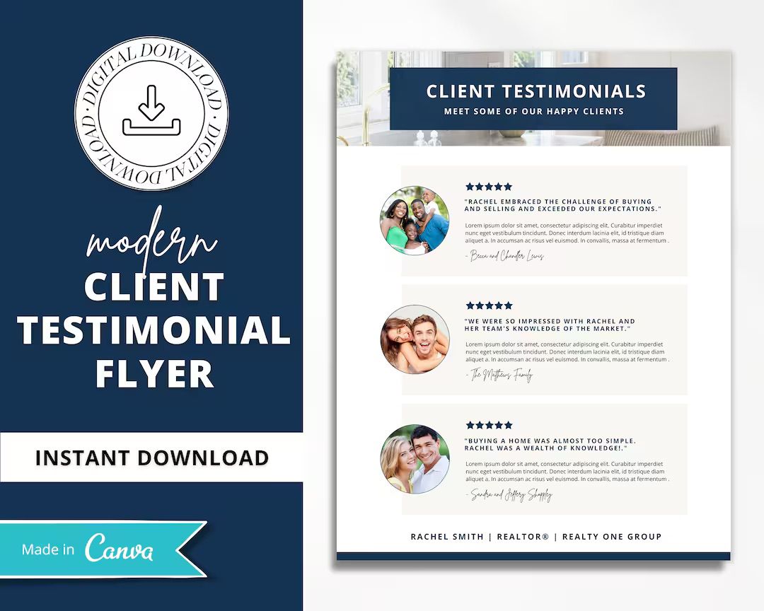
Testimonial-Featured Designs
Include a prominent client testimonial about your service quality. This builds trust and differentiates you from competitors focusing solely on property details.
Position testimonials in a distinct design element like a bordered box or shaded background. Include the client's first name and last initial for authenticity.
This approach works especially well for agent branding flyers or when you're trying to generate listings in a neighborhood. Social proof influences decision-making significantly.
QR Code Integration
Feature a large, prominent QR code that links to virtual tours, video walkthroughs, or additional property photos. This bridges print and digital marketing seamlessly.
Place your QR code where it's easily accessible and explain clearly what viewers will see when they scan. "Scan for 3D Virtual Tour" generates more engagement than an unlabeled code.
Test QR codes thoroughly before printing. Ensure they link to mobile-optimized content since most people will scan with their phones. Digital innovations such as 3D panoramas, aerial views, and floor plans on websites provide immersive property experiences that complement physical marketing materials.
Luxury Letterpress Style
Emulate the look of letterpress printing with textured backgrounds and embossed-looking typography. This creates perceived quality and exclusivity for high-end listings.
Use subtle textures and shadows to create dimension. Choose classic, timeless fonts that suggest refinement and established quality rather than trendy design.
This style signals that both the property and agent operate at a premium level. It stands out from standard printed flyers through elevated design sophistication.
Geometric Pattern Accents
Incorporate modern geometric patterns as background elements or section dividers. Triangles, hexagons, or abstract shapes add visual interest without overwhelming your content.
Keep patterns subtle and use them to direct attention rather than distract. They should enhance your hierarchy and guide viewers through your information flow.
This contemporary approach appeals to younger buyers and works particularly well for modern or newly constructed properties. It creates energy and sophistication simultaneously.
Tips for Creating Eye-Catching Real Estate Flyers That Convert
Knowing design ideas helps, but execution determines results. Let's focus on practical implementation strategies that improve your flyer performance.
Start with Your Best Photo
Before writing copy or choosing colors, select your hero image. This photo drives every other design decision and determines your flyer's overall impact.
Test potential photos by viewing them at actual size. What looks good on your computer screen might lack impact when printed at flyer dimensions. Choose images with clear focal points and strong composition.
If you don't have a photo worthy of dominating your flyer, delay distribution until you do. Quality visual representation determines whether potential buyers engage with your property marketing.
Write Copy That Sells Benefits, Not Features
Transform features into benefits that resonate emotionally. "4 bedrooms" becomes "Room for everyone to spread out." "Updated kitchen" becomes "Host dinner parties in this chef-inspired space."
Focus on lifestyle outcomes rather than specifications. Help potential buyers visualize their life in the property through benefit-focused language that creates desire.
Effective messaging connects emotionally with buyers by addressing their specific needs and aspirations. Understand your target buyer and write directly to their priorities.
Maintain Brand Consistency Across All Materials
Your flyers should be instantly recognizable as yours. Use consistent colors, fonts, and layout approaches across all your marketing materials to build brand recognition.
Create templates that maintain your visual identity while allowing customization for different properties. This efficiency saves time while ensuring professional consistency.
A cohesive visual identity attracts your ideal clients and differentiates you in competitive markets. Your design choices communicate your market positioning and expertise level.
Test Print Quality Before Bulk Printing
Always print test copies before ordering hundreds of flyers. Colors appear different on screen versus paper, and minor design issues become obvious at actual size.
Check photo resolution and sharpness, text readability, and overall visual balance. Hold your test print at arm's length to see how it appears at first glance.
Invest in quality paper stock that feels substantial. Flimsy paper communicates low quality and gets discarded immediately. Premium paper stock suggests premium service and properties.
Optimize for Both Print and Digital Distribution
Design flyers that work equally well on screen and in print. Ensure text remains readable at various sizes and that your color choices translate well to digital displays.
Create high-resolution PDF versions for email distribution and social media sharing. Your digital flyers should download quickly while maintaining visual quality.
Consider creating slightly different versions optimized for each medium. Print versions might use full-bleed photos, while digital versions might include clickable links and embedded video.
Resolution
- Print Optimization: 300 DPI minimum for sharp printing
- Digital Optimization: 72-150 DPI sufficient for screen viewing
Color Mode
- Print Optimization: CMYK for accurate color reproduction
- Digital Optimization: RGB for vibrant screen colors
File Format
- Print Optimization: PDF with bleed for professional printing
- Digital Optimization: PDF or JPG for easy sharing and viewing
Interactive Elements
- Print Optimization: QR codes bridge to digital content
- Digital Optimization: Clickable links, embedded videos possible
Paper Stock
- Print Optimization: Heavyweight glossy or matte for quality feel
- Digital Optimization: Not applicable, focus on file size
Include Multiple Contact Methods
Different people prefer different communication channels. Provide phone, email, website, and social media options so potential clients can reach you however they're most comfortable.
Make your phone number the most prominent contact element. Many people still prefer calling directly, especially for time-sensitive property questions.
Ensure your website is mobile-optimized since most people will visit after seeing your flyer on their phone. A poor mobile experience wastes the interest your flyer generated.
Best Tools and Platforms for Creating Professional Real Estate Flyers
The right tools make flyer creation faster and more professional. Let's examine platforms that balance ease of use with design quality.
Canva for Quick Customization
Canva offers thousands of real estate flyer templates you can customize without design experience. The drag-and-drop interface makes creating professional flyers accessible to everyone.
Start with a template that matches your property type and style, then swap photos, update text, and adjust colors to match your branding. The platform includes stock photos if you need supplementary images.
Canva's free version provides solid functionality, while paid plans unlock additional templates, fonts, and design elements. You can save brand kits with your colors, fonts, and logos for consistent designs.
Export high-resolution PDFs suitable for professional printing or optimized JPGs for digital distribution. The platform makes it easy to create multiple versions of your flyer quickly.
Adobe Express for Designer-Quality Results
Adobe Express provides more advanced design tools while remaining user-friendly. It bridges the gap between simple template tools and professional design software.
Access Adobe Stock photos and graphics directly within your design workflow. The platform includes intelligent resizing tools that adapt your flyer design for different formats automatically.
Integration with other Adobe products allows seamless workflow if you already use Photoshop or Illustrator. However, Express works well as a standalone tool without requiring additional software.
PosterMyWall for Print-Ready Designs
PosterMyWall specializes in flyers and print marketing materials. The platform offers extensive real estate templates specifically designed for property marketing.
The interface focuses on real estate-specific needs like property feature layouts and market update formats. Templates include properly formatted contact information sections and license number placements.
Built-in printing services mean you can design and order printed flyers without leaving the platform. This streamlines production and ensures your designs print correctly.
Microsoft Publisher for Template Consistency
Microsoft Publisher works well if you prefer desktop software and need consistent template management. It provides precise control over layout and formatting.
Create master templates with locked brand elements and editable content areas. This approach ensures brand consistency while allowing quick customization for different properties.
Publisher integrates smoothly with other Microsoft Office tools you likely already use. You can import data from Excel for market update flyers or mail merge for personalized distribution.
Lucidpress for Team Collaboration
Lucidpress excels for brokerages with multiple agents sharing brand templates. The platform enables brand control while allowing individual customization.
Administrators can lock brand elements like logos, colors, and fonts while giving agents freedom to add their own photos and property information. This maintains consistent brand presentation across your team.
Cloud-based collaboration means multiple team members can work on flyer designs and approve final versions before printing. Version control prevents outdated materials from being distributed.
Professional Design Services
For luxury listings or when you need truly custom designs, working with professional designers delivers superior results. This investment makes sense for high-value properties where presentation directly impacts sale price.
Dignuz Design specializes in real estate visual marketing, creating custom flyers that align with your overall brand identity and property positioning.
Professional designers understand layout principles, typography, and visual hierarchy at a level that produces markedly better results than template customization. The expertise shows in final execution quality.
Consider professional design for establishing your brand identity and creating master templates. Once you have solid templates, you can customize them yourself for individual properties while maintaining professional quality.
Real Estate Flyer Design Mistakes That Kill Your Results
Knowing what not to do prevents wasted time and money. Let's identify common mistakes that sabotage otherwise decent flyers.
Cluttered Layouts with Too Much Information
Trying to include everything results in flyers that communicate nothing effectively. Dense text blocks and cramped layouts get ignored immediately.
Prioritize ruthlessly. Include only information that moves potential buyers toward contacting you. Everything else is noise that dilutes your message.
Use white space generously to create breathing room around important elements. Empty space isn't wasted space, it guides attention and improves comprehension.
Low-Quality or Poorly Lit Photos
Blurry photos, poor lighting, or unflattering angles destroy your flyer's credibility instantly. Bad photos suggest either the property isn't worth photographing properly or you don't care about quality presentation.
Never use photos taken with wide-angle phone cameras that distort room proportions. Invest in proper real estate photography or learn to shoot properties correctly yourself.
Lighting makes or breaks property photos. Avoid harsh shadows, overexposed windows, and dim interiors. Professional photographers use proper lighting equipment and techniques to showcase properties optimally.
Fonts That Are Too Small or Hard to Read
If someone needs reading glasses to see your contact information, you've lost them. Use minimum 10-point font sizes for body text and larger sizes for headlines and key details.
Choose legible font families over decorative options. Script fonts might look elegant but become illegible at smaller sizes or when printed on textured paper.
Ensure sufficient contrast between text and background colors. Light gray text on white backgrounds or dark text on dark photos forces readers to squint and strain.
Missing or Buried Contact Information
Your contact details need prominent placement regardless of design style. Potential clients shouldn't have to search for how to reach you.
Include contact information in at least two places on your flyer. Put it prominently near the top and again at the bottom so it's visible however someone handles your flyer.
Make phone numbers large enough to dial while holding the flyer in one hand. Test this yourself before finalizing designs.
Inconsistent Branding Across Materials
Using different color schemes, logos, or design styles across your marketing materials confuses potential clients and weakens brand recognition.
Establish clear brand guidelines and stick to them consistently. Your flyers should be immediately recognizable as yours through consistent visual identity.
This consistency builds trust over time. When potential clients see your materials repeatedly with consistent professional presentation, you become the obvious choice when they need real estate services.
Failing to Proofread Before Printing
Typos, incorrect prices, or wrong contact information make you look careless and unprofessional. These mistakes are permanent once printed and distributed.
Create a checklist of critical information to verify before printing: property address, price, bedroom/bathroom counts, square footage, your contact details, and license numbers.
Have someone else review your flyer before printing. Fresh eyes catch mistakes you've looked at too many times to see clearly.
Cluttered layout
- Impact on Results: Viewers can't identify key information quickly
- Quick Fix: Remove 30% of content and increase white space
Poor photo quality
- Impact on Results: Property appears less valuable and desirable
- Quick Fix: Hire professional photographer or reshoot with proper equipment
Small or decorative fonts
- Impact on Results: Information becomes inaccessible to many viewers
- Quick Fix: Use minimum 10pt simple fonts with high contrast
Hidden contact info
- Impact on Results: Interested buyers can't reach you easily
- Quick Fix: Place contact details prominently in multiple locations
Inconsistent branding
- Impact on Results: Weakens recognition and professional perception
- Quick Fix: Create brand guidelines and stick to them religiously
How to Distribute Your Real Estate Flyers for Maximum Impact
Even perfectly designed flyers fail if they don't reach your target audience. Strategic distribution multiplies your marketing effectiveness.
Neighborhood Farming with Direct Distribution
Target specific neighborhoods where you want to build market presence. Flyers can be delivered to doors, handed out at property fairs, open houses, or shopping malls where passers-by are most likely to engage.
Focus on homes within a few blocks of your listings. Neighbors often know people looking to move into the area or are themselves considering selling.
Create a consistent distribution schedule rather than sporadic campaigns. Monthly touches build familiarity and position you as the neighborhood expert over time.
Open House and Property Showing Distribution
Make flyers available at every open house and showing. Place them prominently near the entrance where visitors can grab them easily.
Encourage visitors to take multiple copies to share with friends or family who might be interested. Word-of-mouth referrals from satisfied visitors expand your reach exponentially.
Follow up open houses by distributing "Just Sold" flyers to the surrounding neighborhood. This demonstrates your ability to close deals and generates listing inquiries.
Strategic Placement in High-Traffic Locations
Build relationships with local businesses willing to display your flyers. Coffee shops, grocery stores, and community centers provide access to potential clients in casual environments.
Refresh flyers regularly so displays don't look stale or outdated. Weekly checks ensure your materials stay current and well-stocked.
Target locations where your ideal clients spend time. Luxury listings might be displayed at high-end restaurants or boutiques, while family homes work well at children's activity centers.
Digital Distribution Through Email and Social Media
Email high-quality PDF versions to your database of contacts. Segment your list so people receive flyers relevant to their interests and needs.
Share flyers on social media platforms where your target buyers are active. Facebook, Instagram, and LinkedIn each serve different audiences and require adapted posting strategies.
Optimize flyer images for each platform's ideal dimensions and format requirements. What works well on Instagram stories might need adjustment for Facebook news feeds.
Encourage sharing by making your digital flyers easy to forward or post. Clear, compelling content gets shared naturally when it provides value to viewers' networks.
Integration with Broader Marketing Strategy
Flyers work best as part of coordinated multi-channel marketing campaigns. Use them alongside digital advertising, email marketing, and content marketing for maximum impact.
Successful real estate marketing combines multiple tactics that reinforce each other. Your flyers should align with your overall brand message and campaign goals.
Track which distribution methods generate the most responses. Ask callers how they heard about the property and adjust your distribution strategy based on results.

Quick Answers to Common Flyer Design Questions
What are 5 elements you must use to design a flyer?
Five essential elements for designing a flyer are a compelling headline, high-quality images, concise and clear text, brand colors and logos, and a strong call-to-action. These components ensure your flyer attracts attention, communicates key information, and prompts readers to take the desired next step.
How do I make my real estate flyers stand out?
Start with your strongest property photo taking up most of the space. Use bold contrasting colors that match your brand, keep text minimal and benefit-focused, and include clear calls-to-action. Quality paper stock and professional printing also differentiate your flyers from competitors using standard materials.
Should I include pricing on my real estate flyers?
Yes, include pricing on listing flyers to attract serious, qualified buyers. Hiding prices creates unnecessary friction and wastes time on unqualified inquiries. Be transparent about what properties cost so interested parties can self-qualify before contacting you.
Your Next Steps for Better Real Estate Flyers
You now have the framework for creating real estate flyers that actually generate leads. The difference between flyers that work and flyers that get tossed comes down to intentional design choices.
Start by auditing your current flyers against the principles we covered. Identify one element you can improve immediately, whether that's upgrading your property photos, simplifying your layout, or strengthening your headline.
Choose one of the design tools we discussed and create a template that reflects your brand identity. Having a solid template makes producing new flyers for each listing faster and more consistent.
Test different distribution channels to identify what works best in your market. Track responses from each method and double down on whatever generates the most qualified leads.
Quality beats quantity every time. One well-designed, strategically distributed flyer outperforms hundreds of mediocre ones. Invest your time in getting the fundamentals right, and your results will reflect that commitment.