Real Estate Graphic Design That Sells Property
Most articles about real estate graphic design treat it as a matter of taste. Pick the right fonts, respect white space, stay consistent. That advice is not wrong, but it misses the point. Graphic design in property marketing has one job that is different from almost every other commercial design discipline. It has to close the distance between a buyer and a physical place they have never visited, across half a dozen different channels, without breaking the thread.
I am Dimitri. I spend my days building the output side of this problem. My studio, DignuzDesign, builds custom websites for property developers, architects and estate agencies. From that vantage point, the thing I see fail most often is not bad typography or clashing colors. It is a beautifully designed brochure that looks nothing like the website, a hero image that cannot survive being cropped to a social tile, and a brand system that lives in a PDF and nowhere else. That is the real subject of real estate graphic design, and almost no one writes about it that way.
Photography Is Still The Raw Material, And The Numbers Say So
Before any of the design craft matters, you need images that carry weight. This is the unglamorous part, and it is the one place where the data is unambiguous. Redfin's listings study on professional photography compared homes shot with professional DSLR cameras against homes shot on point-and-shoot or phone cameras across 22 major markets. In the $400,000 to $499,000 band, professionally photographed homes sold for an average of $11,200 more relative to their list price, and they moved 21 days faster on the market. Across the $200,000 to $1 million spectrum, the premium held between $3,400 and $11,200. More strikingly, homes with the sharpest 10% of listing photos sold at or above their list price 44% of the time, against only 13% for homes with average sharpness.
Translate that into developer language. Two identical units, same floor, same specification, priced identically on the portal, but one of them has photos shot at 24mm with proper window pull and color balance, and the other has phone shots with blown-out windows. The better-photographed unit will sell faster and leave less money on the table. This is not a stylistic preference. It is a line item.
The practical implication for design is that photography is not the deliverable. It is the material. If you commission twelve interior photographs and a drone shot, everything downstream (the brochure, the listing page, the Instagram grid, the emailer, the PPC creative) is cut from that fabric. If the fabric is cheap, no amount of clever layout rescues it. I have turned away projects where the developer wanted a premium website built around a folder of phone-shot construction updates. There is no graphic design move that makes that work.
For practitioners who want to go deeper on the shoot itself, our real estate photography tips post covers the settings, lens choices and shot lists we actually use on site.
The Shift From Static Images To Interactive Media Is Already Here
Photography will always be the baseline that you cannot skip. But the buyer has moved. The National Association of Realtors 2024 Profile of Home Buyers and Sellers reports that 52% of buyers found their home online and 70% searched on a mobile or tablet device. Since the pandemic, the same research group found that listing photos (58% more important), virtual tours (45% more important) and videos (43% more important) have all climbed in perceived value among sellers' agents. Zillow's 2024 Consumer Housing Trends data sharpens this further: 71% of sellers now say they are more likely to hire an agent who offers virtual tours and interactive floor plans, and 64% consider a virtual tour very or extremely important for their listing.
What this does to graphic design is important and often overlooked. The centre of gravity has moved from static, art-directed images to moving, explorable media. A photograph freezes a perspective that the designer chose. An interactive 3D viewer or virtual tour hands that choice to the buyer. That changes the design problem in a way that most generic design advice has not caught up with.
Static compositions still need to work hard for the moments a buyer is scrolling, but the money shots, the ones that actually close the emotional gap, are increasingly the ones the buyer controls. I see this most clearly on off-plan developments where there is no building to photograph yet. Our real estate 3D rendering work produces the stills, but the ones that reliably convert are the immersive 3D experiences where a buyer can walk from the kitchen to the terrace, rotate the view, and look up to see how the light falls in the afternoon. AmplyViewer is built specifically to drop that kind of interaction into a listing page without requiring a separate platform.
If your graphic design system treats the website as a catalogue of photos rather than a frame for interactive media, you are designing for the buyer of 2015.
Visual Hierarchy On A Property Listing Is Not The Same As On A Poster
Most generic design advice about visual hierarchy and F-patterns applies loosely to real estate, but it misses the specific problem a listing page solves. A buyer looking at a listing is making a two-step decision in quick succession. First, does this property match my brief on the obvious criteria (price, location, bedrooms, floor area). Second, is there something about it that makes me want to spend more time here than I did on the other twenty tabs I have open.
The design craft is to answer the first question in under three seconds and earn the second one. That means the price, the area, the bed count, and the primary image have to be resolved the instant the page loads. Everything else (floor plan, amenities, school information, service charge breakdown, finish schedule) can be layered in below the fold or behind a scroll trigger. I see developer sites regularly get this wrong by hiding the price two sections down because they believe it will force the buyer to engage with the story first. It does not. It makes them bounce.
The second half, the part that earns time on page, is where real graphic design earns its fee. Our guide to property listing design best practices breaks down the specific components, but the principle is simple. Once the buyer has confirmed the basics, they want to feel the space. That is where full-bleed imagery, a clean floor plan, and an interactive viewer outperform a bullet list of features every time. A table of amenities is information. A photograph of the morning light hitting the kitchen counter is a reason to keep scrolling.
On mobile, the hierarchy compresses and the rules change again. The hero image has to survive a portrait crop, the price and the primary call to action have to stay visible in the thumb zone, and every tap to reveal more information is a moment when you can lose the buyer. The real estate web page design conversion guide goes deeper on the conversion-layer decisions that follow from this.
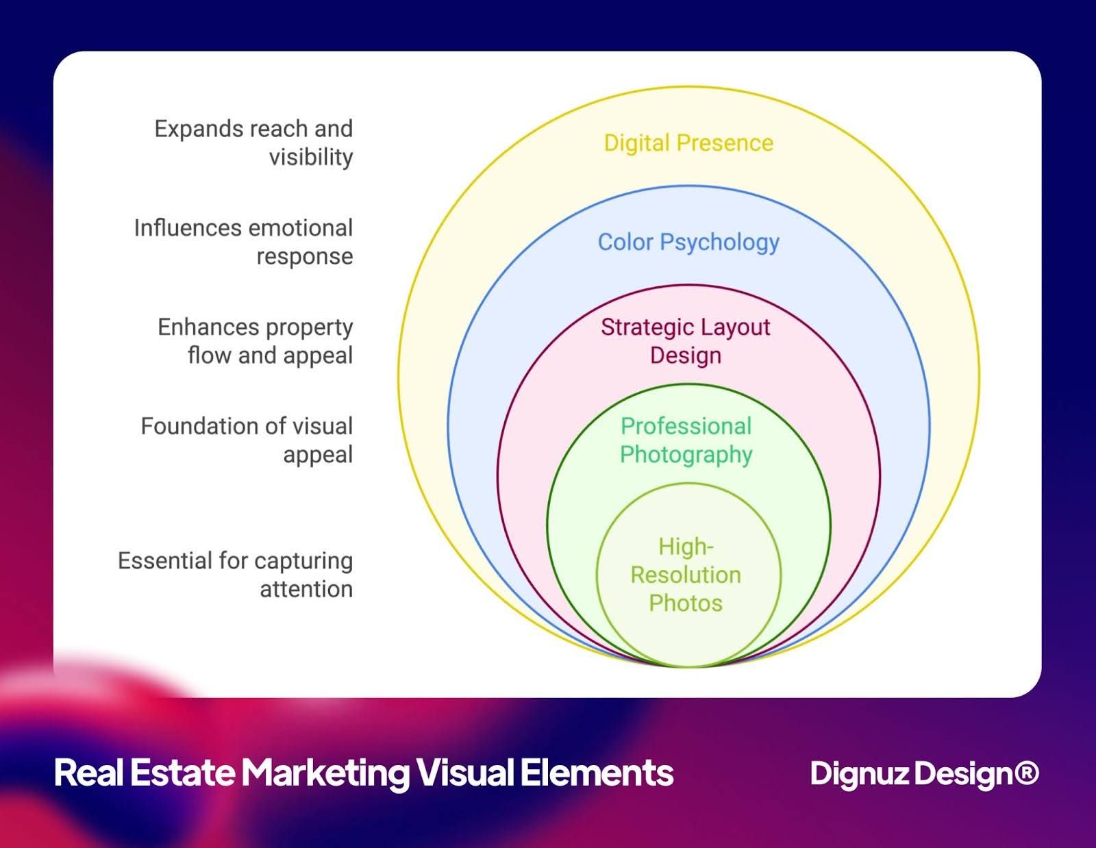
Color And Typography Have To Match The Property, Not The Designer
The most common graphic design failure I see in property marketing is a mismatch between the visual tone and the asset being sold. Luxury developments dressed in the same warm, friendly type system as a first-time buyer scheme. Modernist towers rendered in serif typography lifted from a heritage estate agent's rebrand. Family homes buried under oversaturated teal and orange because the designer wanted to make the brochure "pop".
Color and typography in property marketing are not decorative choices. They signal price bracket, buyer archetype, and the developer's confidence in the asset. Soft, tonal palettes with generous white space and a restrained serif signal that the developer is not trying too hard because the property speaks for itself. High-contrast, saturated layouts with heavy sans-serif weights signal something cheaper and louder, which is fine if that is what you are selling, and a disaster if it is not. For anyone working at the top of the market specifically, our piece on luxury real estate marketing unpacks the positioning decisions in more detail.
There is also a practical side that generic design blogs skip. Color accessibility matters on property marketing because a meaningful share of the buyer base is over 55, and the NAR data shows first-time buyer share at a historic low. If your call to action button has a 3.2:1 contrast ratio against its background, a non-trivial portion of your audience literally cannot read it. The 4.5:1 minimum contrast ratio for body text under the WCAG guidelines is not a compliance checkbox. It is a conversion floor. For deeper reading on how color choices interact with buyer psychology specifically, our real estate color psychology article covers the ground more thoroughly than I can here.
Typography follows the same logic. Two font families is a sensible default, but the specific choice matters more than the count. A luxury development using a neutral geometric sans is a missed opportunity. A family home using a Didone display typeface is a communication failure. Match the typography to the asset, not to whatever is on the designer's current moodboard.
The Real Craft Is Building A Visual System, Not A Set Of Assets
This is the part of real estate graphic design that almost never gets written about, and it is the part that matters most. A property marketing project is not one deliverable. It is a visual system that has to survive across channels, and the channels have different rules.
Think about what a buyer touches in a typical purchase journey. The portal listing on Rightmove or Zillow, which you do not control. The developer's website, which you do. The printed brochure. The social media tile. The email newsletter. The virtual tour. The printed hoarding at the site itself. Most of these have different aspect ratios, different typographic constraints, different color gamuts, and different levels of interactivity. A brochure spread can breathe across an A3 opening. An Instagram tile cannot. A website hero can use video and motion. A printed brochure cannot. A portal listing strips out your typography entirely and replaces it with the portal's own.
Graphic design craft at the property marketing level is the discipline of building a system that holds its identity across all of these without forcing any single channel to compromise. That requires, in practice, a color palette that survives print-to-screen conversion, a typographic system with enough flexibility to handle both a 24-point brochure headline and a 14-point email subject line, a photo treatment that is consistent enough to be recognisable, and a set of component patterns (captions, callouts, pull quotes, data tiles) that compose the same way regardless of format.
This is essentially brand system work applied to property. Our property developer brand identity guide sets out how we approach it with clients, from moodboard through to live production files. The mistake most marketing teams make is to treat the brochure as the master deliverable and everything else as a downgrade. In a mobile-first buyer journey, that is exactly backwards. The website and the social system are the masters. The brochure is a format of convenience, not the source of truth.
Where I See Real Estate Graphic Design Fail Most Often In Practice
A few patterns I have seen repeatedly, both in client projects and in reviewing competitor work.
The brochure and the website are designed by different agencies, and they do not share assets, fonts, or a color pipeline. The buyer downloads a gorgeous brochure and then lands on a website that feels like a different company. Trust leaks immediately.
The 3D renders are commissioned before the brand guidelines are locked, so every render uses a different time of day, sky treatment, and material palette. The resulting marketing set feels like a collage rather than a composition.
Social templates are built once and then reused for eighteen months without variation. By month four, every post looks like every other post, and engagement collapses because the feed trains viewers to scroll past the developer's grid.
Mobile design is treated as an afterthought rather than the primary surface. The website renders beautifully on a 27-inch monitor at the agency office and is borderline unusable on an iPhone held in landscape on a train.
The virtual tour lives on a separate subdomain with a different visual style, a different navigation pattern, and no clear way back to the listing. Buyers enter, and never return to the funnel.
Each of these is a graphic design problem at root. But none of them will be caught by a designer who treats a single layout as the deliverable. They are caught only by designers who treat the whole system as the deliverable.
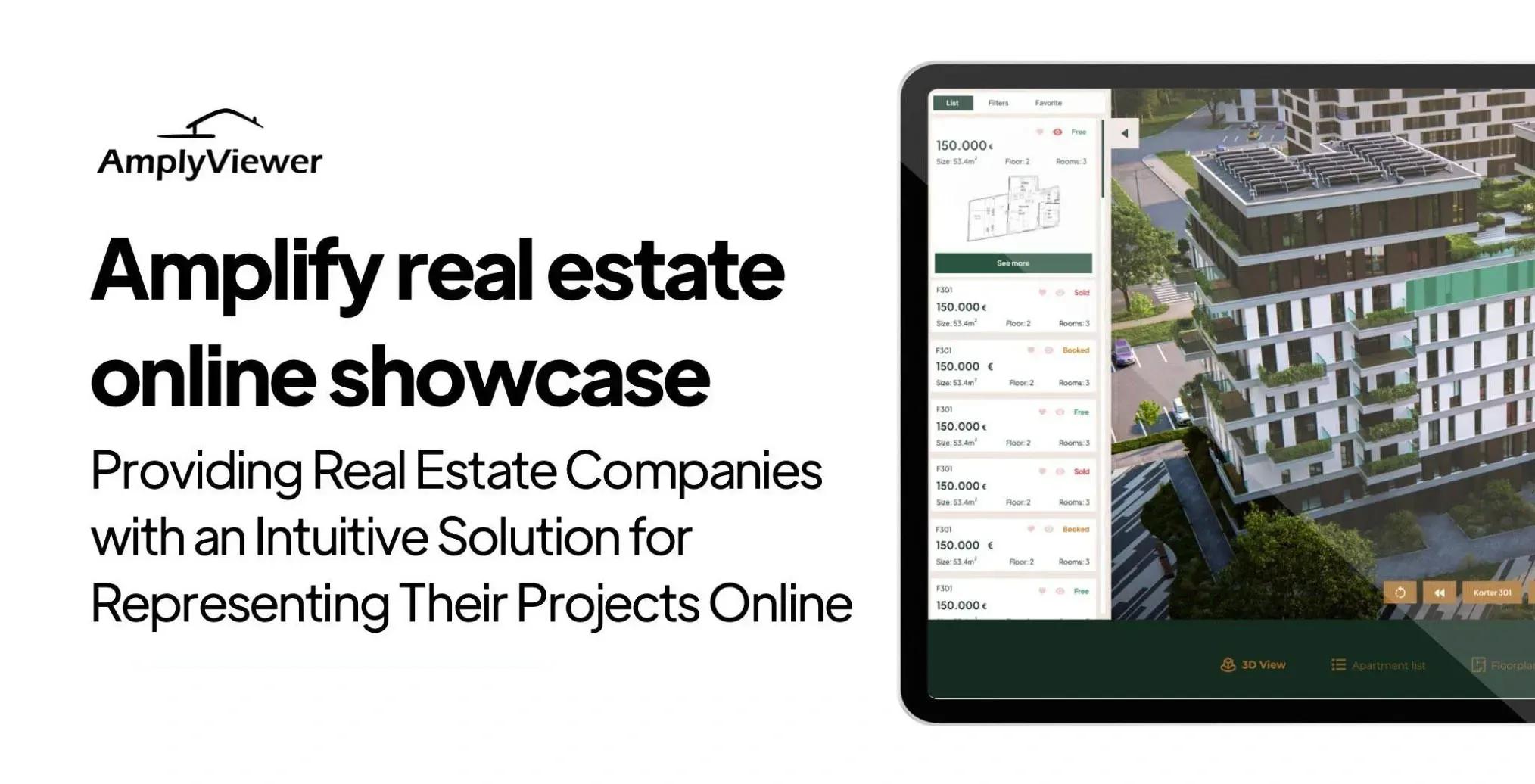
💻 Let us help you create a stunning online showcase for your projects that works seamlessly across all devices. Ready to amplify your real estate business? 👉 Explore AmplyViewer now
Frequently Asked Questions
How much should a property developer budget for graphic design on a new scheme?
For a mid-sized residential scheme, the combined graphic design and visual content budget typically runs between 0.3% and 0.8% of gross development value, depending on positioning. That includes brand identity, brochure, website, social templates, photography, renders and the virtual tour. Luxury and resort developments often push above 1%. Anything below 0.2% is usually false economy, because the scheme will sell more slowly and leave money on the table, as the Redfin data on professional photography alone already suggests.
Is generic graphic design software like Canva good enough for real estate marketing?
For an individual agent producing a handful of listings per month, yes, with serious caveats about photography and brand consistency. For a developer running a multi-phase scheme across brochure, website, site hoardings and 3D content, no. The limitation is not the software itself but the ceiling on craft it encourages. Template-based tools optimise for speed, not for the integrated visual system a property development actually needs.
What is more important for a listing, professional photography or a 3D virtual tour?
Photography is the baseline you cannot skip. The virtual tour is the accelerator that closes the distance from shortlist to viewing request. If the budget forces a choice, shoot properly first. If both are in budget, the combination has compounding value, because the tour pulls the buyer deeper once the photos have earned the click.
How important is the brochure versus the website for property marketing now?
For most developers, the website is the primary surface and the brochure is a supporting artefact, not the other way around. The NAR data shows 52% of buyers found their home online and 70% used mobile. A PDF brochure that never gets opened on a phone is a legacy deliverable. A website that does not hold up on mobile is a lost sale.
Do interactive 3D tours work for existing resale homes, or only for new builds?
Both, but the economics differ. For off-plan developments, 3D is essential because there is nothing to photograph. For resale, a 3D tour or walkthrough adds enough qualifying information that viewings come in more committed, which is where the seller saves time and where the agent sees a higher conversion per viewing. The Zillow data on seller preference for virtual tours applies to both segments.
Why do so many property marketing campaigns look the same?
Because most are assembled from the same stock template libraries, the same drone-shot openers, and the same set of sans-serif headlines with a white drop shadow. The design brief is often written as a shopping list of deliverables rather than a point of view on the property. The campaigns that stand out usually start with a clear positioning decision, not a moodboard.


