Real Estate Website Features Buyers Actually Use
Most articles about real estate website features are constructed in the same way. Someone opens a few competitor sites, lists the features they have in common, attaches a borrowed statistic to each one, and calls it a checklist. The result is a long, evenly weighted list where IDX search, drone photography, AI chatbots, and saved searches all appear as equally critical. Read enough of these and you start to believe that a property website is a feature inventory, and that adding more boxes to that inventory will produce more leads.
It does not work that way. I have built and rebuilt enough real estate websites to know that a handful of features carry the entire buyer experience, and the rest is decorative. The features that carry the experience are not always the ones that look most impressive in a sales pitch. They are the ones that match how property buyers actually move through a long, slow, repeatedly-paused decision. I am Dimitri. I run DignuzDesign, a small studio that builds custom property websites for developers, agents, and architects, and Faraday3D, the visualization studio that produces the renders, walkthroughs, and animations those websites depend on. The view from inside both workflows is what this article is built on.
Start From What Buyers Actually Open
Any serious conversation about real estate website features should begin with what property buyers do when they land on a listing, and not with what agencies imagine they do. The National Association of Realtors profile of home buyers and sellers consistently shows the same picture year after year. Every buyer in the survey uses the internet during their search. The three pieces of content they rate as most valuable on a property website are photos, detailed property information, and floor plans, in that order. Everything else - mortgage calculators, neighbourhood guides, market data widgets, agent bios - sits below those three by a meaningful margin.
This single finding is what most real estate website builds get wrong. Budgets are spread evenly across the feature list, and the three things buyers actually open get the same attention as the chatbot, the newsletter modal, and the financing calculator. The result is a site where the headline assets are mediocre because everything else demanded a slice of the budget. The fix is uncomfortable to recommend because it sounds like underbuilding. It is not. It is matching investment to where buyer attention actually lands. Photography, written property descriptions, and floor plans deserve disproportionate investment. The rest deserves whatever is left.
The Listing Page Is The Real Product
The next thing most feature articles get wrong is treating the homepage as the centre of the website. For a property portal, the homepage is the entry point. For an agency or developer site, almost every qualified visitor lands directly on a listing page from a portal referral, a search result, or a shared link. The homepage matters for branded search and brand consistency, but the listing page is where the decisions happen, and it is the URL the rest of the site has to support.
What a listing page has to do is unusually specific. The first viewport, on a phone, needs to confirm what the buyer already saw on the thumbnail that brought them there. That means a clean hero photograph with no aggressive overlays, the price and headline data in text large enough to read in bright daylight, and one obvious action that matches the buyer's intent. The action is almost always "see more photos" or "request a viewing", never "join our newsletter". The rest of the page unfolds in a sequence that respects how buyers triage: the photo gallery first, a brief property description second, the floor plan third, the map fourth, and the contact form last. Reversing any of those is a quiet way to lose enquiries.
Photo sequencing inside the gallery is its own discipline. Twenty photographs ordered as a coherent walk-through of the property outperform fifty photographs dumped in capture order. The first photograph should communicate what is distinctive about the home, which is rarely the one the agent personally likes. Floor plans, which buyers open repeatedly across multiple sessions, deserve a full-resolution view with simple pan and zoom. Hiding the floor plan behind an email gate is one of the most reliable ways to lose serious buyers, because serious buyers are the ones who need that plan to confirm the layout for someone they live with. Our notes on property listing design best practices walk through these decisions at the layout level.
Search And Filters In Proportion To Inventory
Almost every generic feature list recommends advanced search with map view, faceted filters, saved searches, and listing alerts. That stack is correct for a national portal with hundreds of thousands of listings. It is mostly wrong for an agency, developer, or boutique brand with twenty, fifty, or two hundred active properties.
The reason is a basic principle of how filters help users. Filters succeed when they reduce an overwhelming inventory to a manageable shortlist. They fail when they fragment an already small inventory into dead-end combinations. On a site with thirty active listings, an aggressive filter UI produces dozens of empty-result views where the buyer is told their criteria do not match anything and concludes the brand has nothing for them. The cleaner experience is a single browsable list, ordered sensibly, supported by a small number of entry points - by neighbourhood, by price band, by bedroom count - rather than a wall of filter checkboxes that mostly returns no matches.
Where search does earn its place, it has to map to how buyers actually shortlist. That is consistently a combination of budget, location, and bedroom count. Anything beyond those three is a refinement that belongs behind a "more filters" toggle, not in the primary interface. The active selection needs to be visible at a glance, because buyers return to a site dozens of times across a months-long search and each return picks up where the last left off. Saved searches and email alerts are worth building only when the inventory turns over often enough that there is something new to alert on - on a stable developer site with a finite pipeline of units, the saved search is a feature that rewards the buyer with silence.
Visual Content Is The Most Underdelivered Feature On Every Real Estate Site
Photography, video, and 3D content are listed as features on every real estate website specification, and almost universally underbudgeted. A property is a visual product. The buyer cannot see, touch, or stand in the home, so the visuals are the property as far as the website is concerned. The gap between a listing shot in good light by someone who knows what they are doing, and a listing shot on a phone by the agent in a hurry, is the gap between an enquiry and a tab close. No amount of clever feature engineering closes that gap.
Virtual tours and 3D walkthroughs are where the conversation gets more interesting, because the data finally matches the promise when the production is right. Zillow has reported that listings with their 3D Home tours can receive significantly more views than listings without one, and that listings with an interactive floor plan are saved by buyers far more often than those without. Those numbers track with what I see in the projects we run through Faraday3D and embed using AmplyViewer, our own interactive 3D property viewer for real estate sites. For an off-plan development, where the buyer is committing to a property that does not yet physically exist, an honest 3D walkthrough is no longer optional. It is the difference between a sceptical enquiry and a confident reservation. Our longer treatment of immersive 3D real estate experiences and their sales impact covers where the lift comes from.
The conditions on that upside matter. A poorly produced tour, slow to load, awkward to navigate, with stretched textures and uncorrected exposure, damages the listing more than no tour at all. The tour needs to load on demand rather than block the rest of the page, it needs a clear way back to photos and the floor plan for buyers who prefer those formats, and it needs to be navigable on a phone without forcing the user into a fullscreen mode that breaks the browser back button. The principle is consistent across all visual features. Do fewer things better. A listing with twenty good photos, one strong walkthrough, and a high-resolution floor plan beats a listing with fifty mediocre photos, two cheap tours, and a thumbnail floor plan. Interactive ways to showcase properties covers the production trade-offs that sit behind that judgement.
Mobile Is The Build Constraint, Not A Feature
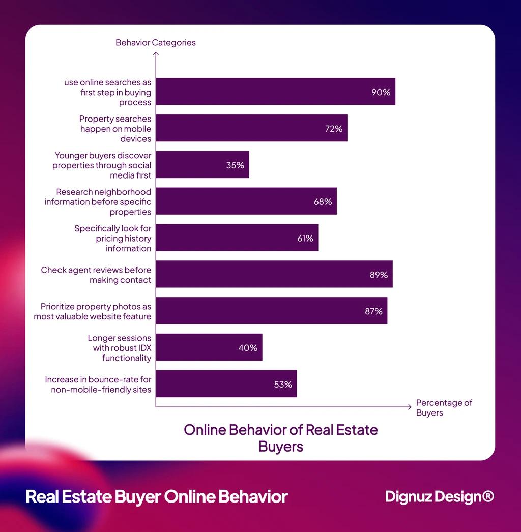
Every feature list includes "mobile responsiveness" as a bullet. That framing is part of the problem. Mobile is not a feature you add. It is the constraint the entire site has to be designed around, because the dominant device for property search has been a phone for years and shows no sign of changing. The agency that treats mobile as a final-stage check is the agency that ships a desktop site with a folded-down mobile view, which is a different product from a site designed for the phone first.
The practical implications are concrete. Tap targets on a listing page need to be sized for thumbs, not for a designer's mouse. The call-to-action to phone the agent should actually open the dialer, not copy a number to a clipboard. Photo galleries need to support swipe and pinch as first-class gestures. Maps need to size sensibly inside a viewport rather than fight for it. Forms need to surface the right keyboard for each field, which is a one-line HTML decision that most builds skip. The cumulative effect of getting all of these right is a site that feels effortless on a phone, and the absence of any one of them is what makes a site feel like work. Our broader piece on real estate website user experience walks through these decisions in context.
Neighbourhood Context, Not Neighbourhood Marketing
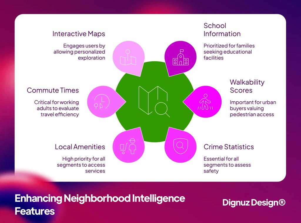
Almost every real estate site offers some form of neighbourhood content - guides, school maps, walkability widgets, lifestyle pages. Most of that content is filler, written generically and dropped into a template that does not connect it to any specific property. Buyers can tell, and they discount it accordingly. The version that does earn engagement is more boring than it sounds. It is a short, specific paragraph for each property explaining what the immediate area is actually like, written by someone who knows it, and supported by a map that places the property next to two or three named anchor points the buyer will recognise - a station, a school catchment, a high street, the city centre.
The same principle applies to the map. A map that takes the full viewport without offering context is a feature that consumes space and adds nothing. A map that shows the property pin alongside the things a buyer in that area cares about does real work. Walkability scores and school ratings are useful when they reflect the buyer's mental model of the area. They are noise when they are presented as standalone widgets without any narrative connecting them to the property. The decision about how much neighbourhood content to build comes down to whether the brand has the editorial capacity to write it specifically. If it does not, less is more.
Lead Capture That Respects The Buyer's Pace
Lead capture is the area where the feature inventory mindset does the most damage. Mortgage calculators, valuation tools, brochure downloads, callback forms, live chat, sticky enquiry bars, exit-intent modals, newsletter pop-ups - every feature list says yes to all of them. The result is a listing page that interrupts the buyer at every scroll depth and reads as desperate.
The principle that helps here is one that Baymard Institute's long-running research on checkout and form usability has settled across thousands of hours of testing in adjacent industries. Forms with fewer fields, fewer mandatory steps, and clearer purpose convert better than forms that try to capture everything in one go. For a property enquiry, three fields is the working maximum - name, contact method, message - and the message field should be optional. The phone number, if you ask for one, should be optional too. Buyers who are ready to talk will give it. Buyers who are still triaging will not, and forcing them off the form costs more than the missing data ever returns.
The other practical rule is to put the enquiry form where the buyer is already looking. The end of the photo gallery, the bottom of the floor plan view, and a fixed but unobtrusive bar on mobile are the three placements that consistently work. Modal pop-ups that interrupt scrolling do not. Live chat is worth keeping if there is a real person on the other end during the hours buyers actually browse, which is mostly evenings and weekends. If there is not, the chat widget is a polite lie that costs more in trust than it earns in leads. Our guide on real estate web page design for conversion covers how the form sits inside the rest of the page.
Speed Is A Feature, Even When Buyers Do Not Name It
Page speed never appears on the buyer-facing feature list, because no buyer thinks of speed as a feature. They think of slow sites as broken, and they leave. Google's own Core Web Vitals documentation sets the thresholds the industry uses to define a usable page experience. The Largest Contentful Paint should land inside 2.5 seconds, Interaction to Next Paint inside 200 milliseconds, and Cumulative Layout Shift below 0.1. Those are not aspirational numbers. They are the line below which Google itself starts to discount the site in search results, and they correspond closely to the point at which buyers start to abandon.
Real estate sites are particularly exposed because the listing page is the heaviest URL on the site. It carries a twenty-image gallery, a floor plan, a map, often a video, and increasingly an embedded 3D tour. Loaded carelessly, that page takes six or seven seconds to become usable on a mid-range Android phone on city Wi-Fi. The buyer does not file a bug report. They simply close the tab. The mechanics of fixing this are not exotic. Modern image formats, sensible dimensions, lazy-loaded heavy embeds, deferred third-party scripts, and a careful approach to fonts together account for most of the gap. Our piece on real estate website speed optimization walks through them in order of impact.

💻 Let us help you create a stunning online showcase for your projects that works seamlessly across all devices. Ready to amplify your real estate business? 👉 Explore AmplyViewer now
Trust Signals That Survive Scrutiny
The trust section of the typical feature article is a list of badges - SSL, privacy policy, security certifications, professional association logos. None of those are bad to have. None of them carry significant weight in a property decision either, because property purchases are the largest financial decisions most people make, and the trust signals buyers weigh on those decisions are correspondingly heavier than an SSL padlock.
The signals that actually move serious buyers are specific and verifiable. A real agent profile with a real photograph, a phone number that connects to that agent on the first attempt, recent listings with sold prices, and named projects in named locations. Stock-photography "team" pages, anonymous testimonials, and generic decade-of-experience copy do the opposite of what they intend. They tell the buyer the brand is hiding behind language because there is nothing concrete to point at. Reviews carry weight when they name properties and neighbourhoods. They are close to worthless when they are five-star blurbs from anonymous initials. The most underrated trust signal of all is the property description itself. A short, specific paragraph that says what is unusual about the home, written in language that sounds like the agent actually spoke it, beats a polished but generic write-up by a wide margin.
What To Build First If The Budget Is Finite
If I had to compress everything above into one ordered list, this is what it would look like. Build these in order, and do not move to the next one until the previous one is genuinely good:
- Photography, floor plans, and written descriptions. These are the three pieces of content buyers consistently rate as most valuable, and the area where most sites underinvest. Get a real photographer, get measured floor plans, and write each description by hand. Nothing else compensates for failing here.
- A listing page that loads fast and respects the buyer's intent. Hero photo, headline data, gallery, description, floor plan, map, enquiry form, in that order, on a page that hits Core Web Vitals targets on mid-range mobile devices.
- A small number of clear entry points to the inventory. By neighbourhood, by price band, by bedroom count. Skip the faceted-filter UI until inventory volume genuinely demands it.
- A short, well-shot 3D tour or video for any property that warrants it. Off-plan developments, premium listings, and unusual layouts benefit most. Avoid producing tours for properties where photos and a floor plan already do the work.
- A simple enquiry form, well-placed, with the minimum fields. Three fields, optional phone, no required message. Surface it at the end of the gallery and at the bottom of the floor plan view.
- Concrete trust signals. Real agent profiles, named past projects, sold prices where regulations allow, and reviews that name properties and neighbourhoods. Save the badge collection for the footer.
Everything else - newsletter modals, AI chatbots, mortgage calculators, market-trend widgets - is optional and should be added only when the foundations are solid. Most agencies skip the foundations and go straight for the optional features, which is why most real estate websites underperform the inventory they are trying to sell. The question of whether to build the foundations on a template platform or commission a custom build sits one level above this conversation. Our piece on why custom real estate websites outperform template solutions covers that decision.
Frequently Asked Questions
Which real estate website features actually generate enquiries?
The features that consistently move enquiries are the ones that match how buyers triage listings: high-quality photographs, accurate floor plans, written property descriptions that sound like a person wrote them, and a listing page that loads quickly on mobile. The most over-promoted features - AI chatbots, large neighbourhood guide libraries, advanced filter UIs - rarely move the needle on a brand-level site, even when they look impressive in a demo.
Do small real estate sites need an IDX integration?
Not necessarily. IDX makes sense when the site is supposed to compete with a portal on inventory breadth, which is true for some brokerage sites and almost never true for developers or boutique agencies. A developer with twenty units does not need MLS feeds. A boutique agency with curated listings often benefits more from presenting fewer properties in more depth than from pulling in everything in the market. The decision should follow the brand's actual position, not the assumption that every property site needs IDX by default.
Are virtual tours and 3D walkthroughs worth the cost?
For off-plan developments, premium listings, and properties with unusual layouts that photos do not communicate well, yes. The data on engagement uplift from interactive tours is consistent across the major portals and matches what I see in our own projects. For standard mid-market listings where the photos and floor plan already tell the story, a tour is often surplus to requirements and the budget is better spent on better photography.
What is the minimum viable real estate website?
A homepage that loads quickly and establishes the brand, a list of current properties with one entry per listing, a listing page template that does the work described above, a contact page with a real phone number and a working form, and an agent or team page with real photos and bios. Everything beyond that is an enhancement, not a requirement. Most agencies and developers can ship a serious site at this scope and only add complexity as inventory volume or marketing strategy demands it.
How important is page speed compared to other features?
It is foundational. A slow site discounts every other feature on the page, because buyers leave before they ever experience them. Page speed is also one of the few features Google itself rewards directly in rankings, through the Core Web Vitals signals. If the site does not hit the LCP, INP, and CLS thresholds on mobile, no amount of feature richness will compensate.
Should every listing have a video?
No. Video has a real cost to produce well, and a bad video damages a listing more than no video at all. The properties that benefit from video are the ones where the experience of the space - flow between rooms, views, scale - does not come across in still photos. For a standard apartment with clear photos and a clean floor plan, a video adds production cost without adding meaningful information for the buyer.