How to Build an Effective Nonprofit Website
Most nonprofit websites I audit have the same problem, and it has almost nothing to do with the things the marketing blogs talk about. The homepage hero is fine. The mission statement is somewhere on the page. There is a donate button in the header. The site loads. None of that is the problem. The problem is the path between someone arriving on the homepage and a completed donation, and on most nonprofit sites that path is broken at two or three different points that nobody on the team has tested in months.
I run DignuzDesign, where I build custom websites for organizations that need their site to convert: real estate developers, architects, and increasingly, nonprofits that have outgrown a Squarespace template. The mechanics of a high-converting donation page are the same mechanics behind a high-converting property inquiry form. Both depend on trust, speed, and removing every micro-decision between intent and action. Most nonprofit website advice ignores all three.
This guide is what I would tell a nonprofit director who has $15,000 and one shot at getting the site right. It assumes you already know what your mission is. It does not assume your current site is helping you raise money.
The donation page is the only page that has to be perfect
Start here, because almost every other priority cascades from this one. According to the M+R Benchmarks study, which aggregates data from hundreds of nonprofits and tracks billions of dollars in online giving, the average conversion rate on a nonprofit's main donation page sits around 12%. Desktop conversion runs about 16%; mobile drops to 10%. Average gift size follows the same pattern: $137 on desktop, $83 on mobile.
Those numbers tell you three things, and most teams miss all of them. First, your donation page is doing all the work. Second, the gap between desktop and mobile conversion is not a design choice, it is a friction problem - mobile users are abandoning the form, not the cause. Third, every other page on the site exists to deliver people to this single page in a state where they are ready to convert. If your homepage is beautiful but your donation page is a five-field embedded iframe with a default amount of $25 and no recurring option, you are leaking money you already earned.
The practical implications: keep the donation page on your own domain, not on a third-party processor's subdomain. Use a payment processor that supports Apple Pay and Google Pay on mobile, because the M+R data shows the wallet integrations cut mobile form abandonment significantly. Default to monthly giving with a one-time toggle, not the other way around. Show what the gift does in concrete terms next to each amount, not as a separate section. Strip the page of the global navigation. Nobody who has clicked Donate needs to be reminded that you also have a careers page.
Mobile traffic, desktop money, and what that means for your architecture
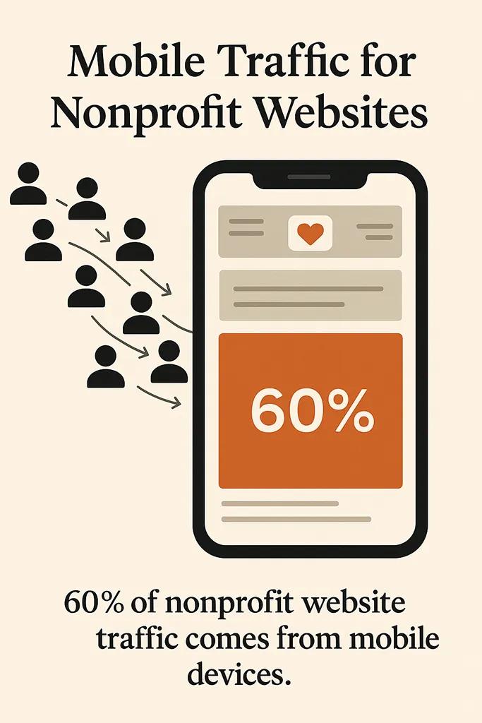
The same M+R data shows that 52% of nonprofit website traffic comes from mobile devices, but 78% of online revenue still comes from desktop. This is the most misread statistic in nonprofit digital. Most teams interpret it as "mobile is not where the money is, so prioritize desktop." That conclusion is wrong, and it costs them a meaningful share of donors.
The correct reading is that mobile is the discovery channel and desktop is the closing channel. Donors find you on their phone during a commute, an emotional news cycle, or a forwarded link in a group chat. They read your story, they form an intention. Then they pull out a laptop in the evening, pull up the same URL, and complete the transaction. The mobile experience is not optional, but its job is different from the desktop experience. Mobile has to make the case quickly, build trust, and not get in the way. Desktop has to close.
This changes what you optimize. Mobile pages should be ruthlessly fast, scannable, with one clear primary action. The donate page should also work flawlessly on mobile, because the donors who do convert on phones tend to be your most engaged supporters - existing monthly donors increasing their gift, not cold visitors. Desktop can carry richer media, longer-form impact reports, and the deeper navigation. If you only have time to build one polished flow, build the desktop donation flow first and make the mobile experience clean and minimal. The reverse is the mistake most teams make.
Speed is a trust signal before it is a performance metric
I have rebuilt sites where the only meaningful change was reducing the homepage to a fraction of its previous weight and putting it on a content delivery network. Donation conversion went up. Nobody on the donor side knew anything about Core Web Vitals or Largest Contentful Paint. They just knew the new site felt real, and the old one felt like a flyer printed on a copier.
Speed is a trust signal. A nonprofit website that takes four seconds to load tells a first-time visitor that this organization either cannot afford competent infrastructure or does not prioritize it. Either reading hurts the giving decision. Most nonprofit sites are built on WordPress with a heavy theme, a dozen plugins, and shared hosting that costs $12 a month. That stack made sense in 2014. It does not make sense now, and the cost gap to a modern static-first build has collapsed.
For most nonprofits, I build on Astro and deploy to Cloudflare. The hosting bill ends up around $5 a month. The site loads in under a second from anywhere in the world. There is no database to be hacked, no plugin to be exploited, no admin login for an attacker to find. The content team edits through a headless CMS that they actually enjoy using. None of this is exotic anymore. It is just what fast websites look like in the current decade. If you want to dig into the technical case for fast architecture, I wrote about it in website speed optimization in a real estate context, but the principles transfer directly.
The point is not the framework. The point is that page speed is now table stakes for any site that asks visitors for their credit card information. If your donation page takes longer to load than the donation form does to fill out, you have a problem that no amount of storytelling will solve.
Accessibility is no longer optional, and that is good news
The Web Content Accessibility Guidelines from the W3C are now an ISO standard (ISO/IEC 40500:2025), and the European Accessibility Act became legally applicable in EU member states in June 2025. If your nonprofit operates in or serves the EU, WCAG 2.1 AA conformance is no longer a suggestion. In the US, accessibility lawsuits under the ADA continue to target nonprofit websites with predictable regularity, and WCAG 2.0 or 2.1 Level AA is the standard most consent decrees reference.
The defensive framing is that you need to be compliant. The better framing is that nonprofit donors skew older than the general internet population, donors with disabilities are a population your organization probably serves directly, and accessibility improvements correlate almost perfectly with general usability improvements. A site that meets WCAG 2.2 AA is a site that older donors with reading glasses can also use, that people on slow connections can use, that screen reader users can navigate, and that anyone with a motor impairment can complete a donation on. Those are not edge cases. They are a non-trivial slice of your donor base.
Practical baseline: minimum 4.5:1 color contrast for body text and 3:1 for large text and UI elements, every interactive control reachable and operable by keyboard alone, every image with meaningful alt text, every form field with a real label (not placeholder-as-label, which fails when the field is filled), heading order that makes structural sense, and visible focus indicators on every interactive element. None of this requires a specialist agency. It requires the person building the site to actually run an audit before launch and fix what they find. If your developer cannot produce a WCAG report for the site they just built, that is a credentialing problem on their side, not a budget problem on yours.
The homepage's job is routing, not storytelling
This is the recommendation I get the most pushback on from nonprofit boards, and it is the one I am most confident about. The homepage is not where the donor decision happens. The donor decision happens on a deeper page where the story can actually do its work - a program page, an impact report, a single beneficiary profile told well. The homepage's job is to figure out who the visitor is and send them to the right next page in under five seconds.
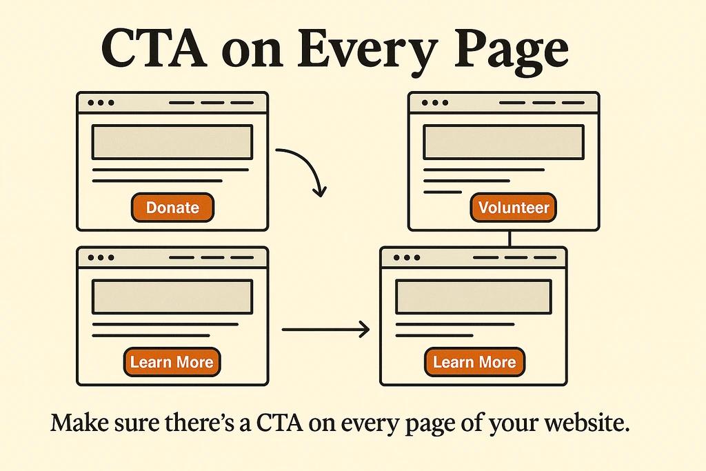
That means the homepage needs four things and almost nothing else. It needs a one-sentence statement of what you do and for whom, written without jargon and without the word "empower." It needs a primary action for first-time visitors (usually "learn what we do," not "donate," because cold visitors do not donate from the homepage). It needs a secondary action for returning supporters (usually "donate" or "volunteer"). And it needs proof that you are a real organization - a recent piece of news coverage, a recognizable funder, a number that reflects current activity. That is the entire homepage. Everything else is a distraction.
The mistake is treating the homepage as a brochure for the whole organization. You end up with a hero, three feature blocks for your three programs, a testimonial slider, a recent blog grid, a partner logo wall, an email signup, and a fundraising thermometer. That page is doing none of those jobs well because it is trying to do all of them. A homepage built around clear routing will outperform a homepage built around comprehensive coverage every time, and the analytics will tell you within a month. For more on how navigation choices flow from this, my notes on website navigation design are written for a different industry but the architectural logic applies.
Trust signals that move donations
Nonprofits get the trust signal question 20% right. They put a Charity Navigator or GuideStar badge in the footer and consider the box checked. That is the floor, not the ceiling. Donors at the gift sizes that move your budget - the $500 supporters and up - are doing real diligence, and they want to see specific things on the site before they reach for a card.
The list is short and worth getting right. Show your most recent financial information prominently, not buried in a downloadable PDF from three years ago. Name your program staff with photos and short bios, not just the executive director. Show beneficiaries as people with names and stories, with consent, not as stock-photo abstractions. Link to recent independent press coverage, not your own press releases. Include the year the organization was founded and where it operates from. Show your most recent annual report and make sure the date on it is from the current or prior fiscal year. If you have not updated the annual report in 18 months, the message a thoughtful donor takes from your site is that you have nothing to report.
The single highest-leverage trust signal is what I call the named promise: somewhere on the site, a real person on your team should be on camera or on the page telling a donor what their gift will do this quarter. Not what the organization does in general. What this quarter's specific funded work looks like, who is leading it, and how you will report back on it. That is the signal that separates a nonprofit that knows what it is doing from a nonprofit running a permanent capital campaign.
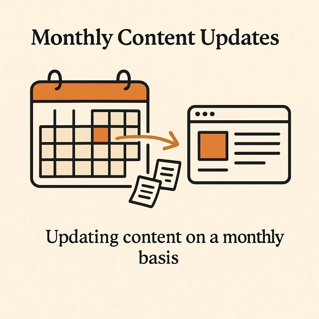
Content that earns the second visit
Nonprofit content strategy is almost universally backwards. Teams produce one big annual report, drop it as a PDF, and publish blog posts that read like board minutes. None of that earns a second visit. What earns a second visit is short, recurring, specific content that gives a returning donor a reason to check back: a monthly impact note, a quarterly named-program update, a quick post when something changes on the ground. Even three or four pieces of this kind of content per year, written by someone close to the work, outperforms a polished annual report that took six weeks to produce.
Donor email is downstream of this. Email outperforms every other channel for nonprofit fundraising because the audience has already opted in and the cost per send approaches zero, but the email program only works if you have something to put in it. Tying the content calendar to the email calendar so that the same impact note that goes up on the site this week is the same story that anchors next week's email is how you make a lean content operation work. I built AmplyDigest partly because I was tired of watching organizations produce content nobody had time to consume - the inversion of that problem is producing content people actually want to read, and then giving them a clean way to subscribe to it. A good content cadence solves both ends.
The how-to part is craft, not strategy. If you want a longer treatment of writing pages that convert, I wrote one in website copy that converts. The short version: write the way someone on your team would talk about the work over coffee, not the way the board's communications subcommittee approves.
What you actually have to maintain
The maintenance conversation is where nonprofit websites quietly die. The site launches, everyone is proud of it, and then 18 months later the SSL has expired, the events calendar still has last year's gala, three plugins are flashing red in the WordPress admin, and the executive director's photo is from the previous executive director. None of this happens on purpose. It happens because nobody on the team has maintenance written into their job description.
Realistic minimum maintenance for a small nonprofit looks like this:
- Weekly: Check that the donation flow still works end-to-end, on both desktop and mobile, including the receipt email. This takes ten minutes and catches the failures that cost you the most. Most teams discover their donation form has been broken when a donor emails to complain, which means many silent donors gave up.
- Monthly: Publish one piece of content, refresh any time-sensitive blocks on the homepage (current campaign, upcoming events, recent press), and run a single accessibility and broken-link scan. Both can be automated.
- Quarterly: Review analytics with someone who can read them. Not page views. Conversion rate on the donation page, drop-off points in the donation form, top entry pages from search, and the bounce rate on mobile vs desktop. Decide one thing to change based on what you find.
- Annually: Update photos of staff and programs, refresh the financial transparency page, review the privacy policy, and check that the entire site still loads under your target speed budget.
That is the entire ongoing commitment, and it is honestly achievable for a one-person communications team. For a deeper take on what tends to break and why, I have notes on website maintenance for nonprofits that go further than the surface checklist.
When a redesign actually pays for itself
I get the redesign question constantly, and the honest answer is that most nonprofits redesign too often and at the wrong time. The right reasons to redesign are that your donation conversion has been flat or declining for over a year despite traffic growth, your site is on a stack that can no longer be safely maintained, or you have shifted programs or audience meaningfully enough that the architecture no longer fits. The wrong reasons are that the board feels the site looks dated, a new executive director wants something that feels like theirs, or a vendor convinced you that you need to migrate to their platform.
A well-built nonprofit site should last seven to ten years with iterative updates. Plenty of organizations are running on platforms that age fine if the underlying architecture was sound. The redesign question is really an architecture question in disguise, and I worked through that question in detail in nonprofit website redesign. The short version: figure out what is structurally wrong before you decide it needs to look different. Most of the time the structural problems are the ones worth solving, and a fresh coat of design over the same broken architecture buys you nothing.
If you do conclude that a full rebuild is the right call, the planning steps in my website redesign checklist apply just as well to a nonprofit as to any other organization. Scope creep is what kills nonprofit redesigns, and the only defense is documenting the goals in writing before anyone touches a design tool.

Frequently asked questions
How much should a small nonprofit budget for a website?
For a custom-built site on a modern stack with a CMS your team can actually use, plan for $8,000 to $20,000 for a small organization. Below $5,000 you are usually getting a template build with limited customization, which is fine for the smallest organizations but caps your conversion ceiling. Above $30,000 for an organization with under $1M in annual revenue is usually overinvestment unless the site is doing genuinely complex work like event registration, member portals, or program applications.
Should we use WordPress or something else?
WordPress is fine if you have someone who maintains it actively, and a problem if you do not. The plugin ecosystem is both its strength and its biggest security liability. For nonprofits without a dedicated technical staffer, a static-first build on Astro, Eleventy, or a managed platform like Webflow is usually a better fit. The total cost of ownership over five years is meaningfully lower, and the failure modes are fewer.
Do we need a separate website for our donation processing?
No, and you generally should not. Every additional domain or subdomain in the donation flow is a friction point and a trust hit. Use a processor that embeds cleanly into your own site (Stripe, Donorbox, GiveButter, and similar options all do this well) and keep the donor on your domain end to end. The exception is if your processor's checkout is significantly more optimized than anything you can build, which is rare.
How important is SEO for a nonprofit?
It matters more for some nonprofits than others. If your work is geographically specific - a food bank, a local shelter, a community arts organization - local SEO drives meaningful traffic and donations. If your work is national or issue-based, organic search is a long game that rarely pays off in under 18 months. Either way, the table-stakes SEO work (clean URL structure, decent meta tags, fast pages, real content on real pages instead of PDFs) is essentially the same as good general web hygiene. The fancy SEO work pays off later if at all.
How do we measure if the website is working?
Three metrics, in order. Donation page conversion rate is the only one that matters for fundraising performance: if you are below 8% you have work to do, around 12% is industry average, above 15% is good. Email signup rate from organic traffic tells you whether your content is doing its job. And recurring donor retention is downstream of the donor experience on the site after the first gift - if the receipt flow, donor portal, and stewardship emails are sloppy, retention suffers and the site is part of the cause. Page views, bounce rate, and time on site are vanity metrics. Ignore them.
Can a nonprofit build a good website without hiring a designer?
Yes, but not as cheaply as the no-code marketing implies. A staff member who is genuinely good at design and willing to put 80 to 100 hours into the project can produce a perfectly respectable site on Webflow or Squarespace. A staff member who is fine at design but not particularly trained will produce something that looks like the template they started from, and the conversion ceiling will reflect that. Honest self-assessment is the variable that matters here. If nobody on the team has actually built a site before, hiring a designer pays for itself on the donation page alone.
The summary nobody will publish
Most nonprofit website advice is written to be unobjectionable, which means it is also unactionable. The version that is actually useful: spend 70% of your design effort on the donation page and the path to it, 20% on the trust signals scattered across the site, and 10% on everything else. Build on infrastructure that loads fast and does not require constant maintenance. Make the site accessible because it is the right thing to do and also because the law in many places now requires it. Treat the homepage as a routing problem, not a storytelling problem. Write content as if the reader is a real donor with limited time, because they are. Maintain what you launch with, or do not bother launching it. Measure conversion, not vanity.
The rest is craft, and the craft is learnable. If you want to talk through what a build like this would look like for your specific organization, you can reach me through DignuzDesign. Either way, the framework above is the one I would apply if I were running it myself.


