Web Design for Real Estate Companies: What Actually Converts

Most real estate websites I am asked to audit have the same problem, and it is rarely the one the client thinks. The site looks fine. The photography is decent. The agent or developer paid for a "modern" template or hired a generalist agency that delivered something that would not embarrass them at a conference. The traffic numbers in Google Analytics look healthy. And yet the inquiry count is flat, the inquiries that come in are unqualified, and the team is back to running social ads to compensate. The site is not broken in the obvious sense. It is broken in the specific places that real estate buyers care about, and those places are almost never the ones a generic web design brief covers.
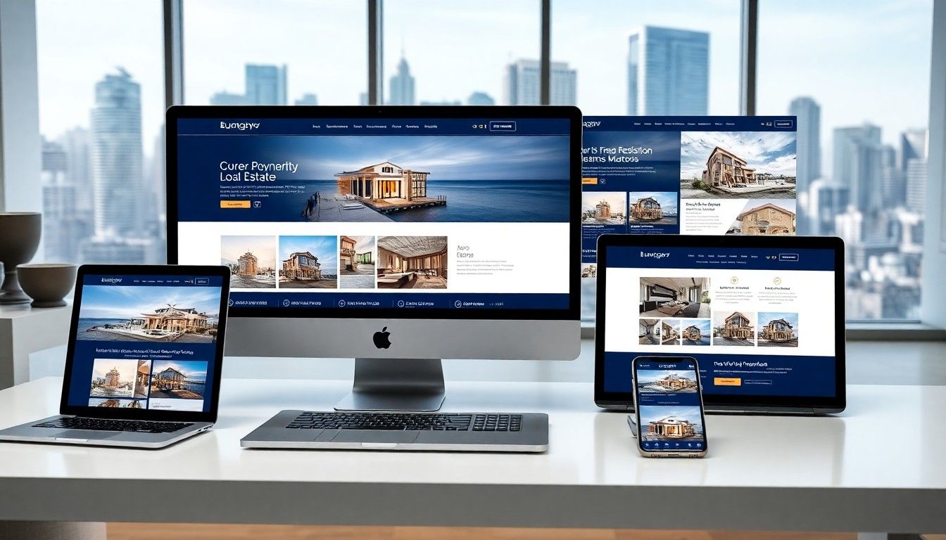
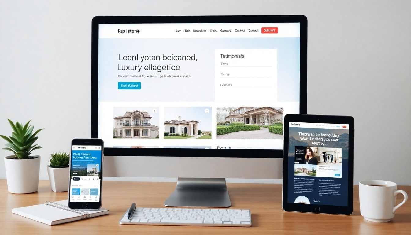
I build websites for property developers, estate agents, and architects through DignuzDesign, and I produce the 3D renders and interactive tours that fill those sites through Faraday3D. Sitting at that intersection has taught me something most marketing blogs about real estate web design miss: the difference between a property website that converts and one that leaks is not visible in a screenshot. It is in the page weight on mobile, the structure of the property page, the way enquiry forms behave on a phone over patchy 4G, and the dozen technical decisions made before a single pixel was placed. This article is about those decisions.
The Real Estate Buyer Does Not Browse Like a Retail Shopper
Most templated real estate sites are descendants of e-commerce design. They assume a buyer who scans a grid, filters by price, and clicks through to a product page that closes the sale. Property buyers do not behave that way, and designing for the e-commerce mental model is the original sin of a lot of real estate web design.
The National Association of Realtors' annual profile of home buyers found that while a majority of buyers find the home they purchase online, the average buyer takes eight weeks searching, looks at ten properties, and revisits the same listings repeatedly. They are not converting on a single visit. They are returning, comparing, sending links to a spouse, and saving listings to a folder. The website is not a transaction surface. It is a research environment that has to survive being opened in twelve tabs across three devices over two months.
This changes almost everything about how the site should be built. URLs need to be stable and shareable. Listings need to be findable again after the buyer has closed the tab and come back a week later. Property pages need to load fast enough that a buyer who is comparing six listings at once will not bounce on yours specifically because it stalled. And the navigation needs to assume the visitor has been on the site before, not designed for a first-time impression alone. The single-visit conversion model is the wrong frame for a property site.
Mobile Is Not a Layout Problem, It Is a Bandwidth Problem
Every real estate web design article you will read tells you to be mobile-first. Almost none of them tell you what that actually means in practice. Responsive layouts are table stakes. The real question is whether your property pages load over a real mobile connection in under three seconds, because that is where the bulk of your potential buyers are sitting when they form a first impression.
Google's own performance research is unambiguous on this: the probability of a mobile visitor bouncing increases by roughly a third when load time moves from one to three seconds, and more than doubles by five seconds. Real estate sites are especially exposed to this because they tend to be image-heavy by nature, and the typical fix from a generalist agency is to lazy-load the gallery, which still leaves the hero image and the page shell competing for bandwidth on the critical path. The visitor sees a flash of white, then a half-rendered hero, then the listing appears. By the time it does, they have tapped back to the search results and opened a competitor.
The technical work that actually matters for real estate mobile performance is mostly invisible from the design layer. Image format choice (modern formats like AVIF reduce typical property photo weight by half against JPEG at equivalent quality), proper image sizing per breakpoint, server-rendered HTML rather than client-side rendering for first paint, and aggressive caching of the property database. I have written a fuller breakdown of how to think about real estate website speed optimization, and the short version is that performance is an engineering problem disguised as a design problem. If the underlying stack is wrong, no amount of visual polish recovers it.
This is the main reason I tend to build new real estate sites on a Jamstack architecture rather than a traditional WordPress or page-builder setup. Pre-rendered HTML, edge delivery, and a clean separation between the listing data and the presentation layer give you a baseline performance budget that template-driven systems simply cannot match. The full argument for that approach is in my piece on why property developer websites benefit from a Jamstack approach.
The Property Page Is the Only Page That Matters
Strip a real estate website down to traffic and you will find that the homepage, the about page, and most of the marketing copy account for a small fraction of meaningful sessions. The property pages are where buyers spend ninety percent of their time and where every conversion is ultimately won or lost. Yet on most real estate sites, the property page is treated as a templated afterthought generated from a CMS feed, while the homepage gets all the design attention.
This is backwards. A property page has to do a specific, complicated job in under thirty seconds: show the visitor whether this home is plausible for them, give them enough emotional pull to keep scrolling, surface the practical information (price, address, key features, agent contact) at the moment they want it, and offer a path to act that does not feel like a commitment. Most templated property pages fail at one or more of those, and the failure modes are predictable.
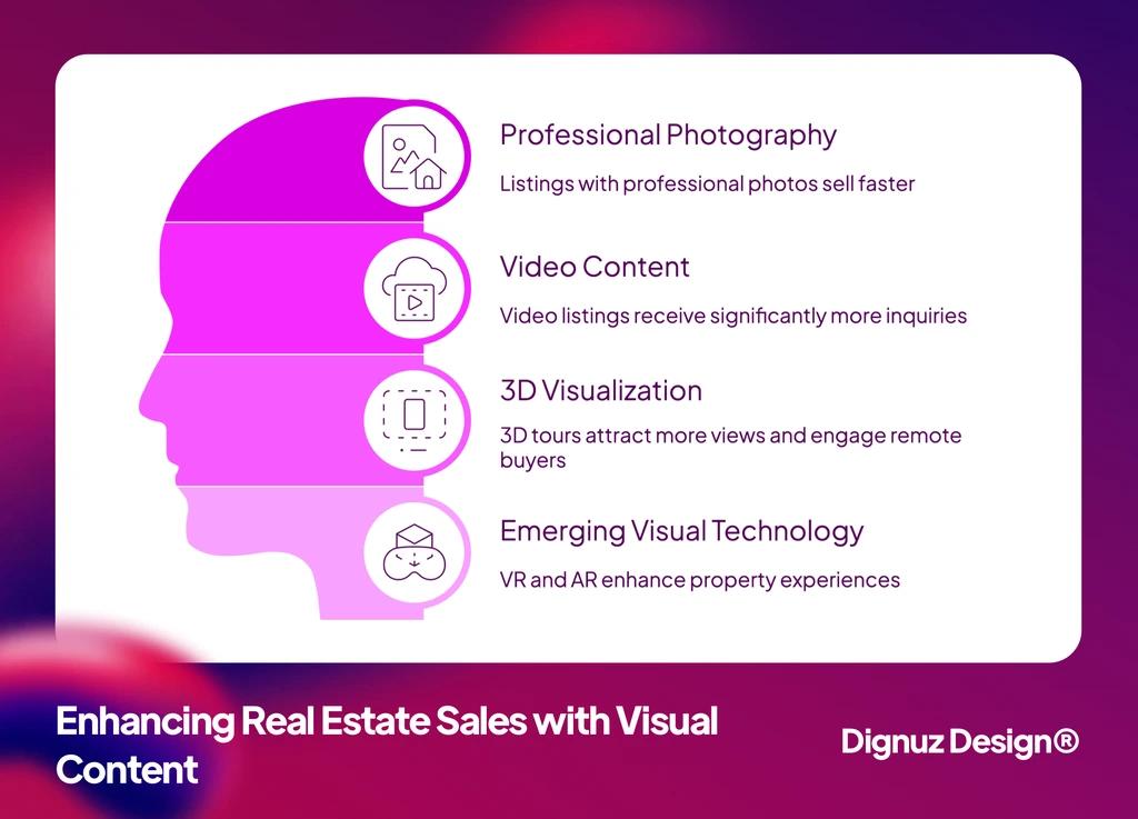
The image gallery is the most common failure point. Many templates default to a small lead photo with thumbnails below, or a tight carousel with no full-screen mode. Buyers do not want to look at a 600-pixel-wide thumbnail of the kitchen. They want to drag through the entire set at full screen, on their phone, smoothly. The gallery is the listing, in practical terms, and it deserves the same care a portfolio site would give to its main work. I have collected a fuller set of recommendations on this in my notes on property listing design best practices.
The second failure point is the absence of spatial context. Photos show you what a room looks like; they do not show you how the rooms relate to each other or how the property sits within its plot. Floor plans help, but the real upgrade is a proper interactive 3D experience, and this is where the gap between the listings that convert and the ones that do not has widened in the past few years. Zillow's own research, drawing on their platform data, found that listings with a 3D Home tour received significantly more views and were saved by buyers around a third more often than listings without one. That is not a marginal effect. That is the difference between a listing that gets shortlisted and one that gets skipped past.
This is also why I built AmplyViewer, our interactive 3D property viewer that embeds into real estate websites and lets buyers walk a property in the browser before they decide to visit in person. The market shift it responds to is straightforward: buyers expect a richer pre-visit experience than they used to, and the sites that meet that expectation harvest the demand the others lose. A static gallery is no longer competitive on its own in the categories where it used to be.
Lead Capture Loses More Inquiries Than Anything Else
The single biggest preventable loss on most real estate websites is the contact form. Almost every site I audit has a contact form that asks for too much, looks like a tax document, and triggers a wall of validation errors the moment a user mistypes a phone number. The form is the last step before a conversion and the place where the most casual visitors get filtered out by friction the designer never imagined.
The Baymard Institute's long-running usability research on web forms has found that the average commerce site asks for nearly fifteen form fields when it could comfortably get by with six to eight, and every removed field measurably increases completion. Real estate sites tend to be worse than commerce sites on this dimension, not better, because the historical norm in the industry has been to qualify leads heavily up front. That norm made sense when leads were scarce and agents had time to chase. It does not make sense in an environment where the buyer has nine other tabs open and will go to whichever site responded fastest.
The form on a property page should ask for a name, a contact method (one, not both), and ideally an optional note. Everything else can be gathered in the follow-up conversation. The same form should be reachable without scrolling and should work flawlessly with autofill on iOS and Android. A surprising number of real estate sites still ship forms that fail iOS keyboard autocomplete because the input types and autocomplete attributes are wrong, which loses you the buyer who would have filled the form in three taps and instead gave up after the keyboard misbehaved. I have written more about this kind of conversion-focused detail in my guide to real estate web page design for conversion.
Search and Filtering Are Where Property Sites Quietly Fail
The property search interface is the second-most-trafficked feature on a real estate site after individual listings, and it is where a lot of design briefs go wrong by trying to imitate Rightmove or Zillow without the engineering budget to make that work. A buyer who lands on your search page expects it to feel responsive, to remember their filters when they return, and to surface results that match what they typed without needing a five-step filter sequence to get there.
The common mistakes I see are unfiltered "all listings" landing pages that dump a hundred properties into a slow grid, filter sets with twenty options when buyers really only use four (price, location, bedrooms, type), and map views that re-render the entire result set on every pan. All three are fixable with a different technical approach, but they need to be designed for from the start. Bolting a real search experience onto a template that was not built to support it produces exactly the half-broken filtering most property sites end up with.
A useful diagnostic: ask whether your search experience would survive being used in a single-handed grip on a phone, while standing on a train, by a buyer who has already looked at twenty similar sites that week. If the answer is no, the layout is not the problem. The interaction model is.
Trust, Local Authority, and the Long Tail of Content
Property is one of the highest-stakes purchases a person makes, and the website is a trust check before it is anything else. Buyers want to know who they are dealing with, what the company has actually delivered, who has worked with them, and whether the operation feels professional enough to handle a transaction worth hundreds of thousands of euros or more. The visual brand contributes to this, but the deeper trust signals are written, not designed. They live in case studies, in named past projects, in genuinely useful neighborhood pages, in clear pricing, and in content that demonstrates the company actually knows the market it claims to serve.
This is where most real estate sites underinvest. The homepage is polished. The portfolio is thin. The blog, if it exists, is either generic recycled content or absent. The result is a site that looks credible at first glance but cannot pass a second-look test from a careful buyer or their advisor. The fix is unglamorous: a real content programme that documents the work, the market, and the team's actual point of view. The luxury end of the market in particular punishes thin content brutally, because the buyer is performing due diligence that goes well beyond the homepage before they ever pick up the phone.
Templates, Page Builders, and Why They Eventually Hurt
Most real estate companies start with a template or a page-builder solution because it is fast and cheap, and for the first year that decision is often fine. The problems start when the company tries to grow into the site. Listings outpace what the template was designed to handle. Performance degrades as plugins accumulate. SEO suffers because the URL structure was never planned. Custom features (a specific kind of property page, a particular search filter, an integration with the CRM) become expensive workarounds because the underlying system was not built to flex.
I have written a more direct argument on this in my piece on why custom real estate websites outperform template solutions over the long run, and the headline conclusion is that templates are a fine starting point and a poor finishing one. The right time to leave a template is before it starts costing you leads, not after. By the time the symptoms (slow pages, abandoned forms, awkward listings) are visible in the analytics, you have already lost a quarter or two of pipeline to a site that could have been doing better work.
What Actually Moves the Numbers
If I had to compress everything above into a short list of the design and engineering decisions that genuinely shift performance on a real estate website, it would be these. Performance budget on property pages: a hard ceiling on page weight and time-to-interactive, treated as a release blocker rather than a nice-to-have. Gallery experience: full-screen, draggable, fast on mobile, with proper image formats and sizes. Interactive spatial content: floor plans at minimum, ideally a true 3D viewer for properties where the geometry is part of the sell. Lead capture: short forms, autofill-friendly, reachable without scrolling, with no validation hostility. Search and filter UX: designed for a returning buyer on a phone, not a desk-bound first-time visitor. Stable, shareable URLs and a real content backbone that supports the long, slow trust-building most property purchases actually involve. None of those are visible in a homepage screenshot. All of them are visible in the conversion rate.

💻 Let us help you create a stunning online showcase for your projects that works seamlessly across all devices. Ready to amplify your real estate business? 👉 Explore AmplyViewer now
Frequently Asked Questions
How much should a real estate company actually spend on its website?
The honest answer is that it depends on the listing volume and the average transaction value, but the budget that makes sense is whatever recovers itself within a single closed transaction influenced by the site. For a developer selling units at a few hundred thousand each, that math justifies a fully custom build. For a single agent handling a handful of listings a year, a strong template with a few key customizations is usually the right call. The mistake to avoid is splitting the difference: spending mid-five-figures on a template-based build that still ends up bottlenecked by the template's limits.
Is Webflow a good platform for real estate websites?
Webflow can work well for smaller real estate businesses and for agents whose listings are managed manually, because it gives you design control without committing to a custom front-end build. It struggles when listing volumes get large or when you need to integrate with an MLS or property feed at scale. For developers and agencies handling significant listing inventory, I generally recommend a Jamstack architecture instead, where the CMS is decoupled from the front end and the site can be rebuilt in seconds when listings change.
Do I need a 3D tour on every listing?
No, and pretending you do is a good way to waste budget. Mid-market and luxury listings benefit clearly from 3D, because the buyer is doing more pre-visit research and the geometry of the home is a real part of the decision. Lower-priced listings with high turnover often do fine with strong photography alone, because buyers are visiting in person anyway and the marginal value of a 3D tour does not justify the production cost. Use 3D where it changes whether a listing makes the shortlist.
How long should it take to build a real estate website from scratch?
A serious custom build for a property developer or estate agency, including design, development, content migration, and integration with whatever listing or CRM system they use, typically runs eight to twelve weeks if scope is held tight. Projects that drag past that window are almost always victims of scope creep, not technical complexity. Setting a hard scope at the brief stage and being willing to defer features into a phase two is the single biggest predictor of a build that ships on time and converts.
Should the website integrate directly with my CRM or listing system?
Yes, and the integration should be one-way wherever possible. Listings should flow from the source of truth (your MLS feed, your in-house listing database, or your CRM) into the website, not the other way around. Manual listing entry on the website is a productivity sink and a source of stale or duplicate data. Lead capture should flow back into the CRM automatically, ideally with a short SLA on first response, because the agent who replies in under an hour wins a disproportionate share of the leads the site generates.
Why does my real estate site rank below competitors with worse content?
In nine cases out of ten it is a technical problem rather than a content one. Slow page speed on mobile, broken or missing schema markup on property listings, a sitemap that is not being submitted or is incomplete, or duplicate-content issues created by filter URLs that should be canonicalised. Search engines reward real estate sites that are fast, well-structured, and have clean signals about what each page is. Fix the technical layer first and the content gap closes faster than you would expect.
Closing Note
Real estate web design is not a visual exercise. It is a decision about how a buyer will research, compare, and ultimately trust a company through a screen, mostly on a phone, mostly while doing something else. The sites that win in this category are not the ones with the cleverest hero animation. They are the ones that load when the buyer taps the link, show the property as clearly as possible without making the visitor work for it, and make the act of getting in touch feel like the easy next step rather than the friction-laden one. Everything else is decoration on top of those decisions. Get those right and the design has done its job.