How to Create a Real Estate Presentation That Sells

Most advice on how to create a real estate presentation treats the presentation as decoration. Pretty photos, a slick slide deck, a 3D tour as a bonus feature. That framing quietly misses the point. A real estate presentation is not a garnish around the property. Until the buyer physically walks the home, the presentation is the property. That reframing changes every decision that follows about what to build, how to sequence it, and what actually has to be true for the work to convert.
I am Dimitri. I run DignuzDesign, a studio that builds custom websites for property developers, real estate agencies, and architects. I also run Faraday3D, a visualization studio that produces renders, virtual tours, and animated walkthroughs for the same clients, and I develop AmplyViewer, an interactive 3D property viewer that embeds inside a real estate site so a buyer can walk a unit without leaving the page. This article is written from that vantage point. I have spent a decade at the intersection of web development, 3D visualization, and property marketing, and what follows is not advice pulled from marketing textbooks. It is what I have watched succeed and fail at the pixel level.
Why a Real Estate Presentation Is the Product, Not Its Wrapping
Start with an honest description of what the buyer is actually being asked to do. On a new build they are committing a six or seven figure deposit to a structure that does not yet exist. On a resale they are shortlisting a property online, usually on a phone, from a list of twenty or thirty alternatives, most of which they will never visit in person. In both cases, the buyer's first experience of the property is mediated entirely by visual assets. The render, the photo, the 3D tour, the floor plan. That is the property as far as their decision-making is concerned.
This is why a real estate presentation built as a pretty container around a good property will get beaten by a good presentation built around a mediocre one. Buyers are not comparing the properties behind the presentations. They are comparing the presentations, and then shortlisting the best two or three to see in person. You do not win the booking by having the better property. You win it by having the presentation that earns a physical visit.
Research from the National Association of Realtors confirms what the work looks like from the other side of the screen. Around 43 percent of buyers report that their first step is to search for homes online, and the majority of shortlisting now happens before any agent is involved. A buyer who arrives at a physical viewing has usually looked at eighty to a hundred listings online to get to that point, and the ones that survived the cut survived because of how they presented.
The Three Contexts a Real Estate Presentation Has to Work In
Before building anything, be specific about which real estate presentation you are actually creating. The same term gets used for three different jobs and each one has different requirements.
The first is the listing presentation, which an agent delivers to a prospective seller to win the instruction. This is usually a slide deck or a web page that demonstrates the agent's market knowledge, pricing evidence, and marketing plan. Its job is to earn the signature on the contract. The buyer is the seller. The currency is trust, not visual desire.
The second is the property pitch, which an agent or developer delivers to a specific buyer or a small group of buyers. This can be an in-person walk through a slide deck on a tablet, a PDF sent after an enquiry, or a bespoke page built around one high-value property. Its job is to move an interested buyer closer to a reservation or an offer.
The third, and by a wide margin the most important in 2026, is the always-on property showcase that lives online and works while nobody is watching it. The project website, the listing page, the interactive tour embedded on both. Its job is to do the first eighty percent of the selling on its own, before the buyer ever speaks to a human.
A presentation built well for one of these jobs is often wrong for another. A seller-facing listing pitch that leans on market data and fee structure will bore a buyer. A buyer-facing bespoke pitch that relies on the agent's voiceover will not work on an unattended website. Before writing or commissioning anything, decide which job the asset is for and build it for that job, not for all three.
What a Buyer Is Actually Doing When They Open Your Presentation
Most presentation advice assumes the buyer is paying attention. They are not. A 2023 Zillow Consumer Housing Trends Report found that 61 percent of buyers said they wished more listings offered 3D tours, and listings that included a Zillow 3D Home tour attracted substantially more views and saves than those without. That data tells you what buyers want to see. It also tells you what they are trying to avoid: the cognitive effort of reconstructing a property in their head from a sequence of static photos taken at random angles.
In practice, a buyer looking at your presentation is doing something close to triage. They are eliminating, not choosing. Thirty seconds on each listing, maybe less. What they are looking for in that thirty seconds is usually three things: can I understand the layout, does the space feel like somewhere I would live, and am I being misled. If any of those three answers come back as "no", the property exits the shortlist and rarely returns.
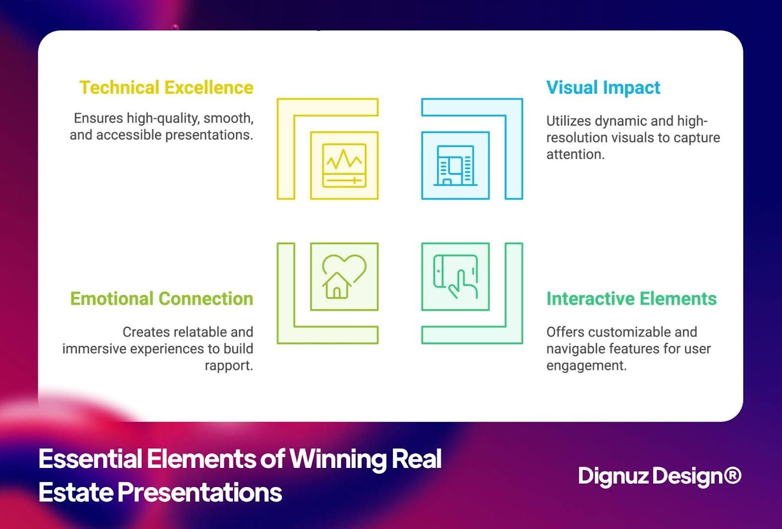
That is why the old advice about "capture attention in seven seconds" misses the point even when it is not fabricated. You do not need to capture attention. You need to pass three tests in thirty seconds. Those tests favor clarity and honesty, not cleverness. A well-composed hero image, a clean interactive floor plan, and an immediately obvious 3D tour will beat an animated intro and a carousel of mood shots every time I have watched them compete for the same traffic.
The Visual Stack That Does the Real Work
A serious real estate presentation is built on four layered assets, not one hero piece. Each one does a distinct job and skipping any of them leaves a gap the buyer feels.
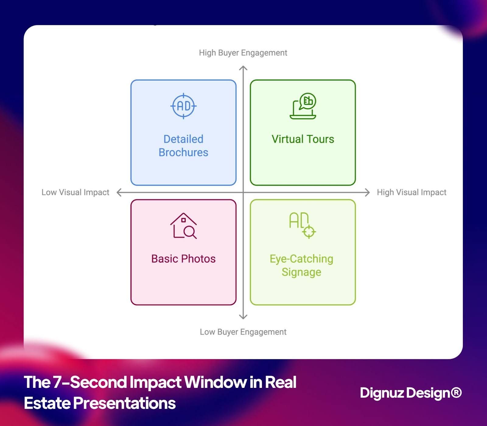
The first layer is the hero render or hero photograph. This is the image the buyer forms their first impression from. On a new build it has to be a render, because the building does not exist, and that render has to be commissioned at the specification the final campaign will demand, not at the cheapest bid. A good hero render shows the property at the time of day it looks best (almost always dusk for exteriors, morning or late afternoon for interiors) and at an angle that signals the architectural character in a single glance. On a resale, the hero photograph is usually the most architecturally distinctive room or the view, not the kitchen. Kitchens go in position four or five, not one.
The second layer is the floor plan, and specifically an interactive one where possible. Zillow's own research found that listings with an interactive floor plan receive about 60 percent more views than those without, and that is not a coincidence. A static floor plan answers layout questions in the abstract. An interactive one, where clicking a room shows the photograph or render taken from that room, collapses the layout question and the visual question into a single interface. That is the answer to one of the three triage questions the buyer is asking.
The third layer is the immersive tour. A professional 3D rendering service or 3D capture tool produces a user-controlled environment the buyer can navigate at their own pace. This is where the "does this feel like somewhere I would live" question gets answered, because the buyer controls the dwell time in each space and the angles they return to. A video tour does not do this job. A video is timed by the editor, not the buyer, and every buyer decides a home at their own pace. The practical choice between a captured tour (Matterport or similar) and a rendered tour depends on whether the property exists. If it does, capture it. If it does not, render it. Both need to match the final delivered product closely enough that the handover is not a confrontation.
Matterport's own published data, summarized in their research on 3D tour outcomes, shows that listings with a Matterport 3D tour sold up to 31 percent faster and at measurably higher sale-to-list price ratios than listings marketed with photography alone. I treat those numbers cautiously because the vendor published them, but the directional conclusion is consistent with the Zillow data and with what I see in practice: properties presented with a navigable 3D experience get shortlisted harder, held longer, and converted faster.
The fourth layer is the written narrative. This is the part almost every AI-generated property description gets wrong, because the machine generates adjectives rather than observations. A good written narrative should read like someone who actually walked the property describing what stands out. Which window catches the afternoon light, which room is unexpectedly generous, where the flow breaks and why that is actually fine. Two paragraphs of that, written by a human who has seen the property, will outperform a thousand words of generic copy every time.
Flow: The Order Your Presentation Reveals Information In
A real estate presentation is not a grid of equal-weight elements. It is a sequence. The order in which information is revealed affects conversion more than any single asset does, and most presentations lose their sale here rather than on the individual pieces.
The sequence that works, in my experience, runs as follows. The buyer lands and sees a single hero image that establishes the character of the property in under two seconds. Below that, a one-line locator (neighborhood, bedrooms, price range) so the buyer can self-qualify out quickly if the property is wrong for them. Next, the interactive floor plan with room-by-room previews, because layout is the first elimination criterion. Then the immersive 3D tour, opened prominently, because that is the emotional commitment step. Then the written narrative and the specification. Only at the end, the pricing detail, the reservation path, and the agent contact. A buyer who scrolls to the bottom of a well-ordered presentation has already decided to enquire. All the reservation form has to do is not get in their way.
Most presentations I audit invert parts of this sequence. They open with a carousel of mood shots that show nothing concrete, push the floor plan below the fold, and bury the 3D tour under a "View More" button. The buyer leaves before the good part loads. A cleaner layout, informed by property listing design best practices, pulls every load-bearing asset above the first interaction and removes the friction that was hiding them.
The Project Website Is Where Most Presentations Get Finished
For anything above the entry end of the market, a single listing page is rarely the real presentation. The real presentation lives on a dedicated project website, where the buyer spends fifteen to forty minutes across multiple sessions in the weeks leading up to a decision. That site is the one doing the quiet work of converting a tepid first click into a warm reservation.
Treat that project website as the primary sales instrument, not as a marketing brochure. It has to load fast enough that a commuter glancing at a social ad on the train does not bounce before the hero paints. It has to handle launch-day concurrency without degrading, which is where an interactive property showcase built on a modern static or hybrid architecture outperforms a traditional content management system. And it has to be designed with one explicit goal for the current phase of the campaign, not three competing ones, which is the argument for a proper real estate web page built for conversion rather than a general "nice website" brief.
The single most overlooked upgrade on most project sites is replacing the static image gallery with a real immersive 3D experience embedded in the page. An embedded AmplyViewer tour keeps the buyer on your domain during the most emotionally loaded part of the decision, which means you can measure the session, follow up on it, and retarget it. A YouTube embed hands that session to YouTube. A third-party tour link hands it to the tour platform. Keep the tour on your site.
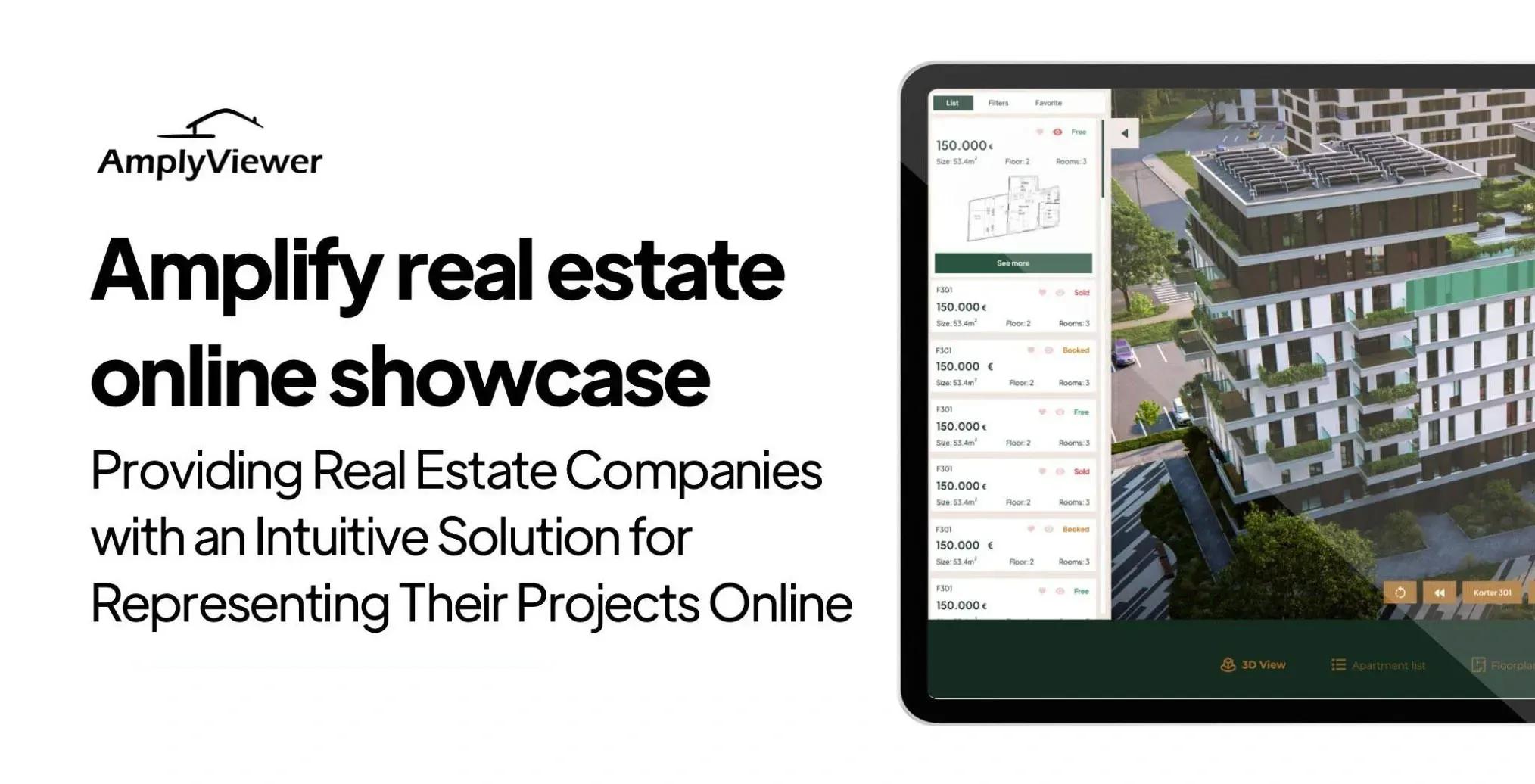
💻 Let us help you create a stunning online showcase for your projects that works seamlessly across all devices. Ready to amplify your real estate business? 👉 Explore AmplyViewer now
Mobile Is the Default Canvas, Not the Accommodation
Every piece of research on home search behavior in the last five years tells the same story. Most first impressions now form on a phone. Weekend real estate searching happens disproportionately on mobile. First-time buyers in their thirties and forties, which is the largest cohort by volume, are browsing in bed at ten p.m., on the train, or during lunch, almost always on a six-inch screen.
That fact changes how a real estate presentation has to be built. A hero render that dominates a twenty-seven inch monitor and collapses to a postage stamp on a phone has already wasted the single most important impression the buyer will form. A floor plan rendered as a PDF that forces pinch-to-zoom loses the buyer before the layout registers. A 3D tour that requires a desktop browser is functionally invisible to half the audience. Mobile is not a responsive checkbox at the end of the project. It is the canvas the presentation has to be designed on from the start.
In practice, this means the hero assets need to be composed twice: once for wide aspect ratios and once for tall ones, because cropping a horizontal render for a phone screen usually cuts the architectural signal out of it. Floor plans need to be rendered as responsive SVG or built as interactive components that reflow, not embedded as images. And the 3D tour must run inside the page, inline, without launching a new tab or requesting an app install, because every one of those steps loses a percentage of the session.
Tailoring by Buyer Stage, Not by Buyer Type
Generic presentation advice segments buyers by type: first-timer, investor, luxury, upgrader. That segmentation looks rigorous but produces shallow work, because the same buyer behaves differently at different points in their search and wants different things from the presentation at each point.
The cleaner segmentation is by stage. A buyer at the "casually watching" stage, nine to eighteen months from any transaction, is browsing for visual inspiration and neighborhood feel. Your presentation needs to leave a lasting mood impression and collect an email. A buyer at the "active shortlisting" stage, one to three months out, is eliminating. Your presentation needs to pass the triage tests and earn the physical visit. A buyer at the "final decision" stage, days from a reservation, is verifying and reassuring themselves against loss. Your presentation needs to provide the depth, the specification, and the confidence that feeds a yes.
The same physical presentation can serve all three stages if it is built with layers, which is why the four-layer stack I outlined earlier matters. The hero and the mood shots serve the casual watcher. The floor plan and the tour serve the shortlister. The specification, the narrative, and the buyer guide serve the final-stage decider. A presentation that only has one layer, usually the shiny one, only works for one buyer stage and leaks the other two.
For the luxury segment specifically, an entirely different calibration applies. A buyer considering a property above the high-end threshold is unlikely to convert through a public website and usually will not complete a reservation form. The presentation for them is private, often under an NDA, and the online asset is a discreet gateway rather than a sales machine. A tailored luxury real estate marketing approach uses the presentation to qualify the enquiry, not to close it.
Where Real Estate Presentations Break in Practice
The failure patterns I see most often, across dozens of projects, are not the ones marketing blogs warn about. They are quieter and more expensive.
The first is visual inconsistency across the presentation bundle. The render style on the brochure does not match the render style on the website, which does not match the photography style on the social ads. The buyer reads that inconsistency as lack of seriousness. A written property developer brand identity document solves this at the cost of one week of upfront work, and most projects skip it because it feels like overhead. It is not overhead. It is the spine that holds every asset aligned.
The second is a mismatch between the render and the delivered product. The renders showed warm oak, brass fittings, and generous natural light. The handover delivered gray laminate, chrome, and a smaller window than the render suggested. That specific failure is what turns a happy reservation into a legal dispute, and it is a render problem more than a construction problem. Renders should be commissioned to the actual specification, not to the aspirational mood board, and the spec should be locked before the presentation goes live.
The third is optimization for the wrong action. I see presentations that aggressively push brochure downloads on the hero, collect email addresses, and report strong "engagement" while generating a handful of reservations. A well-structured capture flow, covered in more detail in the guide on essential property marketing visuals, aligns the primary call to action with the actual campaign phase and demotes everything else. Five weighted buttons in the hero collect clicks on the least committing of them.
The fourth is neglecting the construction phase on new builds. A presentation that stops updating the day pricing goes live leaves the buyer watching a static site for six to eighteen months while their deposit is committed. A presentation that adds a monthly construction update, a new interior render, a drone flyover of the actual site, keeps the buyer warm and often generates referrals to their network in the process.
Frequently Asked Questions
What is the most important part of a real estate presentation?
The sequence, not any single asset. A presentation where the hero, the floor plan, and the 3D tour are all present but poorly ordered will underperform one where the same assets are worse in isolation but ordered correctly. The sequence that tends to convert is hero image, locator line, interactive floor plan, immersive tour, written narrative, specification, pricing, reservation. Anything that inverts that order is losing buyers who would have converted.
Do I need a 3D tour for every listing?
For new builds, yes, because the buyer has nothing else to walk. For resale properties in competitive markets and above the mid-market price band, yes, because the Zillow and Matterport data is consistent that listings with a 3D tour get more views, more saves, and sell faster. For entry-level resale in a fast-turnover market, a 3D tour is often unnecessary because the property is cleared on price and location before visual differentiation matters. Know which market you are in before commissioning the asset.
How long should a real estate presentation be?
As long as the layered stack requires and no longer. A buyer at the casual-watching stage reads the top two hundred words. A shortlister interacts with the floor plan and the tour. A final-stage decider reads everything. A presentation optimized for just one of those stages is shorter than this but will only convert one buyer type. A layered presentation is longer on the page but shorter per-buyer, because each stage only consumes the layer that serves them.
Should I use video or a 3D tour in my real estate presentation?
Both, for different jobs. A video is timed by the editor and works well as a social-feed asset, a press embed, or an email preview. A 3D tour is timed by the buyer and works as the core exploration asset inside the presentation itself. The video brings the buyer to the presentation. The tour converts them once they arrive. Using one as a substitute for the other leaves a gap that shows up in either the traffic or the conversion numbers.
How much should a property developer invest in their real estate presentation?
Enough to match the unit count. On a ten-unit scheme where a single reservation is worth five to eight percent of the scheme's revenue, the presentation budget should reflect that unit-level stakes. A rule I apply in practice is that the total presentation stack (renders, tour, website, brochure, brand identity) should be costed at roughly the contribution margin of one and a half to two units. Anything significantly below that is underinvestment given the leverage the presentation has across the entire scheme.
Can I create a professional real estate presentation in-house?
Parts of it. The written narrative and the basic photography can be handled well in-house by anyone who has actually walked the property. The renders, the interactive 3D tour, the interactive floor plan, and the presentation website almost always benefit from specialist production. The cost of a weak render or a clunky tour is usually higher than the cost of the professional version, because it shows up as a lower conversion rate that compounds across the entire campaign.


