Website Navigation Design: Key Tips for Improving Usability and Conversion Rates
Your website's navigation is the roadmap for visitors. It guides users through your content and services. Well-designed navigation helps visitors find what they need quickly. Poor navigation frustrates users and drives them away.
For real estate professionals, effective website navigation is particularly important. Property seekers need to find listings efficiently. They want to compare options without confusion. Your navigation design directly impacts how successfully they can do this.
In this article, we'll explore the essential elements of effective website navigation. We'll examine how good navigation improves user experience and conversion rates. You'll discover practical tips specifically tailored for real estate websites.
Understanding Website Navigation Fundamentals
Website navigation is the system that helps users move around your site. It includes menus, links, buttons, and search functions. Good navigation anticipates user needs. It provides clear pathways to important information.
Navigation serves multiple critical purposes on your website:
- Helps users find the information they need
- Creates a logical structure for your content
- Builds trust through predictable patterns
- Guides visitors toward conversion points
- Improves overall user experience
Users form expectations about navigation based on their previous web experiences. Standard patterns like top horizontal menus have become familiar. Deviating too far from these patterns can confuse visitors. Strategic innovation should enhance usability, not hinder it.
Common Navigation Patterns
Several navigation patterns have proven effective across different website types. Each has specific advantages for different purposes. Understanding these patterns helps you choose the right approach for your real estate website.
Let's look at the most common website navigation patterns and their applications:
Horizontal Top Navigation:
- Description: Menu bar across the top of the page
- Best For: Sites with 5-7 main categories
- Considerations: Limited space, familiar to users
Vertical Sidebar:
- Description: Menu along the left or right side
- Best For: Sites with many categories
- Considerations: Takes up screen real estate
Hamburger Menu:
- Description: Collapsed menu icon that expands
- Best For: Mobile sites, minimal designs
- Considerations: Hides options, requires click to view
Mega Menu:
- Description: Expandable menu with multiple columns
- Best For: Sites with many subcategories
- Considerations: Can overwhelm if poorly organized
When choosing a navigation pattern, consider your specific audience needs. Real estate websites often benefit from a combination of approaches. A horizontal main menu with property-specific filters works well. This provides both structure and search functionality.
The Impact of Navigation on User Behavior
Navigation significantly influences how users interact with your website. When users can't find what they need quickly, they leave. Data confirms this user behavior trend across industries.
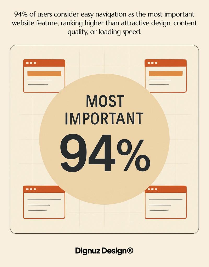
An overwhelming 94% of users consider easy navigation as the most important website feature. (Source: My Codeless Website) This ranks higher than attractive design, content quality, or loading speed. Users prioritize function over form when navigating websites.
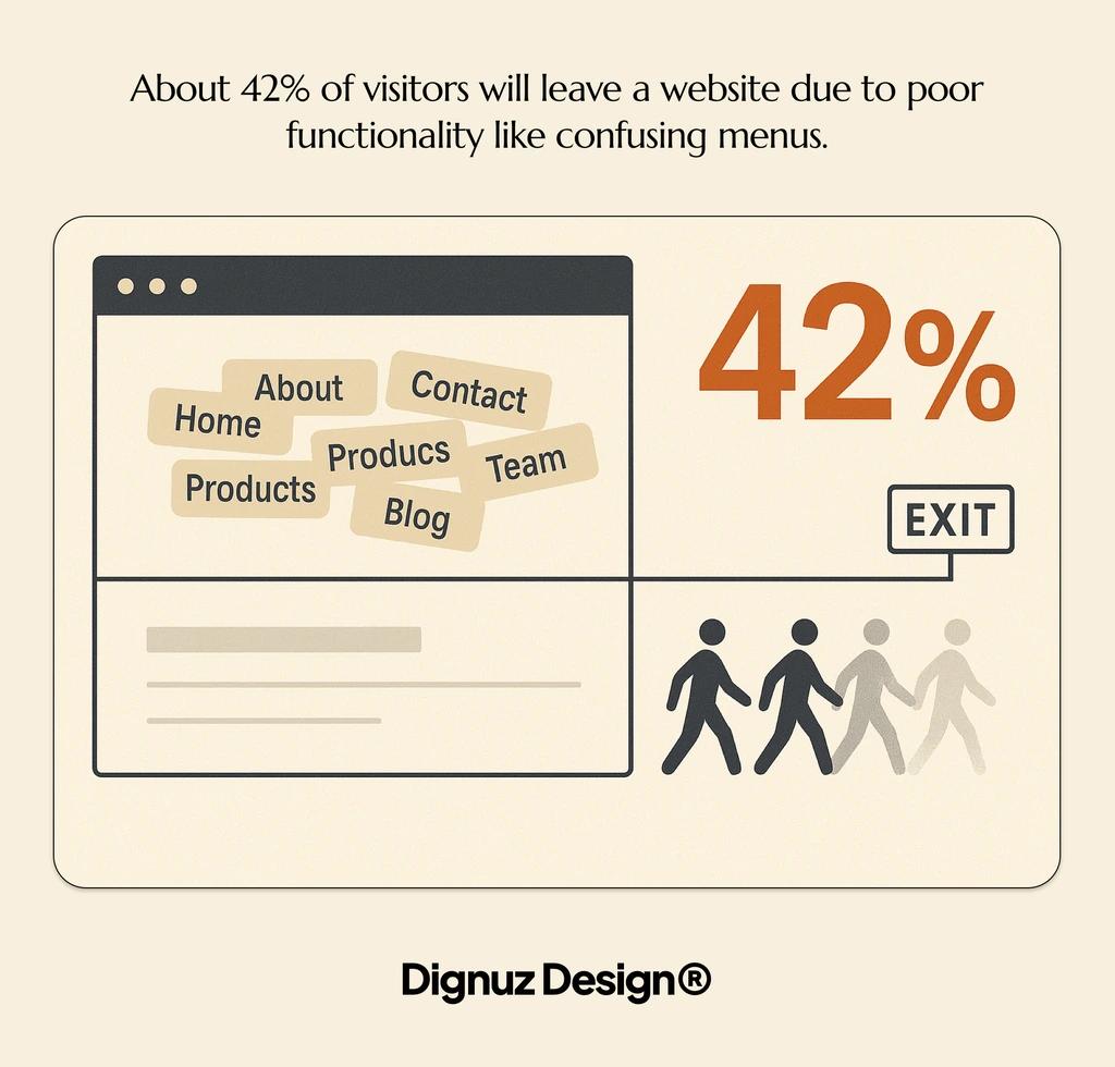
The consequences of poor navigation are equally clear. About 42% of visitors will leave a website due to poor functionality like confusing menus. (Source: My Codeless Website) For real estate websites, this means potential clients abandoning property searches out of frustration.
Navigation's Role in Trust Building
Clear navigation does more than prevent frustration. It actively builds trust with your visitors. When users can easily find what they need, they perceive your business as organized and professional. This perception transfers to their impression of your real estate services.
Intuitive navigation demonstrates respect for your visitors' time. It shows you've invested in creating a user-focused experience. For real estate professionals, this attention to detail matters. It suggests the same care will extend to property services.
The Connection Between Navigation and Engagement
Well-designed navigation encourages deeper site exploration. When moving between pages is easy, visitors view more properties. They spend more time learning about your services. This extended engagement improves the chances of conversion.
For real estate websites, engagement metrics directly connect to business outcomes. More property page views mean more potential inquiries. Better navigation facilitates this exploration process. It removes barriers between interest and action.
Confusing menu structure:
- User Impact: Difficulty finding properties
- Business Consequence: Higher bounce rates
- Solution Approach: Logical categorization
Hidden search functions:
- User Impact: Inability to filter options
- Business Consequence: Fewer property views
- Solution Approach: Prominent search placement
Inconsistent navigation:
- User Impact: Disorientation across pages
- Business Consequence: Shorter site visits
- Solution Approach: Standardized menu systems
Poor mobile navigation:
- User Impact: Frustration on smartphones
- Business Consequence: Lost mobile visitors
- Solution Approach: Mobile-optimized menus
Understanding these connections helps prioritize navigation improvements. Each enhancement directly contributes to better user experiences and business outcomes.
Essential Components of Effective Website Navigation
Creating effective navigation requires several key components working together. Each element serves a specific purpose in guiding users. Together, they create a cohesive system for website exploration.
Clear Main Navigation Menu
Your main navigation menu provides primary pathways through your site. For real estate websites, this typically includes categories like:
- Property listings (by type or location)
- Services offered
- About the agency/agent
- Resources and guides
- Contact information
Keep your main navigation concise and descriptive. Limit it to 5-7 core options. Use clear labels that visitors immediately understand. Avoid industry jargon or clever phrases that might confuse users.
Search Functionality
For real estate websites, robust search functionality is essential. Property seekers often have specific requirements. They need tools to filter by location, price, features, and property type.
Make your search function prominent and easy to use. Place it in a consistent location across all pages. Include advanced filtering options that match how your clients think about properties. Test search functions regularly to ensure they deliver relevant results.
Consistent Secondary Navigation
Secondary navigation elements support the main menu. These include breadcrumbs, footer navigation, and utility links. They provide alternative paths through your content and quick access to important information.
Breadcrumbs show users their current location within your site structure. They help with orientation and provide an easy way to move back up the hierarchy. This is particularly useful for users deep in property listing categories.
Footer navigation offers access to important but less frequently used pages. This often includes privacy policies, terms of service, careers, and detailed company information. Keep your footer organized and scannable.
Visual Hierarchy and Design Elements
The visual design of navigation elements communicates their importance. Size, color, positioning, and whitespace all influence how users perceive navigation options. Use these design elements strategically to guide attention.
Primary navigation should stand out clearly on the page. Use contrasting colors or backgrounds to make it immediately visible. Secondary options can use more subtle styling while remaining accessible.
The concept of specialized real estate web development includes creating intuitive navigation systems tailored to property showcases. This specialized approach considers both standard navigation principles and industry-specific needs.
Mobile Navigation Considerations
Mobile devices now account for a significant portion of real estate website traffic. Designing navigation for smaller screens requires additional considerations. The limited space demands more efficient solutions.
About 62% of top-ranking websites prioritize mobile optimization, demonstrating its importance in modern web design. (Source: Hostinger) For real estate websites, mobile optimization is particularly crucial as many property searches happen on smartphones.
Standard mobile navigation patterns include hamburger menus, bottom navigation bars, collapsible sections, and prominent search bars. Choose the approach that best suits your content structure and user needs.
Navigation Best Practices for Real Estate Websites
Real estate websites have unique navigation requirements. Property listings, search functionality, and contact options need special attention. Following these best practices will help create intuitive navigation for your real estate site.
Property-Focused Navigation Structure
Structure your navigation around how people search for properties. Most visitors want to browse by location, property type, price range, and features. Place these filtering options prominently in your navigation system.
Consider using a combination of top-level categories and faceted search. This allows visitors to quickly narrow down to relevant listings. Make the search process intuitive and aligned with how buyers think about properties.
With digital business cards becoming essential for real estate professionals, integrating access to these tools in your navigation is crucial. Include links to your digital business card in contact sections for easy access.
Visual Navigation for Property Showcases
Real estate is highly visual. Your navigation should support and enhance the visual exploration of properties. Consider these approaches:
Property Carousels:
- Purpose: Browse featured listings
- Implementation Tips: Include directional controls and indicators
- User Benefit: Quick visual scanning of options
Map-Based Navigation:
- Purpose: Search by location
- Implementation Tips: Use interactive maps with clustering
- User Benefit: Spatial understanding of property locations
Filter Visualization:
- Purpose: Show filter effects visually
- Implementation Tips: Instant visual feedback when filters change
- User Benefit: Better understanding of search parameters
Gallery Navigation:
- Purpose: Browse property photos
- Implementation Tips: Thumbnail navigation and full-screen options
- User Benefit: Comprehensive property visualization
These visual navigation elements complement traditional text-based menus. They provide intuitive ways to explore your property inventory. The combination helps all types of users find what they're seeking.
Call-to-Action Integration
Effective real estate website navigation guides visitors toward conversion points. Integrate clear calls-to-action within your navigation structure. Make it easy for potential clients to take the next step.
Common real estate CTAs include scheduling a viewing, requesting information, saving properties to favorites, sharing listings, and contacting agents directly. Place these CTAs consistently throughout the navigation experience.
Going Deeper
Discover how successful real estate marketing strategies incorporate navigation design to guide visitors toward conversion.
Common Navigation Mistakes to Avoid
Even well-intentioned navigation designs can contain critical flaws. These mistakes create friction for users and reduce conversion rates. Identifying and fixing these issues can significantly improve website performance.
Overcomplicated Menu Structures
Complex menus with too many options overwhelm visitors. They create cognitive overload and decision paralysis. Keep your navigation structure as simple as possible while still meeting user needs.
Signs your menu is too complicated include having more than 7 top-level items, multiple nested dropdown levels, redundant categories, and inconsistent naming conventions. Simplify by consolidating similar items and creating logical groups.
Ignoring Mobile Users
Poor mobile navigation alienates a significant portion of your audience. Many property searches begin on mobile devices. Your navigation must work well across all screen sizes.
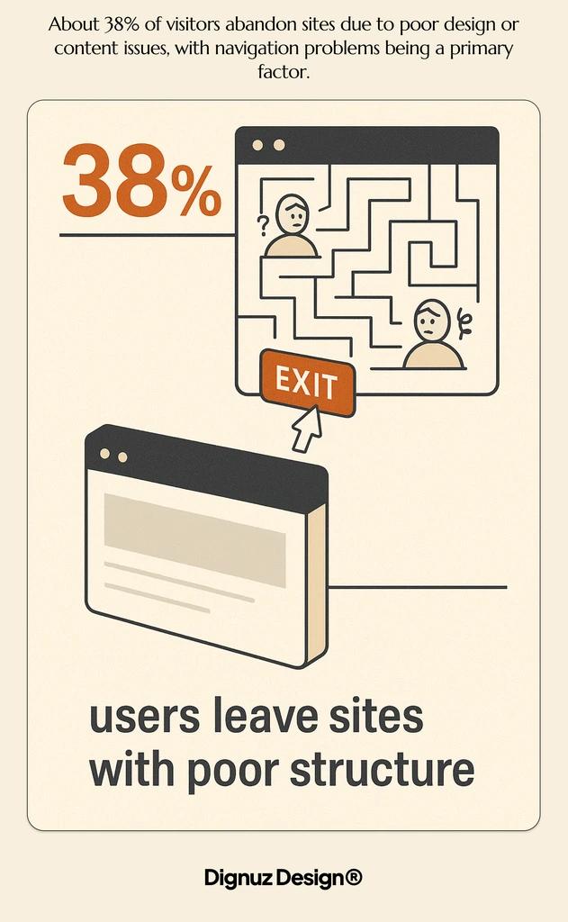
About 38% of visitors abandon sites due to poor design or content issues, with navigation problems being a primary factor. (Source: Hostinger) This abandonment rate is often higher for mobile users facing navigation difficulties.
Common mobile navigation mistakes include too-small touch targets, overcrowded menus, poor finger reach consideration, lack of search functionality, and horizontal scrolling requirements. Test your navigation on actual mobile devices for real-world usability.
Slow-Loading Navigation Elements
Navigation must load quickly to be effective. Slow-loading menus, especially those with heavy JavaScript, create frustration. Users often leave before navigation becomes usable.
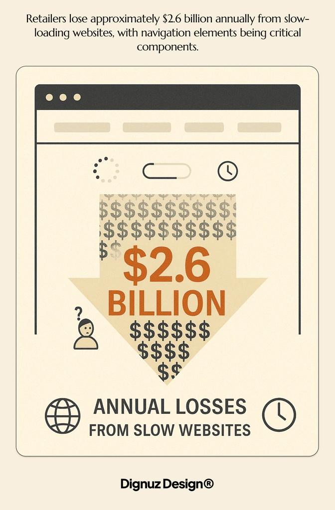
Retailers lose approximately $2.6 billion annually from slow-loading websites, with navigation elements being critical components. (Source: Hostinger) This demonstrates the significant financial impact of performance issues.
Optimize navigation performance by minimizing JavaScript dependencies, reducing custom font usage in menus, optimizing images, implementing lazy loading where appropriate, and using performance monitoring tools. Test navigation loading times on various connection speeds.
Optimizing Navigation for Conversion
Strategic navigation design directly impacts conversion rates. By guiding users efficiently toward conversion points, you can significantly improve business outcomes. These optimization strategies focus specifically on turning visitors into leads and clients.
Navigation User Flow Analysis
Understanding how users move through your site helps optimize navigation for conversions. Analyze the paths users take from entry to conversion. Identify where they drop off or get confused. Use these insights to improve navigation structures.
Tools for analyzing user flows include Google Analytics (Behavior Flow reports), heatmap tools like Hotjar or Crazy Egg, session recording software, and user testing with specific tasks. Look for patterns in successful conversions to streamline these pathways.
A/B Testing Navigation Elements
Systematic testing reveals which navigation approaches drive more conversions. A/B testing allows you to compare different navigation designs with real users. The data helps make informed decisions rather than relying on assumptions.
Here are key navigation elements worth testing:
Menu Structure:
- Variations to Try: Different category groupings
- Metrics to Measure: Click-through rate, time to task completion
- Implementation Complexity: High
Label Wording:
- Variations to Try: Different terminology for menu items
- Metrics to Measure: Click rates, search usage
- Implementation Complexity: Low
CTA Placement:
- Variations to Try: Various positions within navigation
- Metrics to Measure: Conversion rate, click-through rate
- Implementation Complexity: Medium
Search Functionality:
- Variations to Try: Different designs and placements
- Metrics to Measure: Search usage, successful search rate
- Implementation Complexity: Medium
Start with small, focused tests that isolate specific variables. Use statistically significant sample sizes before drawing conclusions. Implement winning variations and continue testing to refine navigation further.
Personalized Navigation Experiences
Tailoring navigation to user behavior can significantly improve conversion rates. About 36% of web designers now use AI tools to optimize navigation and create personalized experiences. (Source: Hostinger) This trend reflects the growing importance of customized user journeys.
Personalization options for real estate website navigation include showing recently viewed properties, highlighting listings similar to previous interests, remembering search preferences, offering location-based property suggestions, and providing returning visitor recognition.
Mobile Navigation Considerations
Mobile navigation requires special attention due to screen size limitations and touch interactions. With 90% of websites now using responsive design, the focus has shifted to optimizing the mobile experience rather than merely making it functional. (Source: Hostinger)
Touch-Friendly Design Principles
Mobile navigation must accommodate finger interaction rather than precise mouse clicks. This means larger tap targets and appropriate spacing. Navigation elements that work well on desktop can be frustrating on mobile devices.
Key touch-friendly design principles include minimum tap target size of 44×44 pixels, adequate spacing between clickable elements, clear visual feedback for touch interactions, avoiding hover-dependent navigation, and positioning critical navigation within thumb reach zones.
Simplified Mobile Menu Structures
Mobile navigation needs more streamlining than desktop versions. Screen constraints require focused, prioritized structures. Reduce options to the most essential pathways while maintaining access to key content.
- Use progressive disclosure (revealing options as needed)
- Implement collapsible sections for category filtering
- Prioritize navigation based on mobile user behavior
- Consider a search-first approach for content-heavy sites
- Use bottom navigation bars for critical functions
The goal is making navigation discoverable without overwhelming limited screen space. Use mobile analytics to understand which navigation elements mobile users need most frequently.
Performance Optimization
Navigation performance is especially critical on mobile devices. Mobile connections may be slower or less stable than desktop. Users are also less patient on mobile, with 39% abandoning sites due to slow image loading. (Source: Hostinger)
Optimize mobile navigation performance by minimizing code, optimizing images, reducing JavaScript dependencies, and testing on various devices and connection speeds. Pay particular attention to low-end devices and slower connections.
Measuring Navigation Success
Effective measurement helps verify navigation improvements and identify ongoing optimization opportunities. Establish clear metrics to evaluate navigation performance. Track these metrics consistently to guide design decisions.
Key Navigation Metrics
Several metrics directly reflect navigation effectiveness. These measurements provide insights into how well users can find and access content. They indicate where navigation might be causing frustration.
Important navigation metrics include navigation click-through rates, search usage rates, time to task completion, path analysis, exit rates from navigation pages, and return visits. Establish baselines for these metrics before making changes.
User Testing Methodologies
Direct user testing provides invaluable insights into navigation effectiveness. Qualitative feedback reveals issues that analytics might miss. It helps understand the why behind navigation problems.
Why do custom real estate websites perform better than templates? The answer often lies in navigation design that's specifically tailored to property showcase needs, as confirmed through user testing.
Effective navigation testing approaches include:
Task-based usability testing:
- Best For: Finding specific navigation issues
- Time Investment: Medium
- Cost Level: Low to medium
Tree testing:
- Best For: Evaluating menu structures
- Time Investment: Low
- Cost Level: Low
Card sorting:
- Best For: Creating logical category groups
- Time Investment: Medium
- Cost Level: Low
First-click testing:
- Best For: Assessing initial navigation decisions
- Time Investment: Low
- Cost Level: Low
Combine multiple testing methods for a complete picture of navigation performance. Include diverse participants who represent your actual user base. Pay special attention to first-time visitors, as they face the steepest learning curve with your navigation.

Conclusion
Effective website navigation design significantly impacts both usability and conversion rates. For real estate websites, intuitive navigation directly connects potential clients with properties they might purchase. It's a critical business asset worth ongoing investment.
The statistics are clear: 94% of users prioritize easy navigation, and 42% leave websites with confusing menus. Well-designed navigation keeps visitors engaged and moving toward conversion actions. Poor navigation drives potential clients to competitor sites.
Navigation best practices for real estate websites include property-focused menu structures, visual navigation elements, mobile-optimized interfaces, strategic CTA placement, and performance optimization for all devices.
Avoid common mistakes like overcomplicated menus, inconsistent patterns, and poor mobile implementation. These errors cost conversions and damage user trust. Regular testing and measurement help identify and fix navigation issues before they impact business results.
Remember that navigation design isn't just a technical exercise—it's about creating intuitive pathways that feel natural to users. When visitors can easily find what they need, they're more likely to become clients. Great navigation removes barriers between interest and action.


