Website Design for Construction Companies That Wins Clients
Most construction websites I look at have the same problem. They were built to look like a construction website instead of being designed to win the kind of client the company actually wants. They open with a hero image of a hard hat or a crane, list services in identical three-column grids, and hide the only thing a potential client came to check: the work. Then they wonder why inquiries are thin and why every lead asks about price first.
I run a studio called DignuzDesign that builds websites for property developers, architects, and construction firms, plus a sister studio called Faraday3D that produces architectural renders and virtual tours. Much of what I do sits at the intersection of web performance, 3D visualization, and property marketing. Construction companies sit right next to that world. You are often building what a developer or architect conceived, or you are selling a design-build service to a homeowner who is essentially commissioning a one-off product. The digital purchasing journey looks the same. People arrive on your site cold, size you up in seconds, and make a short list before they ever fill in a contact form.
This guide is what I actually tell construction clients when we sit down to rebuild their site. The topic is website design for construction companies, but the subtext is simpler: your site is a quiet salesperson that has to earn trust in about fifteen seconds, show competence without bragging, and make it easy for the right person to contact you. Almost every design decision below flows from those three jobs.
Why most construction websites stall
A few years ago the assumption was that a website existed mainly so prospects who already knew you could verify you were a real business. That is no longer the pattern I see. The remodeling and construction market is enormous, fragmented on the supply side, and increasingly researched online before anyone picks up the phone. Translation: there are a lot of construction firms chasing the same projects, and the internet is where prospects quietly narrow the field.
What that shift rewards is a site that looks like it was made by people who finish what they start. What it punishes is the template look: stock imagery, vague "we're your trusted partner" copy, a portfolio section with three photos, and a contact form that asks for fifteen fields. The prospect is not reading. They are scanning. If the scan says generic, they are gone in one click.
The first fifteen seconds: trust signals that actually work
When a visitor lands on a construction site, they are unconsciously running a credibility check. In rough order, they want to know: do these people exist, do they do the kind of work I need, have they done it well, and can I speak to a human? Everything above the fold has to answer those four questions without making the visitor scroll.
The companies that get this right are specific in the hero area. Not "quality craftsmanship since 1998" but "Design-build renovations for pre-war homes in North London" or "Tenant improvements for medical offices across Denver metro." One real sentence about who you serve filters out tire-kickers faster than any clever copywriting. Behind that line, use a hero image of actual finished work, shot well, not a stock photo of blueprints. If you do not have a single great hero image, that is the first thing to fix, before the website itself.
Trust signals that carry weight below the hero: a strip of logos from clients, architects, or general contractors you have worked under; named testimonials with the project type and location included; and licensing or affiliation badges that are relevant in your market. If you are posting a testimonial, the phrase "Mike Harper, kitchen renovation, Boulder, 2024" does more than "Mike H., satisfied customer." Specificity reads as real. Vagueness reads as fiction.
One thing I push hard on with clients: do not bury your phone number. Construction is still a phone-led industry for a lot of prospects, especially on commercial work and emergency jobs. A visible number, tap-to-call enabled on mobile, with hours next to it, has converted more leads for my clients than any clever hero animation. If you are paranoid about spam calls, run a dedicated line and track it.

Your project gallery is the website
Everything else on a construction site is secondary to the portfolio. The gallery is where prospects either decide you are a fit or click away, and most galleries are built backwards. They show three thumbnails, a generic "view more" link, and the same handful of photos shuffled. The good ones treat every project as a case study, which is how an architect or serious buyer expects to read work.
A case study that sells has a short context paragraph (what the client wanted, what the constraints were), a sequence of images showing the finished work from hero shot to detail shots, and ideally a before image or a construction-progress image or two. Numbers that matter in your segment belong here too: square footage, project duration, zoning or permitting complexity, approximate budget band if you are comfortable publishing one. A single well-built project page outperforms fifty thumbnails.
This is where photography quality becomes non-negotiable. If you have been sending a team member out with a phone to document jobs, the site will look it, and no amount of design polish fixes that. Budget once for a real architectural photographer to shoot your best five or six finished projects, and write the case studies around those. A proper treatment of photography for this context is covered in our real estate photography tips guide, and most of the advice applies to construction as well.
Showing work before it exists
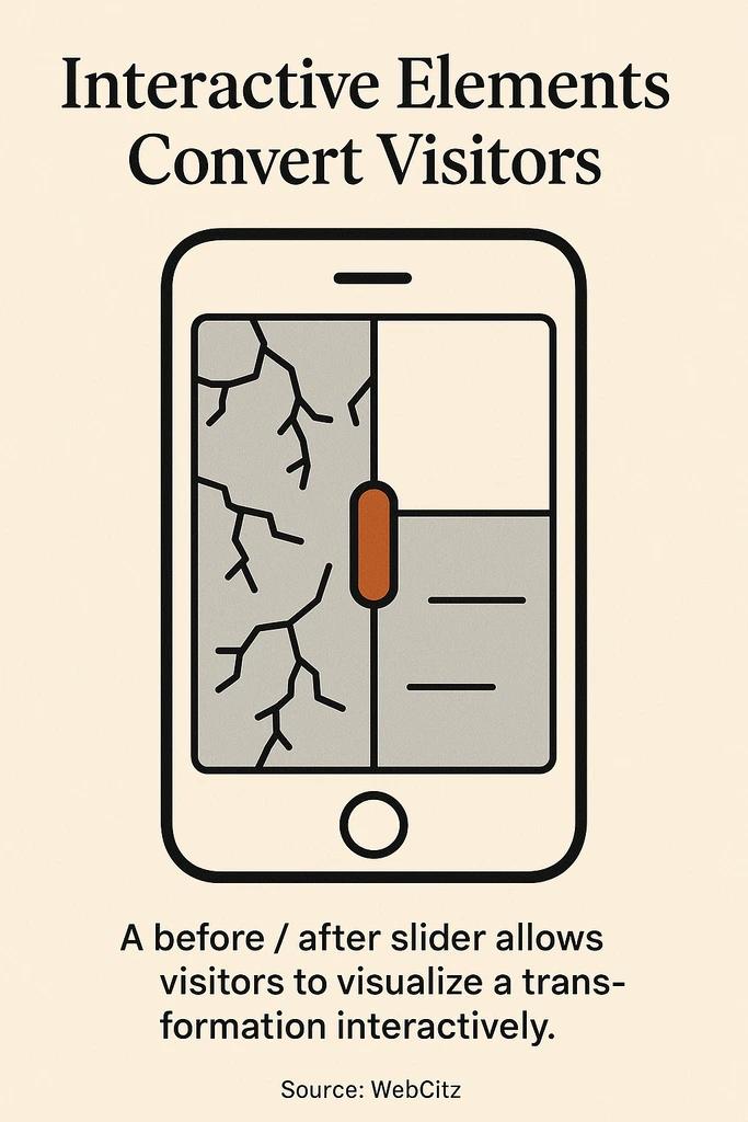
Here is where construction sites quietly differ from finished-product industries. A big chunk of the prospects walking in are commissioning something that does not exist yet: a new build, an extension, a fit-out, a gut renovation. They cannot see what you are proposing to do for them, and they are expected to sign a six or seven figure commitment based on plans and a conversation. That is a real psychological barrier, and almost no construction website addresses it.
The firms that do address it tend to win on margin, not just volume. What works: architectural renders of a concept before ground is broken; animated walk-throughs or short render flyovers embedded on a proposal page; interactive 3D models a prospect can rotate and explore in the browser. In my Faraday3D work this is a regular brief for design-build firms and spec builders, and the difference in client confidence between "here is a 2D plan PDF" and "here is the living room as it will look, from the sofa's point of view" is not subtle.
If you build spec homes or work on repeat floor plans, interactive 3D viewing starts to pay off beyond any single project. That is what we built AmplyViewer for originally in the property developer context, and the same logic extends to construction: embed an interactive 3D model of a completed or in-progress build into your website and the prospect spends minutes exploring instead of seconds glancing. There is a broader argument for why this changes buyer behaviour in our piece on immersive 3D experiences and sales, and the practical production side of CGI in our 3D rendering services overview.
For most construction firms, you do not need a full 3D build-out on day one. A single well-produced render embedded in each new-build case study signals that you think one step ahead of where your competitors stop.

Mobile speed is the silent conversion killer
Construction sites tend to be image-heavy, and image-heavy sites on generic hosting tend to be slow. The cost of that is not theoretical. Google's mobile page speed benchmarks show the probability of a mobile visitor bouncing rises 123 percent as load time goes from one second to ten, and 53 percent of mobile users abandon a site that takes more than three seconds to load. Prospects do not tell you they bounced because your hero image was 4 MB. They just do not fill in the form.
Two things matter more than anything else for construction site speed. First, compress and resize every image before upload. The hero photo should be delivered at the size it is actually displayed, in a modern format like WebP or AVIF, not a fifteen-megapixel JPEG straight out of the camera. Second, pick a tech stack that starts fast. For the sites I build at DignuzDesign I lean on Astro and Cloudflare because the baseline performance is excellent without much tuning, and a construction portfolio is a perfect fit for a static-first architecture. If you want a deeper walk-through of the specific levers, our website speed optimization guide goes through what to measure and how to fix it.
Mobile layout is its own discipline. The top of the mobile screen should get a visitor to a phone call, a contact form, or the portfolio in one tap. If your mobile menu is burying "Contact" behind two nested sub-menus, that is a tax on every inquiry you could have had.
Lead capture without friction
The contact form is where most construction sites throw away the work the rest of the site has done. I have inherited sites with forms asking for first name, last name, company, phone, email, project address, project type, budget range, timeline, and "how did you hear about us," all behind a reCAPTCHA that sometimes fails. Nielsen Norman Group's research on simplifying forms is blunt on this: every extra field drops completion, and the effort it takes to fill a form is the single strongest predictor of whether someone finishes it.
What I actually recommend: three fields on the first form. Name, phone or email, and a short "tell us about your project" text area. That is it. If you need more detail to qualify, ask in the reply or the phone call. You will get more leads. Some will be junk. Getting a hundred raw leads and filtering to ten good ones is almost always better than getting twelve pre-qualified leads and closing three, because the top of the funnel is where growth comes from.
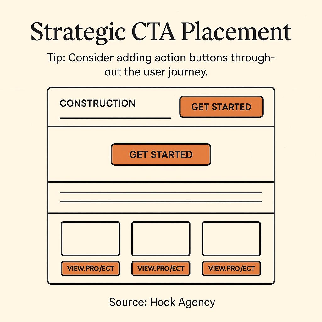
The second lesson is about calls to action. Put them in more than one place, and vary the language. A "Request a quote" button at the top of the site, a "Start your project" block at the end of each case study, and a final "Talk to us about your build" section above the footer will outperform a single contact page every time. These are not aggressive asks. They are there for the moment the prospect decides they are ready, which varies by person. More on the structural side of this in our web page design conversion guide.
Content that reads like a practitioner
The part of a construction website that reads the worst is almost always the service pages. They default to a list of capabilities ("kitchen remodeling, bathroom remodeling, additions") with a generic paragraph under each. Nothing a prospect cannot find on a dozen other local sites.
What I push clients to do instead: write as if you are explaining the job to a friend who is about to hire you. A service page for kitchen remodels should explain, roughly, what a typical project of that size takes start to finish, what the hidden costs usually are, where clients tend to get stuck, and what decisions you will ask them to make in what order. This reads as genuine expertise because it is. It also pre-qualifies prospects who read the whole thing and arrive at the contact form already half-sold.
One data point worth anchoring on: Houzz's 2025 U.S. Houzz and Home Renovation Trends study found that around nine in ten renovating homeowners hired a professional for their project, with forty percent specifically hiring a construction professional and fifty-seven percent saying online consultations were important to the selection process. Those prospects are reading your service pages. They are comparing you to the next firm in the search results. Generic content is a loss by default in that comparison.
For the deeper story on writing copy that actually converts in a service industry, the principles in our guide on website copy that converts carry directly over to construction.
Where to spend first on a tight budget
A lot of construction firms hesitate to invest in their websites because they see it as a sunk cost until a lead comes in. That is fair. Here is the order I give when a small firm asks me what to do first on a limited budget.
First, pay for professional photography of your best completed work. Nothing else on this list compensates for bad photos, and nothing else on this list gets close to its impact per dollar. Second, rewrite the three or four pages that matter: home, services, about, contact. Cut every generic sentence. Replace it with something specific. Third, simplify the site. Fewer pages, shorter menus, one obvious path to contact. Fourth, check the site on an actual phone, on a cellular connection, away from your office Wi-Fi, and fix whatever makes you wince. Fifth, and only fifth, consider a full rebuild if the structural bones are still wrong after the first four.
Custom design pays off sooner than most people expect for firms competing on quality rather than price, because the whole site has to carry a level of polish that template builders cannot quite reach. There is a longer argument for that in our piece on why custom websites outperform template solutions, and the logic is identical for design-build and quality-focused construction firms.
Frequently asked questions
How much should a construction company spend on a website?
There is no single answer, but the honest floor for a site that meaningfully competes is in the low five figures for a custom build, plus a recurring budget for photography and updates. Below that you are usually buying a template plus some images, which is fine as a starting point but rarely the last word. The higher the ticket size of your typical project, the faster a better site pays for itself.
What is the most important page on a construction website?
The project gallery or portfolio, by a wide margin. Prospects come to see the work, and they decide about you based on what they see there. Home pages get the traffic, but portfolios close the deal. Invest more time and money on the portfolio than on any other section, and treat each case study as a small standalone sales tool.
Do construction companies really need 3D renders or virtual tours?
Not every company, and not for every project. If you mostly do repair and maintenance, probably not. If you do new builds, additions, large renovations, or anything where the client is committing to something they cannot yet see, then yes, and the advantage is real. A single render included in a proposal often shifts the conversation from price to quality, which is usually where you want it.
How fast should a construction website load?
On mobile, aim for a largest contentful paint under 2.5 seconds and total load under four seconds on a mid-tier phone and typical cellular connection. Anything slower and you are leaving leads on the table. Image compression and a modern static or Jamstack stack fix most of the gap for construction sites.
How many fields should a construction website contact form have?
Three or four on the first contact. Name, a way to reach them, a short project description, and optionally a location. Every field beyond that is a tax on completion. You can ask for more detail in the follow-up email or phone call, where the prospect is already warm.
Is local SEO worth it for a construction company?
Yes, and it is often more important than general SEO. Most construction work is geographically bounded, and prospects search by city or neighbourhood plus service. A well-kept Google Business Profile, consistent local citations, and service-area pages written for real local intent usually beat general keyword optimization for this industry.

Closing
A construction website is not a brochure. It is the first meeting, the reference check, and the portfolio review compressed into whatever time the prospect gives you before they click away. The companies that treat it that way put real work into specifics: named clients, named projects, real photos, a clear sense of who they are for, a fast load, and an easy way to get in touch. Nothing on that list is expensive if you sequence it right. Most of what looks like a design problem on a construction site is actually a clarity problem, and clarity is free.


