Real Estate Banner Design: A Practitioner's Guide to Ads

Most articles on real estate banner design treat the question as a graphic design problem. Pick complementary colors, choose a legible font, balance the composition, add a call-to-action. None of that is wrong, but none of it is what separates a property banner that earns its ad spend from one that quietly burns it. After building property websites and producing the renders, listings, and ad creative that sit inside campaigns for developers and agents, I have watched plenty of beautifully designed banners do nothing, and plenty of crude-looking ones outperform them by margins that would embarrass the design team.
I am Dimitri, and I run DignuzDesign, a studio building custom websites for property developers, agents, and architects. I also run Faraday3D, the visualization studio that produces renders and walkthroughs for the same audience. That combination matters for a banner conversation, because most banner failures are not design failures - they are mismatches between the ad, the visual asset inside it, the landing page it points to, and the way a buyer is actually scrolling when they meet it. The good news is that fixing those mismatches is mostly free, and the rest of this article walks through how.
Why most property banners fail before design enters the picture
The first thing worth saying is that real estate is one of the better-performing categories in digital display advertising, not because the creative is unusually good but because the audience is unusually motivated. Industry benchmarks consistently place real estate display ad click-through rates around 1.08%, well above the cross-industry display average sitting under half a percent, as collected in LocalIQ's real estate advertising benchmarks. The buyer pool is small, the stakes are high, and the search intent is genuine. That tailwind hides a lot of bad creative. Developers and agents look at a 1% CTR and assume their banner is working when, in reality, the category is doing most of the work and the creative is leaving money on the table.
The actual failure modes I see again and again are almost never about color or font choice. They are about three things. First, the banner is trying to be a brochure - dense with information that no one will read in a scroll. Second, the visual is wrong for the message, either because the photograph is generic stock or because the render is too ambitious for the format. Third, the banner is divorced from the landing page, so the buyer who clicks lands somewhere that looks like a different company. Solve those three things and the design questions become much smaller.
What buyers actually see in the first second
The single most useful number in display advertising is the viewability threshold. The Media Rating Council standard, which is what most ad networks use to count a "viewable" impression, requires that at least 50% of the pixels of a display ad be in view for one continuous second. A summary of the rule is collected in this primer on IAB and MRC viewability standards. One second. That is what counts as the ad even having a chance.
You should design every property banner against that one-second test, not against how it looks on your monitor in a calm Figma frame. In one second, a buyer scrolling a feed cannot read body copy, cannot parse a price list, cannot absorb three benefit bullets. They can register an image, one short line of text, and a brand. If a banner cannot survive being seen for one second on a phone in bad lighting, the rest of the design conversation does not matter.
The IAB and MRC published updated attention measurement guidelines in late 2025, formalizing the gap between an ad being viewable and an ad being noticed. The takeaway for designers is blunt: viewability is the floor, not the goal. Even within the one-second window, attention is being competed for. A banner that loads cleanly, communicates one idea, and gets out of the way will outperform a banner stuffed with the developer's logo, the agent's headshot, the price, the location, the amenity list, and a call-to-action.
This is the discipline that separates property banners that work from those that look like flyers. Choose the single thing the buyer needs to take away. For an off-plan launch that is usually a feeling - the place, the lifestyle, the elevation. For a finished listing it is usually a price hook and a hero photo. For a brand campaign it is recognition. One thing, executed cleanly, with everything else cut.
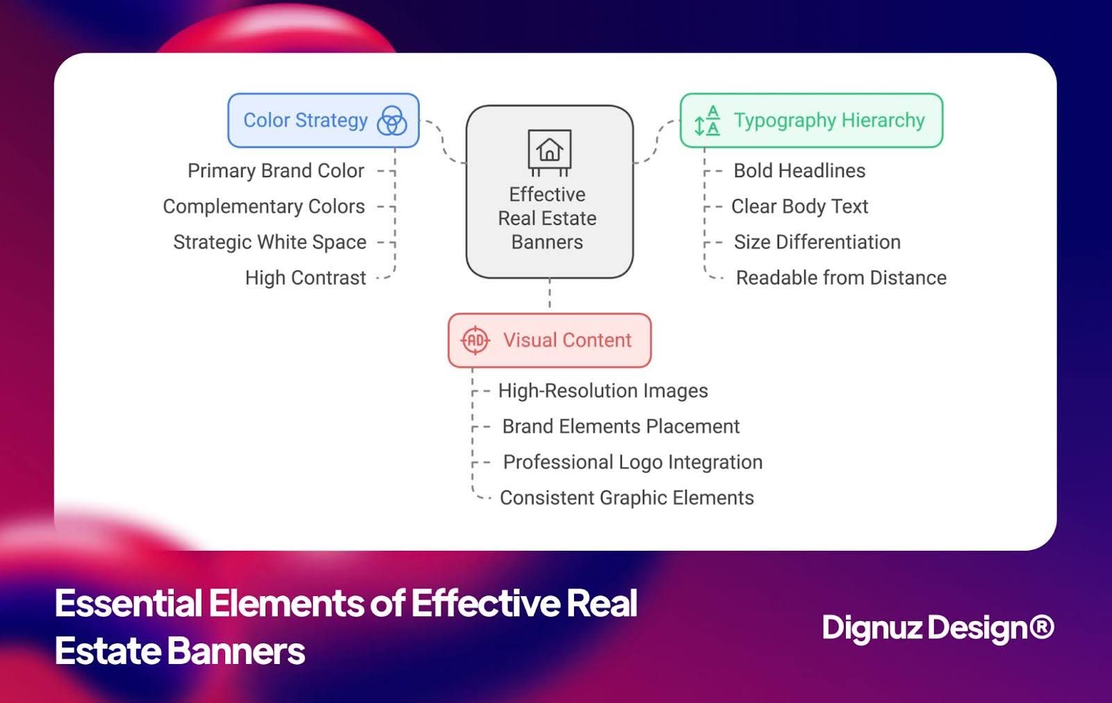
Photography or render: the visual decision specific to property banners
Most generic banner design advice tells you to use "high-quality images" and stops there. In property marketing, that sentence hides the most consequential creative decision you make on every campaign. You are choosing between photography and 3D rendering, and the answer depends on the project stage, the asset itself, and the impression you need the banner to create.
For finished, photographable properties, professional photography almost always outperforms renders in banners. Buyers can subconsciously detect the unreality of CGI even when they cannot articulate it. A photograph captures imperfect light, real materiality, and the small visual cues - shadows, weathering, a slight asymmetry - that signal a real place exists. The same trust signal does not survive a banner that uses a glossy render for a building that has been standing for two years. If the property exists and is photographable, photograph it. Our notes on real estate photography cover the technical side of getting that right.
For off-plan developments, renders are not a choice but a necessity. A banner promoting an unbuilt scheme has to do emotional work without a real subject to point a camera at. Here the question is not whether to render but how cinematic to go. A common mistake is to use a full-resolution architectural render - composed for a brochure cover - as banner creative. The banner format is small and short-lived. A render that took weeks to produce gets compressed to thumbnail size and stripped of all the detail it was made for. For banners specifically, I commission tighter, simpler compositions: one dominant element, one focal light, generous negative space for the headline to sit. Our guide to real estate 3D rendering services goes into more detail on commissioning renders that work across formats rather than being orphaned in a brochure.
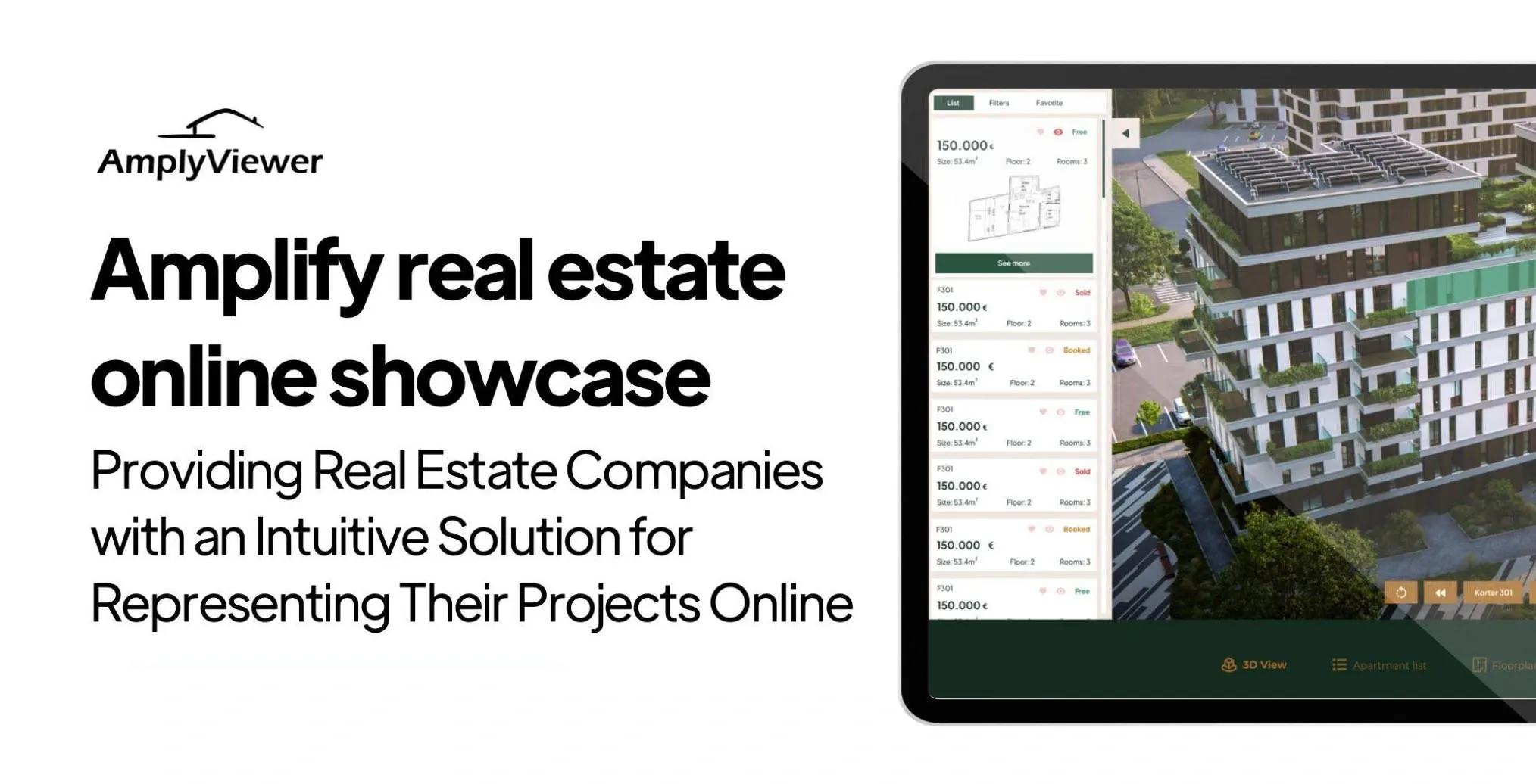
For developments where the buyer needs to feel the inside of an unbuilt apartment before they click, a static render is not always enough. An interactive layer - AmplyViewer, our embedded 3D property viewer, is one example - can run as the destination behind the banner rather than inside it. The banner uses the render as a teaser. The click delivers the interactive experience. That handoff is one of the highest-converting patterns I have seen on premium off-plan campaigns and sits well inside the broader logic of interactive ways to showcase properties.
Headlines that work on a property banner
Generic banner copywriting advice tells you to write benefit-driven headlines and lists adjectives. In property, the practical question is sharper. You have roughly four to seven words to do the entire job. The rest is the property itself doing the talking through the image.
The headline patterns I see consistently outperform on real campaigns share a few traits. They name a specific thing - a neighborhood, a price band, a property type - rather than a vague category. They avoid the word "luxury" except where it is genuinely warranted, because the word has been so abused that it now flattens premium positioning rather than signaling it. They earn the click by promising something the landing page actually delivers, which is the only honest way to sustain a campaign over more than a week. The harder problem of writing real-estate copy that converts beyond the banner is covered in our piece on real estate marketing messages that resonate with buyers and sellers.
A common error is to lead with the developer's brand or the agent's name. Outside a tiny circle of repeat buyers, no one is scrolling because they recognize the developer. They are scrolling because they might be interested in a property. The brand earns its place after the property has earned the click, not before. The exception is a brand campaign explicitly aiming for recognition rather than direct response, which is a different brief and usually a different budget line.
The landing page is half the banner's job
Here is the part that gets ignored in every banner design article I have ever read. A banner is not a finished asset. It is the first half of a two-part conversation. The second half is the page the click delivers the buyer to, and if that page does not visually and tonally match the banner, the banner has wasted its impression.
I have run audits on dozens of property campaigns where the banner is well-designed, the targeting is right, and the bounce rate is over 80% on the landing page. Almost always, the cause is a disconnect. The banner showed a moody twilight render of a coastal development. The landing page showed a generic gridded archive of all the developer's projects, with the campaign property buried six rows down. The buyer arrives, fails to find the thing they clicked for in two seconds, and leaves.
The fix is not complicated, but it is unglamorous. Every banner campaign needs its own dedicated landing page or a deep link to a section visually consistent with the banner. The hero image on the page should be the same render or photograph from the banner, ideally a larger crop of the same composition. The headline should be a longer-form version of the banner headline. The first piece of supporting content should answer the question the banner implicitly raised - price, availability, location, completion date. This is straightforward conversion logic, treated in more detail in our real estate web page design conversion guide.
If you are running banner campaigns and you do not control the landing page, push back hard until you do. A banner pointing at a homepage is a banner that has been set up to fail.

Designing for the way buyers actually search
Almost every banner I see in early reviews is designed on a desktop monitor, sized for desktop, judged at desktop scale. Then it ships and runs predominantly on mobile, where it is seen at a fraction of that size and held at arm's length on a phone. The NAR 2025 Profile of Home Buyers and Sellers found that 70% of buyers used a mobile or tablet device during their property search, with around 80% of millennial buyers starting their search on a phone. The implication is not subtle: design for mobile, ship a desktop variant, never the other way around.
Designing for mobile means three constraints that quietly govern good banner work. Text has to be readable at thumbnail scale, which usually means it has to be much larger and shorter than your first draft. Compositions need a clear focal point that survives heavy cropping into vertical and square formats. Brand elements need to read as silhouettes, not as detailed marks - a logo that disappears on a 1080-pixel mobile feed is doing nothing.
This is also where matching the banner to the rest of your digital presence starts to matter. A banner that does not look related to your website, your social posts, your real estate social media marketing, and your listing page is teaching the buyer that your brand is unreliable. Visual continuity is one of the cheapest forms of trust in digital advertising, and one of the most consistently undervalued.
Platform-specific reality without the generic dimension table
The original advice on banner technical specs - here is the Facebook size, here is the Instagram size, save as JPG at 72 DPI - is correct but unhelpful, because every ad network publishes its own current specs and they change quarterly. Build your file production around the principle instead of the number. You need each campaign to ship in three core families: a wide landscape ratio for in-feed display and most placements, a square version for newsfeed compactness, and a vertical version for Stories and Reels. Build them from the same source artwork with deliberate composition for each crop, not from one auto-cropped master.
The trap with auto-cropping is that property banners almost always have a critical detail - the building, the headline, a model unit - that an algorithmic crop will cut in half. I have lost count of the number of campaigns where the developer's hero render arrived on Instagram Stories with the building hidden behind the Stories interface chrome at the top, because no one had crop-checked the vertical version. Composing for the crop is dull work and worth the time.
On file format, the only practical rule is to ship the lightest file that survives compression. Most ad platforms re-encode whatever you upload, so a 2MB pristine PNG and a 200KB optimized JPG often look identical once they pass through the platform pipeline. Lean toward smaller files, test them in the actual placement, then commit. The same logic about file weight applies to landing pages and is one of the bigger drivers of conversion drop-off, covered in our notes on real estate website speed optimization.
Testing without burning the campaign
Generic banner advice tells you to A/B test images, headlines, and calls-to-action. That is true but worth qualifying for property campaigns, because the buyer pool is small enough that statistical noise dominates if you test too many variables at once. On a campaign delivering a few thousand impressions a day, splitting traffic across four variants of a banner mostly produces inconclusive results and wastes the budget while you wait for significance.
The discipline I use on property campaigns is to test one variable at a time and to test the variable that is most likely to move the needle first. Image variants almost always move the needle more than headline variants on real estate banners, because the image is what stops the scroll. Headline variants matter most when the image is already strong and the click rate has plateaued. CTA variants almost never matter for property banners - "Learn More" and "View Property" perform within margin of error on every test I have run.
What is worth doing aggressively is segmenting by audience and serving different creative to different segments. An off-plan banner aimed at investors should look different from one aimed at end-users, even for the same property. Investors want price points, yield context, and completion dates. End-users want lifestyle imagery and location signals. Running the same banner against both audiences pulls the creative toward an unhappy compromise and dilutes the result. This kind of segmentation thinking sits inside the broader strategy work we cover in estate agent digital marketing.
What design quality really means in this format
It is worth ending where most banner design articles begin: with the design itself. Color, typography, hierarchy, balance - these matter, but they matter as second-order concerns. A well-designed banner with a wrong message and a wrong landing page is a polished failure. A scrappy banner with the right image, the right one-line message, and a matched landing page often beats it on a tenth of the budget.
The reason I keep emphasizing this is not because design does not matter. It is because the way most property teams think about banner design under-invests in the strategic decisions that move conversion (visual choice, headline discipline, landing-page alignment) and over-invests in the cosmetic decisions that do not (which font, which exact color, how many decorative flourishes). Reverse that ratio. The cosmetic work will come together once the strategic work is solved. The reverse is not true.
If you are taking banner design seriously as part of a broader property campaign, it is worth reading alongside our pieces on luxury real estate visual marketing strategies and essential property marketing visuals, both of which treat the banner as one node in a larger visual system rather than as an isolated craft problem.
💻 Let us help you create a stunning online showcase for your projects that works seamlessly across all devices. Ready to amplify your real estate business? 👉 Explore AmplyViewer now
Frequently asked questions
What banner sizes should I prioritize for real estate digital ads?
Build three families: a landscape format around 1200x628 for Facebook in-feed and most display placements, a square format around 1080x1080 for Instagram and LinkedIn feeds, and a vertical format around 1080x1920 for Stories and Reels. Treat each as a deliberate composition rather than an automatic crop of a master. The specific dimensions shift over time and by platform, but those three crop families cover almost all serious property ad placements.
Should I use photography or 3D renders in real estate banners?
Photography for finished, photographable properties. 3D renders for off-plan developments and unbuilt amenities. Mixed campaigns can use both as long as the banner is honest about what it is showing. The single biggest mistake is using glossy renders for properties that have been standing for years, because buyers detect the unreality even when they cannot name it, and trust drops as a result.
How long should a real estate banner headline be?
Four to seven words is the practical ceiling for in-feed banners. Long enough to name a specific thing - a neighborhood, a price band, a property type - and short enough to be read inside the one-second viewability window the MRC standard sets. If a headline cannot survive being read at thumbnail size in one second, the banner is overwritten.
Do I need a separate landing page for each banner campaign?
For any campaign worth running, yes. The cost of building a dedicated landing page is trivial compared to the wasted ad spend you incur by sending banner traffic to a generic homepage. At minimum, deep-link to a section of an existing page that visually continues the banner's hero image and headline. Banners pointing at homepages are banners set up to fail.
What metrics matter most for real estate banner campaigns?
Click-through rate tells you whether the banner is doing its job. Bounce rate on the landing page tells you whether the campaign is honest. Lead form completions or viewing requests tell you whether the entire chain - banner, landing page, follow-up - is converting. Watching click-through rate in isolation is the most common mistake, because a high CTR with an 80% bounce rate often signals a banner that overpromises and a landing page that underdelivers.
How often should I refresh banner creative?
On a sustained campaign, refresh hero creative every four to six weeks even if performance has not declined. Display ads suffer from creative fatigue faster than search ads, and the audiences most likely to convert see the same ad repeatedly. Rotating creative also gives you cleaner data on what is working, because you can compare like-for-like across refresh cycles rather than guessing at long-tail drift.


