B2B Website Optimization for Property Lead Generation

Most B2B websites I see in property and real estate are built like brochures. A polished hero shot, a long scrolling reel of credentials, a portfolio gallery with no commercial context, and a Contact Us button sitting alone at the bottom of the page. They convert almost nothing, because they answer almost nothing.
I run DignuzDesign, a small studio building custom websites for property developers, architects, and real estate companies. The first version of this article was written for the same site by a generic AI writer with no specific point of view on what actually moves a deal in property, and Google's Helpful Content system stopped indexing it. Fair enough. So I am rewriting it from where I actually work, and what I see every week when I take on a new B2B property brief.
If you sell into developers, investors, asset managers, corporate occupiers, or institutional buyers, this is for you. Everything below comes from production work, not from a marketing playbook.
What a "B2B website" actually means in property and real estate
Most B2B optimization advice was written for software companies. It does not transfer cleanly to property. The deals are larger, the buying group is wider, the cycle is measured in quarters, and the asset being sold often does not exist yet. Lead generation in this space is closer to relationship initiation than transaction. Your website's job is not to capture an email and hand it off to a drip sequence. Its job is to make a serious buyer comfortable enough to take a meeting.
That covers more of the industry than people realize. A property developer raising joint venture capital is doing B2B sales. An architect pitching for a mixed-use commission is doing B2B sales. A commercial real estate firm marketing a logistics asset to institutional buyers is doing B2B sales. So is the construction company chasing developer contracts and the brand agency winning a new estate. The websites in each of these segments share a common pathology: they were designed to look prestigious, but not to do work.
Why most B2B property websites underperform
A few patterns repeat across almost every site I am asked to fix.
The homepage opens with the company instead of the offer. "Welcome to" copy, an abstract tagline, and a hero image that could belong to any firm in the sector. The portfolio is a wall of images with no commercial context, no client outcome, and no story about what the project was actually trying to achieve. The visitor never sees a deal flow, a process, or a measurable proof point. Every call to action says "Contact Us" with no indication of what happens next. Forms ask for ten fields when three would do, and the site is heavy enough on mobile that half the visitors who arrived from LinkedIn never see the second scroll.
Each of these is fixable. The reason they tend not to get fixed is that they get treated cosmetically. A new hero shot, a sharper logo, a colour refresh. The actual issue is structural, and structural means the brief at the start of the project was wrong.
The buyer is doing the work without you
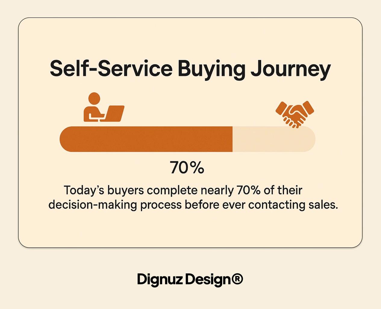
Recent research from Gartner finds that B2B buyers now spend roughly seventeen percent of their total buying time meeting with potential suppliers, and a majority prefer a rep-free buying experience for as long as possible. McKinsey's work on B2B omnichannel points in the same direction. Buyers move fluently between digital, remote, and in-person channels, and a meaningful share are willing to commit to large purchases - including transactions north of half a million dollars - through digital channels alone.
In practice this means a serious property buyer is forming an opinion of you before you know they exist. A fund manager scanning new assets, a corporate occupier shortlisting architects, a regional developer comparing brand agencies, an estate agent searching for a digital partner. Your website is the first interview, and you do not get to choose the questions. The questions are simple and unvarying: who are these people, can they actually deliver this, what is it going to cost me, and what happens if I get in touch.
If the homepage does not answer those four questions inside the first scroll, the buyer leaves. Not in frustration. In efficiency. There are eight other tabs open.
Build the first scroll like the first three minutes of a meeting
I treat above-the-fold space the way I would treat the opening of a sales meeting. State who you serve, what problem you solve, and the evidence that you have done it before. Skip the abstract value proposition. "Crafting unforgettable digital experiences" is not a value proposition. It is a tagline waiting for a job.
A B2B property hero that converts tends to have four elements working together. A specific audience line that names the buyer ("Architectural visualization for residential developers in Western Europe"). A proof element visible without scrolling - a logo strip, a portfolio thumbnail, or a measurable outcome from a recent project. A single primary action with a real next step ("See three recent projects" or "Book a twenty minute review"), not a vague "Get in Touch." And a sub-headline that names the actual problem the buyer arrives with, not the service category they used to find you.
For positioning specifically, more is covered in a separate piece on property developer brand identity. The same structural logic applies to architects building a portfolio site: a complex practice needs to compress into a hero that tells a developer "I work on your kind of project."
Forms, gates, and the cost of friction
Most lead capture forms on property websites are built defensively. They ask for phone, company size, role, project type, timeline, budget, and source, because somewhere along the way a sales team asked for all of it before a first call. The result is predictable: nobody fills them out, including the buyers you most want to hear from.
Three rules keep this clean.
- Every field has to earn its place. Each additional field measurably shaves off completions, and the buyers most willing to fill in a ten-field form are usually not the buyers you want first. Senior decision-makers fill in short forms. Junior researchers fill in long ones because they have to. This is the single biggest leverage point on most B2B property sites I rebuild.
- The form's promise has to match the form's length. A short form with a soft offer like "send me the project brief" or "book a quick review" converts at a much higher rate than the same short form pretending to be a full qualification gate. If you want qualifying information, ask for it after the initial reply, not before, and only when the buyer's interest is already established.
- Never gate the things that build trust before the buyer trusts you. Case studies, project galleries, technical capabilities, and pricing context belong on the open web. Gate the things a serious buyer would expect to gate: detailed financial models, full project breakdowns, sample contracts, and custom proposals. Reversing this is the most common conversion error I correct.
There is a separate problem with chat widgets that interrupt rather than assist. If a chat box appears with a fake first message ("Hi! Looking for help today?") before the visitor has shown intent, it reads as a sales overlay, not as help. I disable autoload behavior on every B2B property site I build and reserve chat for visitors who actively open it.
Visual proof is the conversion engine in property
This is where the unique angle of working across web development and 3D visualization actually matters. In most B2B verticals, the "proof" section is a logo wall and three quote cards. In property, the proof section is the product. A developer is not buying your services in the abstract. They are buying confidence that the building they have not yet built will look the way you promise, that the asset they are about to fund will perform the way you model, that the brand identity you are pitching will hold up across hoardings and brochures and a five-year sales campaign.
This is where rendered visuals, walkthroughs, and interactive 3D earn their place. On developer and agency sites I embed AmplyViewer, our own interactive 3D property viewer, directly into the page. A prospective buyer can rotate, zoom, and explore a building in the browser without any sales contact. This is not novelty. It changes the meeting that follows. The buyer arrives already familiar with the asset, the unit layouts, the views, and the spatial context. The first call becomes a conversation about commercial terms rather than a slide tour, and conversion to qualified meeting climbs noticeably.
I see the same effect in pure architectural visualization work through Faraday3D. A render is a sales argument, and the quality of the visual either reinforces or undermines everything else on the site. A high-end developer brand cannot afford visual proof that looks like real estate portal stock. The institutional view of property is moving the same direction: JP Morgan's commentary on PropTech adoption in commercial real estate notes that institutional capital increasingly expects transparency and digital visibility into the asset before any meeting takes place. A static PDF brochure does not meet that expectation. An interactive web experience does.

The technical floor: speed, mobile, and AI crawlers
You can lose a B2B lead on technical performance alone. Google's documented work on Core Web Vitals and the broader research around page-load behavior is consistent. As time-to-interactive climbs past two or three seconds, bounce rates climb sharply. A site that loads in under one second routinely outperforms a heavier site that looks more polished, because the heavier site never gets seen in the first place.
For developer and architect websites I default to Astro on Cloudflare with modern image formats, deferred non-critical scripts, and a strict budget on third-party tags. The result is a site that hits "Good" on Core Web Vitals out of the box and stays there. Webflow can produce comparable results with discipline, but in practice I see far more Webflow sites failing on bloat than passing on it. The same principle applies to Jamstack architectures for property developer sites: speed comes from how the build is shaped, not from the platform marketing.
Mobile matters even in B2B property. Buyers shortlist on their phones. They forward a link from a desk to a phone to share with a colleague. A site that breaks on mobile is a site that gets cut on Monday morning, regardless of how strong the desktop experience is.
The newer concern is AI crawler accessibility. ChatGPT, Perplexity, and Google's AI Overviews now influence early-stage discovery for a meaningful share of B2B buyers. If your content is rendered entirely client-side, or if your llms.txt is missing or wrong, you may simply be invisible at the moment a buyer asks an AI to compare developers in your region. This is not a theoretical risk anymore. Several clients I work with have already seen first-call enquiries that opened with "Perplexity recommended you." That is what discoverability looks like now.
Copy that does work, not copy that fills space
Most B2B property sites are over-written. The voice is corporate and the sentences are long, because the brief asked for "professional tone" and the writer interpreted that as formal. The result is a wall of generic text the buyer skims past on the way to the portfolio.
Copy on a B2B property website has three jobs. It needs to qualify the visitor in or out within seconds. It needs to convert credibility into specifics. And it needs to make the next step feel small. "Discuss your vision" is a big step. "See three recent residential projects in your region" is a small one. The smaller the next step looks, the more buyers take it. I cover the mechanics of this more fully in a separate guide on website copy that converts.

Measurement that actually informs decisions
Most analytics setups on property and real estate B2B websites measure the wrong things. Pageviews and bounce rate do not tell you whether the site is doing its job. Two metrics matter more than the rest.
The first is form completions broken out by source and by offer. A lead from a paid social campaign behaves differently from a lead arriving through organic search on a project case study. If you measure form fills as one bucket, you cannot see which content is bringing in qualified buyers and which is bringing in noise. UTM parameters applied consistently, plus a simple dashboard that splits leads by source, is enough to start.
The second is time-to-qualified-meeting. From the first form submission, how long until that lead becomes a qualified meeting on the calendar? This is the metric I care about most for B2B work. If it is taking weeks, your follow-up sequence is broken regardless of how good the form is. If it is happening within forty-eight hours but not converting to meeting, the form is over-promising relative to what the sales conversation actually delivers. The metric tells you exactly where to look. A wider conversion view ties this to page design specifically.
For my own habit of keeping ahead of operational signal across the industry, I built AmplyDigest, which summarizes the newsletters, reports, and channels I read each morning into a single digest. It is not something I build for clients, but the underlying habit - daily synthesis instead of daily scrolling - is the same one I recommend to any B2B marketing lead trying to keep a real picture of what their buyers are reading.
What to fix first if you only have one week
If I were taking over a B2B property website with one week to ship improvements, the order would be: shorten the lead form, rewrite the hero to name a specific buyer and a specific outcome, replace the "Contact Us" CTA with a defined next step, add at least one concrete proof element above the fold, audit Core Web Vitals on mobile and fix the worst offender. Nothing else moves the needle as fast. Logo refreshes, colour systems, microinteractions, all of it can wait. Get the structural answers right first, then dress the site.

Frequently asked questions
What is the difference between a B2B and a B2C website in real estate?
B2C real estate sites are designed for an individual buyer or renter making a single, relatively self-contained decision. The site sells listings. A B2B real estate website is designed for a buying group: a fund manager, a developer, a corporate occupier, an institutional investor. The decision is committee-based, the cycle is long, and the website's job is to qualify the buyer in or out and earn a first meeting, not to capture a transaction. Most B2B property sites fail because they were built with B2C reflexes.
How long should a B2B property website's contact form be?
For a first-touch enquiry, three fields is enough: name, email, and one sentence about the project. Add a fourth optional field for company if it helps your follow-up. Longer forms reduce completion sharply, and the buyers most willing to fill them out are usually researchers or vendors, not decision-makers. If you need richer qualification, do it on the reply, not on the form.
Should commercial real estate websites use 3D visualization?
If the buyer is committing meaningful capital to an asset that does not yet exist, or that they have not physically visited, yes. Interactive 3D - whether embedded viewers like AmplyViewer or high-end renders from a studio like Faraday3D - reduces the perceived risk of the decision and shifts the first sales call from "what does this look like" to "what are the terms." The conversion lift is most visible in residential developer sales, but it applies equally to commercial leasing for trophy assets and to architect pitches for complex programmes.
How important is page speed for a B2B property website?
It is the single technical factor that most often loses a lead before any human contact. Page speed affects search ranking, AI crawler accessibility, and direct buyer experience on mobile. A site that takes five seconds to load on a phone loses roughly half its visitors before the first scroll. For B2B property, where every visitor is potentially a six-figure or seven-figure deal, that wastage is unacceptable. Treat Core Web Vitals as a hard floor, not a nice-to-have.
How do you measure B2B lead generation success on a real estate website?
Two metrics, applied consistently. Form completions split by source and offer, so you can see which campaigns and which content are producing real enquiries versus noise. Time-to-qualified-meeting, measured from form submission to a confirmed meeting on the calendar, so you can see where the funnel is leaking. Both should be tracked monthly and reviewed against changes you make to the site, so cause and effect stay visible.
The shorter version
A B2B website in property and real estate has one job. Make a serious buyer comfortable enough to take a meeting. Most sites in this space do not do that, because they were briefed as showcases rather than as sales surfaces. Fix the structural answers first. Name the buyer. Show the proof. Shorten the form. Make the site fast. Measure the meetings, not the visits. The brand work, the colour system, and the visual identity are real and important, but they are downstream of getting the structural questions right. If you have to choose, choose structure.


