Architect Website Showcase: What Actually Wins Clients

Almost every architect who reaches out to me about a new website describes the same problem in slightly different words. The studio's work is good. The photography is good. The portfolio is full of completed projects that the team is genuinely proud of. And the website, somehow, is not producing the inbound briefs the partners feel it should. Three serious inquiries a quarter from a site that should be doing the heavy lifting of business development is a typical baseline. The brief lands on my desk as a website refresh, but it is almost always a showcase problem underneath.
This is the question worth sitting with before any redesign begins. What does a client who has never met you actually do when they arrive on your site, and what would make them put their email into the contact form rather than back out to the next firm on their shortlist? Everything that follows in this article comes from working on that question with architectural practices over years, from one-person studios to mid-sized firms with full development pipelines.
I run DignuzDesign, the studio behind property and architecture websites built on Astro, Webflow, and Cloudflare, and I work alongside Faraday3D on the visualization side. That position, sitting between web build and 3D production, is what shapes most of the practical observations below.
What a visitor actually does on an architect's portfolio site
The mistake most studios make is treating the website as a static document of completed work. A book of finished projects, organized chronologically, presented as evidence of competence. That model worked when a website was essentially a PDF brochure in a different format. It does not work now because the visitor's behavior has changed.
A potential client lands on an architect's site already partway through a research process. They have a brief in mind, a budget that they have at least roughly defined, and a list of three to five firms they are looking at in parallel. They are not reading the homepage carefully. They are scanning for two specific signals. Does this practice work on projects that look like what I am planning. And is this a practice I can imagine working with day to day, through eighteen months of decisions and revisions.
The first signal is answered by the project pages. The second is answered by everything else, and most architect websites underinvest in the everything else. The result is a site that demonstrates the work but does not demonstrate the practice. A visitor finishes the visit having seen pretty buildings and learned nothing about how decisions get made, how the team handles cost engineering, how scope expansion is managed, or what the studio is opinionated about. That visitor leaves and does not come back.
This is why the more useful framing is to think of the website as a showcase of how the practice works, not only of what the practice has built. The 3D content, the photography, the case studies, and the written voice all earn their place by serving that broader question.
Why this matters more for architects than for most businesses
Architecture is a referral-led industry, and that does not change much from one country or practice size to another. The annual RIBA Business Benchmarking tracks where chartered practices invest their marketing budget, and the average sits at around two percent of turnover. That is a constrained budget by the standards of any other professional service business, which means the website has to do disproportionate work compared to, for example, the marketing site of a SaaS company spending fifteen times that share of revenue on demand generation.
The AIA Firm Survey tells a parallel story for the American market. Existing client relationships and referrals dominate as the primary sources of new work for most firms, and the website's job in that pipeline is usually not to generate cold inquiries from search traffic. It is to convert referrals that have already been warmed up by a personal recommendation. The visitor has been told to look at your work by someone they trust. They arrive expecting to be convinced. The question is whether the showcase you have built holds up under that warm but skeptical attention.
That framing changes what the website needs to do. It does not need to win cold strangers. It needs to confirm warm prospects. That is a different and in some ways harder job, because the visitor is not impressed by surface polish alone. They are looking for specific reassurance about the kind of work you do and the kind of practice you run.
How project pages should actually be built
The project page is the unit of work that does most of the conversion. Get the project page right and the rest of the site does not need to do much. Get it wrong and no amount of homepage animation will save the inquiry rate.
The minimum useful project page has four sections that almost every architect site either skips or rushes. The brief. The constraint. The approach. The outcome. None of these are the same as a project description, which is what most architect sites write instead. The project description is a paragraph of caption-style prose that tells the visitor what the building is. The four sections above tell the visitor how the practice thinks.
The brief section is what the client originally asked for, in real terms. A two-story extension on a Grade II listed cottage. A workplace for sixty people moving from a fragmented serviced office. A retail flagship inside a heritage shell on a constrained corner site. This is not marketing copy. It is the actual starting point of the project.
The constraint section is what made the project hard. Planning context, site geometry, programmatic conflicts, budget envelope, timeline pressure. This is the section that most reassures the next client, because they have their own constraints and they want to see that you do not pretend constraints do not exist.
The approach section is how the practice resolved the tension between the brief and the constraints. This is where opinion and craft come through. This is where the practice's voice belongs. A client deciding between three architects on their shortlist will remember the firm whose project pages explain their thinking and forget the firm whose pages only describe the finished object.
The outcome section is the photography, the renders, and the measurable result. Square meters delivered, programme adhered to, client outcome, awards if relevant. This is where the polished imagery does its job, but the imagery has been earned by the three preceding sections rather than asked to carry the page alone.
For a longer treatment of how to write the prose part of this without it reading like a pitch deck, the piece on writing website copy that converts applies cleanly to architecture case studies.
Where interactive 3D earns its place on a project page
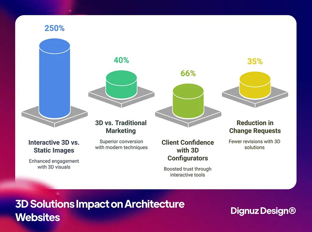
The original version of this article presented interactive 3D as the answer to client engagement. The pitch was that adding a configurator, a walkthrough, and a guided tour to every project page would lift conversion by some quoted percentage. That framing is wrong in a way that matters, and it is worth being precise about why.
Interactive 3D earns its place on a project page when the project itself is not yet built, when the building has spatial qualities that photography cannot convey, or when the client at the next stage will be a developer or buyer rather than the architectural visitor. It does not earn its place on a completed project that has been beautifully photographed, where the photographs do the work that an interactive model would only duplicate at a higher performance cost.
The practical test is simple. For each project page, ask whether the visitor will understand the project better after spending three minutes inside an interactive 3D experience than they would after looking at six well-shot photographs. If the answer is yes, the 3D component earns its place. If the answer is no, the 3D component is a feature looking for a justification, and it will slow the page down without producing commercial return.
The projects where 3D consistently does earn its place fall into a few clear categories. Unbuilt schemes presented during competition or pitch stages, where there is no photography and a navigable model lets the client step into the proposed space. Heritage retrofits where the contrast between existing fabric and proposed intervention is the whole point, and a stripped 3D view layered with the original survey is far more eloquent than a flat plan. Masterplan-scale work where the architecture only makes sense at urban scale and a fly-through is the only way to communicate the relationship of the parts. Residential and development work where the eventual buyer, not the architect's client, is the audience the page is preparing.
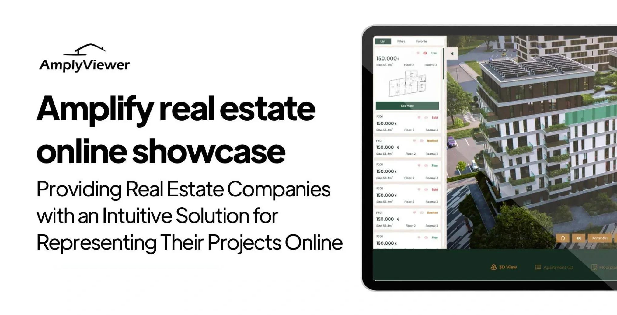
For the buyer-facing case in particular, this is where embedded interactive viewers like AmplyViewer were designed to sit. The model lives inside the studio's own site, loads on the same domain, and feeds analytics back into the same pipeline as the rest of the showcase. For an architect partnering with a developer client on a future scheme, having that capability available as part of the work product is increasingly a differentiator on its own. The comparison between flat visualization and full 3D treatment is covered more directly in the piece on 2D versus 3D design if the production tradeoffs are live for you.
The performance reality nobody flags during the pitch
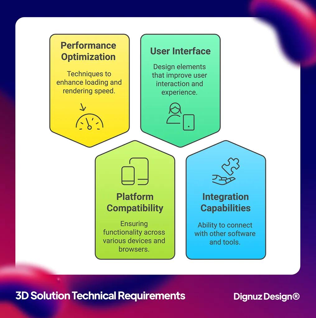
The single most common failure I see on architect websites that have invested in 3D content is that the page is slow. The model is too heavy, the textures are not optimized, the initial load takes eight to twelve seconds, and on a mobile device the experience is degraded enough that visitors leave before the model has finished loading. The studio paid for an interactive feature that is actively reducing conversion on the projects it appears on.
This is not an inherent property of 3D content. It is the result of treating performance as a downstream concern rather than a precondition. A 3D scene that has been properly decimated, baked, and progressively loaded can sit on a fast project page without measurably impacting the time-to-interactive metric for visitors who do not engage with the viewer. The viewer loads only when the visitor explicitly engages with it, the rest of the page renders immediately, and the studio gets the commercial benefit of the feature without paying the speed penalty for visitors who would not have used it.
This is also the reason I default to a static site generator like Astro or a Jamstack stack on Cloudflare for these builds. The static shell stays fast regardless of how heavy any single piece of interactive content becomes, and the interactive viewer can be loaded as a discrete island with its own performance budget. The piece on Jamstack architecture for property and developer websites covers the pattern in more depth. The broader point on site speed for property and architecture websites applies here as well. A slow showcase is a leaking showcase regardless of how good the content inside it is.
The analytics layer most architect sites skip
Almost every architect site I am asked to audit has page-view analytics installed and nothing else. The studio knows how many people visited the portfolio last month. They do not know which projects held attention. They do not know what the visitor looked at immediately before submitting the contact form. They do not know which page or which photograph correlates with inquiries that turn into briefs.
This is a fixable gap and the fix is worth more than most studios realize. Adding scroll-depth tracking and time-on-page tracking to each project page, tagging the contact form submission with the last project page viewed, and capturing which projects the visitor explored before reaching out, all together produce a feedback loop that tells you which work is actually generating inquiries. The answer is almost never the project the principals expected.
That insight reshapes the showcase over time. The projects that quietly drive inquiries get given more weight on the homepage and in the portfolio sequence. The projects that take up space without generating engagement get demoted or rewritten. The case studies that consistently convert get more time and budget invested in their photography and copy because the data justifies it. None of this happens without the analytics layer, and adding the analytics layer is not expensive once the rest of the site is built on infrastructure that supports it.
Mobile is where the showcase usually fails
The single biggest gap between how architects view their own site and how visitors view it is device. The principals look at the site on a large monitor, often in a studio context, and judge it by what they see there. A meaningful share of visitors look at the same site on a phone, often in the evening, often on a connection that is not the studio's office Wi-Fi.
This shows up especially badly for architect sites because the design language tends to favor full-bleed imagery, generous whitespace, and editorial-scale typography that all assume a wide canvas. On a phone, the imagery is cropped, the whitespace is wasted, the typography reflows clumsily, and the carefully sequenced project page becomes a long scroll of poorly compressed photographs. Visitors who would have engaged on desktop bounce on mobile.
The fix is to design the project page as a mobile artifact first and then expand it for desktop, not the other way around. The opening photograph has to work as a phone-sized image. The case study prose has to read at phone column width without losing its rhythm. The interactive 3D viewer, if there is one, has to load and perform on a mid-range Android device, not only on the studio's MacBook. This is not a constraint that limits the design. It is the constraint that produces designs that work for the audience that actually visits.
💻 Let us help you create a stunning online showcase for your projects that works seamlessly across all devices. Ready to amplify your real estate business? 👉 Explore AmplyViewer now
What to do if you are starting from a generic template
A meaningful share of architect websites I see were built on the same handful of portfolio templates, customized lightly, and shipped. The template was chosen because it looked good in the demo, and the studio's own projects were dropped into it with minor edits. The result is a site that is competent on its own terms and indistinguishable from every other studio's site built on the same template.
This is the showcase problem in its most acute form. The visitor cannot tell your practice apart from the four other firms on their shortlist because the visual grammar of the site is identical to theirs. The cure is not necessarily a custom build from scratch on day one. It is to identify the two or three structural things that the template makes generic and to break out of them deliberately. Usually that means rewriting the project pages from the inside out using the brief-constraint-approach-outcome model above, restructuring the homepage so it leads with a point of view rather than a slider, and changing the photography sequencing on the portfolio page so it does not look like every other Squarespace site in the category. The longer piece on why custom property websites outperform templates covers the broader pattern, and most of it transfers cleanly to architecture practice sites.
Things to fix on your existing site this week
If a full rebuild is not on the table this quarter, there are still meaningful changes that almost always lift inquiry rates on an existing architect site. These are the ones I find myself recommending most often during site audits.
- Rewrite the top three project pages using the brief, constraint, approach, and outcome structure described above. Pick the projects you most want to attract more of, not the projects you are most proud of, because the showcase needs to attract the work you want next, not catalog the work you have done.
- Add scroll-depth and time-on-page tracking to every project page, and tag every contact form submission with the last project page the visitor viewed. This unlocks the feedback loop that turns the site into a learning system rather than a static document.
- Audit the homepage on a mid-range Android phone over a throttled mobile connection. Whatever loads slowly there is what your visitors actually experience, regardless of how the site looks on the studio monitor.
- Replace generic stock-style project descriptions with prose that tells the visitor how the practice thinks. Even one rewritten paragraph per project page changes the impression more than a redesign.
- Identify which projects on the site do not have professional photography and either commission it or remove the project, because a half-documented project actively reduces trust in the projects that are properly shot.
The role of platforms like Houzz alongside your own showcase
For residential and small-commercial practices in particular, the question of whether to invest in a Houzz profile, an Instagram presence, or a directory listing always comes up alongside the website conversation. The honest answer is that these platforms work as discovery channels, not as the showcase itself. Houzz reaches a large audience of homeowners who are at the early stage of their architect search, and a strong profile there is worth maintaining. But the visitor who clicks through to your own site from a directory listing is the visitor whose conversion depends entirely on what the showcase does next.
That means the platform investment and the website investment work together. The platforms generate qualified attention. The website converts that attention into briefs. A studio that has a beautiful Houzz profile and a generic website is leaking the qualified attention back out before it converts. A studio that has a quiet Houzz profile and a strong showcase converts less traffic but at a higher rate. Both work, but neither substitutes for the other.
Frequently asked questions about architect website showcases
How many projects should an architect website show?
Fewer than most practices think. Twelve to twenty fully developed project pages, each with proper photography, written case study, and the structural elements covered above, will outperform a portfolio of forty thinly documented projects every time. The visitor is not counting projects. They are evaluating depth and consistency, and a smaller portfolio of well-presented work signals both better than a larger portfolio of unfinished pages.
Do I need interactive 3D on every project page?
No. Interactive 3D earns its place where the project is unbuilt, where spatial qualities cannot be conveyed in photography, or where the audience for the page is a buyer rather than a peer architect. On a well-photographed completed project, an interactive viewer usually duplicates what the photography already does, at a cost to page speed. The decision should be project by project, not site-wide.
What is the right balance between text and imagery on a project page?
Architects tend to undertext their project pages, partly because the discipline trains people to communicate visually and partly because writing about one's own work is uncomfortable. The right balance for a project page is more text than feels natural and less imagery than the studio's instinct suggests. Five to eight hundred words of structured case study prose alongside ten to fifteen carefully sequenced images is a useful starting point for most projects.
How important is the homepage compared to the project pages?
The project pages do most of the conversion work. The homepage's job is to direct the visitor into the right project page as quickly as possible, with as little ambiguity as possible. A homepage that tries to be a portfolio in itself, with cycling sliders and full-bleed video, almost always underperforms a homepage that leads with a clear point of view and three or four hand-picked project entries.
Should the website include 3D walkthroughs of unbuilt schemes?
Yes, when the studio is comfortable showing them. Unbuilt schemes are exactly where interactive 3D does its strongest work, because there is no photography to compete with and the navigable model is the only way the visitor can step into the proposed space. Many studios hesitate to publish unbuilt or competition work, but doing so is one of the clearer ways to differentiate the showcase from competitors whose portfolios are restricted to completed projects.
How often should an architect website be updated?
Continuously, in small increments, rather than rarely in major overhauls. Adding one new project per quarter, refining one existing case study per month, and revisiting the homepage sequencing twice a year keeps the showcase current without ever requiring a full redesign. The studios that fall into the trap of treating the website as a five-year artifact are the ones that end up needing emergency rebuilds when the site has aged out of relevance.
Closing thought
The architect website is the single most leveraged piece of marketing infrastructure most practices own. It runs continuously, it speaks to every prospect who has been referred to the firm, and it costs a small fraction of any other client acquisition channel. Treating it as a showcase of how the practice works, rather than as a record of what the practice has built, is the structural shift that makes everything else compound. The 3D content, the analytics, the project page structure, the per


