Web Design Best Practices That Actually Move The Needle

Most "web design best practices" articles read like checklists copied from each other. Use sixteen-pixel body text. Compress images. Add alt tags. The advice is not wrong. It is just so flat and so universal that following it gets you a site that ticks every box and still fails to convert. I run DignuzDesign, a small studio that builds property and real estate websites in Astro, Webflow, Svelte and Cloudflare. After years of shipping sites where a single conversion can be worth a six or seven figure deal, I have a strong opinion about which of these "best practices" actually move the needle and which are folklore.
This article walks through the practices I keep in front of me on every project, why each one matters, and where the generic advice you read elsewhere quietly misleads you. The order is intentional. Performance and first impression sit on top because they decide whether anyone sees your typography choices at all.
Start With What Happens In The First 50 Milliseconds
The Nielsen Norman Group has measured this for years. Users form an aesthetic judgement of a website in roughly fifty milliseconds, an order of magnitude faster than they can read a single word. That number is not a curiosity. It is the reason every other choice on this page matters less if your hero section looks broken, slow, or amateurish in the half-second after the first paint. You can read their original write-up on how first impressions work in automatic cognitive processing if you want the underlying research.
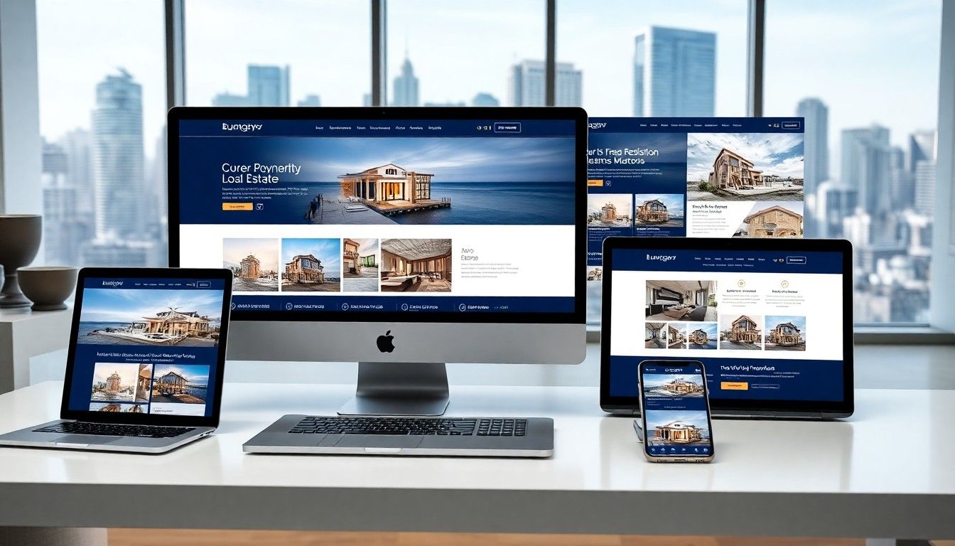
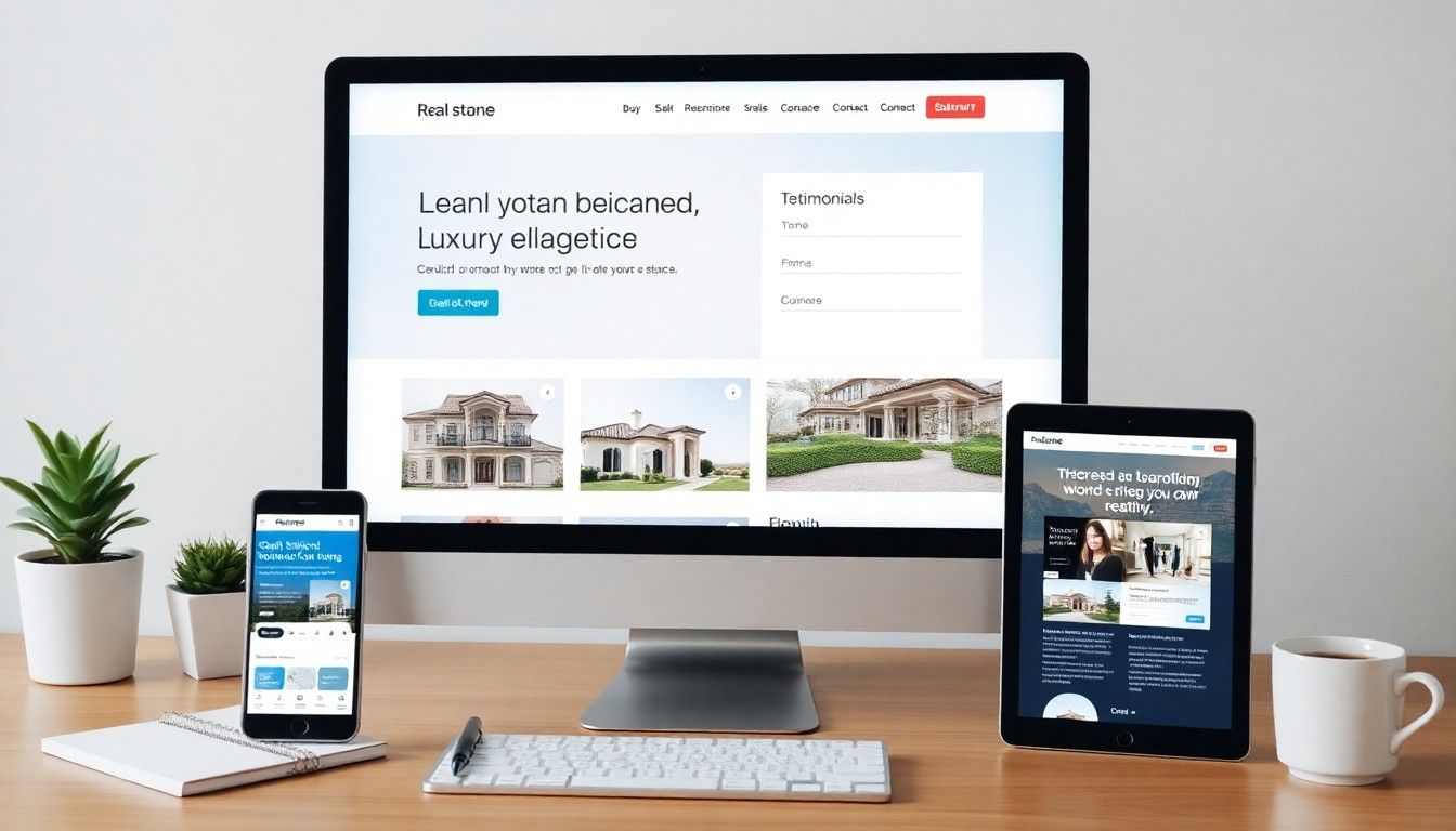
What this means in practice is unintuitive. The hero of a property website should not be optimised for the marketing team's preferences. It should be optimised for the visitor's snap judgement under conditions of attention scarcity. On the projects I take on, that usually means one large, sharp image of the property with almost nothing else competing for attention, a headline that says what is on offer in seven words or less, and a single primary action. No carousel rotating between five images. No two columns of value props. Nothing that asks the brain to do work in those first fifty milliseconds.
If you are building in the luxury segment, the rules tighten further. I wrote about that specifically in my piece on luxury real estate web design, but the short version is that wealthy buyers expect restraint. Anything that feels noisy registers as cheap.
Performance Is The Foundation, Not The Polish
Most teams treat performance like a thing you tune at the end of a project. That is backwards. Performance is the substrate that every other best practice depends on. If your page takes four seconds to render, your typography choices are invisible. Your colour palette is invisible. Your accessibility work is invisible. There is no visitor left to appreciate any of it.
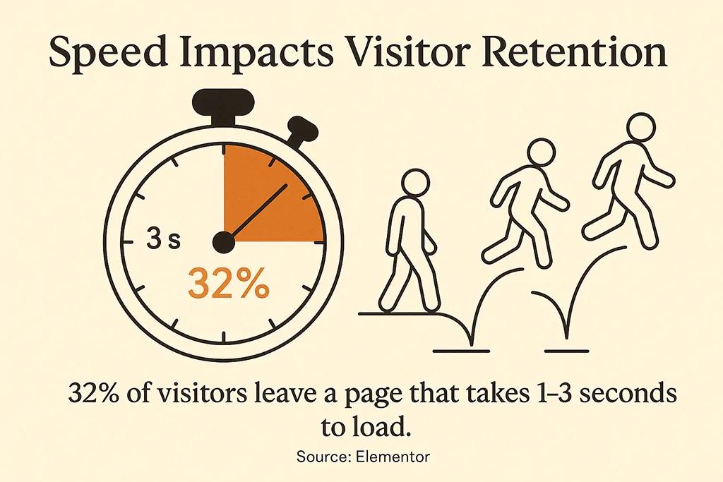
Google's research on mobile bounce probability is the single statistic worth memorising. Their data, drawn from a deep neural network trained on billions of sessions, found that the probability of a mobile visitor bouncing rises 32% as load time goes from one to three seconds, 90% as it goes from one to five seconds, and 123% as it stretches to ten. You can see the original numbers in their mobile page speed industry benchmarks. The shape of the curve is what matters. Each second you shave off load time after the third pays back disproportionately, and each second you let slip in costs more than the previous one.
For property websites this hits hard. Real estate sites are heavy by nature. High-resolution photography, render packages, floor plan PDFs, sometimes drone footage and virtual tours. The naive approach is to upload the assets, accept the load time, and console yourself with the thought that "buyers expect detail". They do, but they will not wait six seconds to see it. The reason I default to Astro and Cloudflare on property builds is that it lets me ship pages that are essentially static HTML with selectively hydrated interactive components. The rendered page weight is whatever the images decide, and nothing else. I unpacked the architectural reasoning behind this in my piece on Jamstack for property developer websites.
If you are inheriting a slow site rather than building from scratch, the levers worth pulling first are nearly always image-related. Convert to AVIF or WebP. Serve responsive sources rather than one large file scaled down by the browser. Defer anything below the fold. The deeper playbook lives in my real estate website speed optimization guide, but those three steps will give you most of the win.
Mobile-First Means Touch-First, Not Just Smaller
Mobile traffic now accounts for the majority of page views worldwide, with current Statcounter platform share data putting mobile around sixty percent of all sessions globally. For property and real estate the share runs even higher. People scroll listings on the train, on the sofa, between meetings. The desktop visit, when it happens, is usually later in the buying journey, after a property has already caught their attention on a phone.
"Mobile-first" gets repeated as if it just means "make sure it does not break on a small screen". That is responsive design, and responsive design is the floor, not the ceiling. Touch-first is the practice that actually matters. It is a different way of thinking about interaction.
The thumb is not a mouse. A mouse can hover, has pixel precision, and has no fatigue. A thumb has none of those things. So hover-revealed navigation does not work. Tiny tap targets do not work. Long forms that require multiple keyboard switches do not work. The patterns that succeed on touch are large primary actions thumb-anchored at the bottom of the viewport, tap targets generous enough that nobody misses, and forms that ask for the absolute minimum to advance the next step.
One specific habit: I test every property site I ship on a real mid-tier Android device, throttled to a 4G connection. Not Chrome DevTools throttling, an actual phone. The phones designers use are not the phones buyers use, and the network in a designer's office is not the network on a regional motorway. The gap between the two has killed more conversions than any typography choice ever did.
Typography That Survives Long-Form Property Content
Property pages are content-heavy by nature. A serious listing page has a headline, a paragraph or two of description, a feature list, area information, agent details, and several blocks of supporting copy. The typography decisions that work for a marketing landing page with thirty words on it do not survive when there are eight hundred.
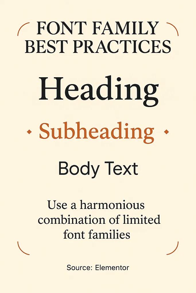
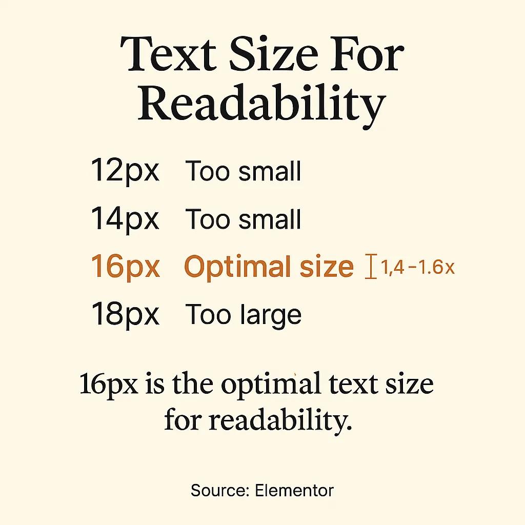
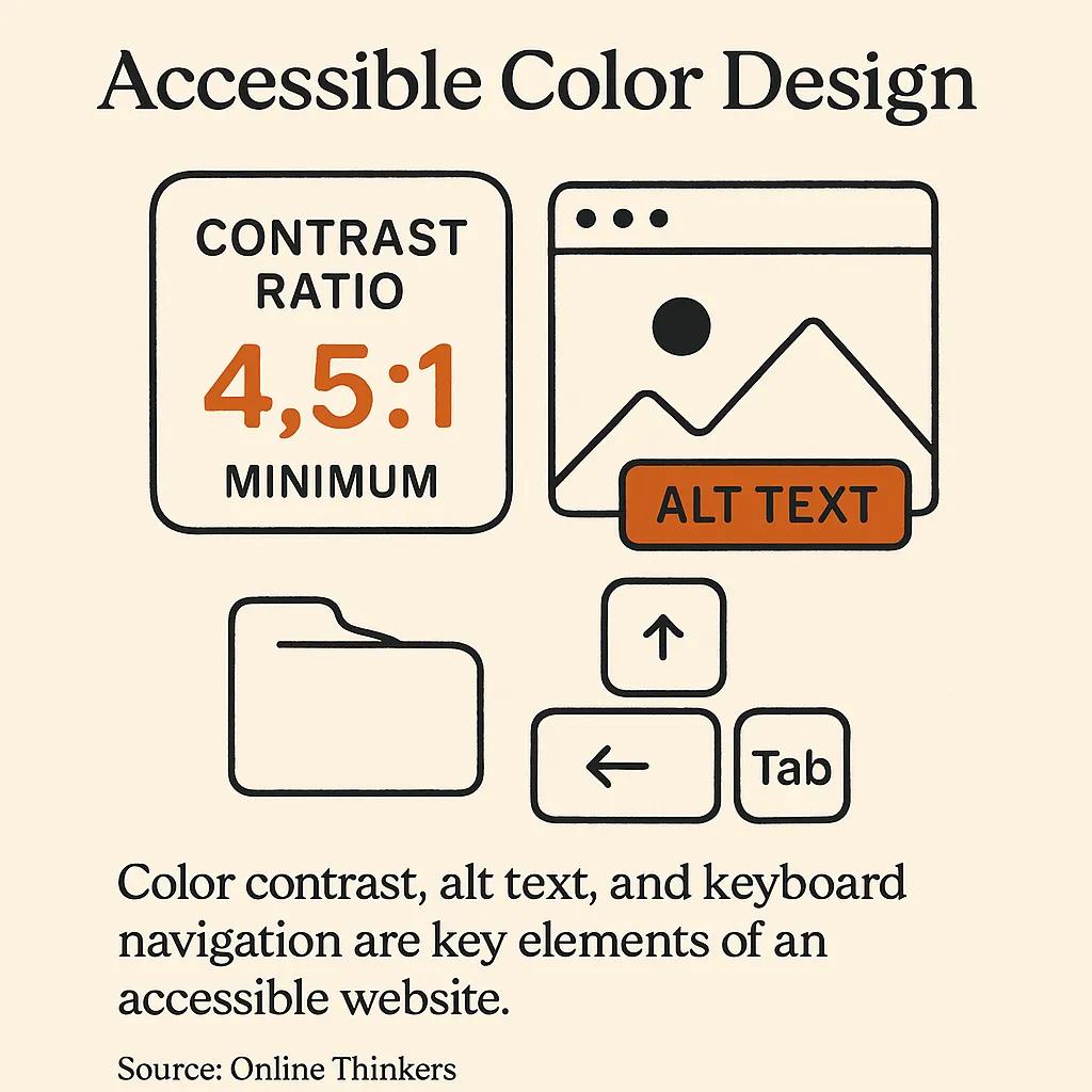
The standard rules apply. Body text at sixteen pixels minimum, line height around 1.5, line length capped roughly between sixty and seventy-five characters. Maximum two type families on any given site, ideally one. The point that gets missed is contrast under real conditions. The text that looks rich and readable on a calibrated office monitor at full brightness can become a fog on a phone screen in direct sunlight. WCAG's 4.5:1 contrast ratio is a floor, not a goal. On primary content I aim higher, usually 7:1 or above, because outdoor reading is the actual use case for someone touring a property and pulling up the listing on their phone.
The other underrated typography decision is paragraph breaks. Property descriptions written by listing agents tend to arrive as walls of text. Breaking them into shorter paragraphs by visual rhythm rather than strict grammar makes them readable on a phone in a way that no font choice ever can. This is a copy and CMS choice as much as a design one, which is why I always touch on it when working on a client's writing process; my notes on writing website copy that converts get into this further.
Visual Hierarchy: Where Most Property Sites Fall Apart
The standard advice on hierarchy is to use size, colour and spacing to direct attention. True. The harder question is to what. On the property sites I review for clients before a rebuild, the most common failure is that the page is shouting at the visitor with five competing primary elements. The hero photo, the price, the "book viewing" button, the floor plan link, the agent's call-to-action banner, and three trust badges all compete for the same role. Visual hierarchy is the discipline of choosing what loses, not what wins.
A useful test on any page: cover the screen with your hand, take it away for a half-second, and ask yourself what you remember seeing. If the answer is more than two things, the hierarchy is broken. The fix is rarely additive. It is almost always subtraction. Demote the trust badges to the footer. Move the floor plan to a tab. Let the hero image carry the page and let the primary action live alone.
Colour plays a role here too, and the role is more subtle than the usual blog posts admit. The "use your brand colours, ensure contrast" advice is true but trivial. The non-obvious thing is that colour fatigue is real on long sessions. A page with eight saturated accent colours feels exhausting after three minutes of scrolling, even when each individual element passes contrast. Restraint is itself a hierarchy tool. I dug into how this plays specifically in property contexts in my piece on real estate colour psychology.
Navigation That Respects The Visitor's Time
Navigation is the part of the site that decides whether someone gets to where they wanted to go. On a property website that is usually one of three things: a specific listing, a contact action, or a category of property. Everything else - about us, blog, careers, language switcher - is secondary at best.
The "three click rule" you have read about a hundred times is folklore. The actual research from the early 2000s showed no meaningful relationship between the number of clicks and user satisfaction, provided each click was confidently in the right direction. The rule worth keeping is something more like the "no dead ends rule": every page should make the next sensible action obvious. If a visitor lands on a listing they are not interested in, the related listings strip below should be the path back to discovery, not the main menu. I covered this in detail in my website navigation design notes.
For property developer sites with twenty or more units across multiple projects, navigation becomes its own design problem. Filtering, faceted search, and saved searches stop being nice-to-haves and become the spine of the site. This is also where decisions about CMS and rendering strategy bite back at you, since heavy filter UIs built badly can take a fast site and make it slow. My piece on real estate website UX goes deeper on the structural choices.
Conversion Paths That Match Buyer Intent
The standard CTA advice is straightforward. Use action-oriented language. Make the button visually distinct. Place it where attention naturally lands. All true. The deeper question is which conversion you are optimising for, because property buyers are almost never one click from a purchase decision.
The conversion ladder for a serious property site looks something like this: from anonymous browsing, to a brochure download, to a viewing request, to a meeting, to a sale. Each rung has a different psychological weight. The brochure download is a low-commitment trade of an email for information. The viewing request is a real time commitment by both parties. Putting the same prominence on both flattens the ladder and pushes most visitors toward the easier action when they would have happily taken the harder one if asked clearly.
What works in practice is differentiated emphasis at different scroll depths. The hero asks for the easy action - explore, see more, browse listings. Halfway down the page, after value has been built and trust has begun, the harder ask appears - book a private viewing, request a call. The full conversion architecture for property sites is one of those topics that needs its own treatment, which I wrote up in my real estate web page design conversion guide.
One specific pattern worth mentioning since it shows up repeatedly in my work: interactive 3D property viewers change the conversion economics of a listing page. When a buyer can walk through a property remotely, the trust threshold for requesting an in-person viewing drops significantly, because they are not asking to see something unknown - they are asking to see in person something they have already inspected. This is the reason I built AmplyViewer, which embeds an interactive 3D walkthrough directly in a listing page. The 3D side of that work is the daily output of Faraday3D, my visualisation studio.
Accessibility Is The Default, Not An Add-On
The most recent WebAIM Million report analysed the top one million homepages and found that 95.9% of them had detectable WCAG conformance failures, with low contrast text being the single most common issue, present on 83.9% of pages. Those numbers should embarrass the industry. They are also a hint about how easy it is to do better than average. Pass the contrast checker on every block of text and you are already in the better-than-average tier.
The deeper case for accessibility is not legal compliance, although that matters in jurisdictions where it is actively enforced. The deeper case is that the choices that make a site accessible to a visually impaired user almost always make it more usable for everyone. High contrast is easier to read in sunlight. Clear focus indicators help keyboard users and also any visitor on a corporate laptop with a stuck mouse. Logical heading structure helps screen readers and also helps Google understand your page. Properly labelled form fields help everyone, but disproportionately help users on touch devices, which is to say almost all of your traffic.
The shortlist for any project I take on includes alt text on every meaningful image (decorative images get an empty alt, not a missing one), keyboard reachability for every interactive element, focus states that are actually visible rather than the browser default, and form labels that are properly associated rather than placeholder-only.

The One Bullet List I Will Allow Myself
If I had to compress everything above into a checklist for someone about to start a property website project, this would be it:
- Performance budget set on day one. Decide what your largest contentful paint target is before the first design comp, and let it kill any visual decision that breaks it. Retrofitting performance is two to ten times more expensive than building with it.
- Real device testing as a habit, not an event. Keep a mid-tier Android phone on your desk. Test on it daily. The gap between what designers see and what visitors experience is the gap that kills conversions.
- One primary action per screen. Every screen, every viewport. If you cannot name the single thing you want the visitor to do here, neither can they.
- Accessibility checks in the build pipeline. Automated tools catch perhaps a third of issues but they catch the easy ones cheaply. Human review of keyboard flows catches the rest. Both belong in the standard process, not as a separate audit.
- Content-first design. Design with real property descriptions, real photos, real prices. Lorem ipsum hides the problems your typography and layout will have when the actual content arrives. I wrote about this in my website launch checklist as well.
The Practices That Look Like Best Practices But Are Not
Three things appear in nearly every web design best practices article that I think are wrong, and it is worth saying so explicitly.
The first is the carousel hero. Rotating banners are a comforting solution to the problem of having multiple things to say, which is why marketing teams love them. They also have decade-old usability research showing that visitors largely ignore everything past the first slide, and that the rotation itself triggers banner blindness. If you have three things to say, find a way to say them in sequence down the page, or pick the most important one and let the others wait.
The second is generic stock photography of "happy diverse business people in a meeting". It signals to visitors that you do not have your own photography, which on a property website signals that you do not have access to actual properties either. Even imperfect original photography outperforms polished stock every time.
The third is the autoplaying hero video. They are heavy, they are visually noisy, they almost always autoplay muted (which makes them confusing rather than impressive), and on mobile they consume significant data on a connection the visitor is paying for. Use video. Just do not use it as the first thing the visitor's browser has to download.
Maintenance Is A Best Practice
The single most overlooked practice in any "best practices" article is the discipline of returning to the site after launch. Browsers update. Frameworks deprecate. Photos get added. Content drifts. A site that was a model of best practice on launch day is rarely the same site eighteen months later. The cheapest way to keep quality high is to revisit, audit, and prune on a schedule. I keep a structured version of this for clients in my website redesign checklist, but even an informal quarterly review will catch most of what matters.
FAQ
How long should it take a web design best practices upgrade to pay back?
For most property websites I have worked on, the performance and conversion path improvements show measurable impact within four to six weeks of launch, provided the site has enough traffic to produce a meaningful sample. Typography and visual hierarchy changes show up more slowly, often through reduced bounce on landing pages and increased depth-of-scroll, which take a quarter or so to settle into reliable numbers.
What is the most common web design mistake on property websites?
Heavy hero media that delays the largest contentful paint past three seconds. Property sites are visual by nature, so the temptation is to lead with the biggest, most cinematic imagery available. Without proper format conversion, responsive sources, and lazy-loading of below-the-fold media, that imagery becomes the reason visitors leave before seeing it.
Are tables and bullet lists really bad for web design?
Not bad, just overused. The problem with the typical "best practices" article is that every section uses the same format, which trains the reader to skim past everything. Tables are useful for comparing structured data, like room dimensions or feature comparisons across units. Bullet lists are useful when items genuinely lack a narrative connection. When everything is a list, nothing is.
Do I need to follow WCAG accessibility guidelines if I am not legally required to?
Yes, and not for the reason you might think. The accessibility floor (sufficient contrast, keyboard navigation, alt text, proper heading structure) overlaps almost entirely with the practices that make a site usable on a phone in sunlight, indexable by search engines, and pleasant to navigate quickly. You get the SEO and UX benefits whether or not the law requires the accessibility work.
Should I use a template or build a custom property website?
For a small estate agent listing a handful of properties at a time, a well-configured template will probably serve. For a developer launching a project where the website is part of a multi-million-pound sales effort, a template is almost always a false economy. The constraints of the template will quietly shape your decisions about photography, copy length, and conversion paths in ways that cost more than custom design ever would. I made the case in detail in why custom real estate websites outperform template solutions.
How important is page speed compared to design quality?
They are not in competition. Page speed is design quality. A beautiful page that takes six seconds to render is a slow page; visitors do not give it credit for the design they never saw. The right framing is that performance is the first design decision, made at architecture time, not the last optimisation, applied as a polish.
Closing
Web design best practices are not a checklist. They are a set of constraints that, taken seriously and applied with judgement, leave you with a site that respects the visitor's time, attention, and intelligence. The articles that present them as a numbered list of equally weighted tips do you a disservice, because in practice they are not equally weighted. Performance and first impression dominate. Mobile-first behaviour matters more than the desktop polish you are tempted to start with. Accessibility pays back beyond compliance. And maintenance is the practice that holds all the others in place.
If you are building or rebuilding a property website and want a second opinion on which of these to tackle first, that is most of what I do. The work I publish through DignuzDesign and the visualisation work through Faraday3D, along with tools like AmplyViewer and the daily AI digest I built at AmplyDigest, all come back to the same idea: take craft seriously, respect the user's time, and do not confuse activity with progress.