Real Estate Color Psychology
When a potential buyer walks into a property, they form their first impression in just 30 seconds. What drives that lightning-fast decision? It's not the square footage or the neighborhood stats. It's color.
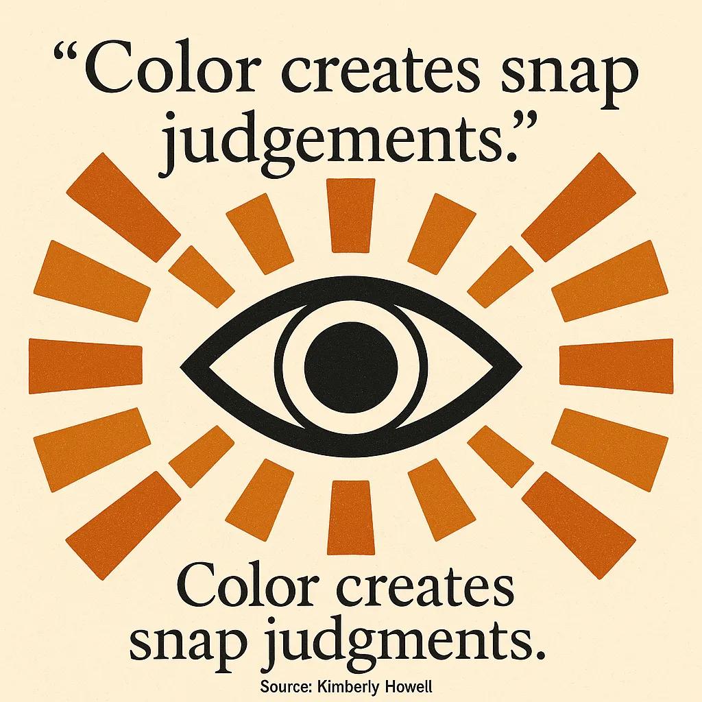
As web designers working with real estate clients, we've seen how colors can make or break a sale. The same principle that makes websites convert applies to physical spaces. Color is a major factor in the snap judgment buyers make within their first 30 seconds of entering a property.
Color drives snap judgments during the first moments of a showing.
The psychology behind color choices affects everything from your branding materials to staging decisions. But here's what most agents miss: different colors trigger specific emotional responses that either help buyers envision themselves living in the space or create subtle resistance.
This guide will show you how to harness color psychology for better buyer connections. We'll start with the science behind color perception, then move into practical applications for marketing and staging. By the end, you'll know exactly which colors work best for different situations and how to implement them effectively.
Think of color as your secret weapon for creating emotional connections with buyers before they even realize what's happening.
The Science Behind Color and Buyer Emotions
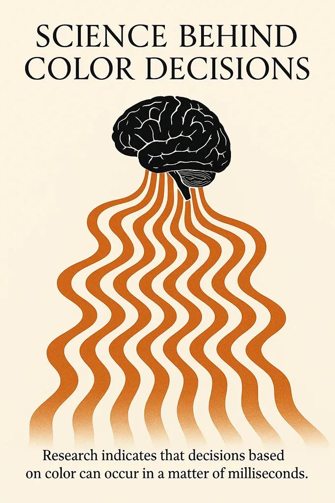
Color psychology isn't just marketing fluff. There's real science behind how our brains process visual information and make decisions. Research in behavioral psychology shows that people make decisions about trustworthiness and desirability within milliseconds of seeing something new.
Trust and desirability are judged in milliseconds—use palettes that signal calm and quality.
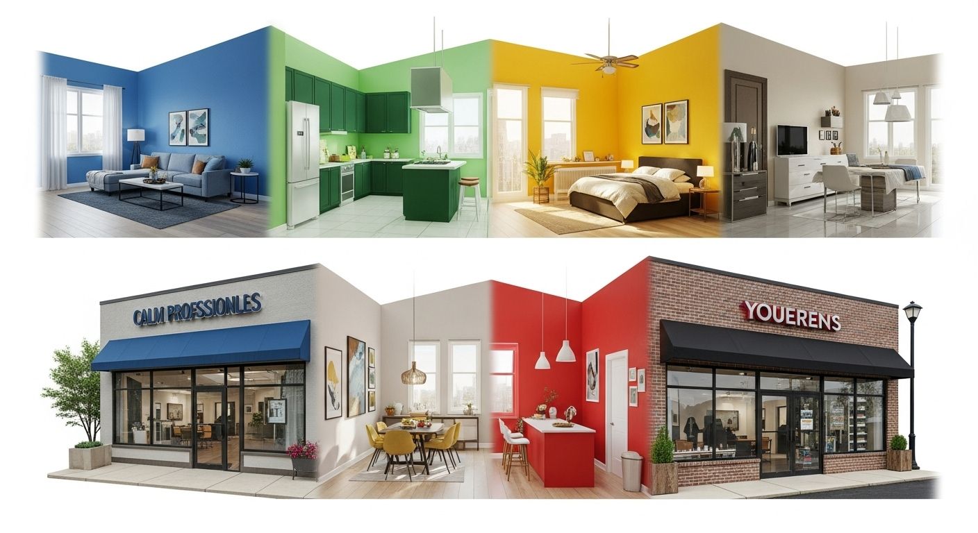
Here's how it works in practice. When buyers see blue tones, their brains associate this with calmness and trust. Red triggers energy and urgency, which can work for dining spaces but might feel overwhelming in bedrooms. Green connects to nature and growth, making it perfect for home offices where productivity matters.
Studies in neuroaesthetics show that color and sensory elements can foster well-being and emotional connection, helping buyers imagine themselves actually living in the space rather than just touring it.
How Light Affects Color Perception
Natural light changes everything about how colors appear. A room with abundant southern exposure can handle deeper, richer tones that would feel oppressive in a north-facing space. Rooms with limited light benefit from lighter, more reflective tones to brighten the space and create the illusion of more square footage.
Morning light has warm undertones, while afternoon light runs cooler. This affects how your staged colors will look during different showing times. Smart agents test their color choices at various times of day to ensure consistency.
Cultural and Personal Color Associations
While some color responses are universal, personal experiences shape preferences too. Your target market's demographics influence which colors will resonate most strongly. Younger buyers often prefer modern neutrals with bold accents, while older buyers gravitate toward traditional earth tones.
Consider your local market when making color decisions. Urban buyers might embrace edgier color choices, while suburban families typically prefer safer, more conventional palettes.
Strategic Color Choices for Different Room Functions
Now that you understand the psychological foundation, let's apply this knowledge room by room. Each space in a home serves a different purpose, and your color choices should support those functions while appealing to buyers' emotions.
Bedrooms
- Best Colors: Soft blues, lavender, light gray
- Psychological Effect: Promotes rest and tranquility
- Buyer Benefit: Easy to envision peaceful sleep
Living Rooms
- Best Colors: Warm beige, soft yellows, cream
- Psychological Effect: Creates welcoming, social atmosphere
- Buyer Benefit: Feels like home immediately
Home Offices
- Best Colors: Sage green, soft blue-green
- Psychological Effect: Enhances focus and productivity
- Buyer Benefit: Perfect for remote work lifestyle
Kitchens
- Best Colors: Warm whites, light wood tones
- Psychological Effect: Suggests cleanliness and freshness
- Buyer Benefit: Ready for family meals and entertaining
Dining Areas
- Best Colors: Warm reds, deep oranges (accents)
- Psychological Effect: Stimulates appetite and conversation
- Buyer Benefit: Natural gathering space for family
Bedrooms: Creating Sanctuary Spaces
Bedrooms are best suited to calming colors such as lavender or light gray because these tones signal to the brain that this is a space for rest and recovery. Avoid bright or energizing colors that might make buyers feel restless.
Consider the bedroom's orientation when choosing your palette. East-facing bedrooms get beautiful morning light that works well with cool blues. West-facing rooms benefit from slightly warmer neutrals that balance the afternoon heat.
Living Areas: Encouraging Connection
Living rooms are enhanced by warm, inviting tones like beige or soft yellows that immediately make buyers feel welcome. These colors suggest comfort and sociability, helping families envision gathering together in the space.
Use the 60-30-10 rule for living rooms: 60% neutral base color, 30% secondary color for furniture or larger accents, and 10% bold accent color in pillows or artwork. This creates visual interest without overwhelming potential buyers.
Work Spaces: Supporting Productivity
Home offices benefit from greens or soft blues to promote focus and productivity. With remote work becoming standard, buyers specifically look for spaces that feel conducive to getting things done.
Avoid overstimulating colors like bright yellow or orange in office spaces. While these can boost creativity short-term, they often become distracting during longer work sessions.
Exterior Colors That Maximize Curb Appeal
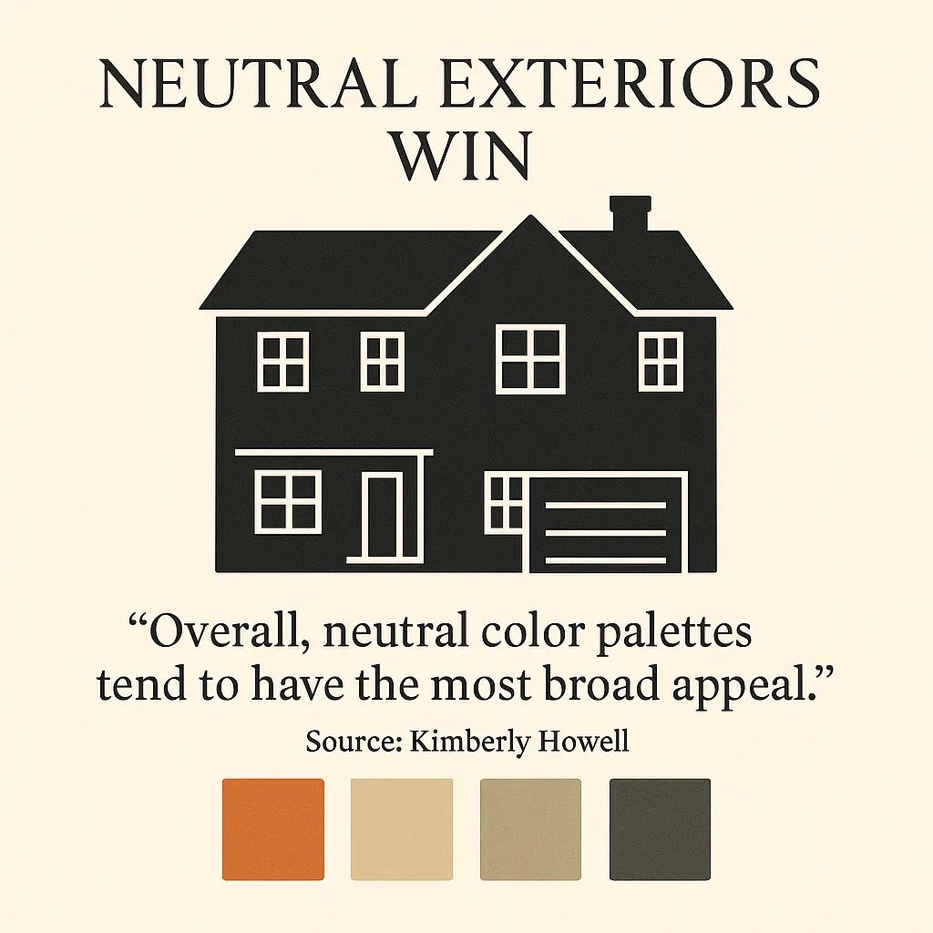
Your exterior color palette creates the crucial first impression before buyers even step inside. Neutral exterior colors such as earth tones, soft grays, and classic whites have the broadest appeal because they evoke feelings of calm and cleanliness.
Neutral exterior palettes broaden appeal and boost curb-first impressions.
Think of exterior color as your property's handshake with potential buyers. It needs to feel welcoming and trustworthy while standing out enough to be memorable among competing listings.
Safe Choices That Sell
Classic combinations work because they don't alienate any buyer segments. Warm white with charcoal accents appeals to modern tastes while remaining timeless. Soft gray with white trim suggests quality and attention to detail.
Bold or unusual exterior colors may limit the buyer pool by creating strong reactions, either positive or negative. In competitive markets, you want the widest possible appeal.
- Light to medium gray with white or cream trim
- Warm white with black or dark gray accents
- Soft beige with brown or bronze details
- Classic navy with white trim for traditional styles
- Sage green with cream accents for natural settings
Adding Personality Without Risk
Tasteful accent colors can add personality through front doors, shutters, or architectural details. A bold front door in deep red or rich blue creates interest while keeping the main structure neutral.
Consider your home's architectural style when choosing accent colors. Craftsman homes look great with earth-toned accents, while modern styles can handle more dramatic contrasts.
Color Psychology in Real Estate Marketing Materials
Your color choices extend beyond the physical property into your marketing ecosystem. Color theory is used to create a cohesive and visually appealing brand identity that reinforces your professional credibility and market positioning.
Every touchpoint with potential buyers should reinforce the same color psychology principles you're using in the physical staging. This creates a consistent emotional experience from online listing photos through the final walkthrough.
Photography and Online Listings
Your listing photos need to capture the emotional impact of your color choices. Shoot during times when natural light enhances your palette rather than competing with it. Morning light works beautifully with cool color schemes, while golden hour photography flatters warm tones.
Color temperature in photography matters too. Slightly warm white balance makes spaces feel more inviting in photos, even if the actual paint colors are cool neutrals. This subtle adjustment helps buyers connect emotionally with the space before they visit.
When working with our real estate clients at Dignuz Design, we optimize listing photos to maintain color accuracy while maximizing emotional appeal. The goal is photos that make buyers want to schedule showings immediately.
Print Materials and Branding
Your business cards, flyers, and signage should complement the properties you're marketing. If you specialize in luxury homes, sophisticated color palettes in deep blues or charcoal grays suggest premium service. For family-focused markets, warmer colors in your branding create approachable, friendly impressions.
Consistency across all materials builds trust and recognition. Buyers should immediately recognize your marketing materials and associate them with quality properties and professional service.
Luxury Properties
- Brand Colors: Deep navy, gold, charcoal
- Psychology: Sophistication, exclusivity
- Materials: High-gloss business cards, premium brochures
Family Homes
- Brand Colors: Warm blues, soft greens, cream
- Psychology: Trust, stability, growth
- Materials: Friendly newsletters, community-focused signage
First-Time Buyers
- Brand Colors: Fresh blues, optimistic greens
- Psychology: Hope, new beginnings, support
- Materials: Educational guides, welcoming office colors
Investment Properties
- Brand Colors: Professional grays, accent blues
- Psychology: Reliability, smart decisions
- Materials: Data-rich reports, clean presentations

Implementation Strategies That Work
Understanding color psychology is just the beginning. The real value comes from implementing these insights systematically across your real estate business. Start with one property and track the results, then scale successful approaches to your entire portfolio.
The key is making changes gradually and measuring their impact on showing requests, time on market, and final sale prices. This data-driven approach helps you refine your color strategies over time.
Staging with Strategic Color Choices
Emotional staging leverages color psychology to create a sense of warmth, comfort, and belonging, which is exactly what transforms property tours into purchase decisions.
Start with neutral base colors that appeal to the broadest buyer pool, then add personality through easily changeable elements like pillows, artwork, and fresh flowers. This approach lets you test different color combinations without major investments.
- Paint walls in market-tested neutral colors that photograph well
- Add color through furniture and accessories you can swap out
- Use natural elements like plants and wood tones for warmth
- Create focal points with strategic accent colors
- Test different combinations based on buyer feedback
Digital Integration for Maximum Impact
Your online presence should reinforce the color psychology you're using in physical spaces. This includes your website design, social media graphics, and virtual tour presentations. We help our clients at Dignuz Design create cohesive digital experiences that support their staging and marketing efforts.
Consider developing signature color palettes for different property types in your market. This creates a recognizable brand system while allowing flexibility for individual properties. Buyers begin to associate certain color schemes with quality properties in your portfolio.
Measuring Success and Adjusting Strategies
Track metrics that matter: days on market, showing-to-offer ratios, and final sale prices compared to list prices. Properties with strategic color implementations should outperform similar listings with generic or poorly chosen color schemes.
Pay attention to buyer feedback during showings. Comments about how "homey" or "welcoming" a space feels often correlate with effective color psychology implementation. Negative reactions to color choices show up in extended time on market or lower offers.
Pro Tip: Keep a color journal for each property, noting which combinations generated the most positive responses and fastest sales. This becomes your personalized guide for future listings.
The most successful agents develop instincts for color psychology through consistent application and measurement. What starts as conscious strategy eventually becomes natural expertise that sets you apart from competitors who rely on generic approaches.
Color psychology isn't about manipulation. It's about creating environments where buyers can genuinely envision their future happiness. When you get the colors right, everything else becomes easier. The showings feel more positive, the negotiations go smoother, and the sales happen faster.
Start with one property and implement these strategies systematically. Pay attention to how buyers respond differently to your color-optimized listings. Most agents are surprised by how much impact these changes make on their overall success rates and client satisfaction.
Your next listing is an opportunity to put color psychology to work. Choose your palette strategically, implement it consistently, and watch how buyers respond. The difference will show up in your results within the first few showings.


