Luxury Brand Website Design: What Reads as Elegant Online
he phrase "luxury website" almost always shows up in a brief written by someone who has just looked at the same five fashion-house homepages. The brief asks for restraint, generous whitespace, slow motion, big serif type, immersive video. The team builds it. The visitor lands, watches the hero loop for half a second, scrolls past it, and forms an opinion about the brand within three seconds that the rest of the site spends the next fifteen pages trying and failing to revise.
This is the gap that defines luxury brand website design and that almost no agency talks about honestly. Luxury on a website is not a visual style applied on top. It is the cumulative effect of small operational decisions made consistently across every page. The decisions that signal real luxury are mostly invisible to the visitor as individual elements, and the decisions that look luxurious in isolation often quietly cheapen the whole experience.
I am Dimitri. I run DignuzDesign, a small studio that builds custom websites for property developers, architects, and real estate companies, mostly using Astro, Webflow, Svelte, and Cloudflare. Most of the briefs that cross my desk include the word luxury somewhere in the first paragraph. This piece is what I would tell a luxury brand team, especially in the property and architecture space, about what their website actually has to do to feel as elegant as the marketing language claims.
Luxury reads as operational excellence, not as ornament
Walk through fifteen luxury brand websites in a single sitting and a pattern emerges that nobody in the brief admitted to. The sites that feel luxurious are not the ones with the most ambitious art direction. They are the ones where small things behave correctly. Type loads first time. Images do not pop in stages. The cursor does not stutter on hover. Scroll holds a steady frame rate. A modal closes the same way every time. The interactions feel rehearsed.
This matters because luxury, at the level of perception, is mostly the absence of friction. Visit a flagship Hermès store in Paris and the experience is not one of overwhelming visual luxury. The lighting is even, the staff are unhurried, the door does not stick, the boxes are wrapped without theatre. The brand is communicated through control. The website has to do the same. The reason a poorly tuned luxury website feels off is that the visitor reads every glitch as a tell. Cheap brands have stuttering carousels. Expensive brands do not. That is a more reliable luxury signal than any specific aesthetic choice.
Bain and Altagamma have been tracking the global luxury market for over two decades, and their most recent industry update makes a useful point: brand-owned digital platforms now consistently outperform multibrand marketplaces because the brand's own site is read as the canonical brand experience. That is exactly the responsibility most luxury sites underestimate. The site is not a brochure. It is the reference experience for the entire brand, and every other channel is graded against it.
The discipline that separates luxury from luxury cosplay
Most websites that describe themselves as luxury are doing what I think of as luxury cosplay. They have adopted the vocabulary of premium design without the underlying discipline. The vocabulary is easy to copy: serif headings, slow fades, oversized photography, dark navigation, lowercase brand marks. The discipline is what costs.
The type system has to be set with proper optical adjustments. Off-the-shelf Google Fonts loaded with default settings produce the visual equivalent of a hotel-room oil painting. The hierarchy reads, but it does not feel composed. Real luxury type work uses a small number of weights, careful letter-spacing tuned per size, line-height that gives the page an unhurried rhythm, and considered choices about where to break a heading. You cannot reach this by accident. It is one of the highest-leverage decisions on a luxury build, and one of the most commonly skipped.
The image work has to be original the whole way down. A site that mixes the brand's own photography with stock imagery telegraphs the exact opposite of luxury. The mix reads as compromise. I have written about why this matters specifically in the property context in real estate visual identity for premium clients, but the underlying principle is generic. Once a single stock image is recognised, the rest of the site becomes suspect. The visitor calibrates the brand's perceived quality to the weakest asset, not the strongest.
The interaction design has to be choreographed. A page where elements all arrive together with the same easing curve at the same moment looks built. A page where elements arrive at slightly different times, with carefully chosen offsets, looks composed. The difference between these two is often a few hours of design work, and it is one of the things that makes a luxury site feel directed rather than assembled.
Spacing has to be intentional and consistent. The most common luxury-site mistake I see is whitespace used as a visual flourish rather than as a system. A page that uses generous padding in the hero and then collapses to tight padding two sections later reads as inconsistent, not luxurious. Luxury spacing is rhythmic. Sections breathe with a similar cadence the whole way down, and the eye moves through the page at a tempo set by the spacing rather than fighting against it.
Why typography carries more weight than imagery
Most luxury brand briefs over-invest in imagery and under-invest in typography. The reasoning seems obvious. Luxury is visual, photography is visual, therefore photography is luxury. The reality is the inverse. Imagery in the luxury space has converged so heavily that any well-shot photo feels generic the moment it is paired with a generic type system. Typography is where a luxury brand still has room to be specific.
The luxury brands that use typography seriously, including most of the heritage Italian fashion houses and a handful of high-end architects' practices, choose a primary face that is unusual enough to be memorable but disciplined enough not to call attention to itself. The face is paired with a more neutral secondary, often a humanist sans, and used at a few carefully chosen sizes. The total number of type permutations on a luxury site is rarely more than six. Most brand websites I review have over twenty.
This matters more in property than in fashion because the visitor is reading. Listing descriptions, neighbourhood narratives, biography pages, brochure-equivalent text. If the type system is undercooked, the reading experience is the experience, and the brand is felt as not-quite-luxury for reasons the visitor cannot consciously name. I touch on the broader application of this in mastering luxury property branding. The headline is that a luxury website with weak type cannot be saved by strong photography, but a luxury website with strong type can survive imperfect photography in a way that surprises most clients the first time it happens.
Pacing is what most teams miss
Pacing is the dimension that separates websites that feel composed from websites that feel hurried. Most luxury sites get the asset quality right and the pacing wrong. The problem usually shows up in three places.
The first is the homepage hero. A hero video that loops too tightly, with cuts every two seconds, reads as advertising. A hero video that lingers, with cuts that are slower than the visitor expects, reads as confidence. The luxury brands that get this right cut their hero loops at a tempo that feels almost too slow on a first watch and that turns out to be exactly right by the third visit.
The second is scroll behaviour. A page that triggers an animation on every section as it enters the viewport feels twitchy. A page that uses entrance animation sparingly, and lets most sections simply be there when they arrive, feels mature. The instinct on a luxury build is often to add more motion. The discipline is to remove most of it. The motion that survives is the motion that was actually doing work.
The third is the thousand small interactions back to the brand. Hover states, transitions between pages, modal openings, focus rings, scroll restoration when the visitor uses the back button. These are the small moments that the visitor encounters dozens of times per session. If they are even slightly off, the cumulative effect is a sense that the brand is amateurish. If they are tuned, the visitor stops noticing them, which is what good design is supposed to do.
Performance is part of the brand, not a technical detail
There is a study I cite often when arguing this point with new clients. Joint research between Deloitte and Google found that a 0.1 second improvement in load time produced a 3.6 percent increase in conversion in the luxury sector and a 40.1 percent increase in users moving from product page to add-to-basket. The headline number that gets quoted most often in industry write-ups, including in the Born Digital summary of the research, is the 3.6 percent. The number that actually matters is the 40.1 percent. Performance is not a marginal optimisation in luxury. It is the deciding factor in whether the buyer's intent survives long enough to become an action.
This is one of the reasons I almost always build luxury brand sites on Astro deployed to Cloudflare rather than on a heavy CMS theme. The build target is not about developer preference. It is about the buyer experience. A site that ships almost no JavaScript by default, serves images intelligently, and hits the green Core Web Vitals thresholds on a real-world device is the only kind of site where the visual vocabulary of luxury survives contact with a hotel Wi-Fi connection. I have written more about this in real estate website speed optimization, and the principle generalises across luxury verticals beyond property.
The harder version of the conversation is that luxury sites cannot afford to optimise for the office desktop. A measurable share of the visits will come from a phone in suboptimal conditions. Google's own Core Web Vitals guidance, summarised in the Search Central documentation, treats Interaction to Next Paint as a primary metric for exactly this reason. The interaction the buyer cares about is not the desktop hover. It is the tap on the listing card from a phone in a car park, and that tap has to feel as composed as the rest of the experience or the brand is read as inconsistent.
Where motion, video, and 3D actually earn their place
The instinct on a luxury build is to use a lot of motion. Hero video, scroll-bound animations, parallax, custom cursors, cinematic transitions. Some of this is justified. Most of it is not. The honest test is whether the motion is doing work the static page could not do, or whether it is decorating a page that would have been clearer without it.
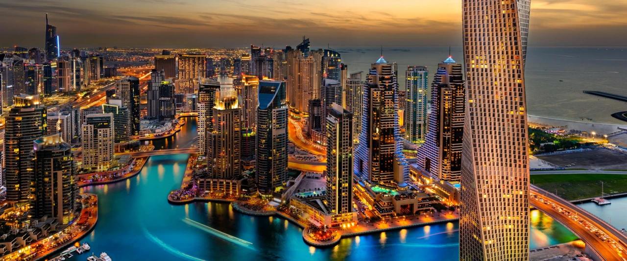
In the property and architecture context this conversation is more focused than in fashion because the assets carry weight. A high-quality drone shot of a development at golden hour does work. A 3D walkthrough of a property in pre-construction does work, because no other asset can answer the buyer's question about scale and layout the same way. A scroll-locked animation that reveals lifestyle copy as the visitor scrolls past a photograph rarely does work.
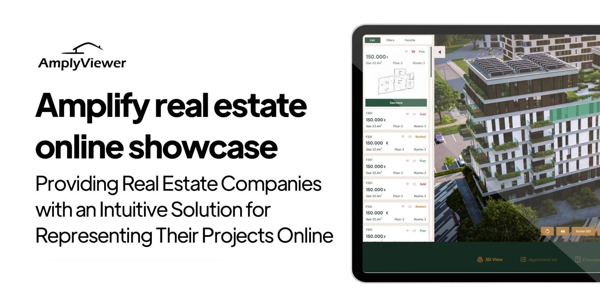
This is the gap I built AmplyViewer to address on the property side. AmplyViewer embeds a tuned interactive 3D experience directly inside the listing page rather than redirecting the buyer into a third-party viewer that looks nothing like the rest of the brand. The choreography of arriving at a 3D scene without leaving the brand environment is itself a luxury signal. The same logic applies whether the practice uses a custom build, a Matterport scan, or scrolling renders produced through a partner like Faraday3D. The luxury motion that earns its place is the motion that lets the visitor do something they could not otherwise do on the page. The motion that does not earn its place is decoration that makes the brand feel like it was designed by people who were trying to look serious rather than be useful.
Where most luxury brand sites cheapen themselves without realising
There is a small set of recurring mistakes I see in luxury website builds across property, architecture, hospitality, and lifestyle brands. They are easy to spot once they are named, and most internal teams are not looking for them.
- Stock photography mixed in with brand photography, especially on inner pages where the team has run out of original assets. The visual register has to be consistent the whole way through. A single recognisable stock photo on a sub-page degrades the perceived quality of the entire site, because it tells the visitor the brand was not willing to invest the photography budget all the way down. The fix is either to commission additional shoots, to use illustration or pattern as a substitute, or to leave the page sparse rather than fill it with second-tier imagery.
- Generic copywriting that reads as if it were written by a marketing tool. Phrases like "we believe luxury is in the detail" or "exceptional properties for exceptional clients" are recognised by the buyer as filler in the first scroll, and the brand is then read as one that does not have a specific point of view. Luxury copy has to be specific or it is worse than no copy at all.
- Animation easing curves left at framework defaults. The default easing on most JavaScript animation libraries produces a movement that has been seen on tens of thousands of sites. Custom easing tuned to a slower, more deliberate curve makes a measurable difference in how the brand is perceived without the visitor consciously noticing why.
- Heavy themes that load five megabytes of unused JavaScript. The visitor never sees this directly. They feel it as latency, layout shift, and a faint sense that the site is not as polished as the brand language suggests.
- Footer treatments and 404 pages that revert to template aesthetics. Most luxury sites invest heavily in the homepage and treat the footer, the 404 page, and the legal pages as places to use a default block. The visitor who reaches these pages is exactly the visitor who is paying close attention.
The thread connecting these mistakes is that luxury is read at the level of consistency. A single moment of compromise is enough to break the spell, because the visitor's read of the brand is calibrated to expect consistency at every touchpoint, not just the showcase ones.
💻 Let us help you create a stunning online showcase for your projects that works seamlessly across all devices. Ready to amplify your real estate business? 👉 Explore AmplyViewer now
The case for custom over template
Luxury is one of the few categories where a template-based build is almost always the wrong answer, and the reasoning is structural, not snobbish. Templates are designed to be flexible across many use cases, which means they have to compromise in dozens of small ways that, individually, do not look like a problem. Default spacing, default typography fallbacks, default animation timings, default button states, default form field treatments. Each of these defaults is set to look acceptable in a wide range of contexts, which means none of them are tuned for the specific brand.
The result is a site that looks competent in a screenshot and feels generic in use. A luxury brand cannot afford to feel generic. The buyer is paying, in part, for the sense of being addressed specifically, and a template-driven site cannot deliver that signal at the level luxury requires. I have written about this in more depth in why custom real estate websites outperform template solutions, and the same argument applies to luxury brands beyond the property vertical.
This does not mean luxury sites have to be built from scratch. Webflow, properly handled, can produce luxury-grade work. Astro can. WordPress can, with effort. The platform choice is less important than the discipline of refusing to accept platform defaults. Every spacing value, every type setting, every transition curve has to be a decision, not a leftover. That is the operational difference between a luxury brand site and a site that wishes it were one.
A note on AI-generated copy and brand voice
The rapid arrival of generative writing tools has created a temptation that luxury brands need to resist. Generic AI-written brand copy is one of the fastest ways to telegraph that a site is not what it claims to be, because the cadence of model-generated luxury writing has become recognisable to readers within a few sentences. The copy on a luxury site has to come from somewhere specific, even if it is edited and structured with assistance.
I run a small side product called AmplyDigest that uses AI to summarise newsletters and YouTube videos into a single morning email. I trust AI for that kind of curation work. I do not trust it for brand language, and the difference is worth naming. Luxury copy carries a brand's specific point of view, and a tool trained on the entire internet does not have one. Use the tools to draft. Do not use them to ship.
How to brief a luxury website build so it actually arrives as luxury
If there is a single recommendation that comes out of years of building these sites, it is to brief differently than the standard luxury template suggests. Stop describing the site you want in adjectives like elegant, sophisticated, refined, premium. Those words mean nothing operationally and produce briefs that any agency can deliver against without ever raising the bar. Brief in terms of behaviour instead. How fast should the listing page open from a tap on a 4G connection. How many type permutations should the site contain. How should the cursor behave on a hover over a property card. How should the contact path differ between a buyer who wants to write and a buyer who wants to text.
The brief that produces a luxury site does not look like a luxury brief. It looks like a list of operational standards. Once those are agreed, the visual vocabulary of luxury becomes a thin layer on top of a substantially better-engineered site, which is the order of operations almost no team gets right the first time.
FAQ
What makes a website actually feel luxurious instead of just looking expensive?
Operational details done consistently. Type set with proper optical adjustments, animation easings tuned away from framework defaults, image work that is consistent the whole way through, performance that holds up on a phone in real conditions. The visual vocabulary is the easy part. The discipline behind the vocabulary is what the visitor reads as luxury, even though they cannot name it.
Can a luxury brand website be built on a template?
Technically yes. Practically no. Templates carry dozens of small default decisions that produce a generic feel even when the visible content is brand-specific. A luxury build needs every spacing value, type setting, and transition curve to be a deliberate decision, which is the opposite of what a template is designed to support. The platform matters less than the discipline of refusing to accept defaults.
How important is page speed for a luxury website?
More important than most luxury teams assume. Joint research between Deloitte and Google found a 3.6 percent uplift in luxury conversion from a 0.1 second load improvement and a 40.1 percent uplift in users moving from product page to add-to-basket. In the property context the same dynamic applies to inquiry submissions and listing engagement, and the gap shows up most painfully on mobile under poor network conditions.
Should a luxury website use a lot of motion and animation?
Less than the brief usually asks for. Motion that lets the visitor do something they could not otherwise do, such as exploring a 3D property model or comparing floorplans interactively, earns its place. Motion that decorates static content rarely does. The discipline is to subtract motion until what remains is doing real work for the visitor.
Is custom photography really worth the cost on a luxury site?
Yes, all the way down. The visitor's read of the brand calibrates to the lowest-quality image on the site, not to the best one. A single recognisable stock photo on an inner page degrades the perceived quality of the whole site. If budget is finite, ship fewer images rather than mix the asset quality.
How do property and architecture brands differ from fashion brands in luxury web design?
The visitor is reading more, the assets carry more weight, and the conversion timeline is longer. Listing descriptions, neighbourhood narratives, and project case studies have to do real work, which puts more load on typography and copywriting than on photography alone. Interactive 3D and floorplans earn their place in property in a way they rarely do in fashion. The aesthetic vocabulary overlaps, but the operational priorities differ in ways that show up in the build.


